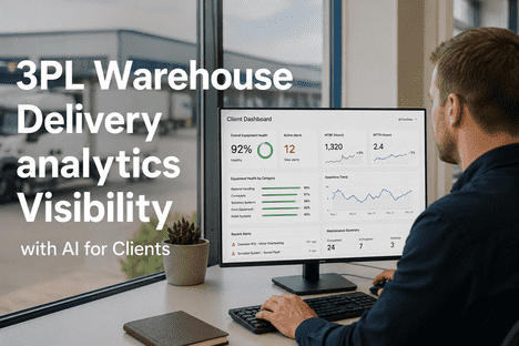
Managing warehouse delivery equipment without a live analytics dashboard means your operations team is always reacting to yesterday's failures. The equipment that failed at 10:45 a.m. shows up in the maintenance log by 2 p.m. The dispatch delay it caused appears in the TMS export tomorrow morning. The first-attempt delivery failures it generated appear in the carrier report at the end of the week. By that point, the failure has already cost you the dispatch window, the delivery accuracy, the carrier SLA performance, and the management time spent investigating a problem that a real-time dashboard would have flagged as an alert 45 minutes before it became a failure event. A best-in-class real-time analytics dashboard for warehouse delivery operations does not just show you what is happening — it shows you what is about to happen. Equipment trending toward failure before it fails. Sort zones running behind throughput targets before they cause dispatch delays. Delivery performance metrics correlating with the equipment events that caused them. Energy systems consuming above baseline before the waste accumulates on the monthly utility bill. iFactory AI's analytics dashboard is built around this real-time intelligence model — connecting equipment performance, dispatch timing, delivery accuracy, energy consumption, maintenance workflows, and shift handover into a single live operational view that enables intervention before consequences rather than diagnosis after them. To see iFactory AI's real-time dashboard running on your operation's data, Book a Demo with our warehouse analytics engineering team.
45 min
Average advance warning from iFactory AI's real-time dashboard before an equipment event becomes a visible operational failure
<60 sec
Dashboard refresh latency — iFactory AI delivers sub-minute analytics updates at peak throughput across all monitored equipment categories
3 days
Average lag between an operational event and its appearance in a spreadsheet-based analytics process — making every decision reactive by definition
1 view
iFactory AI consolidates equipment performance, delivery correlation, energy analytics, maintenance workflows, and shift handover into a single operational dashboard
See iFactory AI's Real-Time Dashboard Running on Your Data
Equipment performance. Dispatch timing correlation. First-attempt delivery analytics. Energy monitoring. Maintenance workflows. Shift Logbook. All in one real-time operational view — configured for your WMS, TMS, and equipment fleet, live in 14 days.
Why "Real-Time" Is the Only Acceptable Standard for Warehouse Delivery Analytics
The word "real-time" is used loosely in analytics. A dashboard that refreshes every 4 hours describes itself as real-time. A system that ingests last night's export from your WMS and calls it current describes itself as connected. The operational standard for warehouse delivery analytics — where a single equipment failure at 10:45 a.m. can produce 40 first-attempt delivery failures by 7 p.m. — is not 4 hours. It is not 15 minutes. It is the sub-minute latency that allows an operations supervisor to see that Zone 7's primary sort conveyor is drawing 14% above its normal current signature and dispatch a maintenance technician to inspect it before the bearing failure occurs and the 90-minute repair window begins.
A
Reactive Dashboards Create Reactive Operations
A dashboard that shows you what happened last shift, last day, or last week does not change operational behavior — it confirms what operations managers already suspected. Real-time dashboards that show developing situations create the intervention opportunities that change outcomes: the sort zone trending behind throughput, the conveyor showing thermal anomalies, the dispatch schedule drifting from plan before the window closes.
B
The Intervention Window Is Short
In warehouse delivery operations, the time between a detectable equipment anomaly and an operational failure event is typically 30–90 minutes for acute failures and 4–8 weeks for gradual degradation. Real-time analytics enables intervention in both windows — catching the acute anomaly before it becomes a failure, and catching the gradual trend before it crosses the threshold that produces delivery impact. Neither intervention is possible with delayed reporting.
C
Delivery Performance Depends on Equipment Timing
The connection between warehouse equipment performance and first-attempt delivery success is a timing relationship — equipment failures during the 10 a.m.–2 p.m. primary sort window produce dispatch delays that translate to delivery failures on afternoon routes. Real-time equipment monitoring is the only mechanism that makes this timing relationship visible and actionable before the delivery window closes.
D
Decision Quality Scales with Data Freshness
Operations managers making dispatch decisions, maintenance prioritization calls, and shift handover recommendations make better decisions when their data is current. The operations director who sees real-time equipment status for all 10 facilities in the morning standup makes better capital allocation decisions than one reviewing last week's summary report — because the current state of operations is visible rather than inferred from history.
The 8 Dashboard Views Every Warehouse Delivery Operation Needs
A best-in-class real-time analytics dashboard for warehouse delivery operations is not a single screen — it is a set of purpose-built views, each designed for a specific operational role and decision type. The eight views below represent the complete analytics visibility layer that iFactory AI delivers, from the maintenance technician's equipment health view to the operations director's network performance summary.
The equipment health dashboard displays real-time health status for every monitored asset — conveyor motors, sorter drives, dock levelers, HVAC compressors, refrigeration systems, compressed air compressors, and inbound receiving equipment — color-coded by health status and sorted by delivery impact criticality. Each asset shows current sensor readings (vibration amplitude, motor current, bearing temperature) against its established baseline, with trend indicators showing whether performance is stable, degrading, or approaching alert threshold. Active predictive maintenance alerts appear with estimated time to failure threshold and the work order status for each open alert.
Key feature: Equipment criticality ranking by delivery impact — highest-delivery-risk assets always visible at the top of the view regardless of failure proximity
The dispatch timing monitor shows live sort throughput versus scheduled throughput by zone, current loading bay status by carrier, projected dispatch time versus scheduled dispatch for each carrier vehicle, and the delta between actual and planned dispatch that determines whether delivery routes will reach recipients within their promised windows. When a sort zone begins running behind throughput target — whether from equipment degradation, sort exception accumulation, or manual handling overflow — the dispatch timing monitor quantifies the projected dispatch delay and its delivery window impact before the delay is locked in by the actual departure time.
Key feature: Projected dispatch delay alert fires before the dispatch window closes — enabling intervention while recovery is still possible
The delivery performance correlation view cross-references equipment failure events, dispatch timing deviations, and carrier first-attempt delivery rate data — revealing the equipment root causes of delivery performance changes that are invisible when these datasets exist in separate systems. The view shows the equipment-to-delivery causation chain: which equipment events correlated with dispatch delays, which dispatch delays correlated with first-attempt failure rate changes on specific routes, and which sites in a multi-facility network are generating the largest equipment-attributable delivery accuracy impact. Historical and live data are both visible — enabling both retrospective root cause analysis and real-time risk identification.
Key feature: Live delivery risk score by sort zone — zones currently running behind target are scored for first-attempt delivery failure probability based on their historical dispatch delay / delivery failure correlation
The energy analytics dashboard shows live energy consumption by system category (HVAC, refrigeration, compressed air, lighting, electrical distribution) versus established baselines — with trend indicators showing which systems are consuming above normal and by how much. Real-time demand charge monitoring tracks the facility's current 15-minute peak demand interval against the billing period's recorded maximum — alerting when equipment startup sequences or operational patterns are approaching a new demand peak that would increase the monthly demand charge. HVAC and refrigeration energy-per-ton calculations are updated continuously, with deviation alerts firing when efficiency drops below configurable thresholds.
Key feature: Live demand charge risk alert — fires when current operational patterns project to set a new billing period peak within the next 15 minutes
The work order management view shows every open, in-progress, and recently closed work order — generated from predictive maintenance alerts or reported manually — with current status, assigned technician, parts status, estimated completion time, and delivery impact classification. Predictive alerts that have generated work orders are tracked through to completion, with closed-loop confirmation that the predicted failure mode was addressed in the maintenance action. Priority classification by delivery impact ensures work orders on assets serving peak dispatch windows receive elevated visibility and response urgency — the maintenance team always knows which open work order carries the highest delivery consequence if not completed before the next peak sort window.
Key feature: Delivery window countdown for open work orders — shows time remaining before the affected equipment enters the next peak dispatch window and the delivery impact of a repair miss
The Shift Logbook view provides the structured operational handover that replaces unstructured Word documents and verbal briefs — displaying the current shift's equipment events, active maintenance alerts, delivery performance exceptions, sort throughput deviations, and any open issues requiring incoming shift attention. The incoming shift supervisor sees a prioritized list of operational context from the outgoing shift: what equipment has active alerts, what work orders are open, whether any sort zones underperformed during the previous period, and what delivery performance trends are active that the incoming shift should monitor. The handover is populated automatically from equipment monitoring and analytics data rather than requiring manual data entry from the outgoing shift supervisor.
Key feature: Auto-populated handover from live analytics — equipment events, alerts, and performance deviations appear in the handover view without manual data entry from the outgoing shift
The parts and inventory view shows current stock levels for all tracked spare parts categories — cross-referenced against active predictive maintenance alerts to flag stock-outs on parts required for upcoming planned maintenance. When a predictive alert fires on a conveyor drive motor, the parts view shows whether the required replacement bearing is in stock, when it was last replenished, and whether current stock is sufficient for the repair plus the recommended safety buffer. Parts consumption trending across equipment categories enables reorder point optimization — ensuring parts ordered before demand spikes rather than reactively after failure confirms the requirement.
Key feature: Active alert / parts availability cross-reference — every open predictive alert is automatically matched to its required parts and current inventory level in real time
For multi-site operations, the network performance summary provides a single-screen overview of operational health across all facilities — showing equipment health status, dispatch timing performance, first-attempt delivery rate, energy performance, and open high-priority maintenance alerts for each site simultaneously. Sites are ranked by operational risk score — enabling the operations director to direct attention and resources to the facilities most at risk of delivery performance failures in the current operational period. Weekly, monthly, and quarterly network performance trends are accessible from the summary view — showing which sites are improving, which are degrading, and which are outliers against the network average on each performance dimension.
Key feature: Real-time network risk ranking — facilities sorted by current operational risk score based on equipment health, dispatch timing, and delivery performance trending
Want to see all 8 dashboard views configured for your warehouse operation? Book a Demo — we configure the dashboard for your specific equipment inventory, WMS, TMS, and site count before the demo session.
What Each Role Sees on the Dashboard — And Why It Matters
The value of a real-time analytics dashboard is directly proportional to how well it matches each user's decision context. A dashboard optimized for the maintenance technician's equipment health view is useless to the operations director who needs a network performance summary. iFactory AI's platform delivers role-specific views that surface the right information for each operational decision type.
Maintenance Technician
Sees: Individual asset health scores, sensor readings vs baseline, active alerts ranked by repair urgency, open work orders assigned to them, parts availability for their current work orders
Decides: Which equipment to inspect first, whether a repair can wait for the next planned window or requires immediate response, whether required parts are in stock before starting a repair
Maintenance Manager
Sees: Fleet-wide equipment health summary, all open work orders with status and delivery impact priority, upcoming planned maintenance schedule vs peak dispatch windows, parts inventory across all equipment categories
Decides: Maintenance crew scheduling and task assignment, whether to escalate a predictive alert to immediate response, parts procurement timing, peak window protection schedule
Operations Supervisor
Sees: Sort throughput by zone vs target, dispatch timing live vs scheduled, active sort exceptions, equipment alerts on delivery-critical assets, carrier loading bay status
Decides: Whether to initiate manual throughput support in a lagging zone, whether to call a dispatch hold while an equipment issue is resolved, shift resource reallocation
Shift Supervisor
Sees: Shift handover summary from outgoing team, all active alerts and open work orders, throughput performance vs target for current shift, delivery performance trending, equipment status for the shift's operating period
Decides: Shift priorities and crew allocation, which outgoing shift issues require immediate incoming shift action, escalation to maintenance manager or operations director
Facility / Operations Director
Sees: Facility-level performance summary (or multi-site network summary), equipment health trends, first-attempt delivery rate vs target, energy cost trending, high-priority alerts, maintenance cost metrics
Decides: Capital maintenance investment priorities, maintenance program effectiveness assessment, delivery performance improvement actions, energy cost reduction initiatives, budget justification data
Finance / CFO
Sees: Automated ROI attribution reports showing dollar savings from specific maintenance interventions, re-delivery cost avoidance, energy savings vs baseline, carrier penalty avoidance from improved first-attempt rates
Decides: Maintenance program budget approval, platform renewal and expansion investment, capital replacement prioritization based on asset TCO analytics
Role-Based Dashboard Access for Every Member of Your Operations Team
iFactory AI delivers the right view to every operational role — from the maintenance technician's asset health screen to the CFO's ROI attribution report — without requiring custom development, separate reporting tools, or manual data export for any role in the operations hierarchy.
Real-Time Dashboard vs Delayed Reporting: The Operational Difference
| Operational Scenario |
Delayed / Spreadsheet Analytics |
iFactory AI Real-Time Dashboard |
| Equipment Bearing Failure Developing |
Discovered at mechanical failure — after 60–90 minutes of dispatch delay during peak sort window |
Vibration trending alert fires 6–8 weeks before failure — maintenance scheduled off-peak before delivery impact |
| Sort Zone Running Behind Throughput |
Visible in daily WMS export next morning — after dispatch delay has already caused delivery failures |
Live throughput vs target shows zone lagging in real time — dispatch supervisor alerted while recovery is still possible |
| First-Attempt Delivery Rate Drop |
Visible in weekly carrier report 5–7 days after failures occurred — root cause investigation begins days too late |
Equipment-to-delivery correlation identifies the failure cascade within hours — root cause visible same day |
| Shift Handover Equipment Status |
Verbal or unstructured document — incoming shift unaware of equipment issues that developed during outgoing shift |
Auto-populated Shift Logbook shows all equipment alerts and performance deviations from the outgoing period |
| HVAC Efficiency Degradation |
Appears as higher electricity bill next month — no system-level attribution, no degradation timeline visible |
Energy-per-ton deviation alert fires when HVAC efficiency drops below threshold — service scheduled before peak season failure |
| Peak Demand Charge Spike |
Appears on monthly utility bill — no advance warning, no load management opportunity |
Real-time demand monitoring alerts when equipment startup sequence is projected to set a new billing period peak |
| Multi-Site Performance Comparison |
Analyst manually compiles cross-site data — 2–3 days to produce, already stale on delivery |
Network dashboard shows all sites ranked by current operational risk in real time — no compilation required |
| Management ROI Reporting |
Operations team manually builds finance presentation each budget cycle — 3–4 hours, correlation without attribution |
Automated ROI attribution report generated on schedule — specific dollar savings attributed to specific interventions |
Expert Perspective
The operational impact of moving from delayed reporting to a real-time analytics dashboard is not incremental — it is categorical. When an operations supervisor can see that a sort zone is trending 12% behind throughput target at 11:20 a.m., they have a recovery decision to make in the next 15 minutes. When they see that information in tomorrow morning's WMS export, the recovery decision is irrelevant because the dispatch window already closed and the delivery failures already happened. The most common objection I hear to real-time analytics investment is that the operation has always run on daily reports and managed acceptably. What that argument misses is the cost of "acceptable." The acceptable first-attempt delivery rate with delayed analytics is 2–3 percentage points lower than it would be with real-time equipment monitoring. The acceptable maintenance cost with delayed reporting is 20–30% higher than it would be with predictive alerts. The acceptable energy cost with monthly utility bill analytics is 15–25% above what continuous monitoring and proactive management would produce. Real-time analytics doesn't change the standard — it reveals the gap between your current performance and what your operation is actually capable of.
— VP of Logistics Operations Technology, National E-Commerce Fulfillment Network · 15 Years Warehouse Operations Analytics · Former Director of Operations Intelligence, Fortune 100 3PL Provider
3–5%
First-attempt delivery rate improvement from real-time equipment-to-dispatch correlation
70%+
Peak-window equipment failure reduction from real-time predictive monitoring
20–35%
Energy cost reduction from continuous monitoring versus delayed utility bill analytics
Conclusion: The Dashboard Is the Difference Between Reactive and Predictive Operations
The gap between a warehouse delivery operation that reacts to yesterday's failures and one that prevents tomorrow's is not a technology gap or a data gap — it is a visibility gap. The data exists in every warehouse: equipment sensor readings, WMS throughput records, dispatch timing logs, carrier delivery reports, utility consumption data. The question is whether that data reaches the right person, in the right format, at the right time — before the failure occurs, before the dispatch window closes, before the delivery rate drops, before the energy waste accumulates. iFactory AI's real-time analytics dashboard is the visibility layer that converts existing operational data into the continuous intelligence that enables predictive operations — connecting equipment health, dispatch performance, delivery outcomes, energy consumption, and maintenance workflows into a single real-time operational view that enables intervention before consequences rather than investigation after them. Managing warehouse delivery equipment without a live analytics dashboard means your team is always reacting to yesterday's failures. It does not have to be.
Get the Real-Time Dashboard Your Warehouse Operations Deserve
Live equipment health · Dispatch timing correlation · Delivery analytics · Energy monitoring · Work Order Management · Shift Logbook · Network overview. iFactory AI — configured for your operation, live in 14 days.
Frequently Asked Questions
What data sources feed iFactory AI's real-time dashboard — and does the operation need to add sensors?
iFactory AI's real-time dashboard is designed to maximize the use of existing data sources before adding new hardware. Most warehouse facilities have WMS and WCS systems generating throughput and dispatch timing data, equipment PLCs and building management systems generating sensor data, carrier feeds generating delivery performance data, and utility sub-meters generating energy consumption data — all of which iFactory AI ingests directly through native integrations. The implementation team assesses existing data sources during the pre-deployment scoping session and identifies specifically which dashboard views can be activated from existing data and which would benefit from additional sensor hardware. For facilities with older equipment lacking PLC connectivity, the implementation team specifies the minimum sensor additions needed to enable predictive monitoring — typically current transducers on motor circuits and temperature sensors on bearing housings, which are non-invasive retrofit installations that do not require equipment shutdown.
Book a Demo to discuss the sensor assessment for your specific facility configuration.
How quickly does the dashboard become operationally useful after deployment begins?
iFactory AI's deployment is structured to deliver operational value at three progressive stages. Within 14 days of deployment start, the live analytics layer is active — WMS and TMS integration complete, equipment monitoring ingesting real-time sensor data, dispatch timing monitoring live, shift logbook active, and work order management connected to equipment alerts. The dashboard is operationally useful from this point for real-time visibility and dispatch timing monitoring. Within 30–45 days, the predictive models are fully trained on facility-specific baselines — the first predictive maintenance alerts begin firing on equipment showing early degradation signatures, and the equipment-to-delivery correlation analysis is available for the first time. Within 60–90 days, the full analytics value is realized — predictive alert accuracy improves as models accumulate more facility-specific data, the delivery correlation patterns become statistically robust, and the automated reporting layer is producing management-ready outputs without manual effort.
Can the dashboard be accessed on mobile devices for operations managers on the floor?
Yes — iFactory AI's dashboard is fully responsive and designed for mobile use by operations team members on the warehouse floor. The mobile view prioritizes the highest-urgency information for each role: active equipment alerts with asset location and severity for maintenance technicians, live sort zone throughput status for operations supervisors, and active delivery risk indicators for dispatch managers. Push notifications deliver high-priority alerts directly to operations team members' mobile devices — an equipment alert on a primary sort motor during the peak dispatch window fires a push notification to the maintenance manager and operations supervisor simultaneously, regardless of whether they are at a desk or on the floor. The mobile interface does not require a separate app download for most functionality — the responsive web dashboard is accessible through standard mobile browsers with full authentication security.
How does the dashboard handle operations with seasonal volume variation — like peak holiday seasons?
iFactory AI's analytics platform handles seasonal volume variation through dynamic baseline adjustment and peak-season risk elevation. During the 30–60 days before a known peak season, the platform automatically elevates the monitoring sensitivity on equipment categories with the highest peak-season failure risk profile — reducing alert thresholds on primary sort drive motors, dock equipment, and refrigeration systems to fire earlier in degradation curves than normal operating period thresholds. This pre-peak elevation ensures that equipment showing early degradation symptoms is addressed in the weeks before peak throughput increases the stress on already-degrading assets. Peak season dashboards additionally display real-time capacity utilization versus peak throughput targets for each sort zone and carrier lane — giving operations supervisors visibility into whether current throughput rates are tracking to meet peak-season dispatch commitments across all carrier streams simultaneously.
What does the iFactory AI dashboard look like compared to what a standard WMS monitoring module provides?
Standard WMS monitoring modules show WMS transaction performance — order processing rates, pick completion, shipping label generation, and dispatch confirmation. They are designed to monitor the WMS application itself, not the physical equipment and operational processes that determine whether the WMS data reflects operational reality. iFactory AI's dashboard operates at the layer below the WMS — monitoring the equipment that determines whether parcels are scanned correctly, sorted accurately, dispatched on time, and delivered successfully. The two monitoring layers are complementary rather than competing: WMS monitoring tells you whether the system processed the transactions correctly; iFactory AI tells you whether the equipment that executed those transactions was performing accurately and whether the timing of those transactions will produce successful delivery outcomes. Most WMS monitoring modules have no visibility into equipment sensor data, dispatch timing correlation with delivery outcomes, energy consumption, predictive maintenance, or cross-site network benchmarking — all of which iFactory AI delivers as native dashboard capabilities.