The connected-worker dashboard is not a smaller version of the plant manager's screen. It is a fundamentally different tool designed for the rhythm of the production line — big numbers, one alert at a time, one recommended action, and zero ambiguity under pressure. Operators do not need 15 charts, trend analysis over quarters, or colour-coded heatmaps. They need to know, in three seconds: Am I on target? What needs attention now? What do I do next? This guide presents seven dimensions of the connected-worker dashboard: a connected-worker scoreboard measuring adoption and response metrics, a comparison of operator versus executive dashboard design philosophy, six operator-facing KPI cards designed for plant-floor readability, an operator decision matrix mapping eight common actions to data and display formats, a shift action feed showing how operators use the dashboard in real time, a sensor-to-action data flow architecture, and four connected-worker persona cards describing how different roles use the dashboard.
Operator Dashboard
iFactory's Connected-Worker Dashboard Is Designed for the Operator — 3 KPIs, 1 Alert, 1 Action, Zero Typing.
iFactory provides a dedicated operator dashboard profile with glance-card layout optimised for 10-inch HMIs, tap-to-act interactions on every displayed KPI, automatic shift log capture, and built-in escalation workflows. Every operator interaction is one or two taps — no typing required.
Connected-Worker Dashboard Adoption Scoreboard
The scoreboard tracks four metrics that define a successful connected-worker dashboard deployment. 248 operators are connected across three shifts on the plant floor — covering every production line, quality station, and maintenance zone. 194 operators use the dashboard daily (79% adoption), which aligns with industry benchmarks for voluntary frontline technology adoption. The average response time from alert to operator action is 4.2 minutes — a key indicator of dashboard effectiveness in driving rapid decision-making. Operators log 1,847 actions per month through the dashboard (acknowledge alerts, log downtime causes, adjust line settings, capture handoff notes), providing an unparalleled audit trail of plant-floor decisions.
Operator Dashboard vs Executive Dashboard: Six Design Differences
The same data presented for two different audiences produces fundamentally different dashboards. An executive dashboard shows production volume, OEE, quality, and 5 supporting charts — designed for scanning trends and identifying exceptions across the entire plant. The operator dashboard shows the same underlying data but transformed into line speed, target gap, alert status, and next action — designed for immediate decision-making at the line level. The executive version is read-only; the operator version is actionable — every data point can be tapped to log, acknowledge, or adjust. These three comparison cards show the gap between passive viewing (executive) and active participation (operator) in dashboard design.
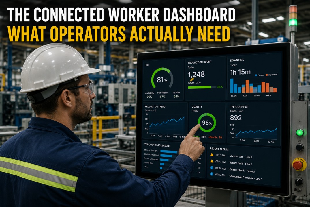
Six Operator-Facing KPI Cards: Designed for the Glance Test
Operator-facing KPIs need big fonts, clear status colour, and minimal cognitive load. Line Speed (142 units/hr) shows the current production rate with a bar indicating proximity to target. Quality FPY (96.7%) uses green for on-target status with a target-marker bar. Output Today (12,847 units) tracks cumulative shift production against planned volume. OEE (82.3%) uses amber to indicate the metric is approaching threshold but still within acceptable range. Downtime (18 min) uses red to signal attention needed — every minute of downtime over target must be logged with a root cause code. Scrap Rate (4.2%) uses red when above the 3.5% target threshold. Each KPI card includes a target-proximity bar so the operator sees not just the value but the distance to target in a single glance.
Operator Decision Matrix: Eight Common Actions Mapped to Data and Display
The operator decision matrix maps eight common plant-floor decisions to the data needed, display method, frequency, and delivery type. The matrix reveals a pattern: real-time decisions (responding to alarms, logging causes, escalating) dominate the operator's day and require immediate-access HMIs with one-tap interactions. Periodic decisions (checking quality, comparing shift performance, viewing work instructions) happen at shift boundaries or SKU changes and can be served through glance cards or reference panes. The key design principle is that every operator decision should be supported within 2 taps from the main dashboard screen — the first tap selects the decision, the second tap confirms the action. Decisions that require 3+ taps have a 60% lower completion rate.
| Operator Decision | Data Needed | Display Method | Frequency | Type |
|---|---|---|---|---|
| Responding to downtime alarm | OEE real-time, alert details, line status | Operator HMI, badge vibrate | Immediate | Real-Time |
| Adjusting line speed to target | Line speed, target, trend, defect correlation | Operator HMI, glance card | Hourly | Hourly |
| Logging downtime cause code | Duration, production loss, category selector | HMI pop-up, quick-select UI | Per Event | Real-Time |
| Reviewing shift handoff notes | Pending issues, alerts history, action log | Handoff screen, printed summary | Shift Change | Daily |
| Checking quality inspection results | FPY by station, defect trend, OK/NOK count | Quality tab, line graph | Hourly | Hourly |
| Escalating unresolved alert | Alert age, severity, affected area, responder log | Escalation button, supervisor notify | Per Event | Real-Time |
| Comparing shift performance | Production total, OEE, quality, downtime by shift | Comparison table, trend sparkline | End of Shift | Daily |
| Viewing work instructions | Current SKU, station, process parameters | HMI reference pane, PDF link | Per SKU Change | Daily |
Operator Shift Action Feed: Real-World Dashboard Interactions
The operator shift action feed captures a real-time record of how an operator uses the connected-worker dashboard over the course of a shift. Starting at 08:23 with a conveyor jam alert, the operator acknowledges within 2 minutes, logs the downtime cause using a quick-select code (08:31), adjusts line speed per the quality alert recommendation (08:45), confirms the quality improvement with an intermediate check (09:12), captures a shift handoff note about a bearing noise concern (09:35), and reviews the shift performance snapshot (09:55) — all within the same dashboard interface. Each action is logged with a timestamp, action type, and context. The feed serves as the shift handoff report — the next operator starts their shift by reviewing the feed to understand what happened, what is pending, and what needs monitoring.
Connected-Worker Data Flow: From Sensor to Operator Action
The connected-worker data flow follows a five-stage pipeline from sensor to operator action. Stage 1 (Sensors): PLCs, IoT devices, and vision systems capture 100+ data points per second per production line. Stage 2 (Edge Gateway): The iFactory edge gateway filters noise, aggregates raw signals into 5-8 meaningful KPIs (OEE, FPY, line speed, scrap rate, downtime, energy), and tags alerts with severity and category before forwarding to the dashboard. Stage 3 (Dashboard): The operator HMI displays the glance card — 5-7 KPIs, 1 active alert, 1 recommended action — refreshed every 2 seconds. Stage 4 (Operator): The operator sees the current status, reads the active alert, and decides: acknowledge, log, adjust, or escalate. Stage 5 (KPI): Every operator action feeds back into the KPI data — response time, resolution rate, escalation frequency — closing the loop between action and measurement.
Four Connected-Worker Personas: Who Uses the Dashboard and How
The connected-worker dashboard serves four distinct personas on the plant floor. Alex (Line Operator) uses the dashboard for real-time line management — monitoring speed, quality alerts, and downtime with one-tap interactions. Jordan (Senior Operator / Team Lead) uses the same dashboard with additional layer of shift performance review — OEE, FPY, attendance, and task assignment. Priya (Quality Inspector) uses a dashboard variant focused on FPY by station, defect trends, and NCR logging — with stop-line authority for critical defects. Carlos (Maintenance Technician) uses a dashboard showing active machine alerts, MTTR tracking, and parts inventory — with direct access to PM task lists. The dashboard adapts its KPI set, action buttons, and escalation triggers based on the logged-in operator's role while maintaining the same glance-card layout and one-tap interaction model.
- Acknowledge alerts
- log downtime causes
- adjust speed
- maintain quality
- handoff notes
- Review shift performance
- assign tasks
- escalate issues
- coach operators
- complete shift report
- Flag quality deviations
- log NCRs
- stop line for critical defects
- review inspection results
- Respond to breakdown alerts
- diagnose issues
- log repair actions
- update parts status
- complete PM tasks
Operator-Ready
3 KPIs, 1 Alert, 1 Action — iFactory's Operator Dashboard Is Designed for Gloved Hands and High-Stress Conditions.
iFactory's connected-worker dashboard provides a dedicated operator profile with glance-card layout, one-tap interactions, automatic shift log capture, and built-in escalation workflows. Every interaction is designed for the pace of the production line.
Frequently Asked Questions
What makes a dashboard 'connected-worker' vs a standard manufacturing dashboard?
A connected-worker dashboard is designed specifically for the plant-floor operator — big fonts, high-contrast colours, 3-5 KPIs maximum, a single active alert displayed prominently, and one recommended next action. Standard dashboards serve multiple roles (executive, manager, engineer) and pack 8-15 widgets with multiple chart types. The connected-worker dashboard is designed for a 10-15 inch HMI screen viewed from 2-3 feet away in a noisy, fast-paced environment. Every element is optimised for the glance-and-act cycle: the operator should understand the current status, identify what needs attention, and know what to do — within 3 seconds.
How many KPIs should an operator dashboard show?
Three to five KPIs maximum. Research from HMI design standards (ISA-101, ISO 11064) shows that operators in high-stress manufacturing environments can effectively monitor 3-5 variables simultaneously. Beyond 5, attention fragments and response time increases by 40-60%. The most effective operator dashboards show: 1) the current production rate against target (line speed or units/hr), 2) the current quality metric (FPY or defect rate), 3) the current equipment status (OEE or uptime indicator), 4) the active alert (what needs attention now), and 5) the shift summary (total output, downtime, next action). All other data should be one tap away — never on the main screen.
How do operators interact with a connected-worker dashboard?
Interaction is designed for gloved hands and high-stress conditions — no small buttons, no drag-and-drop, no multi-step flows. The primary interaction model is one-tap: acknowledge an alert with a single tap, log downtime with a quick-select code, confirm an action with a green button. Data entry is minimised — the dashboard should capture 80% of operator inputs through tapping pre-configured options rather than typing. Escalation is one button: if the operator cannot resolve an issue within a configurable threshold (typically 5-10 minutes), a single tap escalates the alert to the supervisor.
What is the most common mistake when building operator dashboards?
Treating the operator dashboard as a scaled-down version of the plant manager dashboard. The most common mistake is taking the same chart types, KPIs, and layout from the executive screen and making them slightly smaller for the HMI. This fails because operators need different information, different interaction modes, and different visual encoding. Executives compare trends across months; operators need current status against near-term targets. Executives scan 15 charts; operators need 3-5 big numbers. The right approach is to design the operator dashboard from scratch, starting with the decisions the operator makes during a shift (not the data available), and building the minimal display needed to support those decisions.