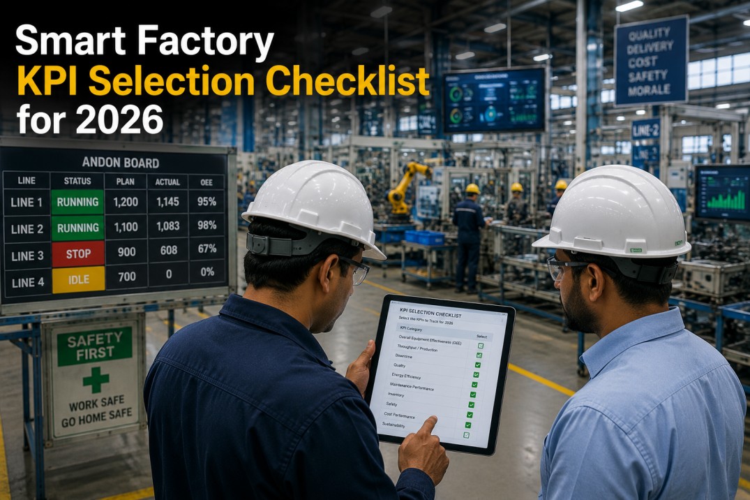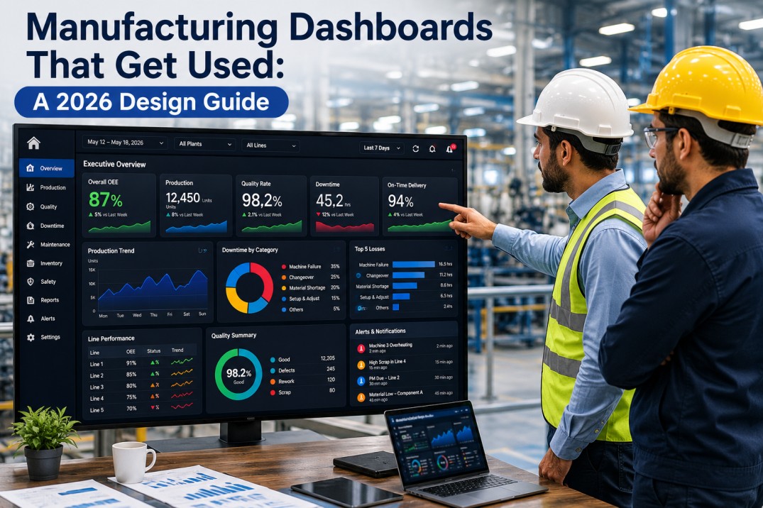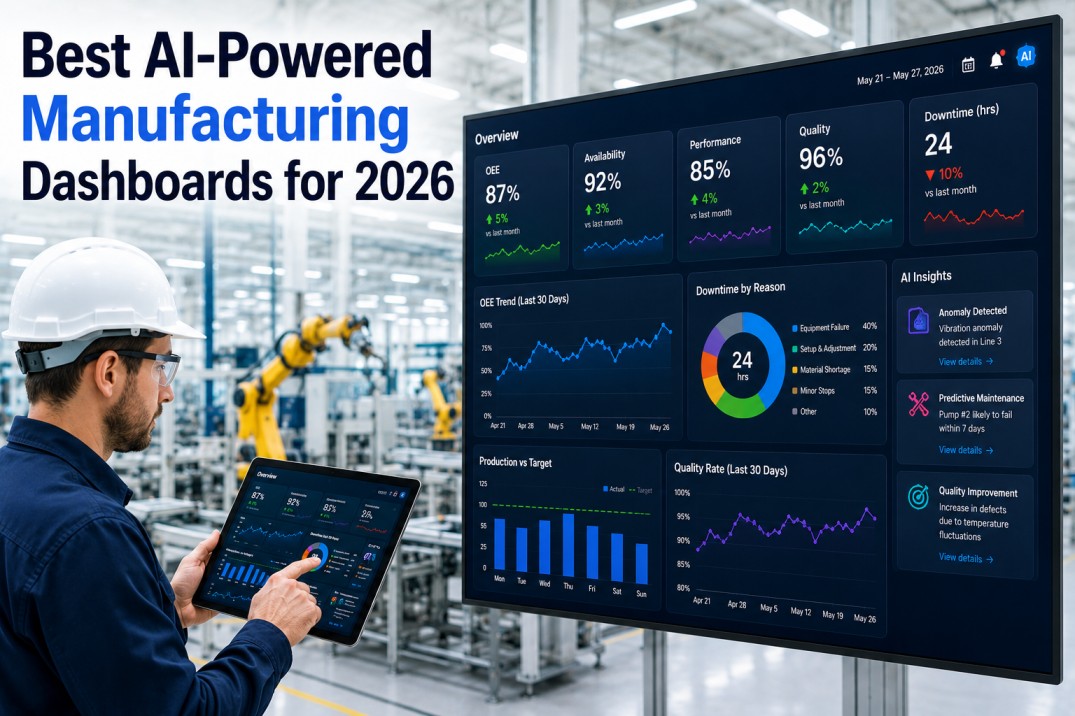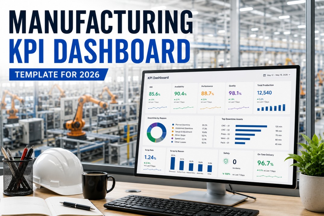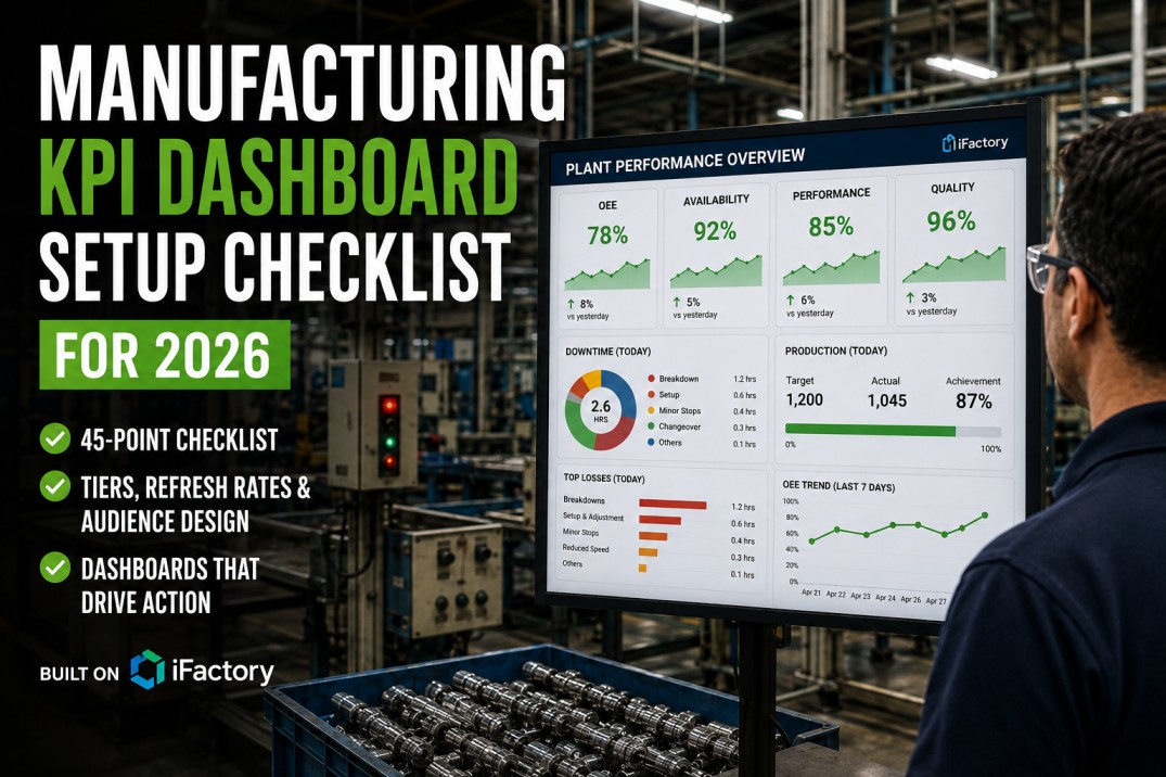
A manufacturing KPI dashboard that nobody looks at is not a dashboard — it is a screen saver. The failure mode of most factory dashboard implementations is not technical; it is design. Dashboards get built for the people who commissioned them rather than the people who work with them every day. Operators get executive-level trend charts they cannot act on. Plant managers get raw machine-counter data they cannot interpret. This manufacturing KPI dashboard setup checklist gives quality, operations, and IT teams a 45-point framework for deploying dashboards that actually get used — covering tier architecture, KPI definition, data source validation, refresh rate design, and the review process that turns a dashboard from a display into a management system.
Deploy Manufacturing Dashboards That Get Used — Configured in iFactory
iFactory delivers pre-built manufacturing KPI dashboards tiered by audience — operator shift view, supervisor daily summary, plant manager trend board, and executive scorecard — all fed from live production, quality, and maintenance data with no manual data entry.
Dashboard Strategy — Audience Before Metrics
The first question in any manufacturing dashboard project is not "what data do we have?" — it is "who is making which decision, and what information do they need to make it correctly?" A shop floor operator needs to know how the current shift is tracking against target, what the current quality rate is, and whether any alert requires immediate action. A plant manager needs weekly OEE trends by line, top downtime causes, and OTIF performance. An executive needs the rolling 13-week plant scorecard against budget targets. Building a single dashboard that attempts to serve all audiences produces a document that serves none of them.
Define Audience per Tier
Every dashboard tier has a specific audience with specific decisions to make. Operator tier: shift-level operational data. Supervisor tier: shift comparison and loss prioritisation. Plant manager: cross-line trend and exception management. Executive: plant-to-plant benchmarks.
Decision-First Design
For each KPI on a dashboard, ask: what decision does this enable? If the answer is unclear or the decision belongs to a different audience tier, the KPI is on the wrong dashboard. Remove it.
KPI Count Discipline
Research consistently shows that dashboards with more than 8–10 metrics produce worse decisions than dashboards with 4–6. Every additional KPI dilutes attention. Build with fewer metrics and add only when a specific decision need is proven.
Named KPI Owner
Every KPI on a live dashboard has a named owner responsible for data quality, threshold currency, and action follow-up. KPIs without owners drift stale and lose credibility.
Separation of Operational and Strategic Views
Operational dashboards (shift-level, real-time) and strategic dashboards (week/month trend) should be separate. Mixing time horizons on a single view creates confusion about whether the audience should take immediate action or trend-analyse.
Pilot With End Users
Before full deployment, pilot each dashboard tier with the actual audience for two weeks. Ask what decisions they made using the dashboard and what information was missing or misleading. Redesign before scaling.
KPI Definition — No Ambiguity in the Formula
Every KPI on a manufacturing dashboard must have an unambiguous formula documented in writing. "On-Time Delivery" is not a KPI definition — it is a category. Does "on time" mean shipped on the customer requested date, the confirmed delivery date, or the revised delivery date? Does "delivered" mean left the warehouse, arrived at the customer, or was accepted by the customer? The formula definition determines whether the KPI produces a number that is defensible in a customer or management review — and whether two plants using the same KPI dashboard are actually measuring the same thing.
Formula Documentation
Every KPI has a written formula: numerator, denominator, time period, unit of measure, rounding rule, and exclusions. Stored in an accessible document linked from the dashboard.
Target Setting
Targets set based on historical baseline, customer requirements, or industry benchmark — not guessed. Traffic light thresholds: green (on or above target), amber (within 5% of target), red (more than 5% below target) as a starting point.
Leading vs. Lagging Balance
A dashboard of only lagging indicators tells you what already went wrong. Include at least two leading indicators per tier — first-pass yield rate, schedule adherence, IPQC non-conformance rate — that predict the lagging outcome.
Time Period Alignment
Each KPI is clearly labelled with its time period: current shift, today, this week, rolling 4-week average, or rolling 13-week average. Mixing time periods on a single dashboard without labelling creates misinterpretation.
Benchmark Reference
Every KPI target has a stated basis: internal historical best, customer requirement, or external industry benchmark. Targets without a stated basis are arbitrary and will be disputed.
Quarterly Target Review
KPI targets reviewed at least quarterly against actual performance trends and business changes. A target that was appropriate 18 months ago may no longer reflect current process capability or customer requirements.
Data Infrastructure — Reliable Sources and Correct Refresh Rates
A manufacturing KPI dashboard is only as trustworthy as its data sources. The fastest way to kill dashboard adoption is to publish a KPI number that operators or supervisors know is wrong. Once credibility is lost, dashboards are ignored — and the organisation reverts to the spreadsheets and whiteboards the dashboard was supposed to replace. Every KPI must have a documented data source, a validated transformation rule, and a stale-data indicator so users know when the feed has stopped updating.
An operator-facing shift dashboard that refreshes every four hours is useless — the shift is half over before the data reflects reality. Shop-floor operational KPIs must refresh in real time or no more than 15 minutes. Supervisors need 5–15 minute refresh. Plant managers and executives can work with hourly or daily refresh.
Every KPI tile on a live dashboard must show when the data was last updated. A dashboard with no timestamp showing is one data feed failure away from displaying yesterday's numbers as today's — and nobody will know until a bad decision is made based on them.
Run the KPI calculation manually using source data and compare to the dashboard output for at least one full week before go-live. Transformation errors — wrong time zone, double-counting, mismatched unit of measure — are common and invisible until they surface in a management review.
Any KPI fed by manual data entry requires a named data owner, a daily entry deadline, a late-entry escalation process, and an audit trail. Manual KPIs without governance degrade quickly — entries get backdated, approximated, or skipped when the shift is busy.
Adoption — The Review Process That Makes Dashboards Work
A dashboard is not a system — it is an input to a management process. The review meeting, the action log, and the escalation protocol are the system. Without them, even a perfectly designed dashboard with flawless data becomes wallpaper within weeks. The manufacturing dashboard implementation checklist below covers the adoption practices that separate dashboards that drive improvement from dashboards that decorate the plant floor.
Each shift handover includes a 5-minute dashboard review: how did the shift perform, which KPIs turned amber or red, what is the top action for the incoming shift. This is the most impactful implementation step and requires zero additional technology.
Every red KPI generates a logged action with owner and due date before the review meeting ends. Actions from the dashboard and actions from the meeting must be in the same system — not a separate spreadsheet that nobody checks.
A red KPI that persists for more than one shift triggers supervisor review. Persisting for more than three days triggers plant manager review. Persisting beyond a week triggers executive escalation. Escalation paths are defined in writing before the dashboard goes live.
Monitor which dashboards are being opened and which KPIs are being drilled into. A KPI that nobody has viewed in 30 days is a candidate for removal or replacement. Dashboard usage data is the feedback loop for continuous improvement of the dashboard design.
Every quarter, review each dashboard against its original audience design: are the KPIs still relevant, are targets still current, is the data source still valid, are actions being generated and closed. Remove KPIs that no longer drive decisions. Add KPIs for new management priorities.
Pre-Built Manufacturing KPI Dashboards — Live in Days, Not Months
iFactory delivers tiered manufacturing KPI dashboards pre-configured for your production, quality, maintenance, and inventory data — refreshed in real time, mobile-responsive, and built with the drill-down and alert logic this checklist describes. Most plants are live within two weeks.
Manufacturing KPI Dashboard Setup Checklist — 30 Items
Use this checklist when deploying or auditing a manufacturing KPI dashboard programme. Items cover dashboard strategy, KPI definition, data sources, design usability, adoption process, and ongoing maintenance.
| # | Checklist Item | Type | Priority | Photo | Required | Critical |
|---|---|---|---|---|---|---|
| 1 | Primary audience defined for each dashboard tier: operator, supervisor, plant manager, executive | Selection | High | — | ✓ | ✓ |
| 2 | KPIs on each dashboard aligned to decisions that audience actually makes | Pass/Fail | High | — | ✓ | ✓ |
| 3 | No more than 8–10 KPIs per dashboard view — clutter reviewed and removed | Pass/Fail | High | — | ✓ | ✓ |
| 4 | Dashboard tier hierarchy defined: shop floor → shift supervisor → plant → executive | Pass/Fail | High | — | ✓ | ✓ |
| 5 | Each KPI has a named owner responsible for data quality and threshold review | Pass/Fail | High | — | ✓ | ✓ |
| # | Checklist Item | Type | Priority | Photo | Required | Critical |
|---|---|---|---|---|---|---|
| 6 | Each KPI defined with exact formula — no ambiguity in numerator or denominator | Pass/Fail | High | — | ✓ | ✓ |
| 7 | Target value set for each KPI — traffic light thresholds defined (green/amber/red) | Pass/Fail | High | — | ✓ | ✓ |
| 8 | KPI targets reviewed and updated at least quarterly — not set once and forgotten | Pass/Fail | Med | — | ✓ | — |
| 9 | Leading and lagging indicators balanced — not only outcome metrics | Pass/Fail | High | — | ✓ | ✓ |
| 10 | KPIs linked to a specific time period: shift, daily, weekly, monthly | Selection | High | — | ✓ | ✓ |
| 11 | No KPI on dashboard that is not reviewed and acted on at least weekly | Pass/Fail | Med | — | ✓ | — |
| # | Checklist Item | Type | Priority | Photo | Required | Critical |
|---|---|---|---|---|---|---|
| 12 | Data source identified and verified for every KPI — no estimated or manual-entry metrics on live dashboards | Pass/Fail | High | — | ✓ | ✓ |
| 13 | Refresh rate matched to audience: shop floor real-time, supervisor 5–15 min, plant/executive hourly/daily | Pass/Fail | High | — | ✓ | ✓ |
| 14 | Stale data indicator shown when data feed is delayed or disconnected | Pass/Fail | High | — | ✓ | ✓ |
| 15 | Manual KPI entry fields have data owner, entry deadline, and audit trail | Pass/Fail | Med | — | ✓ | — |
| 16 | Historical trend available for every KPI — minimum 13 weeks of history | Pass/Fail | High | — | ✓ | ✓ |
| 17 | Data transformation rules documented — how raw data is aggregated to KPI value | Pass/Fail | High | — | ✓ | ✓ |
| # | Checklist Item | Type | Priority | Photo | Required | Critical |
|---|---|---|---|---|---|---|
| 18 | Dashboard visible from normal work position — readable at 3 metres for shop floor displays | Pass/Fail | High | — | ✓ | ✓ |
| 19 | Colour coding consistent across all dashboards: green = on target, amber = watch, red = action required | Pass/Fail | High | — | ✓ | ✓ |
| 20 | Mobile-responsive for supervisor and manager dashboards | Pass/Fail | Med | — | ✓ | — |
| 21 | Drill-down available from summary KPI to underlying data — not just headline number | Pass/Fail | High | — | ✓ | ✓ |
| 22 | Dashboard layout validated with actual end users before go-live — not designed by IT only | Pass/Fail | High | — | ✓ | ✓ |
| # | Checklist Item | Type | Priority | Photo | Required | Critical |
|---|---|---|---|---|---|---|
| 23 | Dashboard review meeting scheduled at each tier — not optional | Pass/Fail | High | — | ✓ | ✓ |
| 24 | Actions generated from dashboard are documented — owner, deadline, and resolution tracked | Pass/Fail | High | — | ✓ | ✓ |
| 25 | Red KPIs have a required response within a defined timeframe — escalation path documented | Pass/Fail | High | — | ✓ | ✓ |
| 26 | Dashboard usage tracked — KPIs nobody views for 30 days are candidates for removal | Pass/Fail | Med | — | ✓ | — |
| 27 | Operator-facing dashboard updated within 15 minutes of shift start | Pass/Fail | High | — | ✓ | ✓ |
| # | Checklist Item | Type | Priority | Photo | Required | Critical |
|---|---|---|---|---|---|---|
| 28 | Quarterly dashboard audit: KPI relevance, target accuracy, data source integrity | Pass/Fail | Med | — | ✓ | — |
| 29 | Alert thresholds reviewed when process changes — not only when KPI turns red | Pass/Fail | High | — | ✓ | ✓ |
| 30 | Documentation of all KPI formulas, data sources, and thresholds maintained in accessible location | Pass/Fail | High | — | ✓ | ✓ |
Frequently Asked Questions
What KPIs should be on a manufacturing dashboard?
The most universally relevant manufacturing KPIs are OEE (Overall Equipment Effectiveness), OTIF (On-Time In-Full delivery), First-Pass Yield, Downtime by reason code, Schedule Adherence, and Cost of Poor Quality. The specific KPIs for any dashboard depend on the audience tier and the decisions they make. Operator dashboards need shift-level OEE and quality rate. Plant manager dashboards need cross-line OEE trends, OTIF, and top downtime causes. Executive dashboards need plant-to-plant benchmarks, cost metrics, and customer quality indicators.
How many KPIs should be on a manufacturing dashboard?
Research on dashboard design consistently shows that 6–8 KPIs per view is the optimal range for decision-making. More than 10 KPIs on a single dashboard view creates cognitive overload and reduces the quality of decisions made from the dashboard. If you have more than 10 KPIs that genuinely need to be visible, use tiered drill-down architecture: a summary view with 6–8 headline KPIs, with drill-down to supporting data available on demand.
What is the difference between a Tier 1 and Tier 2 manufacturing dashboard?
Tier 1 dashboards are shop-floor operational dashboards used by operators and machine operators — displaying current shift OEE, production count versus target, quality rate, and any active alerts requiring immediate response. They refresh in real time or close to it. Tier 2 dashboards are supervisor and team leader dashboards — displaying shift comparison, downtime Pareto, and quality trends across lines. Tier 3 are plant manager dashboards covering multiple lines, weekly trends, and exception management. Tier 4 are executive dashboards covering plant-to-plant benchmarks. Book a Demo to see all four tiers in iFactory.
How often should manufacturing KPI targets be reviewed?
KPI targets should be reviewed quarterly as a minimum, and immediately when: a significant process change occurs that changes the capability baseline, a new customer requirement changes the expected standard, or the operation has sustained performance above target for more than two consecutive quarters (indicating the target is no longer challenging). Targets that are never updated become either permanent red (impossible to achieve) or permanent green (no longer meaningful) — both states kill dashboard credibility.
How does iFactory build manufacturing KPI dashboards?
iFactory connects to your production, quality, maintenance, and ERP data sources and builds tiered manufacturing KPI dashboards from a pre-configured template library — OEE dashboard, quality scorecard, downtime analysis board, maintenance KPI view, and executive plant scorecard. Each dashboard is configurable for your specific KPI definitions, targets, and thresholds without custom development. Book a Demo to see the dashboard configuration process.
iFactory Manufacturing KPI Dashboards — Configured for Your Plant, Live in 2 Weeks
iFactory delivers the complete manufacturing KPI dashboard this checklist describes — tiered by audience, fed from live production and quality data, with drill-down, alerting, and action tracking. No custom development required.