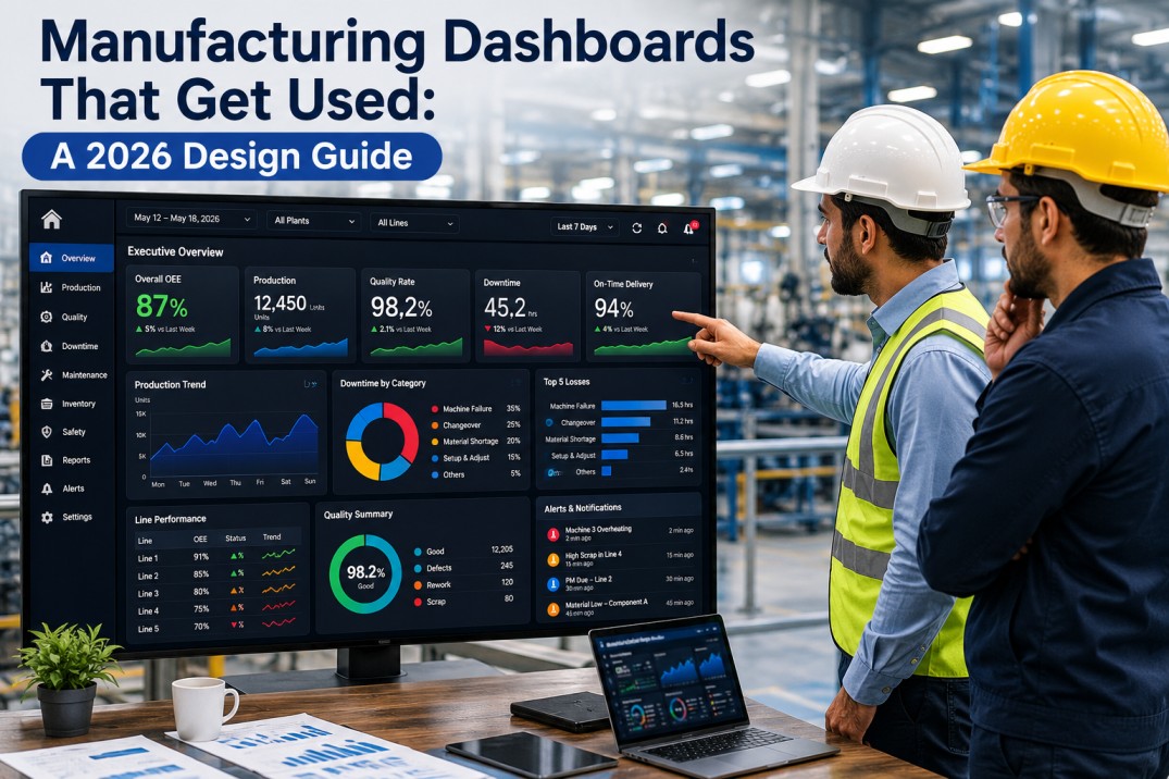
Most manufacturing dashboards fail. Not because the data is wrong — but because the design, layout, and KPI selection don't match how plant teams actually make decisions. A dashboard that looks great in a screen share often becomes wallpaper within a week — ignored because it shows too many metrics, lacks context, or fails to flag what needs attention. This checklist covers 25 tests every manufacturing dashboard should pass in 2026 — from data accuracy and visual design through decision support, technical performance, and ongoing governance. Based on iFactory's dashboard deployment experience across 1,000+ manufacturing plants, these 25 tests separate dashboards that drive action from dashboards that collect dust.
Test Every Dashboard in Your Plant Against 25 Criteria — See Your Score in 30 Minutes
iFactory's dashboard audit evaluates every screen in your plant against these 25 tests and delivers a prioritised fix list. No software required — just a 30-minute screen share.
Why Manufacturing Dashboards Fail — and How to Test for Success
Internal audits across 1,000+ plants show that 87% of manufacturing dashboards fail at least 3 of these 25 tests within the first month of deployment. The most common failure? KPIs without targets — metrics displayed with no reference value, making them impossible to action.
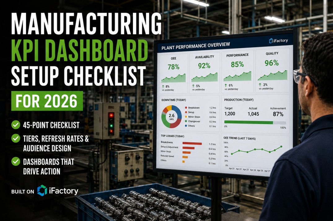
Top 25 Dashboard Tests for 2026 — Pass/Fail Checklist
Each test is a pass/fail check. A dashboard that fails any test should not go live — or should be flagged for remediation within 5 working days. The category indicates which dimension of dashboard quality each test addresses. Mark each test as Pass, Fail, or Not Applicable for every dashboard in scope.
| # | Test | Category | Severity | Pass | Fail | N/A |
|---|---|---|---|---|---|---|
| 1 | Every KPI has a single, documented data source — no manual calculations or spreadsheet inputs feeding the dashboard | Source | Critical | — | ✓ | — |
| 2 | KPI values match source system data — spot-check 5 random KPI values against PLC, MES, or CMMS source screens | Accuracy | Critical | — | ✓ | — |
| 3 | Time zones and shift definitions are consistent across all data sources feeding the dashboard — no mismatched periods | Consistency | Critical | — | ✓ | — |
| 4 | Missing or null data is handled gracefully — gaps shown as grey, dashed trend lines, or explicit "no data" indicators, never as zero | Handling | High | — | ✓ | — |
| 5 | Data freshness indicator is visible on each KPI tile or section — shows the age of the last data update in minutes or hours | Freshness | High | — | ✓ | — |
| # | Test | Category | Severity | Pass | Fail | N/A |
|---|---|---|---|---|---|---|
| 6 | Dashboard fits on a single screen without scrolling for the primary use case — no horizontal scroll, vertical scroll limited to one viewport | Layout | Critical | — | ✓ | — |
| 7 | Colour coding is consistent and meaningful — green for on-target, yellow/watch for warning, red for critical, grey for no data | Colour | Critical | — | ✓ | — |
| 8 | Chart type matches the data being displayed — trends use line charts, comparisons use bar charts, composition uses stacked bars or donuts | Charts | High | — | ✓ | — |
| 9 | Font sizes follow a clear hierarchy — KPI value is largest (2rem+), label is medium (0.85rem), source and freshness are smallest (0.7rem) | Typography | Medium | — | ✓ | — |
| 10 | Dashboard renders correctly on its target device — shop floor monitor, desktop, tablet, or mobile without layout breakage or truncation | Responsive | High | — | ✓ | — |
| # | Test | Category | Severity | Pass | Fail | N/A |
|---|---|---|---|---|---|---|
| 11 | Every KPI has a target or threshold — no metric exists on the dashboard without a reference value that defines good vs bad | Targets | Critical | — | ✓ | — |
| 12 | Every KPI is actionable — each metric links to a specific decision the viewer can make or action they can take when it changes | Action | Critical | — | ✓ | — |
| 13 | Drill-down path exists for each top-level KPI — one click or tap reveals the underlying detail, trend, or breakdown | Drill | Critical | — | ✓ | — |
| 14 | Alerts or visual flags highlight KPIs that need attention — green (on-target) metrics consume no discussion time during reviews | Alerts | High | — | ✓ | — |
| 15 | Comparison context is provided — every KPI shows current vs previous period, vs target, or vs plan, never a raw number alone | Context | High | — | ✓ | — |
| # | Test | Category | Severity | Pass | Fail | N/A |
|---|---|---|---|---|---|---|
| 16 | Dashboard loads in under 3 seconds on the primary target device — measured from request initiation to full render | Speed | Critical | — | ✓ | — |
| 17 | Data refresh interval matches the decision cadence — real-time (<5s) for shift operations, hourly for daily reviews, daily for management | Refresh | Critical | — | ✓ | — |
| 18 | Dashboard handles the expected number of concurrent users — 10+ simultaneous viewers without noticeable performance degradation | Scale | High | — | ✓ | — |
| 19 | Mobile or remote access works if required — dashboard renders correctly on target mobile device without feature loss | Mobile | Medium | — | ✓ | ✓ |
| 20 | Auto-refresh is enabled for live operational dashboards — dashboard refreshes automatically without requiring manual page reload | Auto | High | — | ✓ | — |
| # | Test | Category | Severity | Pass | Fail | N/A |
|---|---|---|---|---|---|---|
| 21 | Dashboard owner is assigned — a named person is responsible for content accuracy, KPI relevance, and user feedback | Owner | Critical | — | ✓ | — |
| 22 | KPI review cadence is established — every KPI on the dashboard is reviewed quarterly for continued relevance, accuracy, and target validity | Cadence | High | — | ✓ | — |
| 23 | Dashboard usage is tracked — view counts, active users, and daily active usage are measured against the target audience size | Usage | High | — | ✓ | — |
| 24 | Version control is in place — dashboard changes are tracked, previous versions are restorable, and change history is auditable | Version | Medium | — | ✓ | — |
| 25 | User feedback mechanism exists — dashboard viewers can report issues, suggest new KPIs, or flag data problems directly from the dashboard | Feedback | High | — | ✓ | — |
Get a Complete Dashboard Audit in 5 Days — Know Exactly What Fails and What to Fix
iFactory's dashboard audit service evaluates every screen in your plant against all 25 tests and delivers a prioritised fix plan. No software, no downtime, no consulting fee. See a sample audit report.
Dashboard Maturity Model — Where Does Your Plant Stand?
Dashboards evolve through four maturity levels. Each level represents a step change in how data drives decisions on the shop floor. Most plants discover they have a mix of levels across different screens.
The Real Cost of Wallpaper Dashboards
Dashboards that fail these 25 tests don't just sit unused — they actively cost your plant time, trust, and missed opportunities. When a dashboard goes dark, teams fall back to manual data gathering and verbal updates.
Frequently Asked Questions About Manufacturing Dashboard Testing
What is a "wallpaper" dashboard?
A wallpaper dashboard is a screen that looks impressive during the demo but is never used for daily decisions. It gets the name because its only real function is to hang on a wall and look good. Common symptoms: KPIs without targets or thresholds, no drill-down capability, data that nobody trusts, and no one notices when it breaks or stops updating. Wallpaper dashboards typically cost $15,000–$50,000 to build and have an average active lifespan of 2 weeks. The dashboard maturity model in this checklist helps you identify whether each screen in your plant is wallpaper, data display, decision support, or predictive.
How many KPIs should a single manufacturing dashboard show?
The best manufacturing dashboards show 5–9 KPIs on the primary screen — one for each key decision area that the viewer owns. A plant manager's morning scan should show 8–12 KPIs across production, quality, maintenance, and safety. An operator's line-level screen should show 3–5 KPIs: current OEE, output vs target, defect count, and next priority. Any dashboard showing more than 15 KPIs on a single screen is almost certainly a wallpaper dashboard — viewers cannot process that many metrics in a single scan, so they stop looking at all of them. The solution is not a bigger screen or smaller fonts — it's role-specific dashboards with the right 5–9 KPIs per audience.
How often should dashboards be reviewed and updated?
Dashboards need three review cadences. First, daily: the primary user should scan the dashboard at the same time each day as part of their standard operating procedure — this is not a review of the dashboard itself but a review using the dashboard. Second, monthly: the dashboard owner should review KPI thresholds, data freshness, and user adoption metrics, adjusting targets if production conditions have changed. Third, quarterly: every KPI on every dashboard should be reviewed for continued relevance — KPIs that no-one references should be removed, and new KPIs that reflect current priorities should be added. Dashboards that do not evolve with the plant's priorities inevitably become wallpaper within 3–6 months.
What makes a dashboard actionable vs just informational?
An actionable dashboard answers three questions for every KPI: what is happening, why it matters, and what to do about it. An informational dashboard only answers the first question. For example, an informational dashboard shows OEE at 72%. An actionable dashboard shows OEE at 72% vs an 85% target (red), highlights that availability loss is the primary driver (drill-down to 18% availability loss vs 10% target), and flags that the top cause is extended changeovers on line 3 (drill-down to changeover duration by line). The viewer now knows exactly what to do: investigate line 3 changeover process. Every KPI on an actionable dashboard has a target, a trend, a breakdown, and a direct link to a decision or action.
Can a single dashboard serve both operators and executives?
No — and trying to build one dashboard for all audiences is the most common cause of dashboard failure. Operators need real-time, line-level data with 3–5 KPIs and immediate alerting. Plant managers need a morning scan of 8–12 aggregated KPIs with drill-down to area detail. Executives need weekly or monthly strategic metrics with trend context and financial integration. These three audiences have different decision cadences, different data granularity needs, and different action horizons. A dashboard designed for all three serves none of them effectively. The correct approach is a tiered dashboard structure where each level shares the same data sources but presents different views optimised for each audience's decisions.
Stop Building Wallpaper — Audit Every Dashboard Against 25 Tests in One Week
iFactory's dashboard audit evaluates every screen in your plant against all 25 tests and delivers a prioritised fix plan. No software required, no consulting fee, no commitment. See a sample audit report in a 30-minute session.