Manufacturing dashboards have a shelf life problem. A plant deploys a new dashboard—pinned to the wall in the production office, visible during the morning stand-up, celebrated as a step toward digital transformation—and within eight weeks, nobody looks at it. The data is accurate. The charts render correctly. The refresh runs on schedule. The dashboard still fails. The cause is not technical. The cause is design.
Dashboards Built Around Operator Decisions, Not Just Data Visibility
Role-based views, sub-second data refresh, and mobile-native delivery are standard in every iFactory deployment. See the difference in a 30-minute walkthrough.
Three Reasons Manufacturing Dashboards Become Wallpaper
A dashboard becomes wallpaper when it answers questions nobody is asking. The investment in software, data integration, and configuration evaporates because the dashboard tells people what already happened instead of what to do next. Three distinct failure modes drive 82% of dashboard abandonment.
The Single-View Myth
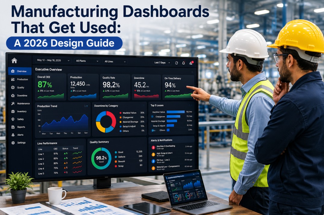
A single plant overview dashboard designed for the plant manager, the supervisor, and the operator simultaneously serves none of them. The plant manager sees too much detail. The operator sees too little relevance. The supervisor sees a mix of both that answers zero of their three core questions: what is happening now, what needs attention, and is the shift on track.
Data Latency
A dashboard showing yesterday's production numbers is a report, not a dashboard. Operators and supervisors make decisions in minutes. Sub-minute data refresh produces 3.4 times higher daily active usage than hourly refresh. The usage gap is a latency problem, not a feature problem.
Information Overload
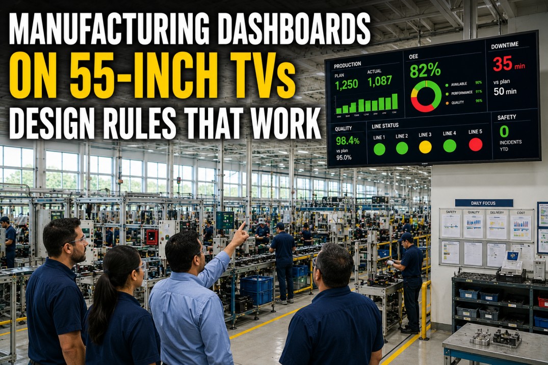
Twenty widgets, twelve KPI tiles, and three trend charts on a single view guarantee nothing is actionable. The human visual system holds approximately four to five information elements in working memory. A dashboard exceeding seven data points on a single screen has already exceeded the operator's capacity to use it under shift pressure.
Dashboard Approaches: What Fails vs. What Works
| Dimension | Failed Approach | Effective Approach |
|---|---|---|
| Audience | Single view for all roles | Role-based views per decision type |
| Data refresh | Daily or hourly batch | Sub-second to sub-minute real-time |
| Information density | Fifteen to twenty widgets per screen | Five to seven elements per role view |
| Device strategy | Desktop or wall screen only | Mobile-native with tablet and desktop variants |
| Layout philosophy | Show all available data | Show data supporting the next decision |
| Refresh trigger | User clicks refresh or navigates | Automatic push on data change |
| Adoption driver | Executive mandate | Embedded in operator workflow |
iFactory Dashboards Ship With All Four Patterns Standard
Role-based views, real-time data, action-oriented layout, and mobile delivery are built into every iFactory deployment across 80+ plants.
Four Patterns That Produce Used Dashboards
Across hundreds of plant deployments, four design patterns consistently separate dashboards that operators and supervisors use every shift from dashboards that become wallpaper.
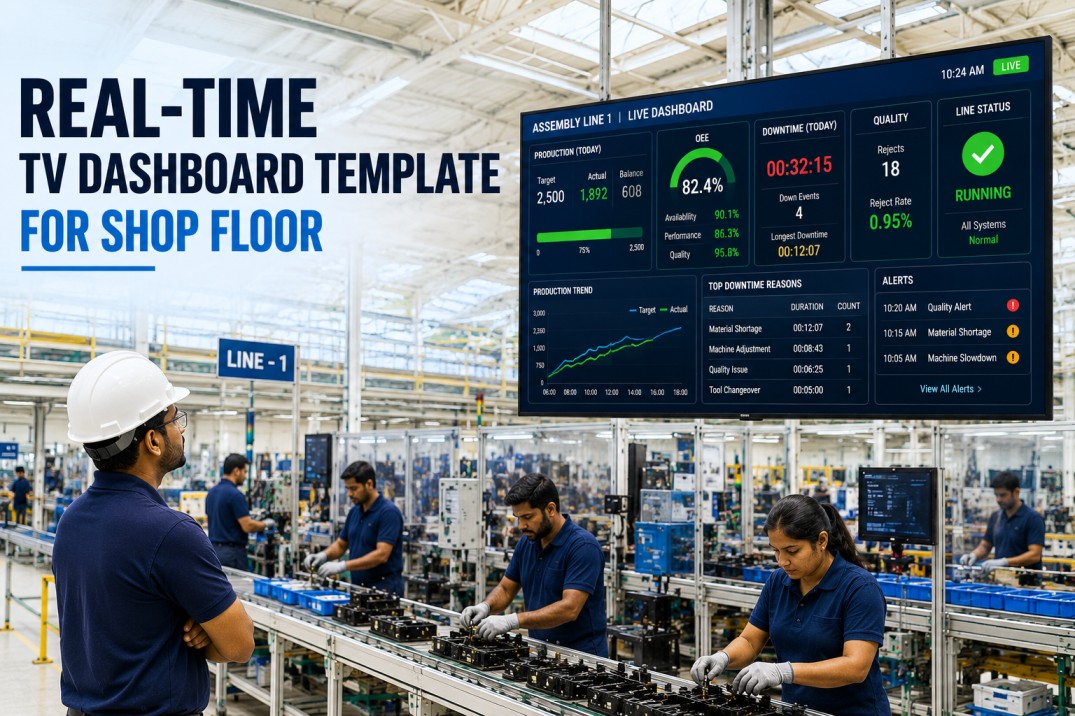
Real-Time Data Refresh
Sub-minute data refresh is the single highest predictor of dashboard adoption. Operators check a real-time dashboard after every cycle, every fault clear, and every natural break. Hourly refresh dashboards are checked once per shift. The usage ratio is 3.4 to 1.
Role-Based Views
Each role requires a distinct information density and decision set. The operator needs current cycle status and shift attainment. The supervisor needs line-level status with active downtime events. The plant manager needs OEE trend and exception alerts across all lines.
Action-Oriented Layout
Every element supports a decision. The attention zone shows the single most important number. The status zone shows asset state in color-coded format. The detail zone provides supporting data on selection. Elements not supporting a decision are removed.
Mobile-Native Delivery
Operators and supervisors do not work at a desk. A dashboard designed for a 27-inch monitor and scaled to a phone is not mobile-native. True mobile-native design starts from the smallest screen and adds capability as screen size increases.
No single screen displays more than seven discrete data elements. Seven is the upper bound of human working memory for time-pressured decisions. Dashboards exceeding seven elements produce longer decision times and lower accuracy. Additional data belongs in drill-down views, not the primary screen.
Plants using role-based views with sub-minute refresh report 42% higher OEE improvement within six months and 3.4 times higher daily dashboard engagement compared to plants using single-view dashboards with hourly refresh.
Frequently Asked Questions
Why do manufacturing dashboards fail at such high rates?
Dashboards fail because they are designed to display data rather than support decisions. Three failure modes drive abandonment: a single view that serves no role effectively, data latency measured in hours when decisions are made in minutes, and information overload exceeding working memory capacity. Dashboards designed around role-specific views with sub-minute refresh achieve adoption rates above 80%.
How many KPIs should a manufacturing dashboard display?
No more than seven discrete data elements on any single screen, and ideally three to five for operator views. The seven-element rule applies per role: operator views need three to five elements, supervisor views need five to seven, and plant manager views need five to seven with drill-down access. Additional data metrics belong in secondary tabs or drill-through views.
Should operator and manager dashboards be identical?
No. They must be structurally different because each role makes different decisions at different cadences. The operator needs current cycle status, shift attainment percentage, and active alerts. The plant manager needs OEE trend, line-by-line attainment against plan, and exception alerts requiring escalation. A single view serving both roles is the most common design error in manufacturing dashboard deployment.
What refresh rate do effective manufacturing dashboards use?
Sub-minute refresh is the standard for dashboards that operators and supervisors use as decision-support tools. In iFactory's deployment data, plants with sub-minute dashboard refresh rates show 3.4 times higher daily active usage than plants with hourly refresh. The dashboard becomes integrated into the operator's natural workflow when data updates without manual intervention.
Book a 30-Minute Demo — iFactory Dashboards on Your Production Data
See role-based views, real-time data, and mobile delivery on a live environment with your equipment types and shift structure. No commitment, no sales pitch.