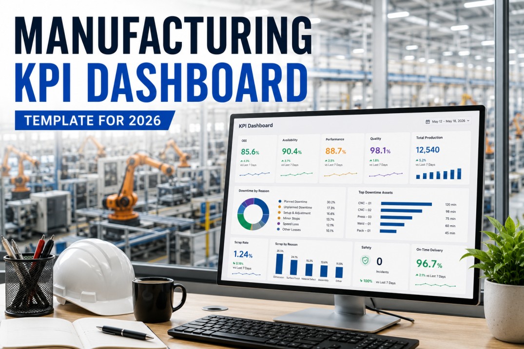
A manufacturing KPI dashboard template that actually gets used solves a specific problem for a specific audience at a specific tier of the organisation — not a single screen that attempts to display every metric to everyone. The operator facing a shift dashboard needs to know right now whether the line is on schedule, what the current quality rate is, and whether there is a downtime event requiring response. The plant manager reviewing a weekly trend board needs OEE by line, OTIF performance, and top quality loss drivers. The executive scorecard needs plant-to-plant benchmarks, cost metrics, and safety status. This manufacturing KPI dashboard template covers the architecture of an effective tiered dashboard system — with the standard KPI set, formula definitions, traffic light thresholds, and the design principles that determine whether a dashboard drives operational decisions or collects dust on the wall.
iFactory Ships the Complete KPI Dashboard With Your Data on Day One
iFactory delivers pre-built dashboards for all four audience tiers — operator shift view, supervisor daily summary, plant manager trend board, and executive scorecard. Fed from live production data from day one.
Manufacturing KPI Dashboard — Live Tile Example
The dashboard sample below shows a Tier 2 supervisor view with six KPI tiles — OEE, schedule attainment, first-pass yield, downtime, OTIF, and safety days since incident. Each tile shows the current value, a progress bar against target, and a one-line trend note. Traffic light colours communicate status at a glance.
KPI Dashboard Architecture — Four Tiers, Four Audiences
A single manufacturing KPI dashboard cannot serve all audiences simultaneously. The operator on the shop floor needs real-time operational data — current shift output versus target, active quality alerts, downtime status. The plant manager reviewing weekly performance needs trend data across multiple lines and aggregated quality and delivery metrics. Building one dashboard that tries to serve both produces an overloaded display that serves neither. The standard manufacturing dashboard architecture uses four tiers with different KPI sets, different time horizons, and different refresh rates at each level.
| KPI | Formula | Target (Typical) | Refresh Rate | Audience Tier |
|---|---|---|---|---|
| OEE | Availability × Performance × Quality | ≥ 85% | Real-time / shift | All tiers |
| Schedule Attainment | Actual output / planned output × 100 | ≥ 95% | Real-time / shift | Operator, Supervisor |
| First-Pass Yield | Good (first pass) / total produced × 100 | ≥ 98% | Shift / daily | All tiers |
| Scrap Rate | Scrap units / total produced × 100 | ≤ 1.5% | Shift / daily | All tiers |
| Downtime (unplanned) | Sum of unplanned stop durations | Per line target | Real-time | Operator, Supervisor |
| OTIF | Orders on-time & in-full / total orders × 100 | ≥ 95% | Daily / weekly | Plant Manager, Executive |
| PM Compliance | PM tasks completed on schedule / total due × 100 | ≥ 90% | Weekly | Supervisor, Manager |
| Days Since Incident | Days elapsed since last recordable incident | Maximise | Real-time | All tiers |
Tier 1 — Operator Shift Dashboard
The Tier 1 dashboard is the shop-floor operator's real-time view — visible from the workstation and readable from three metres. It answers the questions an operator or team lead needs to answer without leaving the line: are we on schedule, is quality within target, has there been a downtime event in the last hour, and is there anything requiring immediate action? The Tier 1 dashboard must refresh in real time or no more than five minutes. It must show current-shift data, not daily aggregates. It must use large, clear numbers and traffic light colours that are readable under shop-floor lighting.
Schedule Attainment — Live
Current shift actual output vs. shift target. Updates with every unit counter increment. Green above 95%, amber 90–95%, red below 90%. The single most important real-time production metric for an operator.
Quality Rate — Current Shift
First-pass yield % for the current shift. Updated with every inspection result. Displayed prominently — a quality rate falling mid-shift is an early warning signal that stops defect escalation.
Downtime Status
Current downtime state: running or stopped. If stopped, elapsed time since stop. Previous shift downtime events visible as context for incoming operator.
Active Alerts
Any active quality holds, safety alerts, or maintenance requests that require operator awareness. Simple colour-coded alert panel — not a text feed that requires reading.
Hourly Output Bars
Simple bar chart showing actual vs. target output per hour through the shift. Allows operators to see mid-shift whether recovery is realistic or escalation is needed.
OEE — Shift Running Total
Current shift OEE updating in real time as downtime, count, and quality data is captured. Operator sees the composite performance of the shift while it is still possible to influence it.
Tier 2 — Supervisor Daily Dashboard
The Tier 2 supervisor dashboard provides a cross-shift and multi-line view — enabling shift supervisors and team leaders to compare performance across shifts, identify lines that are trending below target, and prioritise actions before the next shift review meeting. The Tier 2 dashboard refreshes every 15 to 30 minutes and covers the current day and prior-day comparison as a minimum.
OEE by Line — Today vs. Yesterday
OEE for each production line for the current day compared to the equivalent day in the prior week. Identifies lines trending downward before the weekly management review.
Downtime Pareto — Top 3 Causes Today
The three downtime causes that consumed the most time across all lines today. Supervisor can direct maintenance attention to the highest-impact cause.
First-Pass Yield by Line
FPY for each production line today. Any line below target is flagged in amber or red with drill-down to defect reason codes.
Schedule Attainment by Line
Actual vs. planned output by line for the current production day. Lines with attainment below 95% show the shortfall cause category.
Open Actions
Actions outstanding from previous shift reports or daily reviews — owner, due date, and priority visible. Red for overdue.
Safety: Days Since Incident
Running count of days since last recordable safety incident — visible on all Tier 2 and above dashboards. Resets to zero on any recordable event.
Tier 3 & 4 — Plant Manager and Executive Dashboards
Tier 3 (plant manager) and Tier 4 (executive) dashboards aggregate performance across lines and plants, display trend data over weeks and months, and surface the exception items requiring management attention. The plant manager dashboard is the weekly management meeting anchor; the executive dashboard is the plant-to-plant performance scorecard used in leadership reviews. Both tiers require less frequent data refresh — daily for Tier 3, daily or weekly for Tier 4 — and more historical context than the operational tiers below.
OEE trend by line (13-week rolling), OTIF performance vs. customer targets, cost of poor quality (scrap + rework cost per period), PM compliance rate, and top three downtime causes for the week. The plant manager dashboard answers: which lines are improving, which are degrading, and what are the top three improvement priorities this week?
OEE by plant, OTIF by customer, scrap cost as % of revenue, safety recordable rate, and inventory turns. The executive dashboard enables comparison across plants, identification of best practices to replicate, and portfolio-level performance visibility for leadership teams and board reporting.
Days since last recordable incident and near-miss count (rolling 30 days) should appear on every dashboard tier — not only on a separate safety dashboard. Making safety metrics visible at the operator tier reinforces safety culture; at the executive tier it provides early warning before a recordable incident rate trend becomes a regulatory issue.
An effective multi-tier dashboard architecture allows any metric on the executive or plant manager view to be drilled into the underlying shift-level data that produced it. An executive who sees OTIF at 91% against a 95% target should be able to drill to the specific customer orders, ship dates, and production lines that caused the miss — without a separate report request.
iFactory Manufacturing KPI Dashboard — Live With Your Data on Day One
iFactory delivers the complete tiered dashboard this template describes — operator shift view, supervisor daily summary, plant manager weekly trend board, and executive scorecard. Pre-built and fed from your live production data.
Manufacturing KPI Dashboard Checklist — 25 Items
Use this checklist when designing, deploying, or auditing a manufacturing KPI dashboard. Items cover KPI selection, formula definition, data sources, design usability, and dashboard maintenance.
| # | Checklist Item | Type | Priority | Photo | Required | Critical |
|---|---|---|---|---|---|---|
| 1 | Audience tier defined for this dashboard: operator / supervisor / plant manager / executive | Selection | High | — | ✓ | ✓ |
| 2 | Maximum 8–10 KPIs on the dashboard — excess KPIs removed or moved to drill-down | Pass/Fail | High | — | ✓ | ✓ |
| 3 | Each KPI has a documented formula, data source, owner, and target value | Pass/Fail | High | — | ✓ | ✓ |
| 4 | Traffic light thresholds defined for each KPI: green (on target), amber (watch), red (action) | Pass/Fail | High | — | ✓ | ✓ |
| 5 | At least two leading indicators included — not only lagging outcome metrics | Pass/Fail | Med | — | ✓ | — |
| # | Checklist Item | Type | Priority | Photo | Required | Critical |
|---|---|---|---|---|---|---|
| 6 | OEE (Overall Equipment Effectiveness) on dashboard with Availability, Performance, Quality breakdown | Pass/Fail | High | — | ✓ | ✓ |
| 7 | Schedule attainment % (actual output / planned output × 100) current shift or day | Pass/Fail | High | — | ✓ | ✓ |
| 8 | Production output (units) vs. target — by line and shift | Numeric | High | — | ✓ | ✓ |
| 9 | Downtime total and top downtime cause for current period visible on dashboard | Pass/Fail | High | — | ✓ | ✓ |
| 10 | Changeover time vs. target — average and trend | Numeric | Med | — | ✓ | — |
| # | Checklist Item | Type | Priority | Photo | Required | Critical |
|---|---|---|---|---|---|---|
| 11 | First-pass yield % current period visible on dashboard | Pass/Fail | High | — | ✓ | ✓ |
| 12 | Scrap rate % (scrap / total produced × 100) with trend — current vs. prior period | Numeric | High | — | ✓ | ✓ |
| 13 | Top defect reason code for period visible — not only total scrap count | Pass/Fail | High | — | ✓ | ✓ |
| 14 | Customer complaints or returns (rolling 30-day) on manager and executive tiers | Numeric | Med | — | ✓ | — |
| 15 | Cost of poor quality (COPQ) on manager tier — scrap cost + rework cost per period | Numeric | Med | — | ✓ | — |
| # | Checklist Item | Type | Priority | Photo | Required | Critical |
|---|---|---|---|---|---|---|
| 16 | Planned maintenance compliance % (PM tasks completed on schedule / total due × 100) | Numeric | High | — | ✓ | ✓ |
| 17 | MTBF (Mean Time Between Failures) per critical equipment class — trend visible | Numeric | High | — | ✓ | ✓ |
| 18 | MTTR (Mean Time To Repair) per downtime category — trend visible | Numeric | Med | — | ✓ | — |
| 19 | Safety: days since last recordable incident — on all dashboard tiers | Numeric | High | — | ✓ | ✓ |
| 20 | Near-miss count (rolling 30-day) as a leading safety indicator | Numeric | High | — | ✓ | ✓ |
| # | Checklist Item | Type | Priority | Photo | Required | Critical |
|---|---|---|---|---|---|---|
| 21 | OTIF % (On-Time In-Full) — current period vs. customer target | Numeric | High | — | ✓ | ✓ |
| 22 | On-time delivery rate % — shipments delivered on committed date | Numeric | High | — | ✓ | ✓ |
| 23 | WIP inventory turns or WIP days-on-hand — trend visible | Numeric | Med | — | ✓ | — |
| 24 | Finished goods inventory fill rate — orders fulfilled from stock vs. total orders | Numeric | Med | — | ✓ | — |
| 25 | Dashboard data refresh timestamp visible — stale data indicator active | Pass/Fail | High | — | ✓ | ✓ |
Frequently Asked Questions
What KPIs should be on a manufacturing KPI dashboard?
The core manufacturing KPIs for any dashboard are OEE, schedule attainment, first-pass yield, scrap rate, top downtime cause, OTIF, PM compliance, and safety days since incident. The specific set depends on the audience tier: operators need real-time shift-level data, plant managers need weekly trend data across lines, executives need plant-to-plant benchmarks. A dashboard with more than 8–10 KPIs is overloaded for any single audience. Start with the metrics that directly connect to the operational decisions the audience makes every day.
What is the difference between a Tier 1 and Tier 2 manufacturing dashboard?
Tier 1 (operator) dashboards display current-shift real-time data — schedule attainment, quality rate, downtime status — refreshed in real time or every 5 minutes. Tier 2 (supervisor) dashboards display cross-shift and cross-line daily data — OEE by line, downtime Pareto, FPY comparison — refreshed every 15–30 minutes. The KPIs at each tier are selected for the decisions that tier makes: operators act in real time on single-line performance; supervisors act daily on multi-line exception management.
How do you define traffic light thresholds for manufacturing KPIs?
Traffic light thresholds define when a KPI moves from green (on target) to amber (watch) to red (action required). A standard approach: green = at or above target, amber = within 5% of target but below target, red = more than 5% below target. For some KPIs (safety days since incident), any reduction is immediately red. Thresholds should be defined in writing before go-live and reviewed quarterly against actual performance trends. Book a Demo to see how iFactory configures KPI thresholds.
What is OTIF and how is it calculated?
OTIF stands for On-Time In-Full — a delivery performance metric measuring the proportion of customer orders delivered both on time (on or before the committed delivery date) and in full (complete quantity, no short shipments). OTIF % = (orders delivered on time and in full / total orders) × 100. Most manufacturers target OTIF of 95% or above. OTIF below 95% consistently indicates a capacity planning, scheduling, or quality execution gap that is affecting customer service.
How does iFactory deliver the manufacturing KPI dashboard template?
iFactory delivers pre-built manufacturing KPI dashboards for all four audience tiers on day one of onboarding — not a blank template that requires configuration from scratch. The dashboards are fed from iFactory's live production, quality, and maintenance data connections. OEE, schedule attainment, FPY, scrap rate, downtime, and OTIF are all pre-calculated from your live data. KPI targets and traffic light thresholds are configured during the onboarding session and can be updated by your team without vendor involvement. Book a Demo to see all four dashboard tiers live.
iFactory KPI Dashboard — Four Tiers, Live Data, Day One
iFactory ships the complete KPI dashboard with your real production data on day one — operator shift view, supervisor summary, plant manager trend board, and executive scorecard. No months of configuration.