Here's an uncomfortable truth: the average manufacturing plant runs at just 60% OEE. That means 40% of your productive capacity—machines, labor, materials—is being wasted every single day. Worse, most plants already have an OEE dashboard. It's on a TV screen in the break room, in a weekly PowerPointor buried in a spreadsheet that nobody opens after Tuesday. The problem was never measuring OEE. The problem is that 94% of manufacturers never reach world-class status because their dashboards show what happened—but never trigger what should happen next. A dashboard that doesn't drive action is just a scoreboard for a game you're losing.
60%
Average Factory OEE Score
85%
World-Class OEE Benchmark
6%
Of Plants Actually Reach World-Class
$8M/yr
Lost Output Per 13-Point OEE Gap
The difference between a dashboard that gets glanced at and one that drives daily improvement comes down to architecture: real-time data, role-specific views, automated alerts, and—critically—direct integration with your MES and maintenance systems so that when OEE drops, the response is automatic, not optional. Plants using connect live machine data, operator inputs, quality metrics, and maintenance workflows into OEE dashboards that don't just diagnose problems—they trigger the fix.
Why Most OEE Dashboards Fail to Drive Action
If your OEE dashboard isn't changing daily behavior on the plant floor, it's suffering from one (or more) of these five failure modes. Recognizing the pattern is the first step to fixing it.
01
Stale Data
End-of-shift or next-day reporting. By the time you see the drop, you've lost 4-8 hours of production you can never recover.
Fix → Real-time refresh every 30-60 seconds
02
One-Size-Fits-All View
Operators, supervisors, and plant managers all see the same screen. Nobody gets the specific information they need to act.
Fix → Role-based views with progressive drill-down
03
No Alert System
The dashboard shows red, but nobody gets notified. Teams discover problems when they happen to look at the screen—if they look at all.
Fix → Tiered alerts: screen → SMS → auto work order
04
Diagnosis Without Cure
OEE shows availability dropped, but there's no connection to maintenance systems. The "what" is visible; the "fix" is manual.
Fix → MES-CMMS integration: OEE drop → auto work order
05
Too Many Metrics, No Hierarchy
20 KPIs displayed with equal importance. Nobody can tell what matters most right now. Dashboard becomes visual noise.
Fix → KPI tree: OEE at top → drill into A, P, Q losses
Recognize your dashboard in this list? Book a free OEE dashboard audit with our MES specialists—we'll show you exactly where your action gaps are.
The OEE Formula: Quick Refresher
Before we redesign the dashboard, let's make sure the foundation is solid. OEE combines three independent dimensions of production loss into one powerful diagnostic number.
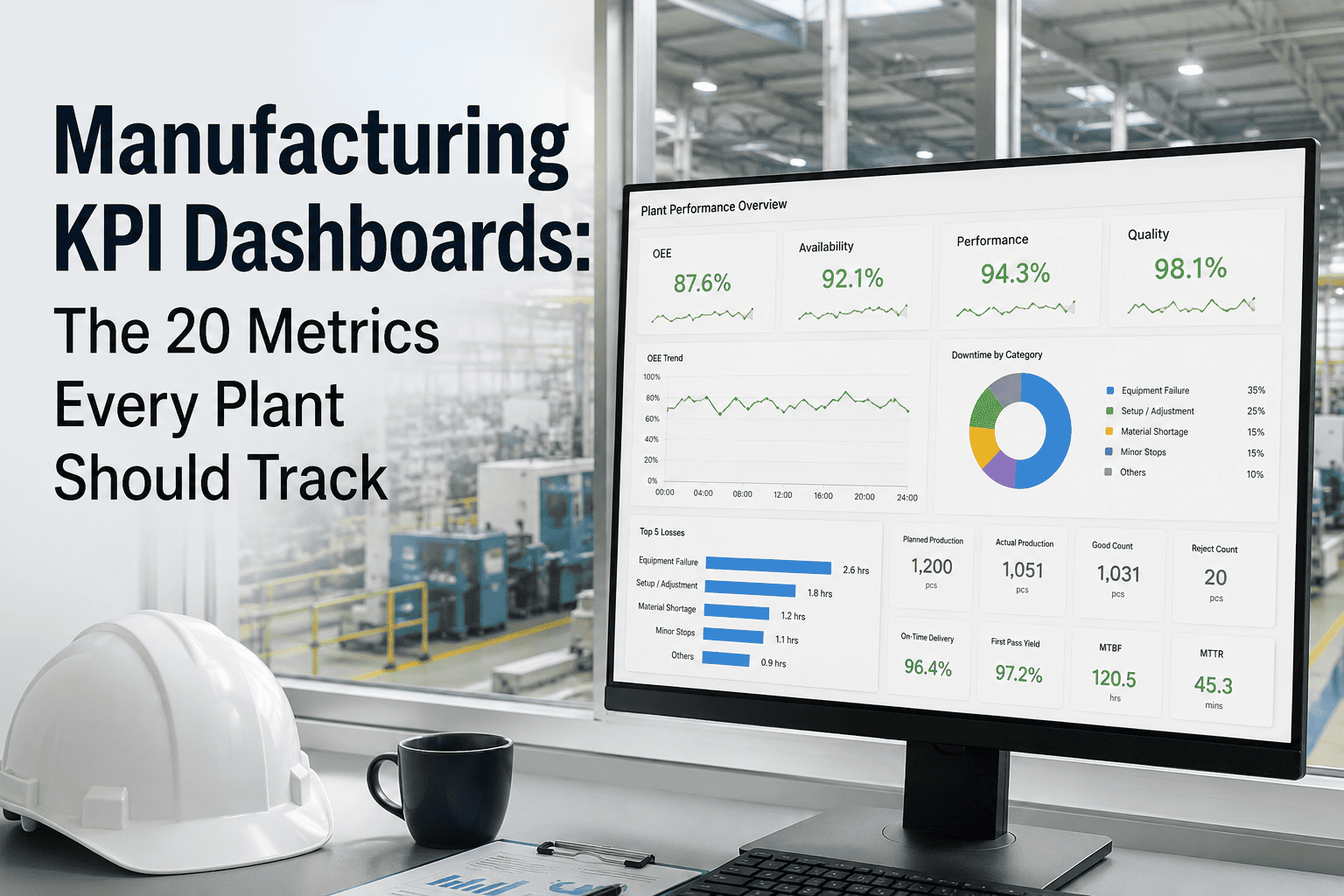
Anatomy of a Dashboard That Actually Drives Action
An actionable OEE dashboard isn't one screen—it's a layered system that delivers the right information to the right person at the right time, connected to the systems that can execute the response.
Operator View
Line-Level: "What's happening right now on MY machine?"
Live OEE gauge
Current cycle vs. target
Downtime reason selector
Parts count vs. goal
Action trigger: Screen turns yellow at -5% from target → operator adjusts. Red at -10% → supervisor alert fires.
Supervisor View
Floor-Level: "Where are the problems across all my lines?"
Multi-line status grid
Top downtime reasons (Pareto)
Shift comparison
Active alerts queue
Action trigger: Line goes red → auto-notification to supervisor mobile. Recurring downtime pattern → escalation to maintenance lead.
Manager View
Plant-Level: "How are we trending toward targets?"
Plant OEE trend (daily/weekly)
A vs P vs Q breakdown
Line-by-line comparison
Cost-of-loss calculation
Action trigger: Weekly OEE trending down → auto-generated root cause summary. Chronic loss identified → improvement project created.
System Layer
Integration: "The dashboard doesn't just show—it does."
MES work order routing
CMMS maintenance triggers
ERP schedule sync
SPC quality alerts
Action trigger: Availability drop → auto work order in CMMS. Quality alert → production hold in MES. Performance drift → parameter adjustment recommendation.
The Six Big Losses: What Your Dashboard Must Track
Every OEE point lost traces back to one of six root causes. A dashboard that doesn't break losses into these categories is hiding the answer you need.
1
Equipment Breakdowns
Unplanned stops due to failures. The costliest loss—averaging $22K/hr in automotive.
2
Setup & Changeover
Time between last good part of one run and first good part of next. SMED methodology can cut this 50%+.
3
Minor Stops & Idling
Jams, sensor trips, blocked inputs. Individually small, but 40 stops × 30 seconds = 20 minutes/shift lost.
4
Reduced Speed
Running below ideal cycle time. Often invisible—the machine "looks" fine but output lags target by 10-15%.
5
Process Defects
Scrap and rework during steady-state production. SPC monitoring catches drift before it becomes defects.
6
Startup Rejects
Parts scrapped during warmup, changeover, or parameter adjustment. Reducing startup yield loss is often the quickest quality win.
Feature Comparison: Dashboard Maturity Levels
See an Actionable OEE Dashboard in Action
iFactory connects live machine data, operator inputs, and maintenance systems into OEE dashboards that don't just report—they respond. Automated alerts, auto-generated work orders, and role-specific views that turn every OEE drop into an immediate action.
OEE Benchmarks: Where Does Your Plant Stand?
Below 40%
Low — significant improvement needed
40-65%
Typical — room for quick wins
65-85%
Good — systematic improvement
85%+
World-Class (only 6% of plants)
Automotive
75%
Lean-driven leaders reach mid-80s
Electronics
82%
High automation drives consistency
Medical Devices
78%
Regulatory compliance enforces control
Food & Beverage
65%
Cleaning & changeovers reduce availability
Pharma
35-60%
Batch setup & validation constrained
Heavy Industry
55-70%
Asset age and complexity vary widely
Want to benchmark your specific lines against industry peers? Schedule a personalized OEE assessment with our plant analytics team.
From Dashboard to Action: The Integration That Matters
1
Detect
Machine signals availability drop. Dashboard updates in real time. Zone goes from green → yellow → red.
2
Alert
Tiered notifications fire: operator sees on-screen alert, supervisor gets mobile push, manager gets email with loss-cost estimate.
3
Respond
MES auto-creates maintenance work order with machine data, recent history, and recommended actions attached.
4
Learn
Every event feeds historical analytics. Patterns emerge. Predictive models improve. Next time, the system warns before the drop happens.
Expert Analysis: The OEE Dashboard Market
The global MES market—the backbone of real-time OEE dashboards—is projected to grow from $15.95 billion in 2025 to $25.78 billion by 2030. Yet 92% of manufacturers believe smart manufacturing is essential for competitiveness while only 29% have deployed AI/ML at scale. The plants closing this gap fastest are the ones connecting OEE visibility directly to execution systems, turning insight into automated action at machine speed rather than meeting speed.
$25.78B
MES Market by 2030
30-45%
Less Downtime With Predictive Maintenance
10-20%
OEE Gain in First Months of Integration
Operating across multiple plants with inconsistent OEE measurement? Book a consultation to discuss standardized multi-site OEE architecture.
Turn Your OEE Dashboard Into a Decision Engine
Join manufacturers using iFactory to connect live production data, role-based dashboards, and automated response workflows into one MES platform—closing the gap between seeing the problem and fixing it.
Frequently Asked Questions
What is a good OEE score for manufacturing?
World-class OEE is 85%, achieved through 90% availability, 95% performance, and 99.9% quality. However, the global average is approximately 60%, and only about 6% of manufacturing organizations consistently achieve world-class status. A "good" score depends heavily on your industry—electronics manufacturers routinely hit 82%+, while pharmaceutical plants may consider 60% strong given regulatory cleaning and batch constraints. The most important target isn't an absolute number but consistent, measurable improvement from your current baseline.
Why do most OEE dashboards fail to drive improvement?
The most common failure modes are stale data (updating daily instead of in real time), one-size-fits-all views (operators and managers seeing the same screen), no automated alerts (relying on people to notice problems), and no integration with maintenance or production systems. When a dashboard only shows what happened without triggering what should happen next, it becomes a reporting tool rather than an operational tool. The fix is connecting OEE visibility directly to MES and CMMS workflows so that every alert leads to an automated response.
How often should an OEE dashboard update?
Critical machine state data (running, stopped, idle) should update every 2-5 seconds so operators see problems develop in real time. OEE calculations can refresh every 30-60 seconds since they're averaged metrics. The key principle is that any team member should be able to look at the dashboard and see current conditions—not conditions from the last hour or last shift. If your OEE data is older than 5 minutes, you're making decisions on stale information.
What are the Six Big Losses in OEE?
The Six Big Losses are the universal categories of production waste that OEE is designed to expose. Availability losses include equipment breakdowns (unplanned failures) and setup/changeover time. Performance losses include minor stops and idling (small interruptions that add up) and reduced speed (running below ideal cycle time). Quality losses include process defects (scrap and rework during production) and startup rejects (waste during warmup or changeover). An effective OEE dashboard breaks every minute of lost production into these six categories so teams know exactly which loss type to attack first.
How do you connect OEE dashboards to maintenance systems?
MES-integrated OEE dashboards connect directly to CMMS (maintenance) and ERP (planning) systems through APIs or middleware. When the dashboard detects an availability drop—for example, a machine exceeding its expected downtime threshold—it automatically creates a prioritized work order in the CMMS with the machine ID, downtime reason code, recent performance history, and recommended corrective action attached. This eliminates the manual step of "someone sees the problem on the dashboard and then walks to a computer to log a maintenance request." Platforms like iFactory build this integration natively, so the detect-alert-respond-learn cycle runs automatically.