Smart Infrastructure Monitoring Dashboard: What Good Looks Like
By Grace on May 27, 2026
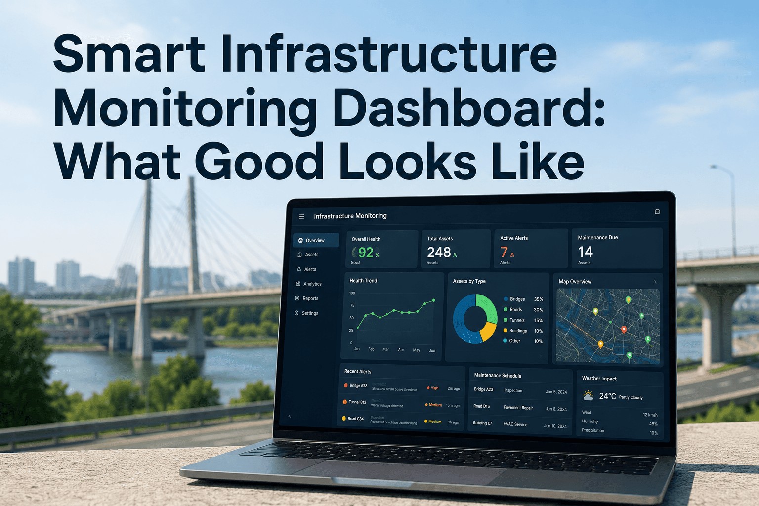
Most infrastructure monitoring dashboards fail the same way: they show everything, prioritize nothing, and leave the operations team staring at a wall of charts while a single critical asset quietly slides into a fault condition that nobody noticed until the work order arrived. A good dashboard isn't a data exhibition — it's a decision tool. It answers three questions in under five seconds: What is the current state? What needs my attention right now? Where do I look next? If the dashboard can't answer those three questions in five seconds, it isn't a monitoring dashboard. It's a report dressed up in widgets. The difference between a dashboard that drives action and one that creates alert fatigue isn't the technology — it's the design discipline behind metric selection, visual hierarchy, alert thresholds, and the choices about what not to show. Research on human cognition consistently shows people can effectively process five to nine items at once before signal turns into noise. Yet most infrastructure dashboards display fifty to a hundred metrics on the home view, then wonder why operators tune them out. iFactory's infrastructure monitoring platform is built around the principle that fewer, sharper signals beat exhaustive telemetry every time — and this article walks through exactly what "good" looks like across the seven design dimensions that matter.
A Dashboard Should Answer Three Questions in Five Seconds. Does Yours?
iFactory's monitoring interfaces are designed around the decisions operations teams actually make — not around the data your sensors happen to collect. Clarity over completeness, action over observation.
The Five-Second Test — What Every Good Dashboard Answers
Q1
What is the current state?
A clear, immediate read on whether the system is healthy, degraded, or in failure.
Q2
What needs my attention now?
Prioritized, severity-ranked items demanding intervention — not just every threshold breach.
Q3
Where do I look next?
A clear path from summary view to the diagnostic detail needed to act.
The Three-Tier Information Hierarchy That Separates Dashboards From Reports
Every effective monitoring dashboard organizes information into three nested layers — North Star metrics at the top, supporting indicators that explain movement in those metrics, and diagnostic detail for root-cause investigation. Trying to put all three layers on one screen is the single most common mistake in dashboard design.
Tier One
3 – 5
North Star Metrics
The Metrics You Would Track If You Could Only Track Five
Asset health composite, network availability, critical alert count, intervention backlog, and asset condition index. These sit on the home view — large, prominent, and unmistakable. If any of these is in a degraded state, the operator sees it before they finish their first sip of coffee.
Tier Two
8 – 12
Supporting Indicators
The Metrics That Explain Why the North Stars Are Moving
Sensor data trends per asset class, work-order completion velocity, alert-to-action lead time, mean time to detection, mean time to resolution, equipment utilization, energy consumption deltas. Accessed via a single click from the home view — never crowded onto it.
Tier Three
All
Diagnostic Detail
The Raw Telemetry, Logs, and Per-Sensor Time Series
Individual sensor readings, full event logs, per-element historical traces, full alert audit history. Reached through progressive disclosure — drill from an indicator to its source data only when investigation requires it. Powerful when needed, invisible when not.
The Seven Design Dimensions That Define a Good Infrastructure Dashboard
A dashboard either succeeds across all seven of these design dimensions or fails at the weakest one. The strongest charting library doesn't compensate for the wrong metric selection. The most beautiful visual style doesn't fix unprioritized alerts. Each dimension is non-negotiable.
01
Dimension One · Metric Selection
Show Outcomes, Not Internal Signals
Operators don't need to see every sensor reading. They need to see whether assets are performing within design parameters. Surface the symptoms — degraded performance, threshold breaches, intervention urgency — and tuck the underlying causes one click deeper. Cause-based metrics belong on diagnostic screens, not the home view.
02
Dimension Two · Visual Hierarchy
The Most Important Thing Should Look Like the Most Important Thing
Size, position, and contrast carry meaning. Critical metrics get the largest visual weight and the prime real estate (top-left in left-to-right reading cultures). Supporting information gets smaller, lower, and less saturated. Decorative variety in chart styles signals nothing — disciplined hierarchy signals everything.
03
Dimension Three · Color as a Signal
Color Means Status. Nothing Else.
Green, amber, and red are reserved for on-track, at-risk, and off-track. Neutral elements stay blue or gray. Decorative color undermines the entire system — if everything is colored, nothing draws the eye. A monochrome dashboard with two splashes of red beats a rainbow dashboard with no signal at all.
04
Dimension Four · Alert Severity Logic
Tiered Thresholds, Not Single Trip Points
Warning at 75% of design limit, critical at 100%. Minor deviations produce low-priority notices that batch into a daily summary; critical events page on-call immediately. This separation prevents the all-too-common pattern of operators muting their phones because every blip rings the same bell.
05
Dimension Five · Alert Correlation
One Incident, Not Ten Notifications
When a substation goes down, a good system creates one alert with the affected assets nested inside it. A bad system creates twenty. Automated correlation by time window, asset proximity, and event signature collapses redundant signals so each notification represents a distinct investigation — restoring trust in the alarm itself.
06
Dimension Six · Context With Every Metric
A Number Without a Baseline Is Useless
"Server at 98% CPU" means nothing without knowing what's normal. Every metric on a good dashboard shows its current value, its expected range, and its trend over a relevant window. Sparklines, threshold bands, and trend arrows belong on every primary KPI tile — anything less makes the operator do the comparison work in their head.
07
Dimension Seven · Role-Aware Views
Different Users, Different Dashboards
An executive needs portfolio condition and cost. An operations supervisor needs today's alerts and crew assignments. A field technician needs the asset they're standing next to. One dashboard cannot serve all three — and trying makes the dashboard useless for everyone. Tailor by role, not by department.
See the Dashboard Built for Your Team's Specific Workflow
iFactory ships role-specific views out of the box — and configurable per-team layouts for the operational details specific to your asset class and reporting cadence.
Dashboard Anti-Patterns: What Bad Looks Like in Practice
Every team building a dashboard makes the same recognizable mistakes the first time. Spotting these anti-patterns is as important as following the principles — because most failed dashboards are familiar patterns, not original errors.
Anti-Pattern
What It Looks Like
The Fix
The Data Dump
50+ charts on one screen, every available sensor stream displayed
Cut to 5–9 primary metrics; move the rest to drill-down layers
The Christmas Tree
Decorative use of every color in the palette; no signal in color choice
Reserve color for status only; use grayscale for everything else
The Alert Storm
Single threshold for all alerts; one event generates dozens of notifications
Tiered severity + automated correlation; one incident, one alert
The Naked Number
A big KPI value with no baseline, no trend, no context
Add sparkline, range band, and trend indicator to every primary tile
The Universal Dashboard
One dashboard built for "everyone" — executives, ops, and field staff
Build role-specific views; share the data layer, not the layout
The Refresh Hammer
Every metric refreshes every second regardless of how often it changes
Match refresh cadence to decision velocity, not data availability
Chart-Type Selection: Pick the Visualization the Data Asks For
Chart choice isn't aesthetic — each visualization type serves a specific analytical question. The mismatch between question and chart type is one of the most common sources of dashboard confusion.
For Trends Over Time
Line Charts
Sensor readings over hours, days, or months. Vibration trends, temperature curves, condition decay over a maintenance cycle. The eye reads slopes naturally; line charts let the operator see the rate of change, not just the value.
For Comparisons
Bar Charts
Performance across assets, regions, or time windows. Substation X vs. Y, this quarter vs. last. Horizontal bars work especially well for long asset name labels and easily fit twenty or more items on a single screen.
For Limits and Thresholds
Gauges and Range Bars
A single value against a maximum, with color-coded warning and critical zones. Battery charge, tank level, sensor utilization. The eye reads position-in-range faster than any number — perfect for instant-status readouts on the home view.
For Spatial Distribution
Heatmaps and Geospatial Maps
Asset condition across a network, alerts clustered by region, pressure variation across a pipeline grid. Spatial patterns invisible in tabular data leap out of a properly-designed heatmap or pin map.
For Status at a Glance
KPI Tiles with Sparklines
Single number, status color, sparkline of recent trend, comparison to baseline. The atomic unit of a monitoring dashboard — when used well, it answers "is this healthy?" before the operator finishes reading the label.
For Event Sequences
Timelines and Event Streams
Alert history, maintenance actions, incident progression. Timeline views give the operator the chronology of what happened — crucial when investigating whether multiple events were related or independent.
“
The shift that changed our control room was discipline about what doesn't go on the dashboard. We pulled twenty-eight widgets off our main screen and put them behind drill-downs. Operators stopped scrolling. Mean time to detection dropped by a third in the first month. The data was always there — the problem was that we'd been hiding what mattered behind what didn't.
— Director of Operations, Regional Water Authority — 19 Years — Lean Six Sigma Black Belt, ISO 55001 Practitioner
Refresh Cadence: Match the Update Speed to the Decision Speed
Real-time refresh is a feature, not a virtue. A metric that informs a quarterly budget decision doesn't need to update every second — and aggressive refresh on every widget creates the visual noise that makes critical changes harder to notice.
Operational Layer
Seconds – Minutes
Active alerts, live sensor readings, system uptime. The operator is making real-time decisions, so the data must be real-time.
Tactical Layer
Hours – Daily
Asset condition trends, maintenance backlogs, work-order velocity. Decisions made today on data refreshed today, not data refreshed every second.
Strategic Layer
Weekly – Monthly
Portfolio condition indices, budget burn, lifecycle cost trends. Executive-level metrics that inform capital planning — refreshing them hourly would only add noise.
Conclusion
A good infrastructure monitoring dashboard is defined by what it leaves out as much as by what it shows. The five-second test — current state, attention needs, next look — is the standard every screen should meet. The three-tier hierarchy of North Star metrics, supporting indicators, and diagnostic detail is the architecture that makes that standard achievable. And the seven design dimensions — metric selection, visual hierarchy, color discipline, alert severity, alert correlation, contextual baselines, role-aware views — are the non-negotiable details that separate a dashboard your team actually uses from one they ignore.
iFactory's platform is built around these principles from the foundation up — role-specific views, tiered alerting, contextual KPI tiles, and drill-down architecture that surfaces what matters without burying the operator in what doesn't. Book a Demo to see the design principles working on a live dashboard configured for your asset class.
Frequently Asked Questions
Five to nine — the range that research on cognitive load consistently identifies as the upper bound for simultaneous processing. Anything beyond that becomes visual clutter, and the operator's eye stops tracking individual metrics. iFactory's default dashboard layout surfaces three to five North Star metrics prominently, with eight to twelve supporting indicators available via single-click drill-down. The full sensor and event detail lives one layer deeper, accessed when investigation requires it.
A two-tier threshold with automated correlation is the proven pattern. Warning alerts at 75% of design limit go to a daily digest. Critical alerts at the design limit page on-call staff immediately. Correlation logic groups simultaneous alerts from related sensors into one incident — so a substation outage produces one ticket, not twenty pages. iFactory's platform supports tiered thresholds out of the box with configurable correlation rules per asset class.
Yes — role-aware customization is built into the platform from day one. Standard views include Executive (portfolio condition, lifecycle cost, budget posture), Operations Supervisor (active alerts, crew assignments, daily KPI), Field Technician (single-asset deep dive), and Audit (compliance evidence trail). Each view can be further tailored per asset class — pipeline operations don't need the same widgets as bridge inspection. iFactory's deployment team configures the initial layouts with your operations leads, then your team can refine them on an ongoing basis. Book a Demo to see role-specific layouts for your asset portfolio.
Yes — the platform connects to existing enterprise asset management systems (IBM Maximo, SAP PM, Cityworks, Bentley AssetWise, AASHTOWare), CMMS platforms, SCADA historians, and direct IoT sensor feeds via standard REST APIs and industry protocols (MQTT, OPC-UA, Modbus). The dashboard layer sits on top of your existing data stack — no rip-and-replace, no forced data migration. Most deployments are fully integrated and live within 4–8 weeks depending on the number and complexity of source systems.
If your team can't read the dashboard in five seconds, they aren't reading it at all.
iFactory's monitoring interfaces are designed to put the decision on the screen — not the data. Role-aware, alert-disciplined, hierarchy-first dashboards built for infrastructure teams that need to act, not just observe.