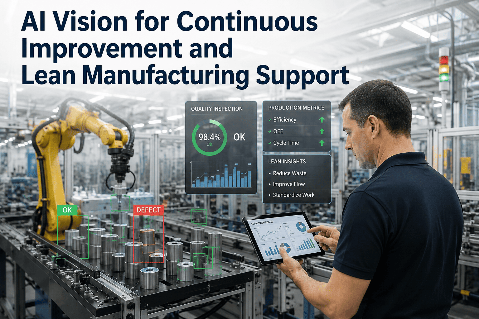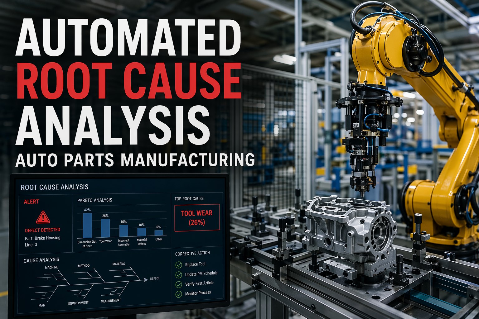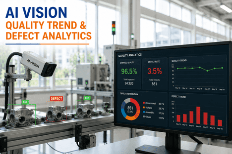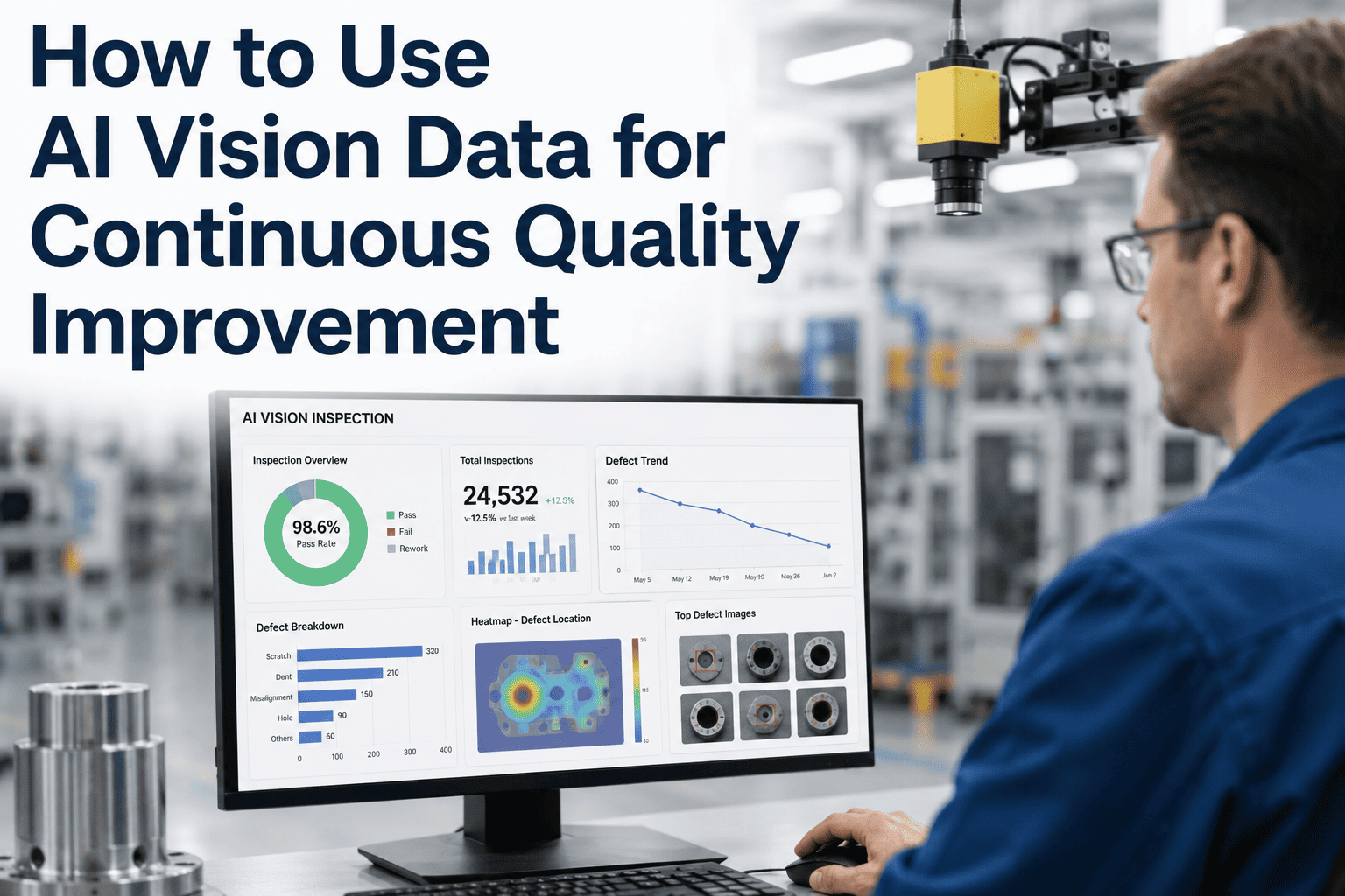
Manual quality inspection sees the defect and rejects the unit. It does not see the pattern, the pareto, or the trend. AI vision inspection flips that equation: every capture, every verdict, every micron of drift becomes a searchable data point tied to batch, line, shift, and root cause. That data — used correctly — converts an inspection station from a filter into an intelligence engine that tells you not just what failed today, but what will fail next month unless something changes. This guide walks through the analytical views, the dashboards, and the improvement loop that turn vision data into compounding quality wins. To see how iFactory operationalizes this on real production lines, book a data walkthrough with our team.
Every Defect Becomes a Data Point. Every Data Point Becomes an Improvement.
Turn 100% inspection coverage into weekly pareto charts, SPC control charts, root-cause drill-downs, and defect trend forecasts — automatically, without a data scientist on shift.
What Data-Blind Quality Actually Costs
Traditional inspection captures a verdict but discards the evidence. That missing evidence is the difference between reacting to escapes and eliminating the source of the defect. The numbers below reflect what typical FMCG and discrete-manufacturing operations recover in the first year of AI-driven quality analytics.
The Vision Data Pipeline: From Capture to Corrective Action
Every high-performing quality program runs the same five-stage pipeline. Each stage feeds the next; a weak link at any point collapses the intelligence yield of the whole system. Here is what iFactory automates end to end.
Per-unit image plus L*a*b*, defect class, confidence, batch, line, shift, and timestamp.
AI model tags defect type — scratch, misprint, cap tilt, seal leak — with location on part.
Time-series database plus image lake indexed by SKU, defect class, and operator credentials.
Automated pareto, trend, heatmap, and SPC charts refresh every hour or on operator query.
Alerts fire to the operator screen; weekly review turns findings into standing corrective actions.
Four Analytical Views Every Quality Team Needs
Vision data is only as useful as the views it enables. These four are the working set every plant should have on the wall-mounted dashboard: what fails, when it fails, where it fails, and whether the process is in control.
Ranks defect classes by volume. The top three explain most of your yield loss. Focus improvement projects here first.
Defect count per shift, day, or SKU. Spikes flag process events; drifts flag equipment wear. Weekly cadence is the sweet spot.
Overlays defect locations on part geometry. Concentrated zones point to tooling, nozzles, or fixtures — not random variation.
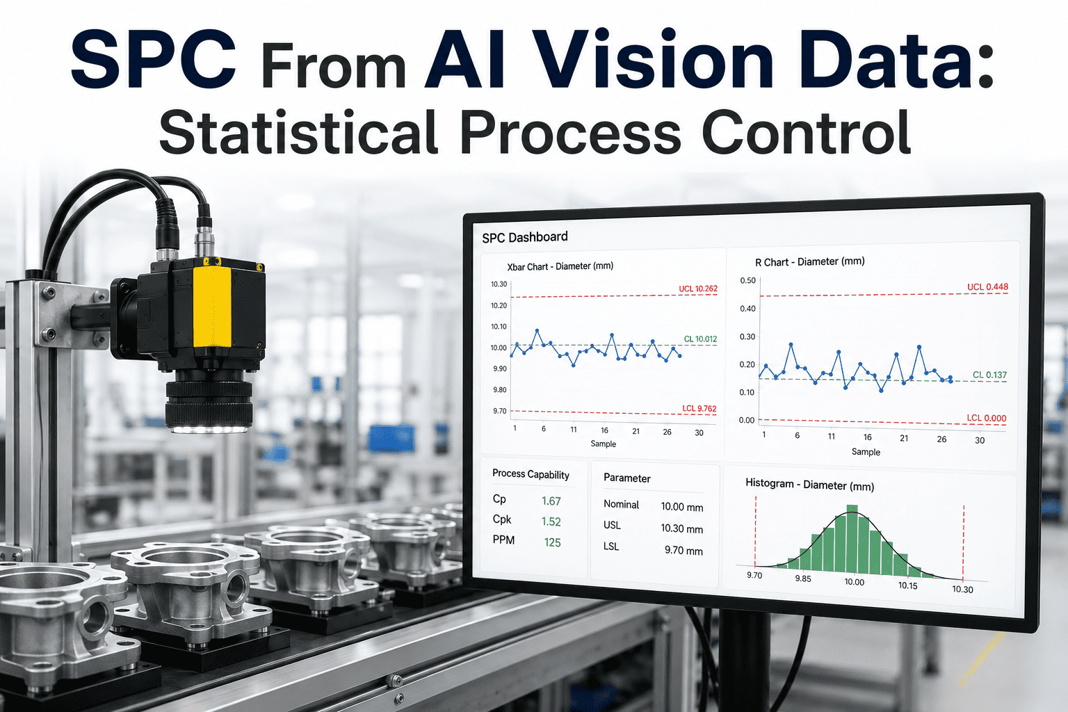
Plots per-unit measurements against upper and lower control limits. Trends toward a limit predict a failure days before it happens.
Symptom to Root Cause in Four Drill-Down Layers
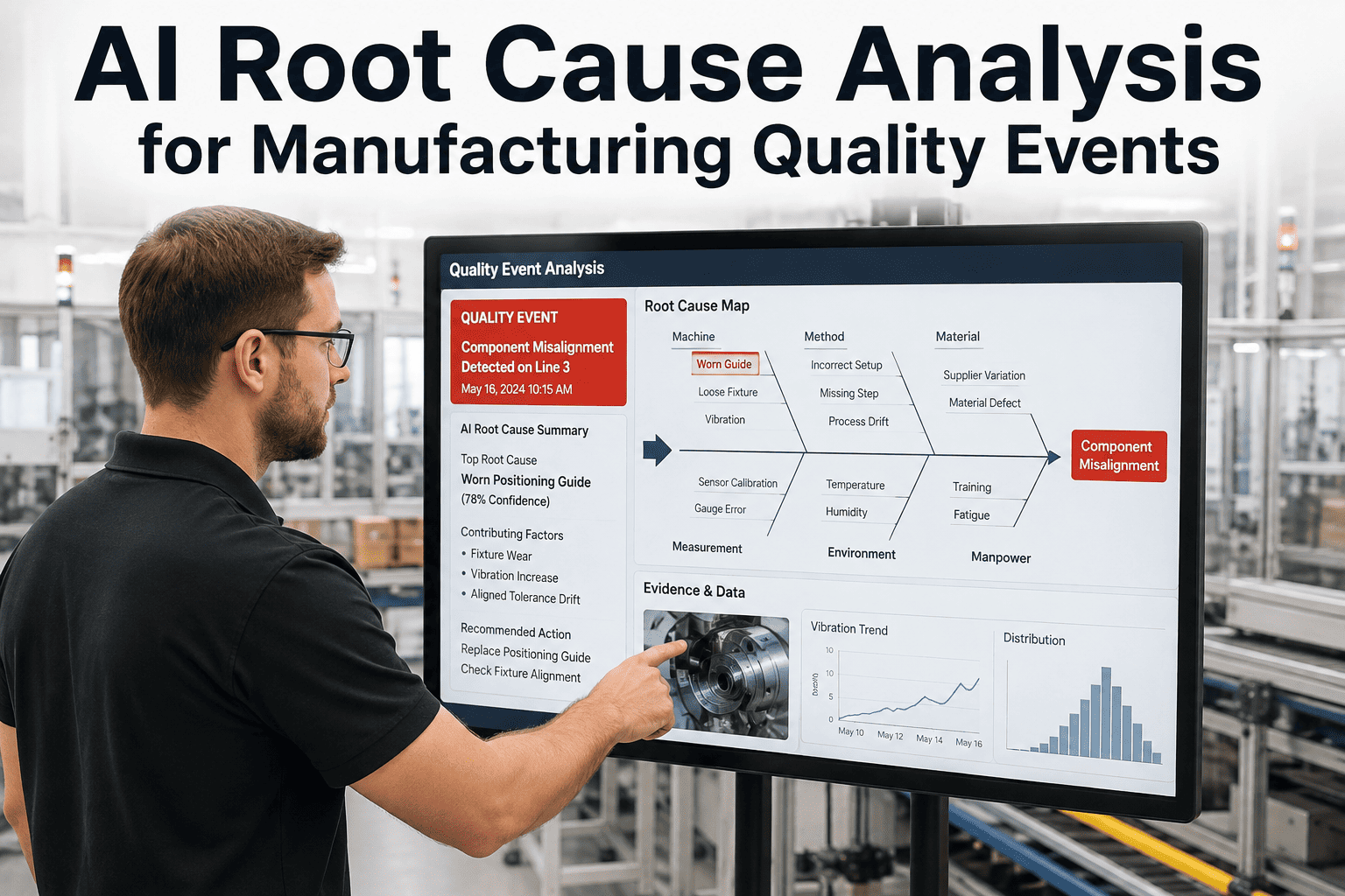
The point of vision data is not the dashboard — it is the decision the dashboard enables. Every alert should drill through four layers: what changed, where it changed, why it changed, and what to do about it. Here is the pattern iFactory applies to every chronic defect.
See Your Own Defect Data Layered This Way
Bring a week of your current inspection records. iFactory rebuilds them as pareto, trend, heatmap, and SPC in the same session — so you see exactly what a data-driven quality program looks like on your product.
The SPC Dashboard That Actually Gets Used on the Floor
Most SPC dashboards fail because they show statisticians what statisticians want to see. The dashboards that get used by line operators show three numbers, big, updated hourly, with a clear direction of drift. Here is the working set.
Process capability rolled up per SKU per shift. Anything under 1.33 flags the SKU for engineering review before the next production run.
Units passing inspection on first attempt, without rework. Divides the plant's improvement wins from its baseline noise more clearly than any other single metric.
Mean time from alert firing to corrective action confirmed. Drops from hours to minutes once the drill-down layers are automated end to end.
PDCA, But Now the Data Does the First Three Steps
Plan-Do-Check-Act has been the improvement loop since Deming. What AI vision changes is who runs each stage: analytics automate Plan, Do, and Check, freeing engineers to spend their time on the only step machines cannot own — Act.
System proposes the next improvement target from the weekly pareto. Highest-volume defect class with a clear top process source.
Engineer runs a controlled trial — changed setpoint, swapped tooling, revised SOP — while vision keeps measuring at 100% coverage.
Trend chart automatically compares before-and-after periods. Statistical significance tested; result posted to the improvement log.
If the change worked, it becomes the new standard: SOP updated, setpoint locked, training issued. Improvement compounds into next cycle.
KPIs That Change When Vision Data Is Live
The same KPI you tracked before still exists — but the number under it, the cadence, and what you can do with it all change. Below is the practical shift, metric by metric, that plants report within the first quarter of deployment.
The 90-Day Data-Driven Quality Roadmap
You do not need a data warehouse project to start. You need three months of disciplined focus on one line, one product family, and one improvement loop. Here is the working sequence.
Deploy vision on the target line. Log every unit for two weeks with no interventions. Establishes the honest starting point.
First automated pareto identifies the top three defect classes. Heatmap points to their physical origin on the part or line.
Run two to three controlled improvements against the top defect. Vision measures the delta at 100% coverage; wins are locked as standards.
Control charts calibrated per SKU. Trend-based alerts fire before a limit is crossed. Improvement loop is now self-sustaining.
Five Data Blind Spots That Kill Improvement Programs
Even with vision deployed, quality programs stall when the data is captured but poorly consumed. These are the failure patterns iFactory sees most often, and the reason a data-driven approach is a discipline, not a purchase.
If the pareto is not part of the weekly production meeting, it does not exist. Data without a standing decision forum decays into wallpaper within a month.
One bucket labeled "cosmetic" collapses ten distinct root causes into one. Pareto becomes useless. Class taxonomies need at least three levels of specificity.
Vision knows what failed. MES knows what temperature, pressure, and speed the line ran at. Without joining them, root cause is guesswork on both sides.
A shift finds a fix; the next shift never hears about it. Every confirmed PDCA win must update the SOP, the training checklist, and the setpoint list.
The AI itself needs a data plan. Weekly false-positive and false-negative audits catch model drift before it silently biases every downstream metric.
Frequently Asked Questions
How much historical data do we need before the analytics become useful?
Meaningful pareto and trend views emerge within the first seven to fourteen days of full production capture, because vision inspects at 100% coverage rather than sampling. Two full weeks typically yields tens to hundreds of thousands of unit records — enough for statistically robust class rankings and shift-to-shift comparisons. SPC control limits stabilize after roughly thirty days, once the natural process variation is well characterized. To scope the timeline for your line volume, book a walkthrough.
Does this replace our existing quality management system or work alongside it?
It works alongside. iFactory publishes per-unit verdicts, defect classes, and images into your existing QMS through OPC UA, MQTT, REST, or direct database write, so your CAPA workflows, audit trails, and PPAP submissions stay in the system your team already uses. What changes is the depth and immediacy of the data feeding the QMS — instead of one AQL sample per hour, the QMS receives every unit tagged with location, class, and confidence, refreshed in real time.
Who on our team runs the analytics — do we need to hire a data scientist?
No. The pareto, trend, heatmap, and SPC views are pre-built and refresh automatically without configuration. Line leads, quality technicians, and production supervisors are the primary users; they interact with the views the way they interact with a stack light — read, decide, act. Data scientists become relevant only for custom deep-dive analyses, model retraining, or plant-wide rollups, and even those tasks are supported through the iFactory analytics workbench without requiring code.
How do we know the AI is not silently misclassifying defects and biasing our data?
Every deployment includes a weekly model-audit workflow. A random sample of captures — passes and fails — is presented to a human labeler; disagreement rates between the model and the labeler are tracked as false-positive and false-negative percentages. If either metric drifts, retraining is triggered on the new samples. This audit is the single most important data-quality discipline in AI vision programs and is supported end to end by our platform.
Can the data help us pass customer audits and PPAP submissions?
Yes, and this is often the fastest ROI a plant sees. Every unit carries a stored image, a numeric verdict, and a link to the batch record — so an OEM customer asking about a specific serial number gets a full evidence packet within minutes rather than days. PPAP submissions benefit from the ability to attach full inspection distributions rather than sample statistics, which frequently accelerates approval cycles for new part launches with automotive and aerospace customers.
Data Is the Compound Interest of Quality
The plants that pull ahead on quality are not the ones with the most inspectors or the newest cameras. They are the ones that turn every captured unit into a data point, every data point into a pattern, and every pattern into a locked-in improvement. Vision inspection makes the raw material free; discipline in how you consume it is where the compounding happens. Start with one line, one improvement cycle, and one shared dashboard on the wall. In ninety days that dashboard will have taught your team more about the process than the last five years of hand-compiled reports combined.
Turn Your Inspection Line Into a Quality Intelligence Engine
Book a 30-minute working session with iFactory. Share a sample dataset or a live line video; leave with the exact pareto, heatmap, and SPC views your plant would run — and a fixed-price pilot proposal to make them permanent.