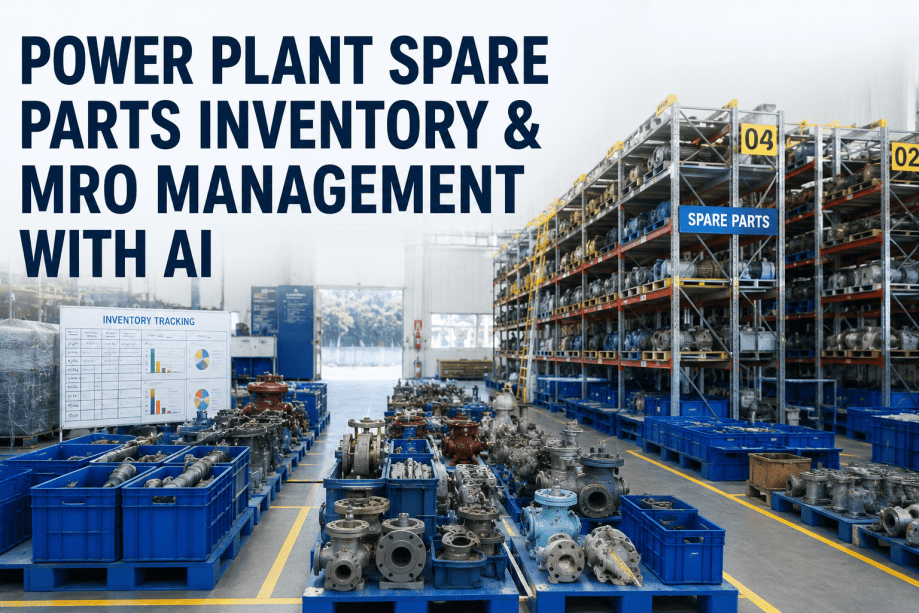
Power plant managers operate in an environment where the gap between available data and actionable intelligence is measured not in technology capability but in dashboard design. A typical combined-cycle plant generates 50,000 to 80,000 data points per minute from DCS systems, vibration monitors, thermography surveys, oil analysis laboratories, and CMMS work order records. Book a Demo to see how iFactory transforms your plant data into actionable KPI intelligence.
Why KPI Dashboards Matter for Power Plant Managers
The fundamental problem that KPI dashboards solve for power plant managers is not data scarcity — it is data fragmentation and attention scarcity. Reliability directors and plant managers who Book a Demo consistently identify the unified KPI view as the single most valuable outcome of iFactory's platform — because it replaces the judgment call with a data-driven assessment that is available at any moment, not just at the monthly performance review meeting.
iFactory's KPI dashboard platform connects directly to your plant's existing data systems — SAP PM, Maximo, PI Historian, DCS archives, and financial reporting systems — and consolidates the key performance indicators that plant managers need into a single interface organized by role and decision frequency. The operations manager sees shift-level OEE trends, current backlog aging, and real-time MTBF tracking. The maintenance manager sees planned versus reactive spend ratios, contractor utilization rates, and critical asset health indices.
MTBF & MTTR Tracking
Real-time Mean Time Between Failures and Mean Time To Repair by asset class, unit, and shift. Trend views with 30-day and 12-month rolling windows enable early detection of degradation patterns before they produce forced outages.
OEE & Performance Analytics
Overall Equipment Effectiveness tracked at the unit, system, and plant level. Availability, performance, and quality components displayed with benchmark comparisons against fleet averages and industry standards. Book a Demo
Backlog & Work Order Analytics
Maintenance backlog by age, priority, trade, and outage window. Planned versus reactive maintenance ratio tracked in real time with trend lines showing the impact of PM program effectiveness on emergency work reduction.
Cost per MWh & Budget Tracking
Maintenance cost per megawatt-hour by asset class and cost category. Budget variance tracking with 12-month forecast based on current spend velocity and planned outage scope commitments.
Your Plant's Performance Story Is Somewhere in Your Data. iFactory Puts It on One Screen.
iFactory's analytics dashboard platform consolidates MTBF, MTTR, OEE, backlog, planned versus reactive ratios, and cost per MWh from your existing plant systems into a single, role-specific KPI interface — eliminating the report-chasing cycle that consumes 8 to 12 hours of management time every week.
Key Metrics Every Power Plant Manager Should Track in Real Time
The difference between a KPI dashboard that drives better decisions and one that creates more noise is the selection and contextualization of metrics. iFactory's platform is built on a structured KPI framework that organizes metrics by decision frequency — what the plant manager needs to see daily, weekly, monthly, and quarterly — and by the specific action that each metric is designed to inform.
| KPI Category | Core Metrics | Data Sources | Review Frequency | Decision Trigger |
|---|---|---|---|---|
| Reliability | MTBF, MTTR, Forced Outage Rate | CMMS, Historian, DCS | Daily / Weekly | MTBF decline > 15% triggers asset-level root cause analysis |
| Operational | OEE, Availability, Performance Rate | DCS, Historian, Production Logs | Daily / Shift | OEE below 85% triggers shift-level performance review |
| Work Management | Backlog Aging, Planned vs Reactive Ratio | CMMS, Maintenance Scheduler | Weekly | Reactive ratio > 35% triggers PM program effectiveness review |
| Financial | Cost per MWh, Budget Variance, Overtime % | ERP, CMMS, Financial System | Monthly | Cost per MWh > target triggers cost driver analysis by asset class |
| Compliance | PM Compliance %, Safety Metrics, Audit Findings | CMMS, LIMS, EHS System | Weekly / Monthly | PM compliance < 90% triggers supervisor-level intervention |
| Asset Health | Critical Asset Risk Score, RUL Estimates | Condition Monitoring, Historian | Daily | Risk score increase > 2 points triggers inspection within 7 days |
From Data Silos to Unified KPI Dashboard: Phased Deployment
Building a unified KPI dashboard that plant managers trust requires more than plugging in a visualization tool. It requires connecting to the source systems, cleaning and normalizing the data, establishing metric definitions that are consistent across the organization, and designing dashboard views that match the decision cadence of each management role. iFactory's deployment methodology follows a phased approach that delivers early value while building toward the full unified view. Maintenance and operations leaders who Book a Demo
Data Source Integration & Metric Baseline
Connect iFactory's data connectors to your CMMS, historian, and financial systems. Establish baseline metric definitions and validate data quality. Create the initial KPI framework with role-based dashboard prototypes for plant manager, maintenance manager, and operations manager. Timeline: 3–4 weeks.
Dashboard Deployment & User Activation
Deploy role-specific dashboards to plant leadership team. Configure threshold alerts, automated report distribution, and drill-down navigation. Conduct training sessions focused on decision workflows rather than dashboard navigation. Timeline: 2–3 weeks.
Analytics Enhancement & Continuous Improvement
Add predictive analytics overlays — failure probability forecasting, maintenance cost projection, risk-based prioritization scoring. Establish monthly KPI review cadence with trend analysis and target adjustment. Continuous metric refinement based on user feedback. Timeline: Ongoing.
Before iFactory, I was spending Monday mornings pulling reports from three different systems — Maximo for work orders, PI for OEE, and SAP for costs — and trying to reconcile them into a coherent picture of plant performance. The data never matched across systems because the time periods were different, the asset hierarchies were different, and the metric calculations were different. I was making decisions based on data that I knew was inconsistent, but I had no way to fix it because the systems couldn't talk to each other. iFactory's KPI dashboard didn't just put the data on one screen — it forced us to standardize our metric definitions across the organization, which was the real breakthrough. Book a Demo
Stop Chasing Reports Across Four Systems. Start Making Faster, Better Decisions from One Dashboard.
iFactory's analytics dashboard platform consolidates MTBF, MTTR, OEE, backlog, planned versus reactive ratio, and cost per MWh into a single role-specific interface — connected to your existing CMMS, historian, and financial systems. Deployed in 6 weeks. Trusted by plant leadership teams across 28 countries.
The KPI Intelligence Layer Your Power Plant Management Team Is Missing
iFactory's KPI dashboard platform delivers this integration layer through direct connections to your existing plant systems, role-based dashboard views organized by decision frequency, and a structured metric framework that ensures every KPI on the dashboard drives a specific management action. The result is a plant leadership team that spends less time chasing data and more time acting on it — with the confidence that comes from knowing that every metric on the dashboard is drawn from the same consistent data model and calculated using the same standardized definitions. The first step is connecting your data sources. The second step is seeing your plant's performance story in a single view. The third step is making better decisions, faster than you ever could with the fragmented reporting processes that consume 8 to 12 hours of every plant manager's week. Book a Demo to start the conversation.
KPI Dashboards and Analytics for Power Plant Managers — Frequently Asked Questions
What data sources does iFactory connect to for KPI dashboard data?
iFactory connects natively to the most common power plant data systems: SAP PM, IBM Maximo, Infor EAM, and Oracle EBS for maintenance and work management data; OSIsoft PI Historian, Aspentech IP21, and Honeywell PHD for process historian data; DCS and SCADA systems via OPC-UA and Modbus TCP for real-time operational data; and SAP FI, Oracle Financials, and standard ERP systems for cost and budget data.
How does iFactory ensure KPI consistency when data from different systems uses different asset hierarchies or metric calculations?
KPI consistency is achieved through iFactory's data normalization and metric governance layer, which is configured during the deployment phase. The platform ingests asset hierarchy data from each source system and maps it to a unified equipment taxonomy that serves as the single reference model for all KPI calculations. Metric definitions — including calculation methods, time periods, inclusion criteria, and threshold values — are documented in the platform's metric governance module and applied consistently across all dashboard views. When discrepancies are identified between source systems
Can the KPI dashboard be customized for different management roles and decision cadences?
Yes — role-based dashboard customization is a core feature of iFactory's platform. During deployment, the platform is configured with dashboard views tailored to each management role's specific decision responsibilities. The plant manager's dashboard focuses on portfolio-level metrics — fleet OEE trajectory, maintenance cost per MWh, top-five operational risks — updated daily with monthly trend overlays. The maintenance manager's dashboard provides deeper operational detail — backlog aging by trade and priority, planned versus reactive spend ratio, critical asset health indices — updated in real time with shift-level granularity. The operations manager's dashboard emphasizes current-shift performance — OEE by unit, active work order status, operator rounds compliance — updated continuously from live DCS and CMMS data streams. Each role-based view shares the same underlying data model and metric definitions, ensuring consistency across the management team while presenting each user with the information that is most relevant to their specific decision-making authority and frequency. Book a Demo
Does iFactory provide threshold alerts and automated reporting, or is the dashboard strictly a visual interface?
iFactory's platform provides both interactive dashboard visualization and automated alerting and reporting capabilities. Threshold alerts can be configured for any metric on the dashboard, with notification delivery through email, SMS, or the iFactory mobile app.
What is the typical deployment timeline and user adoption pattern for iFactory's KPI dashboard platform in a power plant setting?
iFactory's KPI dashboard deployment follows a three-phase approach. Phase one — data source integration, metric definition, and baseline dashboard configuration — requires 3 to 4 weeks for a typical plant with 3 to 5 source systems. Phase two — dashboard deployment, user activation, and training — requires 2 to 3 weeks. Total timeline from kickoff to full production deployment is typically 5 to 7 weeks. User adoption patterns follow a predictable trajectory: initial curiosity during the first week post-deployment, followed by a 2- to 3-week evaluation period during which users test the dashboard against their existing reporting processes, followed by sustained adoption as users discover that the dashboard provides faster, more complete, and more consistent information than the manual reporting processes it replaces.