Most plants run one OEE report — usually a single trend chart pulled monthly. That single view answers "is OEE going up or down," but it can't tell you why, which line is dragging the average, or which loss category to attack first.
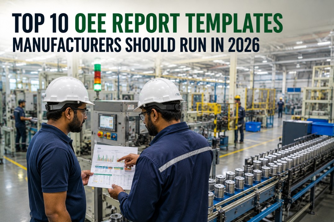
Below are the 10 OEE report templates every manufacturing operation should have ready to run in 2026 — what each one shows, who uses it, and how often it should run. iFactory generates all ten automatically from your existing PLC and MES data, with zero manual entry.
iFactory ships all 10 OEE report templates out of the box — Pareto, trend, shift, plant, and more — generated automatically from your PLC data.
Where Does Your OEE Stand?
Before diving into report types, here's the context that makes them matter — the benchmarks every report should be measured against.
10 OEE Report Templates to Run in 2026
Each card below is a distinct report type — built for a specific question, audience, and review cadence.
Every report above is a one-click view inside iFactory — generated from PLC encoder, counter, and fault signals, with zero manual data entry.
No formulas to maintain. No version drift between the plant manager's deck and the supervisor's spreadsheet.
The Loss Taxonomy Behind Every OEE Report
Reports #2 and #4 above depend on this taxonomy. Every loss in a manufacturing process maps to exactly one of six categories — and each category maps to exactly one OEE factor.
| Loss Category | OEE Factor Affected | Typical Point Impact | Common Fix |
|---|---|---|---|
| L1 — Equipment Failure (Unplanned Stops) | Availability | 5–15 pts | Predictive maintenance, root cause analysis |
| L2 — Setup & Adjustments (Planned Stops) | Availability | 3–8 pts | SMED changeover discipline |
| L3 — Idling & Minor Stops (Small Stops) | Performance | 5–10 pts | PLC event capture, poka-yoke |
| L4 — Reduced Speed (Slow Cycles) | Performance | 3–8 pts | Cycle time monitoring vs. ideal rate |
| L5 — Process Defects | Quality | 2–5 pts | Parameter correlation, predictive quality |
| L6 — Reduced Yield (Startup Rejects) | Quality | 1–3 pts | Standardized startup sequences |
From Single Metric to Full Reporting System
Don't try to deploy all 10 reports at once. Build the stack in this order to get value at every stage.
Start with the two foundational reports. Trend tells you direction; reason codes tell you what's driving it. Everything else builds on this data.
Once events are captured cleanly, layer in Pareto ranking and the Six Big Losses breakdown to focus improvement projects on the top 2–3 contributors.
Add shift comparison and line-level scorecards to localize accountability — find exactly which team, line, or handoff needs attention.
Finish with the enterprise rollup for leadership visibility and the shopfloor live dashboard so operators can act within the shift, not after it.
Frequently Asked Questions
Stop maintaining separate spreadsheets for trend, Pareto, and shift comparisons. iFactory generates the complete OEE report library automatically — accurate, consistent, and ready before your next meeting.