Every quality team faces the same trap: defects arrive in clusters, all competing for attention, and limited improvement resources get spread thin across a dozen problems at once — fixing a little of everything and not enough of anything. The Pareto principle cuts through it. Roughly 80% of your defects come from about 20% of the causes, which means a handful of defect types are quietly responsible for most of your scrap, rework, and customer returns. Find those vital few and fix them, and you move the needle far more than chasing the trivial many. The catch is that building Pareto charts by hand from scattered defect logs is slow, and ranking purely by count can send you after a frequent-but-cheap defect while a rarer, costlier one bleeds margin. iFactory's quality analytics platform builds the Pareto and concentration analysis automatically — ranked by both frequency and cost — so improvement effort lands where it actually pays.
iFactory Quality Analytics
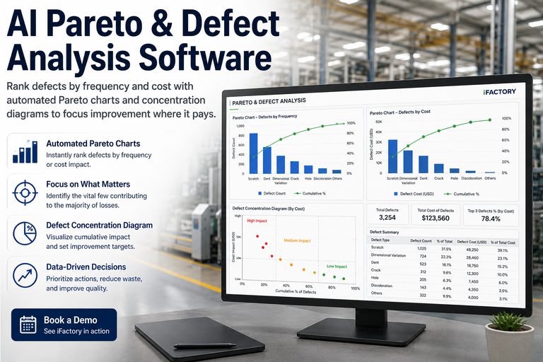
AI Pareto & Defect Analysis Software
Rank defects by frequency and cost with automated Pareto charts and concentration diagrams — focus the improvement effort on the vital few that drive most of your quality loss.
When defects, delays, and complaints all arrive together, the instinct is to react to whatever is loudest. But spreading limited resources across every issue means none gets fixed properly, and the improvement cycle stalls. Pareto analysis replaces that scramble with evidence: it ranks the categories by impact so the team aligns around the same short list of high-leverage problems instead of debating which fire to fight first.
Spreadsheets & Instinct
Effort Spread Too Thin
Defect logs scattered across sheets, late and rarely consolidated
Charts built by hand, out of date the moment they're finished
Ranked by count alone — a frequent cheap defect outranks a costly rare one
Teams argue over priorities instead of aligning on the data
AI Quality Analytics
Effort Where It Pays
Defect data consolidated automatically from the line, live
Pareto and concentration charts rebuilt continuously, always current
Ranked by frequency and cost, surfacing the true high-impact few
One shared, evidence-based priority list the whole team trusts
Reading the Pareto Chart
The Pareto chart is the workhorse: descending bars rank each defect category by impact, and a cumulative line shows the running total. Where that line crosses 80% marks the boundary between the vital few you act on now and the trivial many you can defer. A steep early climb means a few categories dominate; that is exactly the signal you want.
Descending Bars + Cumulative Line — the Vital Few
Descending bars — each defect category ranked by impact, largest first
Cumulative line — the running total; where it hits 80% splits vital few from trivial many
Frequency Tells Half the Story — Cost Tells the Rest
Ranking defects by how often they occur is the classic approach, but it can mislead. A defect that happens constantly but costs little to fix may matter far less than a rare one that triggers a customer return, a downgrade, or a line stop. The most useful analysis runs the Pareto both ways — by count and by cost — because the two lists are often different, and the cost view is where the money actually is.
By Frequency
Ranks defects by how often they occur — the classic Pareto view, ideal for chasing the most common, repeatable problems on the line.
By Cost
Weights each defect by what it actually costs — scrap value, rework hours, downgrade, return. A rare, expensive defect rises to the top where it belongs.
The Two Compared
When the frequency and cost rankings disagree, that gap is the insight — it shows where "most common" and "most expensive" are not the same problem.
Want to see your own defect data ranked by both frequency and cost side by side? Book a 30-minute walkthrough and we'll build the Pareto on your numbers live.
Where the Defect Happens: Concentration Diagrams
A Pareto chart tells you which defect dominates; a defect concentration diagram tells you where on the part it occurs. By mapping every defect onto a picture of the product, clusters jump out — and a cluster in one location is a powerful clue to a specific cause, like a worn fixture, a misaligned nozzle, or a handling pinch point. Together the two views answer "what" and "where" at once.
Defect Concentration Diagram — Clusters Point to Causes
A cluster in one location — not a random scatter — is the tell that a specific fixture, tool, or handling step is the root cause.
What the Analytics Auto-Builds
The platform removes the manual labor that keeps most teams from doing Pareto analysis regularly. It categorizes incoming defects, builds and refreshes the charts, applies the 80% threshold, and keeps the whole thing live — so analysis is something the system does continuously, not a quarterly project someone dreads.
Auto-Categorization
Incoming defects are classified into consistent categories with clear definitions, so the data is clean enough to trust — no overlapping or ambiguous buckets.
Live Pareto Charts
Descending bars and the cumulative line rebuild as new data lands, so the ranking is always current rather than a stale snapshot.
80% Threshold Flagging
The vital few — the categories crossing the cumulative threshold — are highlighted automatically as the priority list.
Cost Weighting
Each defect category carries its cost, so the analysis ranks by financial impact, not just raw count.
Concentration Mapping
Defects plotted by location on the part, surfacing the spatial clusters that point to a specific physical cause.
Trend Over Time
Track whether a category is shrinking after a fix — turning Pareto from a one-off snapshot into a closed improvement loop.
Want the analytics wired to your defect sources so the charts build themselves? Talk to our quality engineers about connecting your data.
Reading the Shape — What the Chart Is Telling You
A Pareto chart's shape carries meaning beyond the ranking. Learning to read it turns the chart from a picture into a diagnosis, telling you not just where to focus but what kind of problem you are facing.
Steep Early Climb
The classic 80/20 — a few categories dominate and the cumulative line rises fast then flattens. Clear priorities; act on the leaders.
One Towering Bar
A single category at 60%-plus signals a systemic issue demanding immediate, focused investigation above all else.
Flat Distribution
No category stands out — a sign to re-examine your categories, or that many small improvements are needed rather than one big fix.
From Ranked List to Closed Loop
The point of the analysis is action, and the value compounds when ranking flows into fixing and verifying. The strongest workflow connects the Pareto output to root-cause investigation and tracks whether the fix actually moved the bar — closing the loop rather than producing a chart nobody acts on.
The Prioritize-and-Improve Loop
1
Collect
Categorize
Defects captured and sorted into clean, consistent categories automatically
2
Rank
Pareto
Charts rank by frequency and cost; the 80% line marks the vital few
3
Investigate
Root Cause
Concentration map and trend point the investigation at the real cause
4
Verify
Track the Drop
Watch the category shrink on the live chart, confirming the fix worked
What Focused Analysis Delivers
The return on Pareto-driven quality work is concentration of effort — fewer projects, bigger results, faster cycles. These reflect how Pareto analysis is applied across manufacturing, healthcare, and service quality programs.
~80%
Of loss in the vital few
a small set of categories drives most of the impact
Faster
Improvement cycles
resources concentrated, not spread across minor issues
Aligned
Team priorities
one shared, evidence-based list instead of debate
Verified
Improvement
the bar visibly drops, confirming the fix landed
Every improvement project pays more when it starts with the right target. Want the analytics scoped to your defect data and cost model? Talk to our quality engineers.
Frequently Asked Questions
What does the 80/20 rule actually mean for our defects?
It means roughly 80% of your quality loss tends to come from about 20% of the defect causes — a small set of categories drives most of the scrap, rework, and returns. The exact ratio varies (you might see 70/30 or 90/10), but the principle holds: a vital few problems matter far more than the trivial many. Pareto analysis finds that vital few so you concentrate effort where it delivers the most improvement.
Why rank by cost and not just how often a defect happens?
Because frequency and cost are often different stories. A defect that occurs constantly but is cheap to fix may matter less than a rare one that triggers a customer return, a downgrade, or a line stop. Ranking by count alone can send your team after the most common problem while a costlier one quietly bleeds margin. Running the Pareto by both frequency and cost — and comparing them — reveals where the money actually is.
What's a defect concentration diagram and how is it different from a Pareto chart?
A Pareto chart answers "which defect type dominates"; a concentration diagram answers "where on the part it happens." It maps every defect onto a picture of the product, so spatial clusters become visible. A cluster in one location — rather than a random scatter — is a strong clue to a specific physical cause like a worn fixture or a misaligned tool. Used together, the two views give you the "what" and the "where" of a problem.
What if our Pareto chart is flat with no clear leader?
A flat distribution, where no category stands out, usually means one of two things: your categories are too broad or overlapping and need re-defining, or you genuinely face many small issues that call for broad improvements rather than one focused fix. Conversely, if a single bar towers over the rest at 60% or more, that's a systemic issue demanding immediate investigation. The shape of the chart is itself diagnostic.
How is automated analysis better than building charts in a spreadsheet?
A hand-built chart is out of date the moment it's finished and only as good as the last manual data pull — which is why most teams do Pareto analysis rarely. Automated analytics consolidate defect data from the line continuously, rebuild the Pareto and concentration views live, apply the 80% threshold, and let you watch a category shrink after a fix. It turns a quarterly project into an always-current view, and a clean, consistent categorization keeps the underlying data trustworthy.
Stop Fixing Everything. Fix What Matters.
See Your Defects Ranked by Frequency and Cost — in 30 Minutes
Bring your defect data. We'll build the Pareto both ways, flag the vital few at the 80% line, map the concentration clusters to physical causes, and show how the bars drop as fixes land — so your next improvement project starts on the target that pays the most.