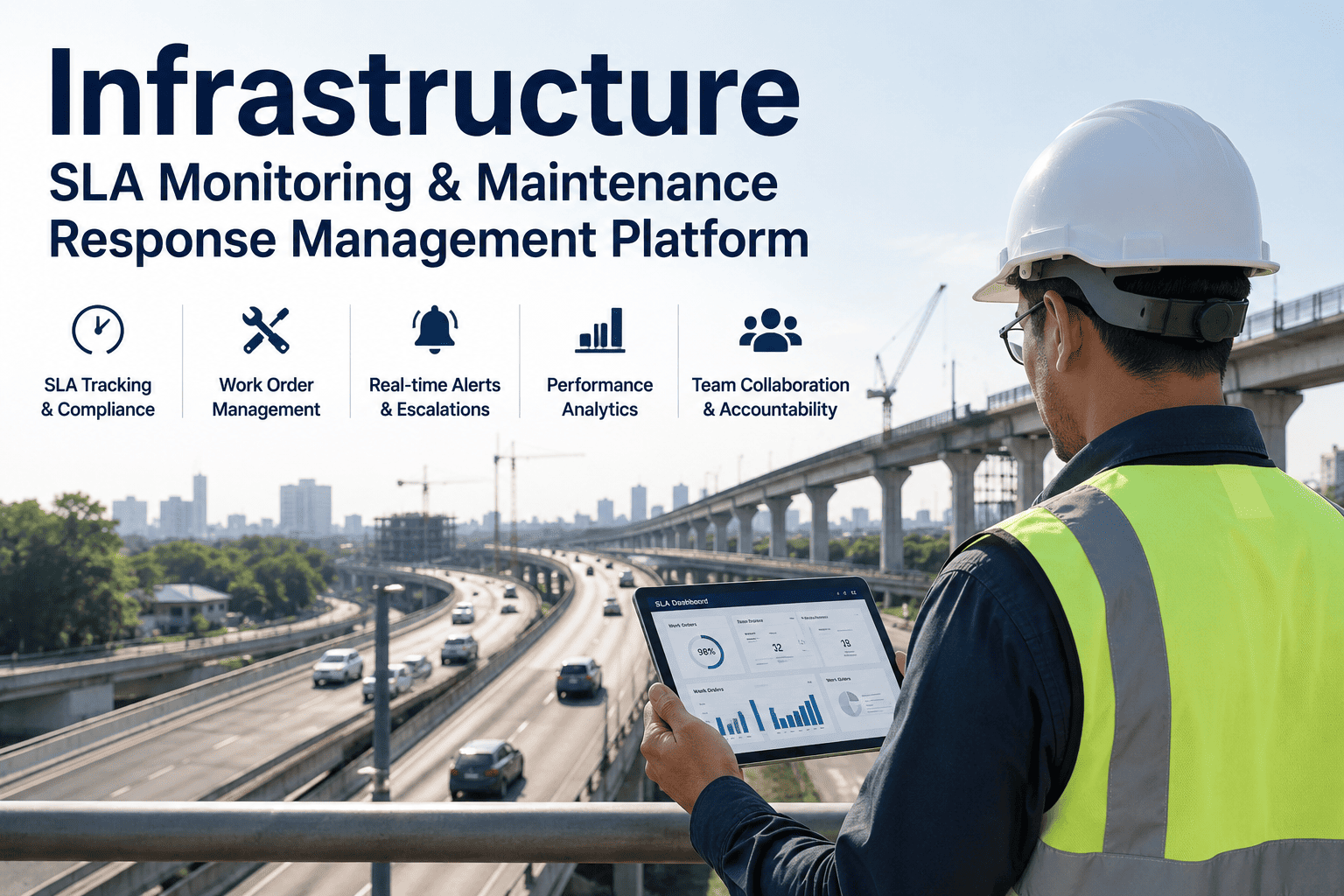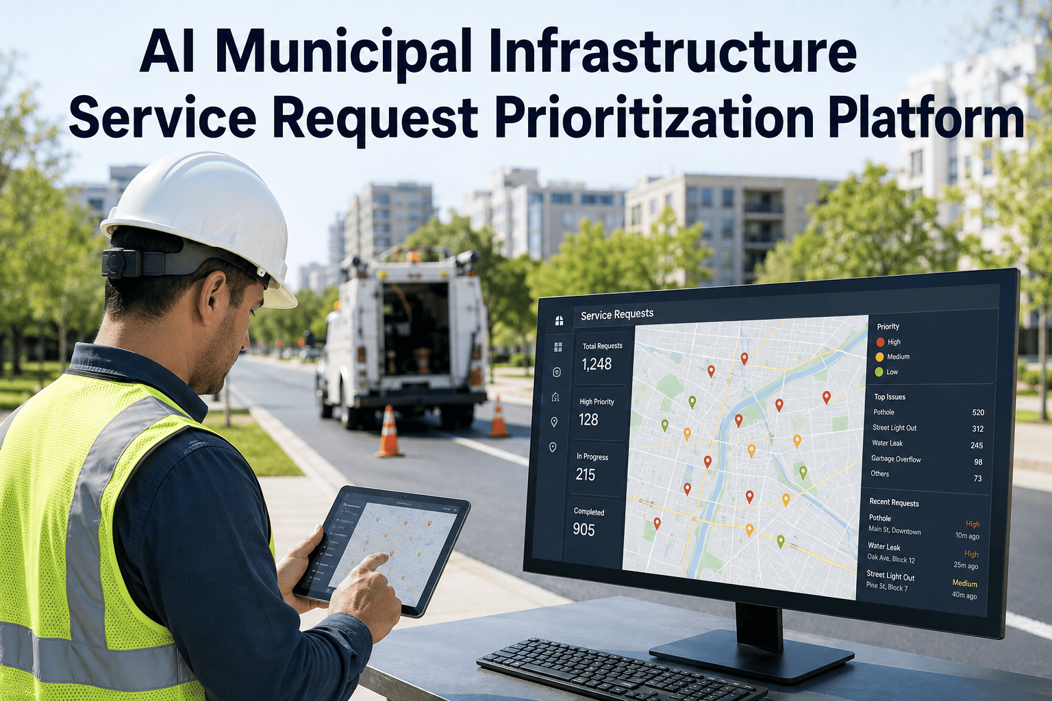
Every week, public works departments across mid-size and large cities take in hundreds of service requests — a cracked sidewalk near a school, a pothole on a school bus route, a failing streetlight in a high-crime corridor, a water main quietly showing the early signs of corrosion. Somewhere in that pile sits the one request that, left untouched for another month, turns into a safety incident or a six-figure emergency repair. Most departments still work the queue in the order it arrived, or in the order the loudest resident complained, because there has never been a consistent way to weigh a drainage complaint against a bridge inspection flag on the same scale. See how iFactory brings AI-driven risk scoring to that queue at ifactory support.
Know Which Request Actually Needs a Crew Today
An AI prioritization layer that scores every incoming infrastructure request against safety impact, asset condition, location risk, and maintenance history, so crews are dispatched by consequence instead of by whoever called first.
Why Service Request Backlogs Keep Growing Instead of Shrinking
Request volume has climbed steadily as more cities push residents toward mobile apps and 311 portals, but headcount on the crews that actually close those requests has not grown at the same pace. A request submitted through an app, a phone call routed through a call center, and a flag raised during a routine inspection all land in the same tracking system with no shared way to compare urgency. A nuisance complaint about a faded crosswalk line sits in the same queue as a corroding gas line marking, and without a scoring layer, both wait their turn based on submission timestamp alone. The result is a backlog that grows quietly in the background while the department focuses on whichever request generated the most phone calls that week, not the one carrying the most risk.
The pressure is made worse by how differently each request type is reported. A resident describing a sinkhole forming near their driveway will use very different words than an inspector logging the same hazard during a scheduled survey, and a system that only sorts by category or keyword tends to flatten both into the same generic bucket. Supervisors end up relying on personal judgment and institutional memory to spot the requests that matter, which works reasonably well until that supervisor is out sick, transferred to another division, or retires after twenty years of knowing exactly which intersection floods first during a storm.
The Five Signals That Actually Determine Priority
A priority score is only useful if it is built from the signals that genuinely predict consequence, not just the ones that are easiest to capture on an intake form. iFactory pulls from location context, asset history, and prior complaint patterns to build a score that reflects what a seasoned public works director would judge in their head, but consistently, for every single request, every single day, regardless of who is on shift. None of the five signals works in isolation; a request that scores moderately on asset condition alone can still land in the critical tier once it is combined with high public exposure or an approaching compliance deadline, which is exactly the kind of judgment call that used to depend on one experienced person remembering the right context.
Bring Your Current Backlog to a Live Walkthrough
Pull a week of open requests from your current system and we will walk through how each one would score across the five signals, side by side with how it is being handled today.
What This Looks Like Against Real Request Types
Two requests can look nearly identical on an intake form and still deserve completely different responses once location, asset history, and public exposure are factored in. A pothole two blocks from a school with an active bus route carries a different weight than a similar pothole on a quiet cul-de-sac, even though both would read as "pothole, medium severity" in a system that only tracks category and description. The table below shows how the same intake categories land on different priority tiers once the scoring signals are applied, using the kind of request descriptions a resident or inspector would actually type in, not an idealized version of the data.
| Request Type | Signal Flagged | AI Priority Tier | Typical Response Window |
|---|---|---|---|
| Pothole near school bus stop | Safety exposure + location criticality | Critical | Under 24 hours |
| Storm drain backup in flood-prone zone | Location risk + compliance deadline | Critical | Under 48 hours |
| Water main showing early corrosion signs | Asset condition + failure history | High | 3 to 5 days |
| Streetlight out on transit corridor | Location criticality | High | 5 to 7 days |
| Sidewalk hairline crack, low-traffic street | Minor safety exposure | Standard | 30 to 45 days |
From Submission to Dispatch: How the Workflow Actually Runs
The scoring layer is only valuable if it plugs into the intake and dispatch process the department already runs, rather than asking staff to learn an entirely new system. The five stages below describe how a request moves from the moment a resident submits it to the moment a crew is standing in front of it, with the AI layer working quietly in the background at each step instead of adding a manual review stage.
Curious how many requests currently sitting in your queue would score as critical under this framework? Send a sample export to our team and we will return a scored breakdown.
Working With Data and Systems You Already Have
A common concern from public works directors is whether adopting a scoring layer means ripping out the systems staff already know how to use. It typically does not. Most departments already have some combination of a GIS map of infrastructure assets, a work order or CMMS system tracking prior repairs, and an intake channel for resident-submitted requests, even if those three systems have never actually talked to each other. The scoring engine is built to sit on top of that existing patchwork, pulling location context from the GIS layer, condition and repair history from the work order system, and new requests from whichever intake channel residents already use, rather than requiring a department to consolidate everything into one platform before getting any value.
Departments with thinner data, such as a smaller city with limited GIS coverage or inconsistent inspection records, still see meaningful benefit from day one, because even partial signals produce a far better ranking than no ranking at all. As more inspection data, sensor feeds, and closed work orders accumulate over time, the scoring model simply gets sharper without requiring a rebuild, since new information is folded into the same five-signal framework rather than triggering a separate migration project.
What Departments Report After Switching to Score-Based Triage
The value of a scoring layer shows up in how quickly the requests that matter most actually get resolved, not just in a cleaner-looking queue. The ranges below reflect what mid-size public works departments have reported after a full year of prioritizing dispatch by risk score instead of submission order, and the gains tend to compound the longer the model runs, since each closed work order feeds back into a sharper picture of which assets are actually degrading.
Common Mistakes That Undermine Manual Triage
The most common failure point is treating every request as equally urgent simply because there is no consistent way to compare them, which quietly defaults the entire queue back to first-in, first-out ordering regardless of what a supervisor intends. A nuisance complaint filed on a Monday morning can sit ahead of a safety-relevant flag filed Monday afternoon purely because of timestamp order, and nobody notices until the safety item becomes a bigger problem.
The second recurring mistake is losing the pattern hidden across repeat complaints. When three different residents report the same failing storm drain over two months, a manual system usually logs three unrelated tickets instead of one asset that is clearly deteriorating. By the time someone manually connects the dots, the asset has often already failed. A scoring layer that automatically links requests to the same asset and location closes exactly that gap, surfacing the pattern the first time it starts to repeat rather than the third or fourth.
A third, quieter mistake is letting political pressure substitute for a scoring framework. A request that gets forwarded from a council office understandably jumps the queue, but when that becomes the informal mechanism for prioritization, the department ends up serving whichever neighborhood is best organized at contacting elected officials rather than the neighborhood with the actual highest-risk infrastructure. A transparent, consistent scoring model gives staff a defensible answer when a request is deprioritized, and gives leadership a fair basis for explaining why one request moved ahead of another.
Frequently Asked Questions
Score Your Backlog and See What Was Actually Waiting
Bring a week of open requests to the call. We will walk through how each one scores across the five signals and what your dispatch queue would look like ranked by risk instead of arrival time.