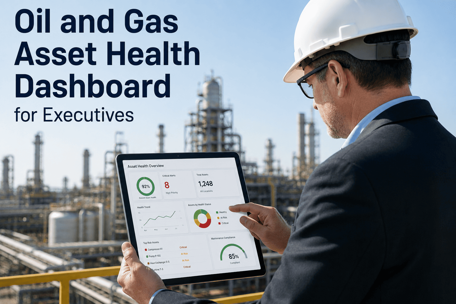
Oil and gas executives at refinery, midstream, and upstream operations make capital allocation, staffing, turnaround scheduling, and compliance investment decisions based on the asset health information they receive — yet most leaders rely on monthly reliability reports compiled from spreadsheets, email summaries from site managers, and periodic operations reviews that represent a snapshot of conditions that may have changed weeks before the report reaches the executive's desk. The result is a persistent visibility gap between what is happening at the equipment level across the enterprise and what the leadership team can see when it needs to make a decision. iFactory's Asset Health Dashboard closes this gap by aggregating real-time equipment condition data, predictive maintenance scores, downtime analytics, safety alert status, and emissions monitoring into a single executive interface that updates continuously and presents information at the strategic level leaders need. Book a Demo to see the executive asset health dashboard configured for a multi-site oil and gas operation.
One Dashboard. Every Asset. Every Site. The Asset Health Intelligence Oil and Gas Leaders Need to Make Faster Decisions.
iFactory's executive asset health dashboard consolidates equipment risk scores, downtime drivers, safety exposure, emissions status, and maintenance performance across all your oil and gas operations into a single real-time interface designed for leadership decision-making.
Health Score
Why Oil and Gas Executives Cannot See What Is Happening Across Their Asset Portfolio
The visibility gap in oil and gas operations is not a technology limitation — it is an information architecture problem. Equipment health data exists at every facility, but it is trapped in site-level CMMS systems, condition monitoring platforms, SCADA historians, and inspection databases that were designed for operational use, not executive decision support. The three layers below illustrate how asset health information degrades as it moves from the equipment to the executive dashboard in traditional oil and gas operations.
At the equipment level, oil and gas facilities generate comprehensive health data — vibration signatures from rotating equipment, process parameter trends from SCADA, inspection findings from route-based programs, CEMS emissions data, and predictive model outputs from AI-based monitoring systems. The data is rich, continuous, and specific to each asset. The problem is that this data lives in systems designed for maintenance technicians and process engineers, not for executive consumption.
When asset health information moves from equipment to site level, it passes through the site reliability engineer, the maintenance manager, and the plant manager. At each step, the information is aggregated, summarized, and filtered. Detailed equipment condition data becomes a red-yellow-green status indicator. Predictive model outputs become a simple risk classification. The nuance that an executive needs to make a capital investment decision — the specific failure mode, the degradation rate, the remaining useful life estimate — is typically lost in the summarization process.
By the time asset health information reaches the executive team, it has been condensed into monthly reliability reports, quarterly operations reviews, and annual capital planning submissions that represent a small fraction of the original equipment-level data. The executive sees aggregate reliability percentages, total downtime hours, and maintenance cost totals — but cannot drill into a specific asset at a specific site to understand the risk profile, the degradation trajectory, or the intervention options. When an unexpected failure occurs, the executive's first question is typically "why didn't we see this coming?" and the answer is almost always that the information existed but never reached the leadership level in a form that enabled action.
Five KPI Categories Every Oil and Gas Executive Dashboard Must Track
iFactory's executive asset health dashboard is organized around five KPI categories that represent the information oil and gas leaders need for the decisions they make most frequently — capital allocation, turnaround scheduling, compliance investment, staffing optimization, and risk governance. Each category aggregates hundreds of equipment-level data points into executive-level metrics that can be viewed at the enterprise, site, unit, or asset level.
What Is Actually Causing Downtime at Your Oil and Gas Operations — And Why Monthly Reports Hide It
Unplanned downtime at oil and gas facilities is driven by a relatively small number of failure categories that account for the majority of production loss. However, when downtime data is presented in monthly aggregate reports, the specific failure drivers are obscured by the total downtime hours and cost figures. iFactory's dashboard presents downtime drivers as a ranked breakdown that executives can view in real time, enabling faster identification of systemic reliability issues that require capital investment or organizational intervention.
Safety Alert and Emissions Exposure — The Risk Tiers Executives Must Monitor Continuously
Process safety management compliance and environmental emissions performance are board-level concerns for oil and gas companies. iFactory's dashboard presents safety and emissions risk in a tiered format that allows executives to see the total exposure at each site, identify the specific assets and permits driving the highest risk, and track the resolution status of open safety and compliance items in real time.
Assets or permits with open safety-related work orders that have exceeded their target completion date, equipment operating outside PSM-covered parameter limits, CEMS units in exceedance status, or permits with unresolved compliance deviations. These items represent immediate regulatory and safety exposure that requires executive awareness and may require resource reallocation to resolve. iFactory flags each Tier 1 item with the specific regulation, permit condition, or safety standard affected, the date the item entered Tier 1 status, and the assigned responsible party at the site.
Assets with predictive risk scores trending toward the critical threshold within the next 30 to 60 days, PM inspections on safety-critical equipment that are overdue or due within 14 days, LDAR survey components approaching the repair deadline under the consent decree, or permit renewal applications within 90 days of the submission deadline. Tier 2 items do not represent immediate risk but will become Tier 1 items if the intervention timeline is not met. iFactory's trend analysis identifies Tier 2 items by comparing current risk trajectories against the site's intervention lead time requirements.
Assets showing early-stage degradation indicators that have not yet reached the intervention threshold but are being monitored more frequently, emissions units operating within permit limits but trending toward 80 percent or more of the allowable limit on a rolling 30-day average, or safety systems with upcoming recertification or proof testing requirements within the next 6 months. Tier 3 items require awareness but not immediate action — the dashboard presents them as a watch list that the executive can review during scheduled operations reviews.
Assets operating within normal parameters with no open safety or compliance items, emissions units well within permit limits with stable trends, and maintenance programs on schedule with no overdue PM activities. Tier 4 status confirms that the site's reliability, safety, and compliance programs are performing as designed. iFactory tracks the percentage of the asset portfolio in Tier 4 status as a composite health indicator — a declining Tier 4 percentage signals that systemic issues are developing across the operation.
Comparing Asset Health Across Sites — The Executive View That Monthly Reports Cannot Provide
Oil and gas companies operating multiple refineries, midstream stations, or upstream production areas need to compare asset health performance across sites to identify best practices, allocate capital and maintenance resources, and hold site leadership accountable for reliability outcomes. The table below represents the executive-level comparison view that iFactory's dashboard provides — aggregating hundreds of equipment-level metrics into site-level summaries that enable direct comparison and trend analysis.
| Metric | Gulf Coast Refinery | Midwest Refinery | West Coast Refinery | Midstream Complex |
|---|---|---|---|---|
| Composite Asset Health Score | 71 / 100 | 84 / 100 | 68 / 100 | 79 / 100 |
| Critical-Risk Asset Count | 14 | 5 | 19 | 8 |
| Unplanned Downtime (MTD Hours) | 127 | 43 | 189 | 61 |
| Planned vs Unplanned Ratio | 62:38 | 78:22 | 55:45 | 72:28 |
| Open Safety Work Orders | 23 | 9 | 31 | 12 |
| Emissions Exceedance Events (YTD) | 3 | 0 | 5 | 1 |
| PM Completion Rate | 81% | 93% | 74% | 88% |
| Maintenance Cost per Barrel | $0.47 | $0.31 | $0.58 | $0.22 per MCF |
| Work Order Backlog (Weeks) | 4.2 | 2.1 | 5.7 | 2.8 |
| First-Time Fix Rate | 72% | 86% | 65% | 81% |
Your Next Capital Allocation Decision Should Be Based on Real-Time Asset Risk Data — Not a Three-Month-Old Reliability Report
iFactory's executive asset health dashboard gives oil and gas leaders the real-time, multi-site visibility they need to allocate capital, schedule turnarounds, and manage compliance risk with confidence. Book a demo and see the dashboard configured for your specific asset portfolio and operational structure.
From Field Instrumentation to Executive Decision — The Data Architecture Behind the Dashboard
The executive asset health dashboard is the visible layer of a multi-stage data architecture that connects field-level instrumentation and operational systems to the aggregated metrics and visualizations that leaders use for decision-making. Each stage in the pipeline performs a specific data transformation function — from raw signal collection through normalization, aggregation, risk scoring, and executive-level presentation. Understanding this pipeline helps executives trust the data they see and understand its freshness, accuracy, and limitations.
Raw equipment data is collected from vibration sensors, SCADA systems, CEMS platforms, inspection management applications, CMMS work order databases, and emissions monitoring systems at each facility through API integrations and standard industrial data protocols. Data collection intervals range from sub-second for SCADA process parameters to daily for inspection route findings, depending on the source system and data type.
Raw data from disparate source systems is normalized into a common asset health data model — equipment identifiers are mapped to a standardized asset registry, measurement units are converted to a consistent standard, time stamps are aligned to a common time zone, and data quality flags are applied to identify missing, out-of-range, or suspect values that could distort the risk scoring calculations downstream.
Normalized equipment data is processed through AI-driven risk scoring models that evaluate each asset's current condition against its failure mode library, historical failure patterns, criticality ranking, and operating context. The output is a quantitative health score for each asset that reflects the probability and consequence of failure, updated at intervals appropriate to the asset type and monitoring frequency.
Individual asset risk scores are aggregated upward through the asset hierarchy — from component to equipment to unit to site to enterprise — using weighted averaging algorithms that account for criticality, production impact, and safety significance. Downtime, safety, emissions, and maintenance performance data are aggregated in parallel using site-specific and enterprise-wide calculation rules.
Aggregated metrics are rendered in the executive dashboard interface with drill-down capability from enterprise to site to unit to individual asset. The presentation layer applies executive-level formatting — trend arrows, threshold indicators, comparison benchmarks, and exception highlighting — that allows leaders to quickly identify the items requiring attention without reviewing every data point in the portfolio.
Measured Impact — How Real-Time Asset Health Visibility Changes Executive Decisions
The following outcomes represent aggregated results from iFactory's executive dashboard deployments across oil and gas operations. Each metric reflects the difference between decision-making with the dashboard active versus the prior state of monthly report-based operations reviews, measured over a 12-month period at each facility and validated by the executive sponsor at each deployment.
Common Questions About Executive Asset Health Dashboards for Oil and Gas Operations
Why Oil and Gas Leaders Switched From Monthly Reports to Real-Time Asset Health Dashboards
I spent 22 years in oil and gas operations leadership — as a refinery manager at two different Gulf Coast facilities, as a VP of Operations for a midstream company with 14 processing plants and 3,200 miles of pipeline, and as a COO for an upstream operator with production across three basins. At every level, the single most frustrating aspect of the job was the time lag between what was happening at the equipment level and what I could see as a leader. At the refinery, I received a weekly reliability summary from the maintenance manager that showed total downtime hours, work order completion rates, and a list of the top five equipment issues. That report was compiled on Friday afternoon from data that was current as of Thursday morning — and by the time I read it on Monday morning, the equipment conditions had already changed. When I moved to the midstream role, the problem multiplied by 14 sites. I received monthly operations summaries from each plant manager, but the formats were different, the metrics were defined differently, and I spent more time reconciling the data than analyzing it. I could not answer the question "which plant has the most critical reliability risk right now?" without making a series of phone calls that took two days. When we deployed iFactory's executive dashboard across the midstream portfolio, the change was immediate and dramatic. For the first time, I could open a single interface in the morning and see the composite asset health score for every plant, the critical-risk asset count at each location, the downtime trend over the last 30 days, and the safety and emissions status — all updated within the last hour. Within the first three months of dashboard deployment, I made three capital reallocation decisions that I would not have made with the monthly report cycle — I redirected $1.2 million from a planned compressor replacement at a low-risk plant to emergency bearing upgrades on three critical compressors at a high-risk plant where the dashboard showed accelerating degradation that the site's monthly report had not yet captured. Those three compressor interventions prevented what our engineering team later estimated would have been a 72-hour forced outage worth approximately $3.4 million in lost throughput and penalty costs. The dashboard did not tell me anything that the site-level data did not already contain — it made the existing data visible to me at the speed and in the format that my role required for effective decision-making.
Every Day You Wait for a Monthly Report Is a Day You Are Making Decisions Without Complete Information — iFactory Fixes That
iFactory's executive asset health dashboard gives oil and gas leaders continuous, multi-site visibility into the asset risk, downtime drivers, safety status, and emissions performance that drive their most consequential decisions. Book a demo and see the dashboard processing live data from your oil and gas operations.


-rollout.png)