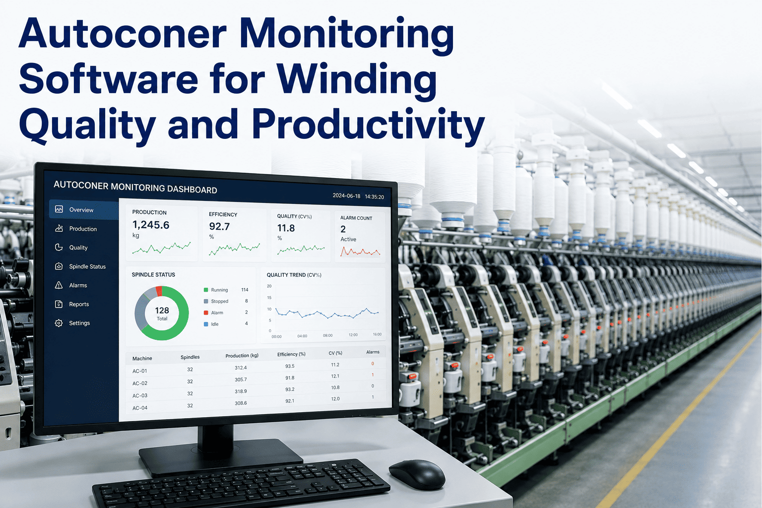
An autoconer running below its rated efficiency rarely announces itself with an alarm, it just quietly produces less than it should while every metric that would explain why, winding speed, clearer cut rate, splice quality, and drum condition, sits scattered across different machine displays that nobody checks together. By the time a supervisor notices output is down for the shift, the specific drum or splicer causing it has usually been running that way for hours. Autoconer monitoring software pulls every one of those metrics into one connected view per machine, so a productivity dip points straight to its cause instead of starting a floor-wide investigation. Winding department leads can book a demo to see it against their own autoconer fleet.
MACHINE MONITORING · AUTOCONER PERFORMANCE
See Every Autoconer's Real Performance, Not Just Total Output
Winding speed, clearer cuts, splice quality, drum efficiency, and stoppages connect in one view per machine, so a productivity dip points to its cause instead of starting a floor-wide search.
Winding Speed
1,340 m/min
Why Winding Metrics Rarely Get Looked at Together
Most autoconer machines display their own performance data locally, which means understanding what's actually happening across a full fleet requires walking the floor and manually noting numbers from each machine. That works for a spot check, but it doesn't build a trend, and it definitely doesn't catch a splicer whose quality has been drifting downward gradually over several shifts without ever crossing an obvious failure threshold.
Clearer cut rate is a particularly easy metric to misread in isolation. A high cut rate could mean the clearer is correctly catching yarn faults, or it could mean upstream yarn quality has degraded and the clearer is compensating for a problem that should be fixed further back in the process. Seeing cut rate next to splice quality and drum efficiency on the same machine makes that distinction much clearer.
SEE YOUR FLEET IN ONE VIEW
Watch Live Metrics Across Your Autoconer Fleet
A working session connected to your own winding machines and shift data.
What Each Metric Actually Tells You
| Metric | What a Drop Usually Means |
|---|
| Winding Speed | Tension inconsistency or a mechanical drag on the spindle |
| Clearer Cuts | Rising cuts often trace back to upstream yarn quality, not the clearer itself |
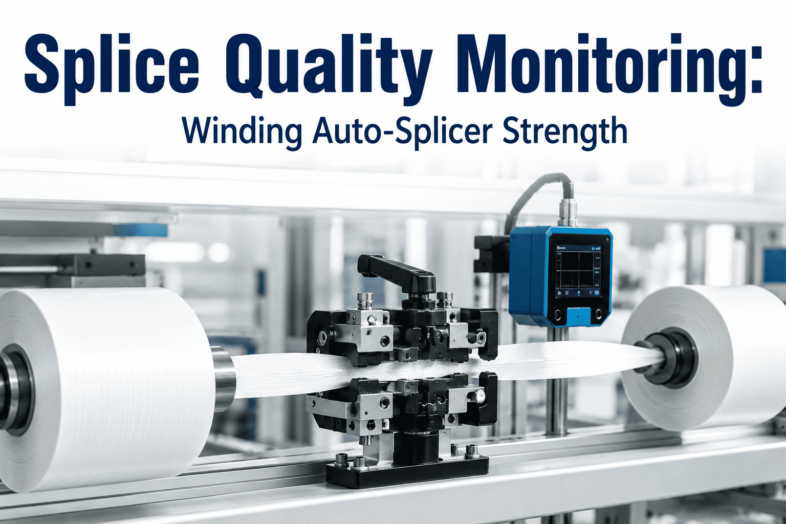
| Splice Quality | Splicer wear, air pressure drift, or incorrect splice parameters for the yarn |
| Drum Efficiency | Drum wear or surface contamination reducing effective winding time |
Turning Stoppage Data Into a Priority List
Every stoppage, whether it's a full bobbin change, a yarn break, or a maintenance stop, gets logged against the specific machine and cause automatically. Over a week or a month, that turns into a ranked list showing exactly which machines are losing the most productive time and why, which is a far more useful starting point for a maintenance conversation than a general sense that the winding department feels slower than it used to.
Per Machine
Every metric is tracked and trended individually, not blended into a department average
20%+
Productivity gains commonly reported in mills adopting connected machine monitoring
Ranked by Impact
Stoppage causes are ranked by lost production time, not just frequency
What a Winding Department Lead Told Us
We used to only find out a splicer was underperforming when someone complained about weak splices downstream. Now splice quality shows up as a trend line per machine, and we catch the drift two or three weeks before it would have become a customer-facing problem.
Winding Department Lead, Yarn Manufacturing Group
Benchmarking Machines Against Each Other, Fairly
Comparing raw output between two autoconers only tells part of the story if they're running different yarn types or package sizes, since those factors naturally affect winding speed and stoppage frequency regardless of machine condition. A fair benchmark normalizes for what each machine is actually running, so a comparison between two machines on the same yarn and package spec becomes a genuine signal of machine condition rather than a reflection of what happened to be scheduled on it that shift.
This matters most when deciding where to focus limited maintenance time. Without normalized benchmarking, a mill risks prioritizing a machine that only looks worse because it was running a harder yarn type, while a genuinely underperforming machine on an easier yarn type gets overlooked.
When a Machine Consistently Underperforms Its Peers
A machine that stays below its peer group across multiple metrics for several consecutive weeks, even after accounting for yarn type and package differences, is usually signaling something beyond routine maintenance, whether that's accumulated wear approaching a rebuild threshold or a persistent setup issue that a quick fix hasn't resolved. Tracking this pattern over time gives maintenance planning a much stronger basis for deciding when a machine needs a deeper overhaul rather than another round of minor adjustments.
Where Winding Stoppage Time Typically Goes
| Stoppage Cause | What It Usually Signals |
|---|
| Bobbin Change | Normal cycle time, worth tracking only if it trends upward |
| Yarn Break | Often traces to upstream yarn quality, not the winder itself |
| Splice Failure | Splicer wear or incorrect parameters for the yarn type |
| Mechanical Fault | Direct maintenance need, usually the smallest share of total stoppages |
Frequently Asked Questions
Does this work across different autoconer brands and models?
Yes, the platform connects to autoconer machines through standard machine data interfaces regardless of brand, and the monitoring layer normalizes the data so metrics are comparable across a mixed fleet. Older machines without digital output can often be added through supplementary sensors during setup. Fleet compatibility can be confirmed through
support before installation.
Can this data connect to our existing maintenance scheduling?
Yes, machines showing a sustained decline in drum efficiency or splice quality can trigger a maintenance work order automatically rather than waiting for a manual inspection to catch the same issue later. This connects monitoring directly to action instead of leaving trend data as a report that requires someone to remember to check it.
How is clearer cut data useful if the clearer is doing its job correctly?
A rising clearer cut rate is a useful early signal even when the clearer itself is functioning correctly, because it often means upstream yarn quality has degraded and needs investigation at an earlier process stage. Tracking cut rate trends by machine and shift helps catch that upstream issue faster than waiting for it to show up as a broader quality complaint. A
demo can show how cut rate trends connect to upstream process data.
How much production data history is kept for trend analysis?
Historical data is retained long enough to support seasonal and multi-month trend analysis, since gradual drift in metrics like splice quality often only becomes obvious over several weeks or months of comparison, not a single shift. This history also supports benchmarking a machine's current performance against its own baseline from when it was newly commissioned.
How long does setup take across a full winding department?
Most mills start with a pilot group of machines to validate data accuracy and dashboard configuration, then expand across the rest of the winding department over the following weeks. Full department rollout typically completes within a month once the initial pilot configuration is proven out.
STOP WALKING THE FLOOR TO FIND THE ANSWER
See Every Winding Metric in One Connected View
See how your own autoconer fleet's performance looks side by side.