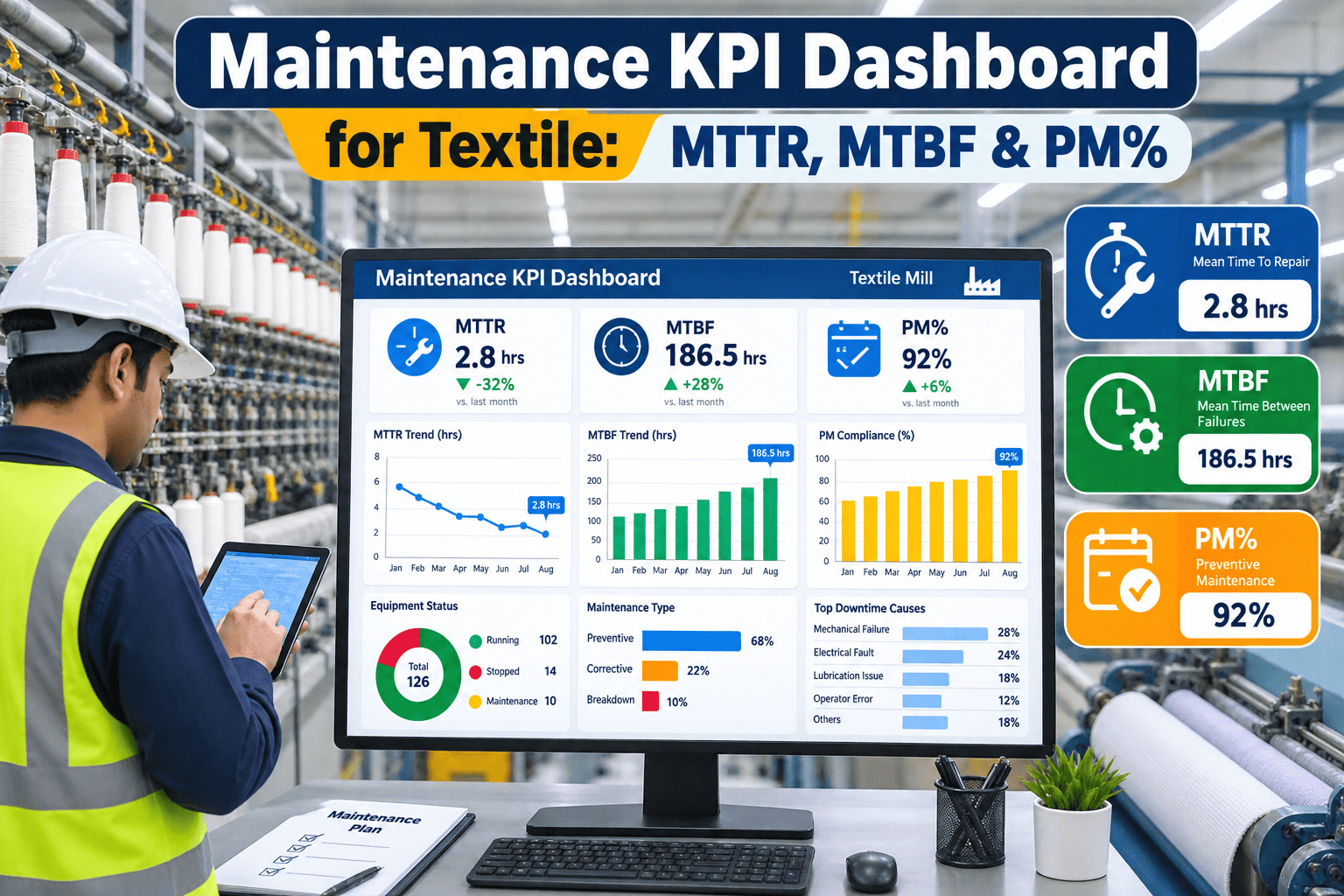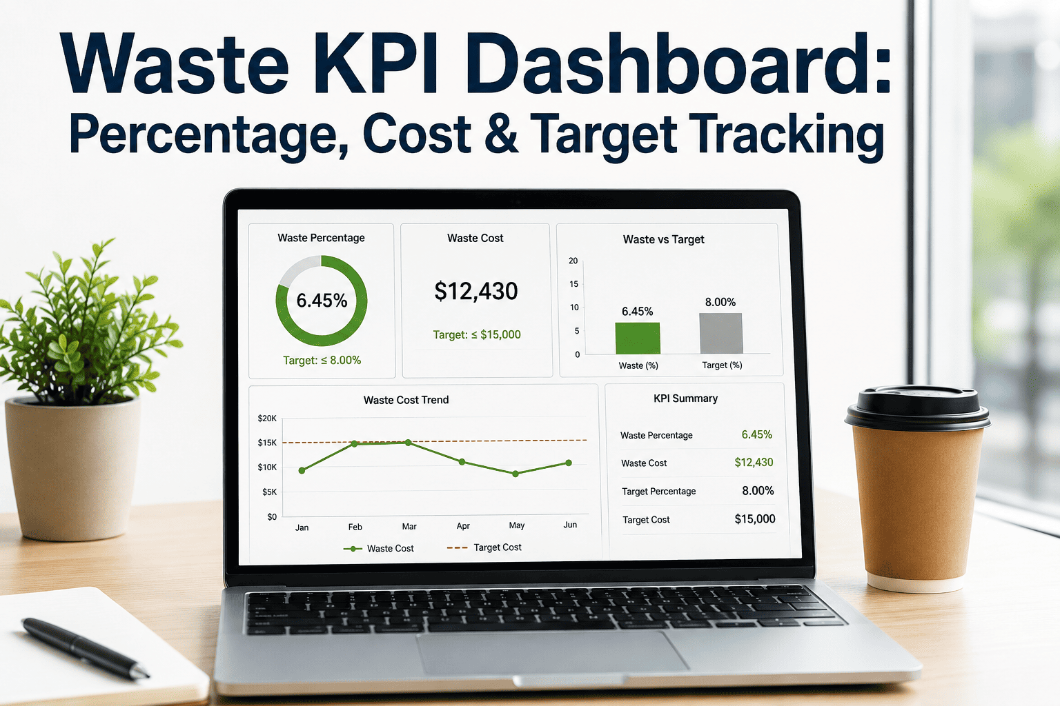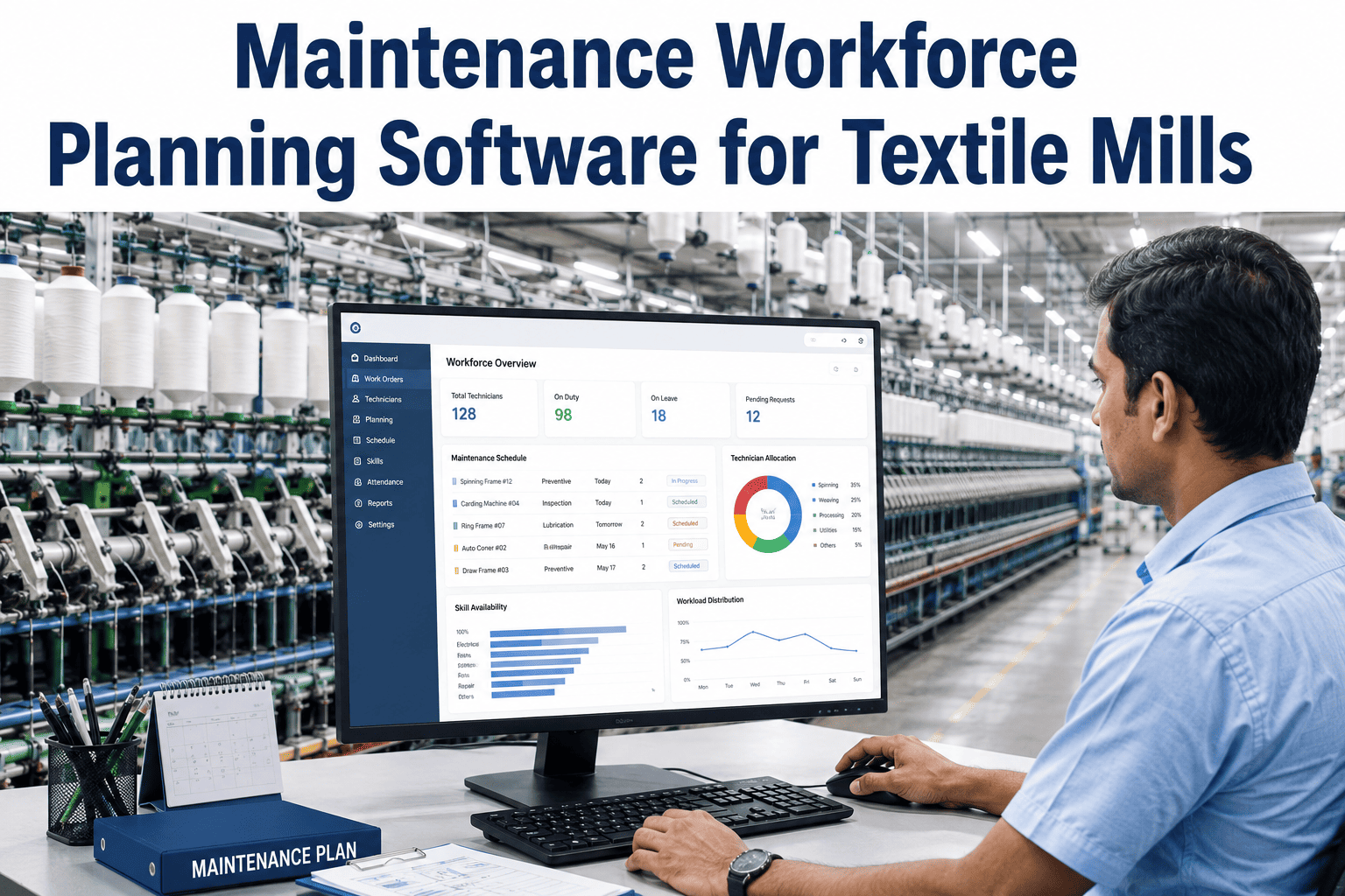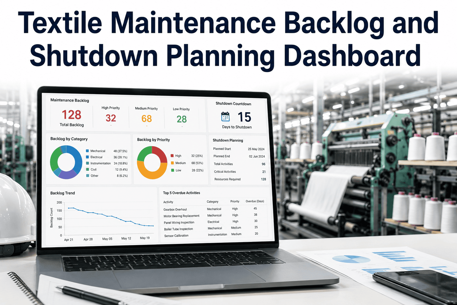
Most textile mills know their total maintenance spend down to the last invoice, because finance closes the books every month whether or not anyone understands what drove the number. What far fewer mills know is which asset, which failure mode, or which shift actually generated that cost, because spare parts, labor hours, and work orders usually live in three different systems that were never designed to talk to each other. iFactory's maintenance cost analytics dashboard pulls all three into one view ranked by dollar impact, so a maintenance manager can see exactly where the budget is going before the next monthly close, and you can book a demo to see it built around your own cost data.
Unplanned Downtime Costs Textile Mills $5,000 to $50,000 an Hour — Most Mills Only Find Out After the Invoice Arrives
iFactory's dashboard ranks every maintenance dollar by asset, failure mode, and shift in real time, replacing a monthly cost report with a live view your team can act on before the budget overruns.
Where a Typical Mill's Maintenance Budget Actually Goes
When cost is tracked at the asset and failure-mode level rather than a single monthly total, most mills find the spend is concentrated far more narrowly than the aggregate number suggests.
These proportions shift from mill to mill, which is exactly why a dashboard built on your own work order and spare parts data matters more than an industry average.
A Total Cost Number Cannot Tell You Which Asset to Fix First
A single monthly maintenance spend figure is useful for finance, but it gives a maintenance manager nothing to act on directly. The value sits in the breakdown underneath it, and that breakdown only exists if work orders, spare usage, and labor hours are connected at the asset level as they happen.
- One aggregate number, once a month
- No link between cost and specific asset
- Problems visible only after they compound
- Cost ranked by asset and failure mode
- Spare usage tied directly to work orders
- Budget overruns flagged as they build
A Cost Report That Arrives After the Month Closes Cannot Stop This Month's Overrun
iFactory's dashboard ranks maintenance spend by asset and cause in real time, so your team can act on the biggest cost driver today, not next month.
Four Cost Views Every Maintenance Manager Gets in One Dashboard
Asset-Level Cost Ranking
Every asset ranked by total maintenance spend over any selected period, surfacing the machines quietly consuming the most budget.
Spare Parts Burn Rate
Tracks which parts are consumed fastest and flags unusual consumption spikes tied to a specific asset or failure pattern.
Labor Cost by Work Order Type
Separates planned labor cost from emergency and overtime labor, showing exactly how much reactive work is inflating the labor line.
Breakdown Trend Over Time
Plots repeat failures on the same asset over months, flagging candidates for root-cause investigation rather than repeated patching.
Sample Asset Cost Ranking From a Live Dashboard
| Asset | MTD Cost | Top Cost Driver | Trend |
|---|---|---|---|
| Loom Bank C-3 | $8,240 | Emergency repair labor | Rising |
| Sizing Machine 2 | $5,910 | Spare part replacement | Stable |
| Compressor Room | $4,380 | Planned PM | Falling |
| Dye Jet 4 | $3,760 | Overtime labor | Rising |
What Mills Report After Moving to Live Cost Analytics
Reactive-to-planned maintenance transitions supported by connected cost data consistently deliver a similar pattern of savings across textile and broader manufacturing benchmarks.
Questions Maintenance and Finance Teams Ask About Cost Analytics
Stop Waiting for Month-End to Find Out Where Your Maintenance Budget Went
iFactory's dashboard connects work orders, spares, and labor into one live cost view ranked by real impact. Book a demo and see it built around your own maintenance data.