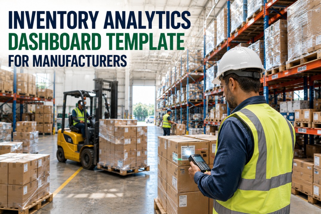
A manufacturing inventory analytics dashboard is the single most effective tool for reducing working capital while improving service levels. This template provides a complete inventory dashboard structure covering turns, days on hand, slow and non-mover identification, ABC classification, warehouse accuracy, and cycle count trends. Each component is designed to connect to your ERP inventory data and update in real time through iFactory. Deploy this template and replace static spreadsheets with a live inventory analytics dashboard that shows every layer of your inventory health in one view.
See Your Inventory ERP Data Live
Your Inventory Dashboard — Connected to Your ERP, Updated Automatically.
The inventory analytics dashboard template you just explored — scoreboard, turns by category, days on hand, slow-mover analysis, ABC classification, location accuracy, and accuracy trends — can be connected to your actual ERP data through iFactory in under a week. No manual data preparation, no custom coding, no waiting for IT. iFactory integrates directly with SAP, Oracle NetSuite, Microsoft Dynamics 365, Infor, Epicor, and other major manufacturing ERP platforms to pull inventory transactions, stock positions, and movement data into a live dashboard that updates automatically. Book a 30-minute personalised demo and we will show you your own inventory data running in our dashboard during the call — no obligation, no setup required on your end.
Inventory Analytics Scoreboard
The inventory scoreboard occupies the top section of every manufacturing inventory dashboard. These four metrics must be visible without scrolling — inventory turns, days on hand, slow-mover percentage, and total inventory value. Each card includes a trailing-period trend indicator so you can see direction at a glance. iFactory places these cards at the top of every inventory dashboard, pulling data from your ERP inventory module in real time.
Inventory Turns by Category
Inventory turns measure how efficiently each inventory category is moving through the plant. A higher turn rate means less cash tied up in storage. The dashboard template tracks turns for six inventory categories — raw materials, WIP, finished goods, MRO, packaging, and consignment — each compared against its target benchmark. The fill bar shows at a glance where performance is above or below target. iFactory calculates turns automatically from your ERP inventory movement data.
Inventory Days on Hand by Category
Days on Hand (DOH) shows how many days of production each inventory category can support at current consumption rates. Lower is better for cash flow, but safety stock requirements vary by category. The table below compares current DOH against target for each inventory category, with a rolling three-month trend column and clear status badges. iFactory surfaces this table directly from your ERP inventory data with automatic trend calculation.
| Category | Current DOH | Target DOH | Gap | Monthly Trend | Status |
|---|---|---|---|---|---|
| Raw Materials | 42 | 45 | -3 | on-target | Near Limit |
| WIP | 28 | 30 | -2 | on-target | Near Limit |
| Finished Goods | 72 | 60 | +12 | over-limit | Near Limit |
| MRO Supplies | 95 | 80 | +15 | over-limit | Near Limit |
| Packaging | 35 | 40 | -5 | on-target | Near Limit |
| Consignment | 14 | 20 | -6 | on-target | Near Limit |
| Total / Avg | 47.7 | 45.8 | +1.9 | — | — |
Identify Inventory Opportunities Instantly
The Classification and Trend Analysis Above — Now Live with Your Data.
The ABC classification table, slow-mover risk cards, and accuracy trend table you reviewed above are not static analyses — when connected to your live ERP inventory data through iFactory, they update automatically with every goods receipt, goods issue, cycle count, and inventory adjustment. The dashboard template surfaces the same information for your plant: which inventory categories are driving days on hand above target, which SKUs are at risk of becoming non-moving, which warehouse locations need accuracy improvement, and whether your cycle count programme is on track. Let iFactory show you these insights for your plant in a 30-minute demo using your actual ERP inventory data.
Slow Movers, Non-Movers & Stockout Risk
Identifying slow-moving, non-moving, excess, and stockout-risk inventory is the fastest path to working capital improvement. The four cards below categorise inventory by movement velocity and coverage. Each card shows the item count, total value, percentage of total inventory value, and a specific recommendation. iFactory computes these classifications automatically from your ERP transaction history so you can act without manual analysis.
ABC Classification & Inventory Strategy
ABC classification segments inventory by value contribution so you can apply the right level of control to each class. A-items (typically 10-20% of SKUs) represent 70-80% of total value and deserve the tightest management. B-items represent 15-25% of value, and C-items, while numerous, contribute only 5-10%. The table below shows each class with counts, value, turns, DOH, cumulative percentage, and the recommended inventory strategy.
| Class | Items | Total Value | % of Total | Avg Turns | Avg DOH | Cumulative % | Strategy |
|---|---|---|---|---|---|---|---|
| A — High Value | 420 | $18.2M | 74% | 8.1 | 35 | Tight control, frequent cycle counts, accurate demand forecasting, JIT replenishment. | |
| B — Medium Value | 680 | $4.8M | 19.5% | 5.2 | 58 | Moderate control, monthly cycle counts, min-max replenishment. | |
| C — Low Value | 1,240 | $1.6M | 6.5% | 2.8 | 112 | Simplified control, quarterly counts, bulk replenishment, higher safety stock. | |
| Total | 2,340 | $24.6M | 100% | 5.4 | 68.3 | — |
Inventory Accuracy & Performance by Location
Inventory accuracy varies significantly by storage location. Main warehouse bins typically achieve higher accuracy than line-side or rework locations. The four cards below show item count, total value, bin accuracy percentage, and fill rate for each major inventory location in your plant. The status dot provides an immediate visual alert if bin accuracy or fill rate drops below acceptable thresholds. iFactory pulls this data from your warehouse management system.
Inventory Accuracy & Cycle Count Trends
Tracking inventory accuracy over time is essential for maintaining data integrity in your ERP system. The table below shows six months of physical inventory accuracy, record accuracy, cycle count completion percentage, and net variance discovered. Each metric includes an inline progress bar for visual context. The six-month average row provides a baseline for evaluating whether your inventory management processes are improving. iFactory generates this trend table automatically from your cycle count programme data.
| Month | Physical Accuracy | Record Accuracy | Cycle Count Completion | Variance ($) |
|---|---|---|---|---|
| Jan | 97.2% | 94.8% | 92% | $42K |
| Feb | 96.8% | 95.1% | 94% | $38K |
| Mar | 98.1% | 96.3% | 96% | $31K |
| Apr | 97.5% | 95.8% | 93% | $35K |
| May | 98.4% | 96.9% | 97% | $28K |
| Jun | 98.7% | 97.2% | 98% | $24K |
| 6-Month Avg | 97.8% | 96.0% | 95% | $33K |
Inventory Analytics Dashboard FAQ
What inventory KPIs should a manufacturing dashboard include?
The essential inventory KPIs for a manufacturing dashboard are inventory turns, days on hand (DOH), slow-mover and non-mover percentage, ABC classification distribution, bin accuracy, cycle count completion rate, and stockout frequency. Most manufacturing organisations start with turns and DOH as the primary metrics since they directly measure working capital efficiency, then layer on quality metrics like accuracy and completeness as the dashboard matures. iFactory's pre-built inventory dashboard includes all these KPIs connected to your ERP data out of the box.
How often should inventory dashboard data be refreshed?
Inventory dashboard refresh frequency depends on the velocity of your inventory movements. For most discrete manufacturing environments, daily refresh is sufficient — inventory positions change overnight with production consumption and supplier receipts. For high-volume or just-in-time environments, intra-day refresh (every 1-4 hours) may be appropriate. Physical inventory accuracy metrics and cycle count completion percentages typically refresh weekly. iFactory supports configurable refresh intervals from real-time streaming to daily batch, matching your ERP's data update cadence.
Can the template connect to ERP inventory data?
Yes. The inventory analytics dashboard template connects directly to your ERP inventory module — including SAP, Oracle NetSuite, Microsoft Dynamics 365, Infor, Epicor, IQMS, and Epicor Kinetic. iFactory's integration layer maps ERP inventory transactions (goods receipt, goods issue, transfer, adjustment, cycle count) into the dashboard's data model automatically. The connector supports both real-time API polling and scheduled batch extraction, depending on your ERP's integration capabilities. No manual data preparation is required.
How do you calculate inventory days on hand?
Inventory Days on Hand (DOH) is calculated as: (Average Inventory Value / Cost of Goods Sold) x 365 days. More specifically, DOH = (Current Inventory Value / Average Daily COGS). For example, if your raw materials inventory value is $2.5M and your average daily raw material consumption is $55,000, your DOH is $2.5M / $55,000 = 45.5 days. The dashboard template computes DOH automatically for each inventory category using your ERP's inventory valuation and consumption data, so you don't need to run the calculation manually.
What is the difference between slow movers and non-movers?
Slow movers are inventory items that have had at least one consumption transaction in the past 90 to 180 days but with a low turnover rate — typically fewer than one consumption event per quarter. Non-movers (also called dead stock) are items with zero consumption transactions in the past 180 days or more. The practical difference is that slow movers may still have planned future use (seasonal demand, long-cycle projects), whereas non-movers rarely have planned consumption and should be candidates for disposal, donation, or supplier return. The inventory dashboard template applies configurable date thresholds so you can align the classification with your business rules.
Deploy This Inventory Dashboard Template
Stop Guessing Inventory Levels. Start Monitoring with a Live Dashboard Connected to Your ERP.
You now have a complete inventory analytics dashboard template covering inventory turns, days on hand, slow-mover and non-mover identification, ABC classification with cumulative value analysis, warehouse location accuracy tracking, and month-over-month accuracy trends. The next step is deploying these components as a live dashboard connected to your actual ERP inventory data so you can see your inventory position, movement patterns, and risk areas in real time without waiting for end-of-month reports. iFactory ships a pre-built inventory dashboard from your existing ERP data on day one, configured for your inventory categories, warehouse locations, and organisational structure. Book a 30-minute demo and we will show you your inventory dashboard during the call — your data, your categories, your plant.