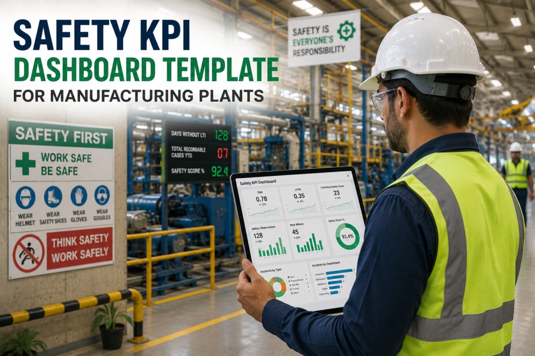
A quality metrics dashboard is the single most important screen for any plant leader who wants to move from reactive quality management — chasing defects after they happen — to proactive quality control where trends are visible before they become problems. This page provides a ready-to-use quality metrics dashboard template with seven dashboard components that cover every major quality domain: first-pass yield, defect parts per million, non-conformance report aging, corrective action effectiveness, and trend analysis. Each component is designed to be fed directly from your inspection, CMM, and ERP data sources. iFactory ships a live quality dashboard from your existing inspection data on day one.
Quality Dashboard Health Scoreboard
Every quality dashboard needs a top-level summary that tells the plant leader whether quality is under control — or deteriorating — at a single glance. These four aggregate metrics form the executive layer of the quality dashboard template, providing the context for all deeper drill-down analysis. iFactory places these cards at the top of every quality dashboard, colour-coded green, amber, or red based on configurable thresholds.
Quality KPI Deep-Dive Cards
Below the executive scoreboard, the quality dashboard template provides drill-down KPI cards for each major quality metric. Each card shows the current period value, the target, the variance percentage, and an inline attainment bar that visually communicates how close the plant is to its quality target. These cards replace the static tables that most plants still use for quality reporting, giving operators and supervisors immediate visual context without needing to interpret rows of numbers.
First-Pass Yield by Production Line
Aggregate FPY hides significant variation between lines. A plant-level FPY of 94% might mask one line running at 98% and another at 82% — the aggregate tells you nothing about where to focus improvement effort. The table below breaks FPY down to individual production lines, showing current performance against target with an inline micro sparkline that shows the three-month trend. iFactory generates this table automatically from inspection data, updating in real time as new quality results are recorded.
| Production Line | FPY % | Target | Gap | 3-Month Trend | Status |
|---|---|---|---|---|---|
| Assembly A | 97.2% | 96.0% | +1.2pp | On Target | |
| Assembly B | 94.8% | 96.0% | −1.2pp | Below Target | |
| Paint Shop | 88.3% | 94.0% | −5.7pp | Critical | |
| Fabrication | 95.6% | 96.0% | −0.4pp | Near Target | |
| Packaging | 98.1% | 97.0% | +1.1pp | On Target | |
| Welding | 93.2% | 95.0% | −1.8pp | Below Target | |
| Quality Lab | 99.0% | 98.0% | +1.0pp | On Target | |
| Warehouse | 99.4% | 98.0% | +1.4pp | On Target |
Defect Pareto Breakdown
The Pareto principle — roughly 80% of quality issues come from 20% of defect types — is one of the most powerful analytical tools in a quality dashboard. Ranking defect types by frequency immediately highlights where corrective action will have the greatest impact. The table below ranks the top defect categories by occurrence count, showing the cumulative percentage alongside a visual bar and a three-level severity dot indicator. iFactory applies Pareto logic automatically, updating the ranking in real time as new defects are recorded in the inspection system.
| Rank | Defect Type | Count | % of Total | Cumulative % | Severity |
|---|---|---|---|---|---|
| 1 | Surface finish defects | 342 | 24.8% | 24.8% | |
| 2 | Dimensional tolerance | 218 | 15.8% | 40.6% | |
| 3 | Material contamination | 184 | 13.3% | 53.9% | |
| 4 | Assembly misalignment | 156 | 11.3% | 65.2% | |
| 5 | Weld porosity | 127 | 9.2% | 74.4% | |
| 6 | Paint thickness variance | 98 | 7.1% | 81.5% | |
| 7 | Packaging damage | 76 | 5.5% | 87.0% | |
| 8 | Labelling errors | 52 | 3.8% | 90.8% |
NCR Severity & Disposition Matrix
Understanding not just how many non-conformance reports exist, but how they are being resolved, gives plant leaders a complete picture of quality response effectiveness. The matrix below cross-tabulates NCRs by severity class (Critical, Major, Minor) and disposition outcome (Scrap, Rework, Use-as-Is, Return to Supplier). Each cell shows the count and a colour intensity that highlights the dominant combinations. A concentration of Critical/Scrap cells, for example, signals a fundamental process failure rather than an isolated quality lapse.
| Severity \ Disposition | Scrap | Rework | Use-as-Is | Return to Supplier | Total |
|---|---|---|---|---|---|
| Critical | 18 | 6 | 2 | 11 | 37 |
| Major | 12 | 22 | 8 | 4 | 46 |
| Minor | 3 | 7 | 14 | 2 | 26 |
CAPA Resolution Timeline
Corrective and Preventive Actions (CAPAs) lose their value the longer they remain open. An effective quality dashboard must not only show which CAPAs are open, but also track progress through each stage of the resolution workflow. The five-step timeline below shows the standard CAPA lifecycle that iFactory's quality dashboard tracks for every corrective action, with the current distribution of open CAPAs across each stage and the average days spent in each phase.
Quality Metrics Monthly Trend Table
Month-over-month trend analysis is the mechanism that turns quality data from a historical record into a forward-looking management tool. The trend table below tracks five key quality metrics across the most recent six months, with each cell colour-coded by performance against target and paired with a directional arrow indicator. This view answers the question "Are we getting better or worse?" for every major quality dimension at a glance. iFactory's quality dashboard generates this table automatically with no manual data manipulation required.
| Metric | Target | Jan | Feb | Mar | Apr | May | Jun |
|---|---|---|---|---|---|---|---|
| First Pass Yield | >96% | 93.8% ▲ | 94.1% ▲ | 93.5% ▼ | 94.8% ▲ | 95.2% ▲ | 94.2% ▼ |
| DPPM | <500 | 1,520 ▲ | 1,480 ▼ | 1,380 ▼ | 1,310 ▼ | 1,280 ▼ | 1,240 ▼ |
| Scrap Rate | <2.5% | 4.2% ▲ | 4.0% ▼ | 3.9% ▼ | 4.1% ▲ | 4.0% ▼ | 3.8% ▼ |
| OTD Quality | >98% | 97.2% ▼ | 97.5% ▲ | 97.8% ▲ | 98.1% ▲ | 97.6% ▼ | 96.8% ▼ |
| Audit Score | >95 | 87 ▲ | 88 ▲ | 90 ▲ | 89 ▼ | 90 ▲ | 91 ▲ |
Quality Metrics Dashboard FAQ
What is a quality metrics dashboard?
A quality metrics dashboard is a visual display of the most important quality performance indicators for a manufacturing plant, updated in real time or near-real time from inspection, test, and production data sources. It replaces static weekly quality reports with live, interactive views that allow plant leaders to spot trends, identify issues, and drill down into root causes without waiting for the next report cycle.
Which quality KPIs should every dashboard include?
A minimum viable quality dashboard should include First Pass Yield (FPY), Defective Parts Per Million (DPPM), Scrap Rate, and Non-Conformance Report (NCR) aging. More advanced dashboards add On-Time Delivery Quality, internal audit scores, CAPA closure rate, and cost of quality (COQ). The exact KPI set depends on the plant's quality management system and the specific quality risks in your production process.
How often should quality dashboard data be refreshed?
The refresh cadence depends on the metric. FPY and DPPM should update in real time as each unit passes or fails inspection. NCR aging and CAPA status should update daily, aligned with the quality team's review cycle. Monthly trends and audit scores can refresh at the end of each month. iFactory's quality dashboard supports multiple refresh cadences simultaneously, so real-time inspection data appears alongside monthly trend data without conflict.
What is the difference between FPY and DPPM?
First Pass Yield (FPY) measures the percentage of units that pass all quality inspections on the first attempt without requiring rework. It is a process-centric metric that tells you how well your production process is performing. Defective Parts Per Million (DPPM) measures the number of defective units per million produced, and it is a customer-centric metric that tells you how many defects are reaching the customer. A plant can have high FPY but high DPPM if rework processes catch defects before they ship, or low FPY but low DPPM if every unit is inspected and reworked before shipment. Both metrics should be tracked together for a complete quality picture.
How do you calculate CAPA closure rate?
CAPA closure rate is calculated as the number of CAPAs closed within the target timeframe divided by the total number of CAPAs due for closure in the same period, multiplied by 100. For example, if 20 CAPAs were due for closure this month and 17 were closed on time, the closure rate is 85%. Most quality management systems target a closure rate above 90%. Tracking closure rate by responsible department can reveal systemic bottlenecks in the CAPA process — a consistently low closure rate in one department may indicate inadequate resources or training rather than individual performance issues.
Deploy This Dashboard
Stop Building Quality Reports. Start Using a Quality Dashboard.
You now have a complete quality metrics dashboard template — executive scoreboard, KPI deep-dive cards, FPY by production line with trend sparklines, a defect Pareto breakdown, NCR severity/disposition matrix, CAPA resolution workflow, and a monthly quality trend table. The next step is deploying these components as a live dashboard connected to your actual inspection data. iFactory ships a pre-built quality dashboard from your existing quality data on day one, with no manual setup or custom development required. Book a 30-minute personalised demo and we will show you your plant's quality data in our dashboard during the call.