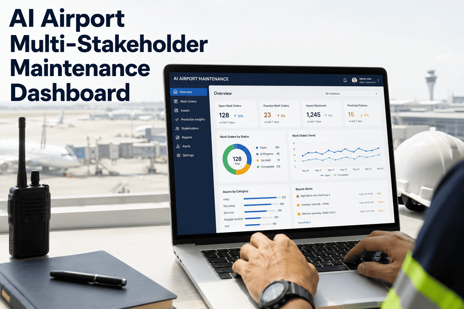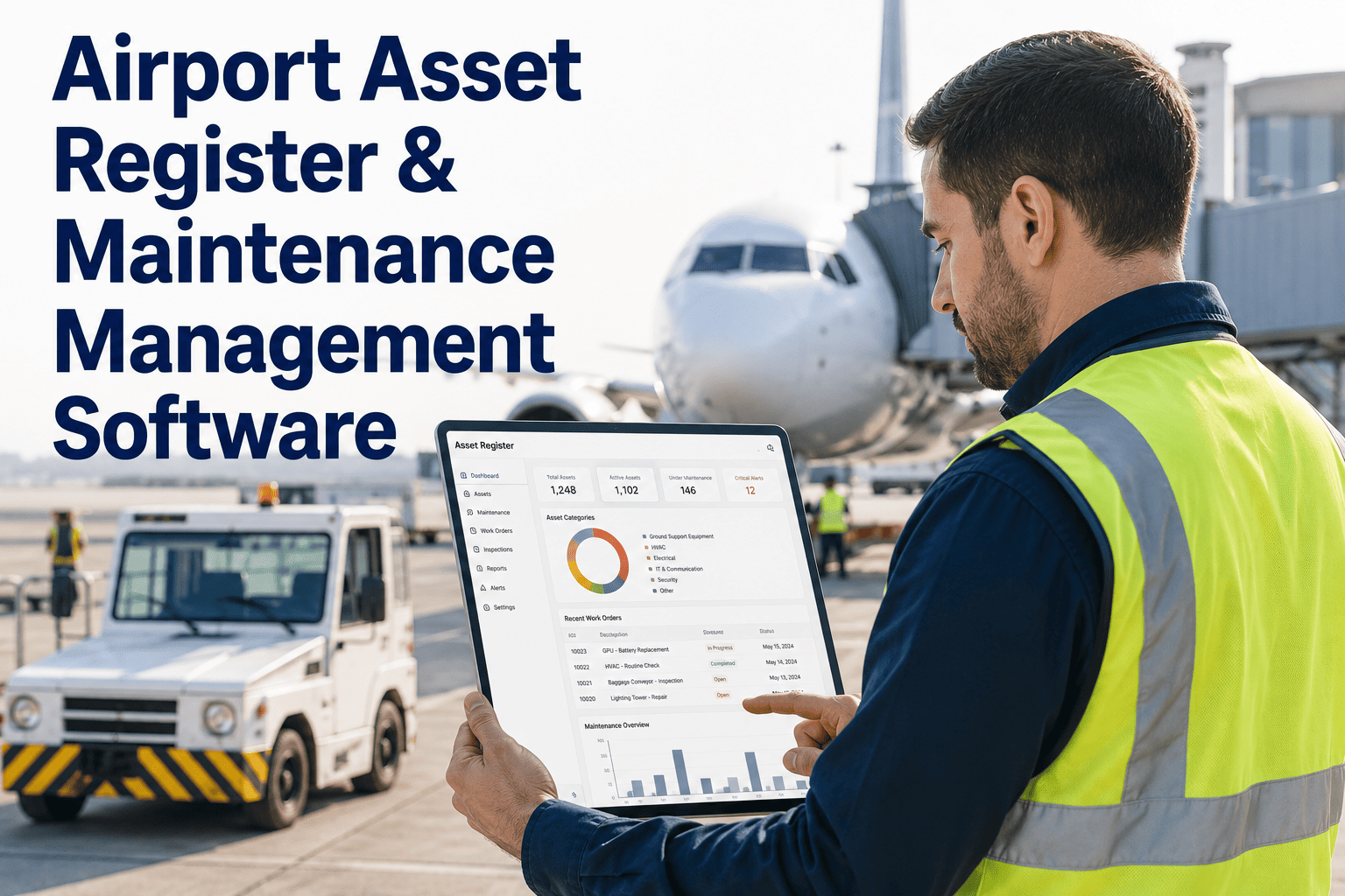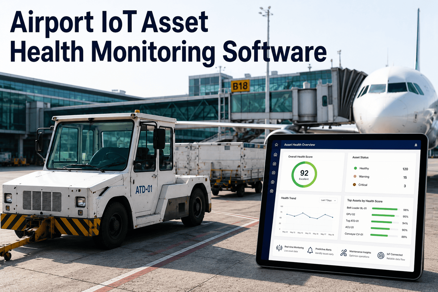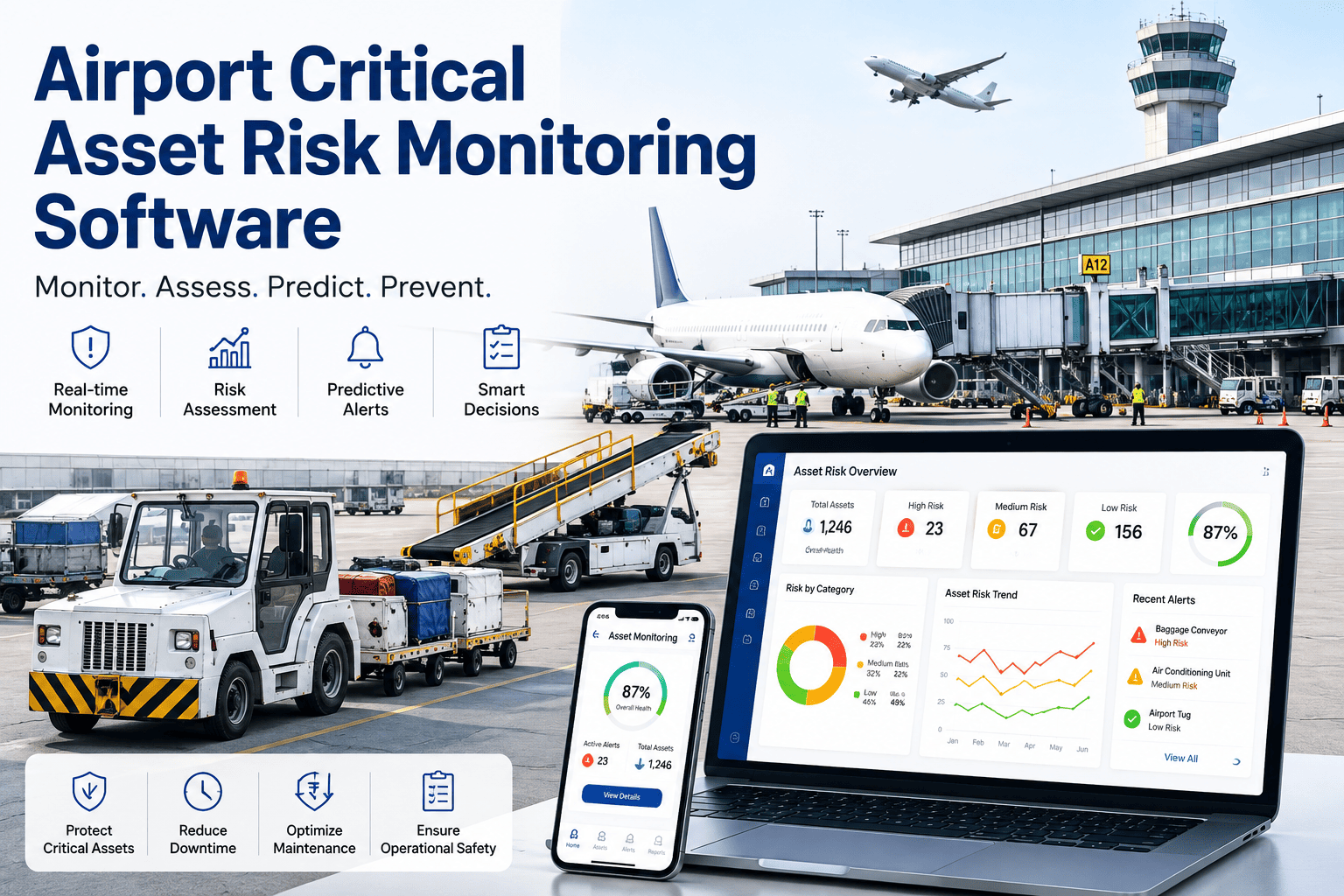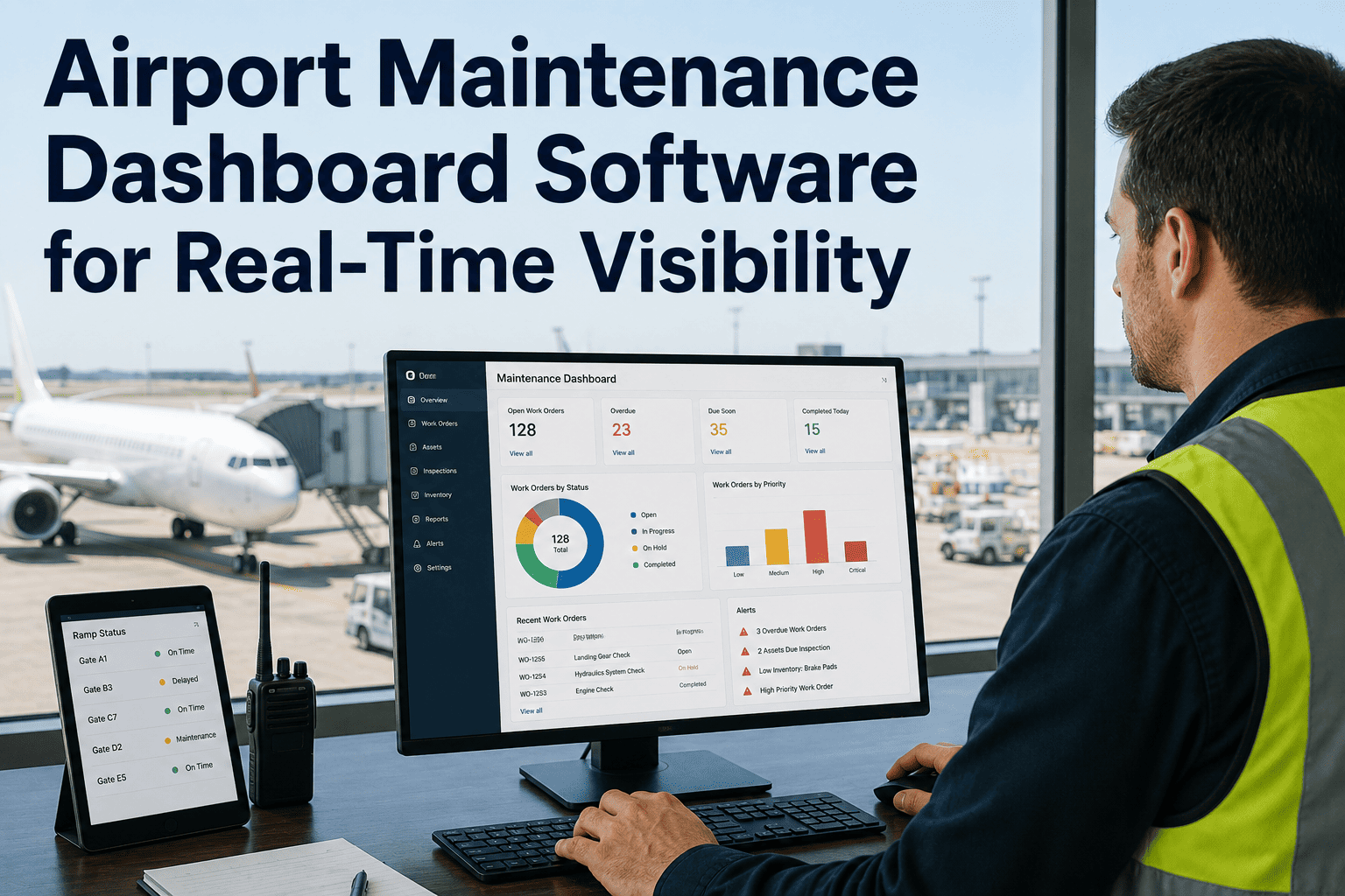
An airport operations director can usually tell you what happened yesterday. Far fewer can tell you, at this exact moment, how many jet bridges are down across four terminals, which work orders just breached their response window, or whether HVAC compliance in Concourse B has quietly slipped below target. That blind spot exists because most airport maintenance data still lives in separate terminal spreadsheets, separate CMMS instances, and separate shift reports that only get assembled into a full picture the next morning — by which point the decision that mattered already had to be made without it. A real-time operations dashboard closes that gap by pulling asset status, work orders, KPIs, and compliance data into one live screen, which is exactly what airport teams are building with iFactory's airport operations engineering team.
Not every airport starts from the same place, and that's fine — the dashboard is built to layer on top of whatever exists today, whether that's a mature CMMS in one terminal and paper logs in another, or four completely different tracking habits across the property. What matters is the destination: one live view that everyone from the ramp to the boardroom can trust.
See Every Terminal, Every Asset, Every Work Order — On One Live Screen
Stop reconstructing yesterday's operations from spreadsheets. Monitor asset health, GSE readiness, open work orders, maintenance KPIs, and compliance risk across every terminal in real time, so your operations center makes today's decisions with today's data — and catches problems while a fix still takes minutes instead of hours.
Four Terminals, Four Data Silos, One Delayed Picture
Running maintenance across a multi-terminal airport is rarely a coordination problem first — it's an information architecture problem. Each terminal often runs its own tracking approach, some on a CMMS, some on spreadsheets, some on radio calls and paper logs, and none of them talking to each other in real time. The operations center director ends up assembling the real picture from phone calls and end-of-shift reports, which means the answer to "what's actually happening right now" always arrives late.
This isn't a technology gap so much as a visibility gap, and it grows worse exactly when the airport can least afford it. Peak travel periods, weather disruptions, and cascading equipment failures all put pressure on the same operations center that a quiet Tuesday afternoon barely tests. When four separate terminal teams are each managing their own version of the truth, small delays in one terminal's reporting can hide the early signal of a bigger problem building across the whole property, and by the time it surfaces in a consolidated report, the window for a proactive response has often already closed.
The cost of that delay compounds fast in an airport environment. A baggage system slowdown that isn't visible for twenty minutes can mean bags missing flights before anyone reacts. A jet bridge fault that surfaces at shift change instead of the moment it happened adds delay minutes that cascade into missed connections across the network. And when leadership asks for a KPI trend across the full property, the honest answer is often that nobody can produce it without days of manual reassembly. A live dashboard replaces that lag with a single, continuously updated view every stakeholder can trust at the same time, whether they're standing on the ramp or sitting in a leadership review three floors up.
Six Core KPIs A Real-Time Airport Dashboard Should Surface Automatically
A dashboard is only as useful as the metrics it puts in front of the people who need them. The six KPI cards below are the maintenance metrics that consistently drive decisions in an airport operations center — each calculated automatically from work order and asset data instead of assembled by hand at month end, and each one filterable down to a specific terminal or asset class the moment leadership needs to know where a trend is actually coming from.
What A Real-Time Airport Operations Dashboard Actually Shows
A live dashboard is not one chart — it's four connected views that let an operations center answer "what's happening, where, and how urgent" in seconds instead of phone calls. The four zones below are what a well-built airport maintenance dashboard puts on screen at all times, working together as one continuously updated picture rather than four separate tools someone has to check in turn.
Why Spreadsheet-Assembled Reports Can't Keep Up With Airport Operations
Every airport already produces some version of an operations report. The problem is when that report is a snapshot from yesterday, hand-built from four different terminal sources, by the time anyone reads it. The comparison below is the structural reason manual reporting cycles fall behind real-time operations at scale, and why the gap tends to widen rather than close as an airport adds terminals, concourses, and asset categories over time.
| Dimension | Manual, Spreadsheet-Based Reporting | Real-Time Operations Dashboard |
|---|---|---|
| Data Freshness | Hours to a full day old | Live, updated as work happens |
| Cross-Terminal View | Manually reconciled from separate files | Automatically consolidated, one screen |
| Alert Speed | Depends on someone noticing and calling | Automatic threshold-based push alerts |
| KPI Calculation | Manually recalculated, error-prone | Automated from work order timestamps |
| Executive Reporting | Built fresh for each meeting | Live view, ready at any time |
| Response To Emerging Risk | Reactive, after the fact | Proactive, flagged before escalation |
The gap is most dangerous during the moments that matter most — a weather event, a peak travel period, or a cascading equipment failure — precisely when manual reporting cycles are slowest and a live dashboard's value is highest. Airports that centralize this data stop reacting to yesterday's problems and start managing today's risk while it's still manageable.
Walk Through A Live Operations Dashboard Built On Your Asset Data
Book a walkthrough and see how iFactory's airport operations platform pulls asset status, work orders, KPIs, and compliance alerts from every terminal into one real-time view your operations center can act on immediately.
How An Alert Moves From Detection To Resolution
A dashboard's real value shows up in how fast a problem travels from "something changed" to "someone is already fixing it." The four-stage flow below is what happens automatically once a live dashboard is watching every asset across the property, and it's the sequence that determines whether a fault becomes a five-minute fix or a delay that ripples across the whole schedule.
What The Same Dashboard Means For Four Different Roles
A single live dashboard means something different depending on who's looking at it, which is exactly why it replaces four separate reporting habits instead of adding a fifth one. The same underlying data, filtered differently for each role, is what keeps every stakeholder working from one consistent version of reality instead of four separate interpretations of it.
The airports that struggle most with maintenance visibility are almost never short on data — they're short on a shared, current view of it. Every terminal is tracking something, every crew has a spreadsheet, every shift produces a report, and none of it lines up by the time leadership needs an answer. The shift that changes everything is moving from "let's pull that together for the meeting" to "it's already on the screen." Once an operations center can see asset status, open work orders, and KPI trends live, the entire posture of the team changes from reactive to anticipatory. You start catching a PM compliance dip on a Tuesday instead of explaining it after an audit finds it in March. That single change in timing is where most of the operational value actually lives.
Frequently Asked Questions
Put Every Terminal, Every Asset, And Every KPI On One Live Screen
iFactory's airport maintenance dashboard consolidates asset status, work orders, KPIs, and compliance alerts across every terminal into one real-time view, so your operations center makes today's decisions with today's data instead of yesterday's report, and catches emerging risk while there's still time to act on it. See what your own property looks like on one screen before your next shift briefing.