Cement plants running a mix of grid power, captive generation, and increasingly solar or other renewable sources often end up with their clearest energy picture in a spreadsheet someone rebuilds manually each month. That works until a sustainability report, a cost allocation question, or a board-level emissions target needs the exact same numbers broken down differently, and the manual rebuild starts eating real time every single reporting cycle. A connected dashboard that maps every meter to its actual power source keeps renewable generation, grid import, and consumption by process all available from the same underlying data, so a new report is a different view, not a new data collection exercise, and if you want to see this mapped against your own plant's power sources, you can walk through a source mapping example with our team.
See Renewable Generation and Grid Consumption in One Connected Dashboard
A single source of truth mapping every meter to its power source, so renewable generation, grid import, and process-level consumption are always ready for whatever report comes next.
Why Source Mapping Has to Come Before Everything Else
Before any meaningful renewable or cost dashboard can work, every meter in the plant needs a clear, documented link to the power source it actually measures.
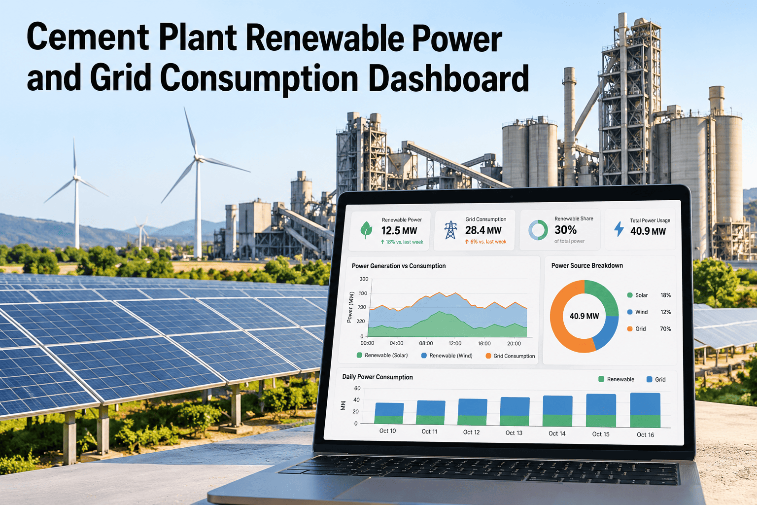
Renewable Generation Against Grid Import, Compared Directly
Seeing both sides of the power supply in one view makes it immediately clear how much the plant is actually relying on the grid versus its own generation on any given day.
Breaking Consumption Down by Process
Once sources are mapped, the same data can be viewed from the consumption side, showing which processes are drawing from which source.
| Process area | Typical power source mix | What to watch for |
|---|---|---|
| Raw mill and kiln line | Primarily grid and captive baseload | Consumption pattern against production schedule |
| Cement mill and packing | Mixed, including renewable where available | Peak demand timing against tariff structure |
| Utilities and compressed air | Often grid-sourced, steady baseline load | Idle consumption during low-production periods |
| Site lighting and auxiliary | Frequently a renewable or solar candidate | Daytime versus nighttime consumption split |
This view is also what makes it possible to identify which processes would benefit most from additional renewable capacity, based on when they actually draw power relative to generation availability.
Map Your Own Meters and Sources
Share your current meter list and power sources and we will show how a connected dashboard would organize them.
How Cost Allocation Follows the Same Mapped Structure
Once consumption is tied to source, assigning an accurate cost per process becomes a direct calculation instead of a plant-wide average applied uniformly.
What a Single Connected View Actually Replaces
The real value of connecting these data streams is not any single report, it is that every future report draws from the same consistent source.
What iFactory Cement and Energy Specialists Recommend
iFactory cement and energy specialists who help plants set up this kind of dashboard consistently find that the source mapping step, while the least exciting part of the project, is what determines how useful every later report actually turns out to be, so it is worth getting right before building any dashboard view on top of it.
They also note that plants adding renewable capacity gradually benefit most from mapping consumption by process early, since it gives a clear, data-backed answer to which process areas would see the most benefit from the next phase of renewable investment.
What Energy and Sustainability Teams Ask About This Dashboard
Bring Renewable and Grid Consumption Tracking to Your Plant
Book a session with iFactory AI to map your meters, sources, and process-level consumption into one connected dashboard.