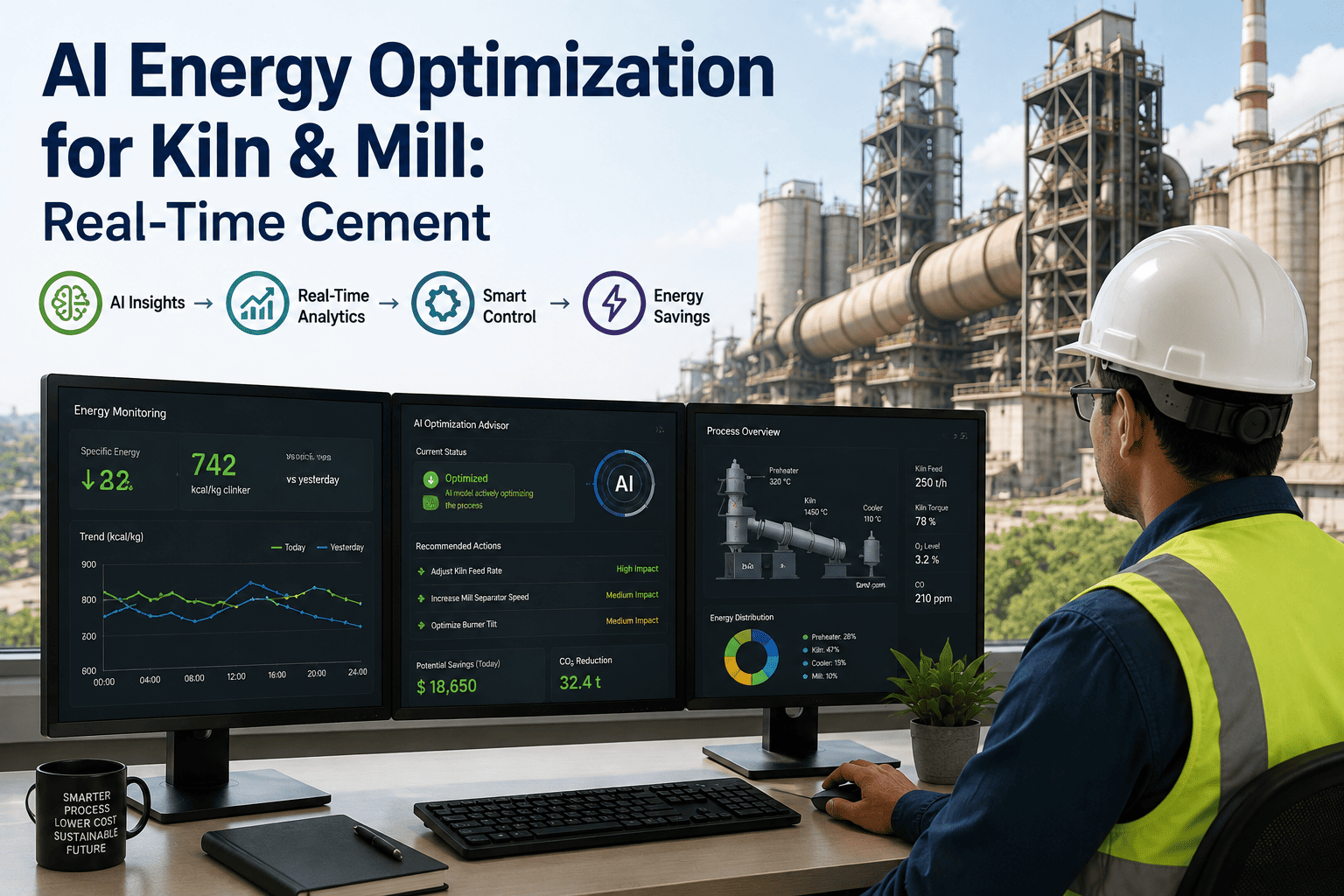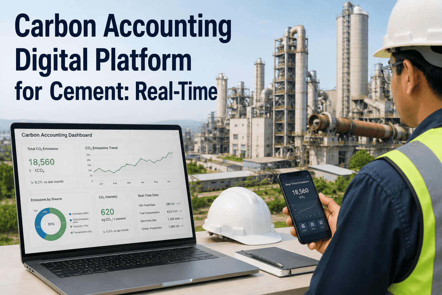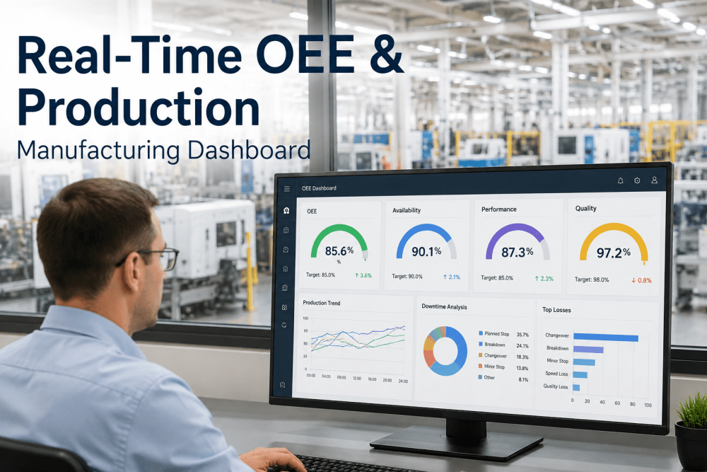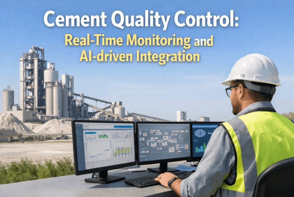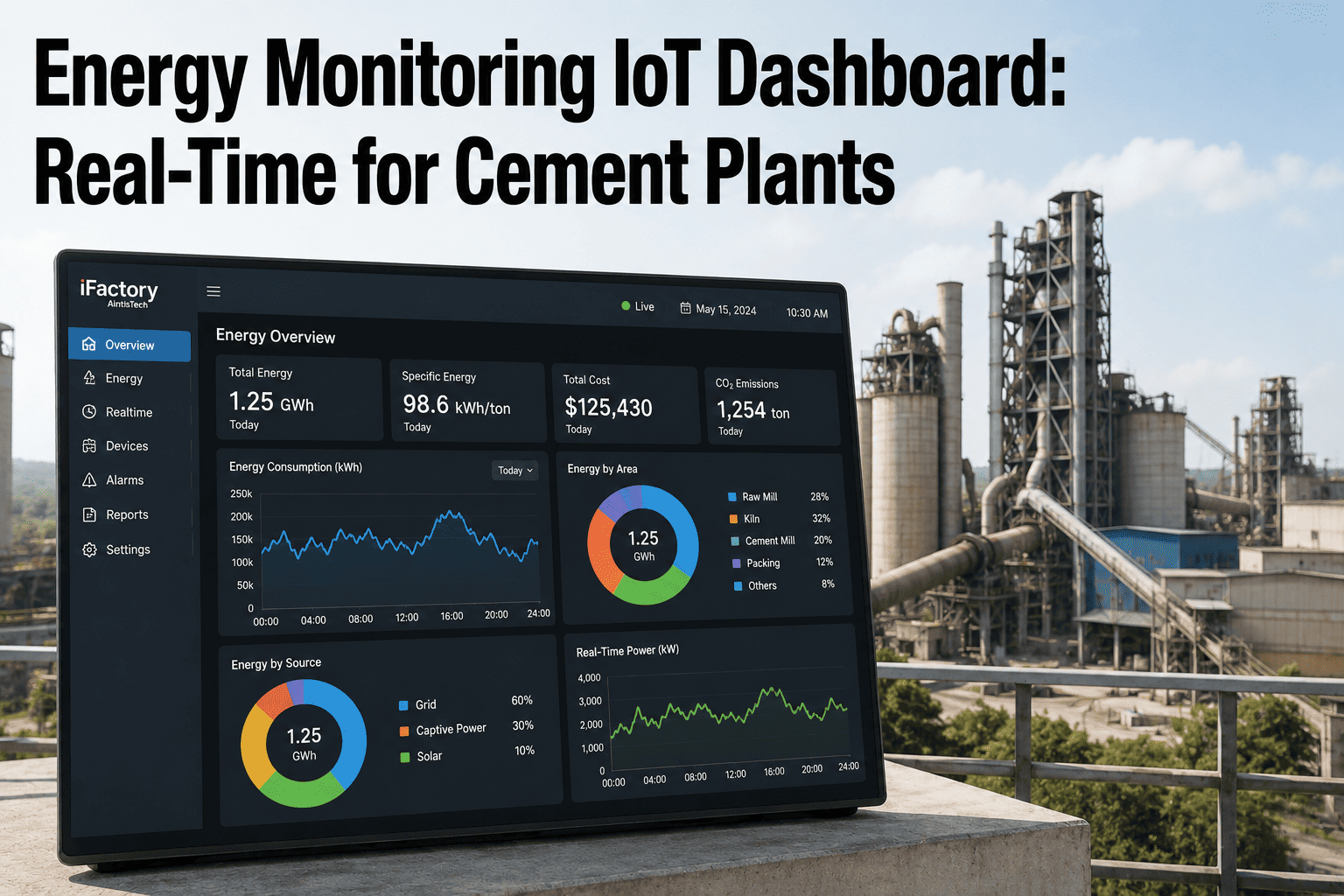
Most cement plants still run their energy program on a 30-day lag. The utility bill arrives, someone compares it to last month, and if the number is up, the investigation starts weeks after whatever caused it has already happened again several times. By the time a raw mill's specific power creeps from 32 kWh/t to 38 kWh/t, or a kiln line starts drawing more per tonne than its identical twin next to it, that drift has usually been running for weeks inside a monthly total that looked unremarkable until someone finally broke it down. A real-time dashboard doesn't just move that same number onto a screen — it turns consumption into something visible department by department, hour by hour, so drift shows up as a trend line instead of a surprise on next month's invoice, and that visibility is worth seeing against your own plant's meter data in a demo.
Energy Monitoring IoT Dashboard for Cement Plants
Real-time consumption tracking, anomaly detection, and department-by-department comparison — built for a plant floor, not a monthly finance report.
What a Real-Time Dashboard Actually Puts in Front of You
A monthly bill gives you one number. A department-level dashboard gives you the four or five numbers that actually explain it — raw mill, kiln system, finish grinding, and material handling each drawing their own share, updating continuously instead of settling once a month into a total that hides which one moved.
Most plants already have the meters to build this view; what's usually missing is the layer that pulls submeter readings, power analyzers, and utility feeds into one place and updates it continuously rather than batching it into a report someone reviews once a shift or once a month. The dashboard itself doesn't need to be complicated to be useful — the value comes from the consistency of the view, not the sophistication of the interface.
Where the Load Actually Sits, and What Drives It
Grinding dominates the electrical bill in almost every cement plant, but "grinding" is really two separate circuits with different failure modes and different improvement levers. A dashboard that lumps them into one number hides exactly the comparison that matters most.
Raw material grinding and finish grinding also respond to entirely different corrective actions when they drift. A raw mill running high on specific power is usually a feed moisture or liner-wear story; a finish mill running high is more often a separator efficiency or ball-charge story. Reporting both under a single "grinding" line item on a monthly bill doesn't just hide which one moved — it hides which corrective action to send a technician to investigate in the first place.
| Department | Typical Share | Specific Power Range | Primary Driver |
|---|---|---|---|
| Raw material grinding | ~33% of electrical load | 10–25 kWh/t depending on hardness | Mill liner wear, feed moisture, media charge |
| Kiln system & ID fans | ~20–22% of electrical load | Varies with false air and draft control | Fan speed control, damper vs VFD operation |
| Finish grinding | ~38% of electrical load | 20–40 kWh/t depending on mill type | Separator efficiency, ball mill vs VRM technology |
| Material handling & misc. | ~7–10% of electrical load | 15–25 kWh/t of handled material | Conveyor loading, elevator duty cycles |
Two Identical Kiln Lines Rarely Draw the Same Power for Long
iFactory breaks total consumption into department and asset-level views so a drifting line, mill, or fan shows up against its own baseline — not buried inside a plant-wide total.
Two Kinds of Anomaly a Dashboard Needs to Catch
Not every energy problem announces itself the same way, and a dashboard built only to fire threshold alarms misses the pattern that usually costs the most over time.
Baseline drift is the harder pattern to catch without trend monitoring, because by definition it never crosses a threshold on any single day — it only becomes visible once enough data accumulates to show the direction of travel, which is exactly what a real-time dashboard is built to surface early.
A dashboard that only handles threshold alerts is effectively doing what the plant's existing SCADA system already does. The value of a dedicated energy monitoring layer is in the second and third categories — drift and divergence — because those are the patterns that traditional alarm logic was never designed to catch, and they're also the patterns most likely to represent genuine maintenance-addressable energy waste rather than a one-time operational event.
Monthly Bill Review vs Continuous IoT Dashboard
The gap between the two approaches isn't about having better meters — most plants already have submeters somewhere in the system. It's about whether that data reaches a screen someone actually watches before the next invoice arrives.
| Factor | Monthly Bill Review | Continuous IoT Dashboard |
|---|---|---|
| Review frequency | Once per billing cycle | Continuous, department by department |
| Detection basis | Total consumption vs prior month | Department and asset-level trend against baseline |
| Drift visibility | Hidden inside a single monthly total | Visible as a trend line while still developing |
| Root-cause speed | Days to weeks of retrospective investigation | Isolated to a department or circuit immediately |
| Demand charge control | Discovered after the invoice | Peak-window loading visible in real time |
A Dashboard Only Matters If Something Happens After the Flag
Visibility on its own doesn't save anything — it's the action that follows a flagged anomaly that turns a dashboard from a screen into a savings program. When a department diverges from its baseline, the useful next step isn't a chart that someone happens to notice; it's a routed alert that reaches the right person with enough context — which asset, which shift, how far off baseline — to act on it the same day rather than during the next scheduled review.
Plants that get the most out of real-time energy monitoring tend to close the loop between detection and response: an anomaly flag becomes an inspection assignment, the inspection outcome gets logged against the same asset, and the next time that department's consumption is reviewed, the corrective action is already documented next to the trend that triggered it. That closed loop is what separates a dashboard that gets checked occasionally from one that actually changes behavior on the floor.
The 6 kWh/t Gap Nobody Had Compared
A plant running two nominally identical finish mills had always reported combined grinding energy as a single monthly figure, since both fed the same product silo and the utility bill made no distinction between them. Once department-level dashboards separated the two circuits, Mill B was drawing 38 kWh/t against Mill A's 32 kWh/t on the same clinker and target Blaine fineness — a 6 kWh/t gap that had been sitting inside the combined total for months without anyone noticing.
The gap traced to worn liner plates and a separator running below its design efficiency setpoint. At the plant's roughly 1 million tonne annual throughput on that mill, 6 kWh/t of avoidable consumption represented a meaningful six-figure annual electricity cost — invisible in a combined total, obvious the moment the two mills were placed side by side on the same screen.
Nothing about the underlying equipment had changed in the weeks before the gap was found — the liner wear and separator drift had been accumulating gradually the whole time. What changed was simply that the two circuits were finally being compared to each other on the same timescale instead of being folded into one number once a month, which is the entire case for department-level visibility in a single sentence.
Five Questions Before You Build a Dashboard
A dashboard is only as useful as the questions it's built to answer. These are worth working through before choosing what to meter and how to structure the views — most plants find that the answer to at least one of these reveals a gap they hadn't previously written down as a problem.
| # | Question | Why It Matters |
|---|---|---|
| 1 | Do you have submeters at the department level, not just a single utility meter? | Total consumption alone can't isolate where drift originates |
| 2 | Can you compare two similar assets side by side, not just against last month? | Divergence between identical equipment is often the fastest anomaly to catch |
| 3 | Is drift detection separate from threshold alarms? | Slow creep never crosses a single alarm limit |
| 4 | Does the dashboard route anomalies to a person, not just a screen? | An unwatched dashboard is functionally the same as no dashboard |
| 5 | Is demand-charge exposure visible during peak tariff windows? | Coincident peak loading is a cost lever separate from total kWh |
Real-Time Energy Monitoring — What Plant Teams Ask
See Your Plant's Departments on One Live Screen
iFactory connects your existing meters into a real-time dashboard with department comparison and baseline-drift detection — so consumption anomalies show up as a trend, not a surprise invoice.