A demand planner staring at a forecast that jumped 30% overnight has exactly one question: why. If the system can't answer that in terms the planner actually understands, the natural response is to override the number and revert to gut instinct, which quietly defeats the entire purpose of building an AI forecasting system in the first place. Explainability is what turns a forecast from a number planners tolerate into a number planners actually trust and use. Teams wrestling with this trust gap can Book a Demo to see how iFactory surfaces the reasoning behind every forecast.
Why a Black-Box Forecast Erodes Its Own Value
An AI forecasting system that outputs a number with no explanation puts the planner in an uncomfortable position — trust it completely with no way to sanity-check it, or override it based on instinct, which reintroduces exactly the human bias and inconsistency the system was meant to reduce. Neither option is good, and in practice most planners default to frequent overrides when they don't understand the reasoning, which means the organization pays for an AI system while still effectively forecasting by gut feel. Explainability breaks this cycle by giving planners a clear, specific reason behind each forecast so they can evaluate whether that reason makes sense.
SHAP and Feature Importance: Translating Model Math Into Plain Language
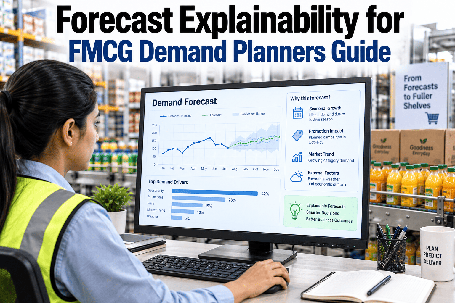
SHAP values, short for Shapley Additive Explanations, offer a mathematically grounded way to attribute a model's prediction to each individual input feature, showing precisely how much a factor like a recent promotion or a calendar effect pushed the forecast up or down relative to a baseline. The technique itself is statistically sophisticated, but the output translates cleanly into the kind of plain-language explanation a planner actually needs — not "feature 14 has a SHAP value of 0.23," but "the upcoming promotion is expected to add roughly this many units to the forecast."
Feature importance rankings complement SHAP values by showing, across many forecasts rather than just one, which features tend to drive the most variation overall. This gives planners and forecasting teams a sense of which signals matter most for a given category, which is valuable both for building trust and for prioritizing where to invest further feature engineering effort.
Driver Decomposition: Breaking a Forecast Into Its Parts
Driver decomposition takes explainability a step further by presenting a forecast not as a single number with attached explanations, but as a visible sum of individual components — baseline trend, promotional lift, seasonal effect, distribution changes — each shown as a distinct contribution that adds up to the final number. This structure lets a planner immediately spot which driver looks unusual or worth double-checking, rather than having to reverse-engineer the reasoning from a single aggregate figure.
This decomposed view also makes forecast adjustments more precise. A planner who disagrees with the promotional lift assumption specifically can adjust that one component directly, leaving the rest of the forecast's reasoning intact, rather than overriding the entire number and discarding every other correctly modeled driver along with it.
Building Planner Trust Over Time, Not All at Once
Trust in an explainable forecasting system builds incrementally, through repeated experience of the explanations proving accurate, rather than being granted upfront simply because the system provides reasons. Early in adoption, planners benefit from being able to easily compare the system's stated drivers against what actually happened in the following weeks, reinforcing or correcting their confidence based on real outcomes rather than the elegance of the explanation alone.
Frequently Asked Questions: Forecast Explainability for FMCG Demand Planners
Does adding explainability slow down the forecasting process or reduce accuracy?
Well-implemented explainability techniques like SHAP are computed alongside the forecast itself rather than requiring a separate slower process, and they don't change the underlying model's accuracy since they explain the existing prediction rather than altering it. The main practical cost is presentation — translating the technical output into a clear planner-facing view — which is a design investment rather than an ongoing accuracy tradeoff. Teams can Book a Demo to see explainability running alongside live forecasts.
Can planners override a specific driver in the decomposition rather than the whole forecast?
Yes — this is one of the main practical benefits of driver decomposition, since it lets a planner adjust the specific assumption they disagree with, such as an overstated promotional lift, while leaving the rest of the model's reasoning untouched, producing a more precise and defensible adjustment than a blanket override of the entire forecast number.
How do we know if an explanation itself is accurate, rather than just plausible-sounding?
The most reliable check is tracking explanation accuracy against actual outcomes over time — if a forecast attributes a large uplift to an upcoming promotion, comparing that stated driver against what actually happened once the promotion ran validates whether the explanation reflected genuine causation or just correlation the model picked up. Consistently tracking this over multiple cycles builds a much stronger basis for trust than evaluating any single explanation in isolation.
Is SHAP the only explainability method suitable for FMCG forecasting, or are there alternatives?
SHAP is widely used because it provides a mathematically consistent attribution across different model types, but simpler alternatives like basic feature importance rankings or rule-based driver tagging can also provide useful explainability, particularly for simpler models where the added complexity of SHAP isn't necessary to produce a clear, trustworthy explanation.
How should new planners be trained to work with explainable forecasts effectively?
Training works best when it goes beyond simply showing planners where the explanation appears in the interface — walking through several real historical examples where a decomposed forecast proved accurate, and a few where it didn't, teaches planners how to genuinely evaluate the explanations rather than treating them as an authoritative black box in a slightly more transparent wrapper. Contact iFactory Support for guidance on structuring planner training around explainable forecasts.