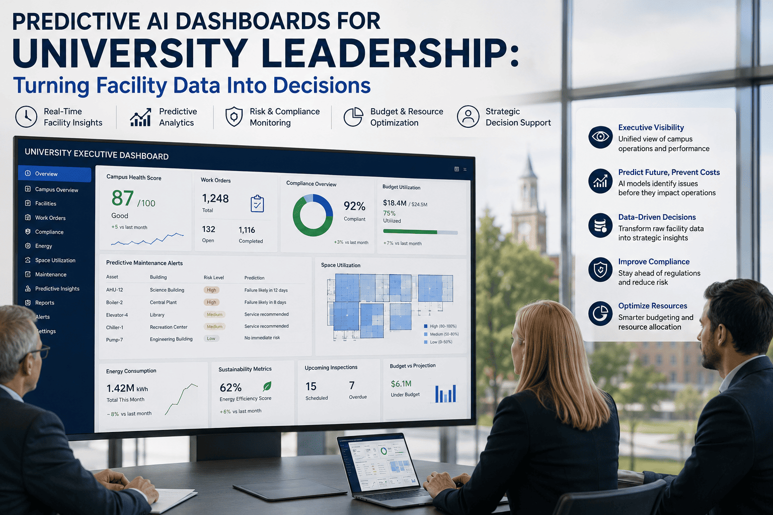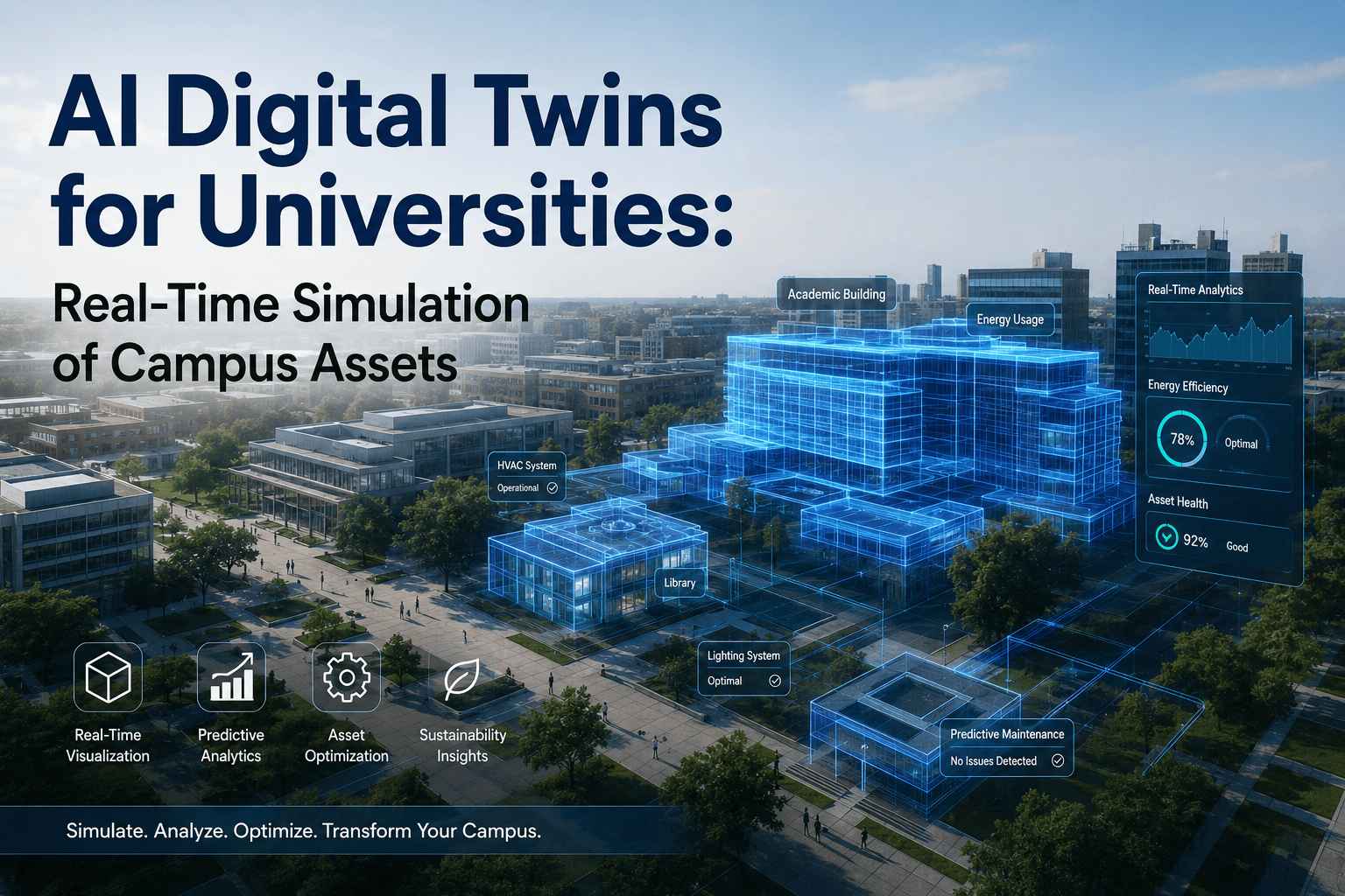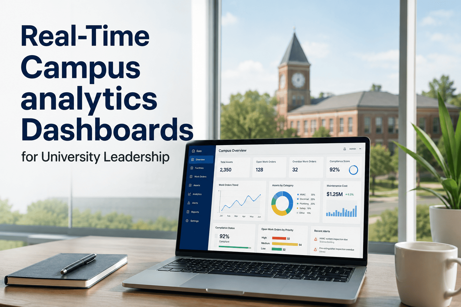
University presidents, provosts, and facility VPs are asked to manage billions in physical assets with fragmented visibility. A typical research university operates 200+ buildings, 50,000+ assets, and spends $40M+ annually on facility operations. Yet most leadership teams receive facility data in static PDFs and monthly spreadsheets — information that is already weeks old when it arrives. Real-time campus analytics dashboards change this by delivering live asset health scores, compliance status, energy use intensity, and predictive maintenance alerts directly to executive dashboards. For university leadership, this means seeing the full portfolio picture in real time, making data‑backed budget decisions, and answering board questions with confidence, not estimates. See how university leaders use real‑time dashboards — Book a Demo.
Gain live visibility into asset health, compliance status, energy performance, and predictive maintenance across your entire campus portfolio — all from a single executive dashboard.
What University Leaders See on Their Dashboard
The iFactory executive dashboard is designed for the university leadership team — presidents, provosts, CFOs, and facility VPs. It answers three questions at a glance: How healthy is our portfolio? Are we compliant? Where is money being wasted? The dashboard aggregates data from every connected building, BMS, and CMMS into a single pane of glass, updated in real time.
Five Dashboard Modules Every University Leadership Team Needs
Single metric aggregating asset condition, deferred maintenance backlog, and failure probability across all buildings. Drill down to any building or system.
Real‑time view of all regulatory inspections — fire safety, boiler certifications, environmental permits. See overdue, due soon, and completed at a glance.
Campus‑wide energy use intensity (EUI), carbon tracking, and AI‑flagged anomalies. Compare buildings, track progress toward net zero commitments.
Live stream of AI‑detected failure risks. Each alert includes probability percentage, estimated cost impact, and recommended intervention window.
5‑year forecast of replacement costs by building, system, and year. Shows which assets will need budget in 2026, 2027, 2028 — with confidence intervals.
Compare your campus performance against peer institutions (anonymised). See where you lead and where you have opportunity.
Executive Dashboard KPIs: What Gets Measured Gets Managed
| KPI Category | Metric | University Benchmark | Update Frequency |
|---|---|---|---|
| Portfolio Health | Average Asset Health Score (0‑100) | 85+ for well‑maintained research universities | Daily |
| Portfolio Health | Deferred Maintenance Backlog ($) | Typically 5‑15% of replacement value | Monthly |
| Compliance | Overdue Inspections (%) | Under 2% for mature programmes | Real time |
| Compliance | Audit Response Time (hours) | Under 2 hours with digital system | On demand |
| Energy | Energy Use Intensity (EUI) kBtu/sq ft | Lab buildings: 250‑400, Classrooms: 80‑120 | Daily |
| Energy | Carbon Emissions (MT CO2e) | Tracked against Scope 1 & 2 baseline | Monthly |
| Predictive | Assets with AI Alert (%) | 5‑10% active alerts is typical | Real time |
| Predictive | Predicted Failure Savings ($) | 30‑40% lower emergency repairs | Quarterly |
From Data to Decision: How University Leaders Use Real‑Time Dashboards
President reviews portfolio health score and any red‑flagged buildings. Sees that Chemistry building dropped from 92 to 78 — investigation finds chiller degradation before failure.
CFO uses capital planning dashboard to forecast replacements for 2026‑2028. Presents data‑backed request to board, approval in one meeting instead of three.
Facility VP sees 98% compliance completion, drills into the 2% — all are low‑priority items with extensions filed. No audit surprises.
Executive summary report generated in 2 minutes. Shows energy savings of $2.4M year to date and 40% reduction in emergency repairs.
Measurable Impact: Universities Using Real‑Time Dashboards
Frequently Asked Questions
See Your Campus Portfolio in Real Time
Join leading universities using iFactory dashboards to reduce emergency spend, accelerate budget decisions, and present data‑backed reports to boards and regulators.