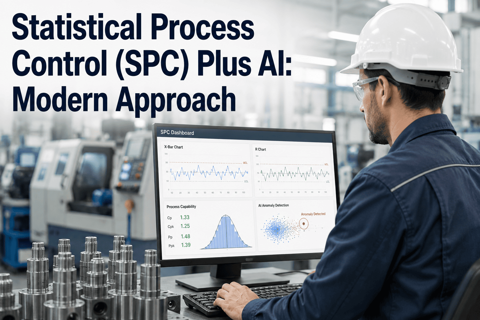
Statistical process control has been part of manufacturing quality for decades, and the math behind a control chart has not changed. What has changed is how much of the work around that math a plant still does by hand — pulling samples on a schedule, plotting points manually or in a spreadsheet, and relying on someone remembering to check the chart before a run of points outside the rules goes unnoticed. Automating that layer does not replace the statistics; it just makes sure the rules that have always defined an out-of-control process get applied continuously, on every reading, rather than whenever a person has time to look. Here is how iFactory's process engineering team typically approaches bringing automated SPC onto a line that already has a working manual process.
Control Charts That Flag Themselves Before a Process Drifts Out of Spec
Why a Chart Nobody Is Watching Is Just a Chart
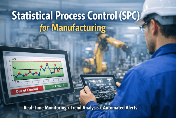
A control chart only does its job the moment someone looks at it and recognizes a pattern the rules define as significant — a single point beyond the control limits, a run of points trending in one direction, points hugging the centerline in a way that suggests reduced variation is being masked. In a manual process, all of that pattern recognition depends on a person having both the training to spot it and the time to sit with the chart long enough to notice. On a busy shift, the chart often gets plotted and filed without anyone actually applying the rules to it in real time, which means the chart exists as a record but not as an active control mechanism.
Automating the rule application does not require replacing the statistical method with something more exotic — it means running the same eight Western Electric rules or Nelson rules continuously against every new data point the moment it is captured, and raising a flag the instant a rule is violated instead of waiting for the next scheduled chart review. The process engineer's expertise does not get replaced in this model; it gets redirected from constantly re-checking charts by eye toward investigating the specific flags that the system has already found.
What Changes When Trending Runs Continuously
Sample-interval SPC — checking a characteristic every thirty minutes or once an hour — was originally a compromise built around how much manual measurement a quality technician could physically perform. It was never the ideal sampling frequency; it was the achievable one. When measurement is captured automatically from an in-line gauge or vision system, that constraint disappears, and the chart can plot against every unit produced rather than a sample. The practical effect is that a drift beginning between two scheduled samples, which a thirty-minute-interval chart would simply never see until the next check, gets caught within the cycle time of the part that triggered it.
| Aspect | Manual Interval Sampling | Automated Continuous SPC |
|---|---|---|
| Sampling frequency | Fixed interval, typically 30-60 minutes | Every unit, as measurement is captured |
| Rule application | Manual review, dependent on reviewer attention | All rules checked automatically on every point |
| Detection lag | Up to a full sampling interval or longer | Near-immediate, within the triggering cycle |
| Cpk calculation | Recalculated periodically, often daily | Continuously updated as new data arrives |
| Chart accessibility | Paper or local spreadsheet, one location | Available live to any authorized role, anywhere |
Want to see how your current sampling interval compares to a fully continuous chart? Send us a sample of your process data and we will run the comparison.
Process Capability Without Waiting for the Monthly Report
Cpk and Ppk are the two numbers a process engineer relies on most to judge whether a process is capable of consistently meeting specification, but in many plants those numbers only get recalculated on a monthly or quarterly cadence because the calculation depends on pulling and cleaning a batch of historical data by hand. That cadence means a process that has quietly lost capability — through tool wear, a fixture shifting, or incoming material variation — can run for weeks producing parts that are technically passing but with far less margin than the last calculated Cpk suggested.
When capability is recalculated continuously against the same live stream feeding the control chart, that lag disappears. A Cpk that begins sliding from 1.6 toward 1.0 shows up as a trend in the capability number itself, well before the process actually starts producing out-of-spec parts, giving engineering time to investigate root cause on a schedule of their choosing rather than in response to a failure that has already happened.
Subgroups, Sample Size, and Why the Setup Work Still Matters
Automating a control chart does not remove the need to think carefully about rational subgrouping, and in some ways it makes that thinking more important rather than less. A rational subgroup is meant to capture only the variation a plant actually wants to monitor for special causes, while excluding variation sources that are expected and already accounted for elsewhere, such as differences between two parallel tooling cavities that are each independently controlled. An automated system fed measurements without correct subgroup definitions will happily calculate limits and apply rules against a blended data stream, and the resulting chart can look perfectly stable while genuinely masking a real shift in one of the underlying sources being averaged together.
Getting the subgrouping right at the start of an automated rollout is a modeling exercise more than a technology one, and it is usually worth involving whoever owns the process capability studies for that characteristic rather than treating it as a pure IT integration task. The upside of doing this correctly once, though, is that the same subgroup logic then applies consistently to every future data point without anyone having to re-derive it manually each time a new operator or shift takes over the chart.
Where Automated Trending Tends to Go Wrong
Reading a Trend Before It Becomes a Violation
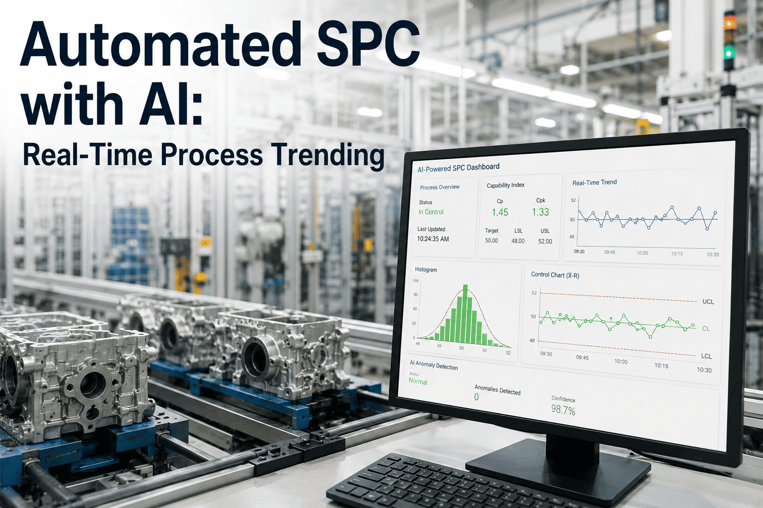
The most valuable output of a continuous chart is often not the moment it flags an outright violation — it is the trend that becomes visible well before any single rule is broken. A slow, steady creep toward the upper control limit across sixty or eighty consecutive points is easy to see on a live chart precisely because every point is plotted the instant it is captured, letting a process engineer notice the shape of the trend forming rather than waiting for the ninth point on one side of the centerline to technically trigger a rule. That earlier visibility is where the real time advantage over rule-based alerting alone tends to show up, since a trend caught early can often be corrected with a small adjustment rather than a full investigation once the limit has actually been crossed.
This is also where automated trending changes the rhythm of an engineer's day. Instead of reserving a block of time to sit down and manually plot the last shift's readings, the engineer opens a live view that already reflects every reading captured up to that second, with any developing trend already visually apparent in the shape of the line. Over a full production week, that shift in rhythm compounds into meaningfully more time available for root cause work and process improvement rather than data plotting and chart maintenance.
Building Trust in the Automated Flags
Trust in an automated chart is built the same way trust in a manual one is — by the flags being right often enough that acting on them becomes the default response rather than something that gets second-guessed every time. Early on, that means running a validation period where every automated flag is cross-checked against what a manual review would have found, and any discrepancy is investigated and used to tune the configuration rather than dismissed. Plants that skip this validation step and go straight to relying on automated flags without confirming their accuracy tend to see slower adoption, since the first false positive an operator encounters without context tends to color how much they trust every flag afterward.
Once that validation period consistently shows the automated flags matching or improving on manual detection, the conversation naturally shifts from whether to trust the system to how to expand it, which is usually the point where a plant moves from a single pilot characteristic to a broader rollout across the rest of the line.
Bringing Automated SPC Onto an Existing Line
The rollout sequence that tends to work best starts with a single characteristic on a single line — usually one that already has a documented history of drifting or one that carries significant cost when it goes out of spec undetected. Running the automated chart in parallel with the existing manual process for a short period lets engineering confirm that control limits calculated from live data match what the historical process capability study suggested, before the automated flags start driving live decisions.
Once that validation period confirms the automated limits are accurate, the chart typically moves from a parallel reference into the primary tool the process engineer checks first each shift, with the manual sampling process either reduced significantly or retired for that characteristic. Expanding to additional characteristics and stations from there tends to go faster, since the integration pattern and control-limit-setting process are already established from the first rollout.
Who Owns the Chart Once It Is Live
A question that comes up in nearly every automated SPC rollout, and one worth settling before go-live rather than after, is who actually owns responding to a flag once the system starts raising them automatically. In a manual process, ownership was often implicit — whoever plotted the chart that shift was also the one who noticed and acted on a violation. With continuous monitoring running around the clock, that implicit ownership breaks down unless it is explicitly assigned, since a flag raised at two in the morning on an unstaffed shift needs a defined path to whoever is actually available to respond, whether that is a rotating on-call engineer, a shift supervisor with defined authority to pause the process, or an automated escalation to a specific role after a set time without acknowledgment.
Plants that settle this ownership question clearly before launch tend to see the automated system treated as a genuine extension of the quality function from day one. Plants that leave it ambiguous tend to see flags pile up unaddressed during the first few weeks, which is often mistaken for a problem with the system itself when the actual gap is in the response process built around it. Getting this right is a short conversation, but it is one worth having explicitly rather than assuming it will sort itself out once the charts go live.