Most refractory performance data lives in a scattered collection of spreadsheets — consumption figures from the warehouse system, cost data from procurement, campaign life records from the operations log, and vendor quality notes from whoever happened to document the last complaint. Each individual dataset might be reasonably well maintained, but no one can answer a simple question like "is our cost per ton of steel from refractory trending better or worse than last year, and is that trend driven by consumption or by price" without someone manually pulling data from four different sources and reconciling it by hand. A unified refractory KPI dashboard exists to solve exactly this problem — bringing consumption rate, cost per ton, campaign life, and vendor performance into a single management view that answers the question in seconds rather than requiring a half-day data reconciliation exercise. Book a session with the iFactory reporting systems team to see how a unified refractory dashboard replaces the spreadsheet reconciliation cycle.
Refractory Lifecycle · KPI Dashboards & Reporting
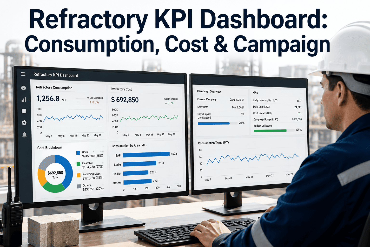
Refractory KPI Dashboard: Consumption, Cost, Campaign Life, and Vendor Performance in One View
A structured dashboard design bringing together the four KPI domains that matter most in refractory management — replacing scattered spreadsheets and manual data reconciliation with a single, always-current management view.
Unified KPI View — Preview
Consumption Rate
1.42
kg/ton steel
↓ 6% vs. LY
Cost per Ton
$3.18
USD/ton steel
↓ 3% vs. LY
Campaign Life
3,240
heats achieved
→ Flat vs. LY
Vendor Score
87
/ 100 composite
↑ 4 pts vs. LY
KPI Definitions
The Four Core Metrics — Defined Precisely, Not Loosely
Refractory KPIs are frequently defined inconsistently across a plant — one report calculates cost per ton using purchase price, another includes installation labor, a third uses a different production volume denominator. A dashboard is only trustworthy if every metric it displays has a single, precisely defined calculation used consistently across every report and every time period.
Consumption Rate
kg refractory consumed ÷ tons of product output
The physical efficiency metric, independent of price — should be tracked separately from cost per ton so that price changes and consumption efficiency changes are never conflated into a single misleading trend line.
Cost per Ton of Steel
Total refractory cost (material + installation) ÷ tons produced
The primary financial metric — must consistently include or exclude installation labor across all reporting periods, since inconsistent inclusion is one of the most common sources of misleading period-over-period comparison.
Campaign Life
Heats or production cycles achieved before relining
Should be tracked both in absolute terms and as a percentage of design/nominal campaign life, since absolute heat counts alone do not reveal whether a campaign underperformed or exceeded its engineering target.
Vendor Performance Score
Weighted composite of quality, delivery, and consumption outcomes
A composite score combining on-time delivery rate, material quality incident rate, and the actual consumption/campaign-life performance achieved with that vendor's material — never based on price or delivery alone.
Dashboard Layer Structure
Three Audiences, Three Views — Operational, Management, and Executive
A single dashboard view rarely serves every audience well — a furnace operator needs different detail than a plant director. Effective refractory reporting structures the same underlying data into three distinct views, each answering the specific question its audience actually asks.
Operational View
Furnace operators, refractory engineers
Real-time or near-real-time detail: current campaign heat count against target, wear monitoring trend, active vendor lot traceability. Refreshed continuously, focused on the specific vessel or line the viewer is responsible for.
Management View
Refractory manager, plant maintenance leadership
Weekly to monthly trend across all four KPI domains, campaign comparison across vessels and lines, vendor scorecard tracking. The primary decision-support view for procurement, vendor management, and process improvement priorities.
Executive View
Plant director, finance leadership
Quarterly and annual trend, cost per ton benchmarked against budget and prior year, summarized in a small number of headline figures without operational detail that would obscure the strategic picture.
See Your Own Data in a Unified Dashboard
iFactory Connects Your Warehouse, Procurement, and Operations Data Into One Refractory Reporting Layer
Most plants have all four KPI data sources already — they simply live in separate systems that have never been connected. iFactory builds the unified dashboard layer, structured across operational, management, and executive views, using data you already collect.
Consumption & Cost Tracking
Separating Consumption Efficiency from Price — Why Blending Them Hides the Real Story
A rising cost per ton figure could mean the plant is consuming more refractory per ton of steel, or it could mean vendor prices increased while consumption stayed flat or even improved — these are two entirely different problems requiring different responses, and a dashboard that only shows blended cost per ton conceals which one is actually happening.
| Scenario |
Consumption Trend |
Price Trend |
Cost/Ton Trend |
Correct Response |
| Process degradation |
Rising |
Flat |
Rising |
Investigate operating practice, lining design |
| Vendor price increase |
Flat |
Rising |
Rising |
Vendor negotiation, alternate sourcing evaluation |
| Genuine improvement |
Falling |
Flat |
Falling |
Document and standardize practice change |
| Masked degradation |
Rising |
Falling |
Flat/falling |
Requires split view — blended cost/ton alone would miss this entirely |
The fourth scenario is the most important reason to track consumption and price separately — a favorable price movement can mask a genuinely worsening consumption trend, and only a split view catches this before it compounds into a larger problem once price conditions normalize.
Campaign Life Benchmarking
Comparing Campaigns Fairly — Accounting for Product Mix and Operating Severity
Raw campaign life comparison across different vessels or time periods is frequently misleading because operating severity varies — a campaign running higher-alloy or more corrosive product grades will legitimately achieve shorter life than one running standard grades, and comparing the two without adjustment produces an unfair and potentially misleading benchmark.
Normalized Campaign Life
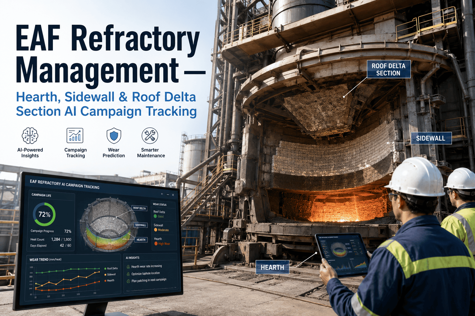
Adjusting raw heat count by a severity factor reflecting product mix, operating temperature, and known corrosive conditions during the campaign — producing a comparison basis that reflects lining performance rather than simply which vessel happened to run easier product during the period.
Design vs. Achieved Life Ratio
Tracking achieved campaign life as a percentage of the refractory design's nominal target life — a more meaningful trend metric than absolute heat counts, since it inherently accounts for changes in design specification between campaigns.
Vendor Scorecard
Building a Composite Vendor Performance View Beyond Price
A vendor scorecard limited to price and delivery timing misses the dimension that matters most financially — whether the material actually performs in service. The scorecard structure below combines the three dimensions that together determine genuine vendor value.
01
Delivery Reliability
On-time delivery rate against confirmed lead time, and consistency of quoted lead time accuracy — a vendor who reliably communicates realistic lead times is more valuable than one who quotes optimistically and frequently misses.
02
Material Quality
Incoming inspection pass rate, documented quality incidents, and consistency of material properties lot-to-lot — tracked as a distinct scorecard dimension from field performance, since material can pass incoming inspection and still underperform in actual service.
03
Field Performance
Actual campaign life and consumption rate achieved with this vendor's material, normalized for operating severity — the dimension most directly connected to total cost of ownership and the one most frequently missing from a purely transactional vendor evaluation.
Dashboard Programme KPIs
Six Metrics That Define Reporting System Effectiveness
Data Freshness
Target: <24 hours
Time lag between an underlying data event (consumption record, delivery, campaign end) and its reflection in the dashboard — determines whether the dashboard supports timely decisions or shows stale information.
Metric Definition Consistency
Target: 100%
Percentage of reports and views using the single, standardized calculation for each KPI rather than a locally modified variant — the foundational trust requirement for any dashboard.
Dashboard Adoption Rate
Target: >80% of target users active weekly
Percentage of intended dashboard users actively reviewing it on a regular basis — a technically excellent dashboard that nobody checks delivers no operational value.
Manual Reconciliation Time Eliminated
Trend: decreasing toward zero
Hours per month previously spent manually assembling refractory performance reports from disconnected sources — the direct labor efficiency metric validating the dashboard investment.
Vendor Scorecard Coverage
Target: 100% of active vendors
Percentage of currently active refractory vendors with a maintained, current composite scorecard — any gap represents a vendor relationship being managed without objective performance data.
Decision Cycle Time
Trend: decreasing
Time from a performance question being raised to a data-supported answer being available — the ultimate measure of whether the dashboard is genuinely accelerating decision-making versus simply digitizing the same slow reporting process.
From the Reporting Desk
“
The most common reaction I get when I first show a plant a unified refractory dashboard pulling together consumption, cost, campaign life, and vendor data is some version of surprise at how much the numbers disagree with what everyone believed. A plant manager convinced their cost per ton had been trending upward for two years discovers, once consumption and price are separated, that consumption had actually been improving steadily and the entire cost increase was driven by vendor pricing — a completely different conversation to have with procurement than the one they had been planning to have with operations. That disconnect between belief and data is not a failure of anyone's intuition. It is simply what happens when the information needed to see a clear picture is scattered across four systems that were never designed to talk to each other. The value of a unified dashboard is not really the dashboard technology itself — it is the discipline of defining every metric precisely once and applying that definition consistently, so that everyone in the organization, from the furnace floor to the executive office, is finally looking at the same numbers and asking the same questions about them.
Ingeborg Achterberg-Nwosu
Refractory Performance Analyst · Plant Reporting Systems Specialist · 17 years building performance reporting systems for refractory-intensive manufacturing · Former Data & Analytics Lead, integrated steel producer · Specialist in unified KPI dashboard design for maintenance-intensive operations
Reporting Team Questions
Refractory KPI Dashboards — Frequently Asked
Do we need to replace our existing warehouse and procurement systems to build a unified dashboard?
No — a dashboard layer connects to your existing systems as data sources rather than replacing them, pulling from warehouse, procurement, and operations records without requiring a system migration.
Book a demo to see how the integration works with your current systems.
How do we handle inconsistent historical data when different teams have tracked metrics differently in the past?
Historical data reconciliation is a real but manageable challenge — we typically establish the standardized definition going forward and reconcile a defined historical window rather than attempting perfect retroactive consistency across all past records.
Book a demo to discuss a practical approach for your historical data.
Can the dashboard show performance across multiple plants or just a single site?
Multi-plant comparison is a common and valuable extension once single-site metrics are standardized, allowing cross-plant benchmarking on consumption and vendor performance.
Book a demo to see multi-site dashboard configuration.
How long does it typically take to get a working dashboard once we start the project?
Initial dashboard deployment covering core KPIs from already-digitized data sources typically takes 4 to 8 weeks, with additional time for sources requiring manual data cleanup or new digital capture.
Book a demo to discuss a timeline specific to your current data systems.
Will operators and engineers need extensive training to use the operational dashboard view?
The operational view is designed for quick daily reference rather than complex analysis, so training is typically brief — most users are comfortable within a single short session.
Book a demo to see the operational view interface firsthand.
Stop Reconciling Spreadsheets. Start Answering Questions in Seconds.
Bring Consumption, Cost, Campaign Life, and Vendor Data Into One Unified Refractory Dashboard
iFactory connects your existing warehouse, procurement, and operations data into a structured three-layer dashboard — operational, management, and executive — with precisely defined, consistently applied KPIs across consumption rate, cost per ton, campaign life, and vendor performance.