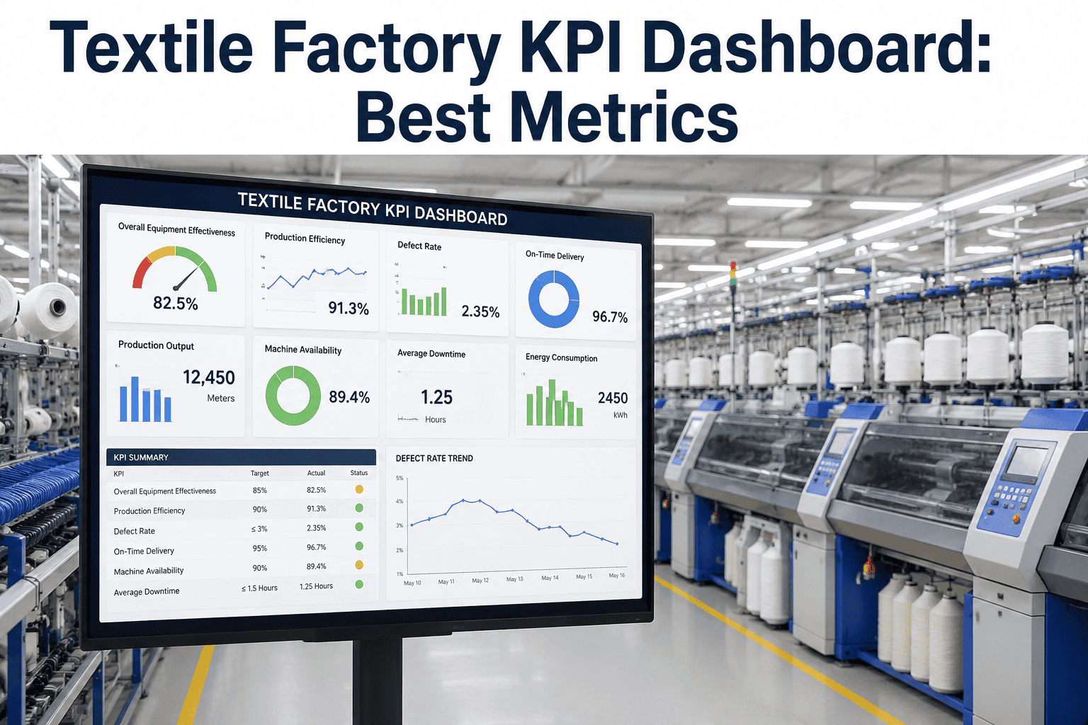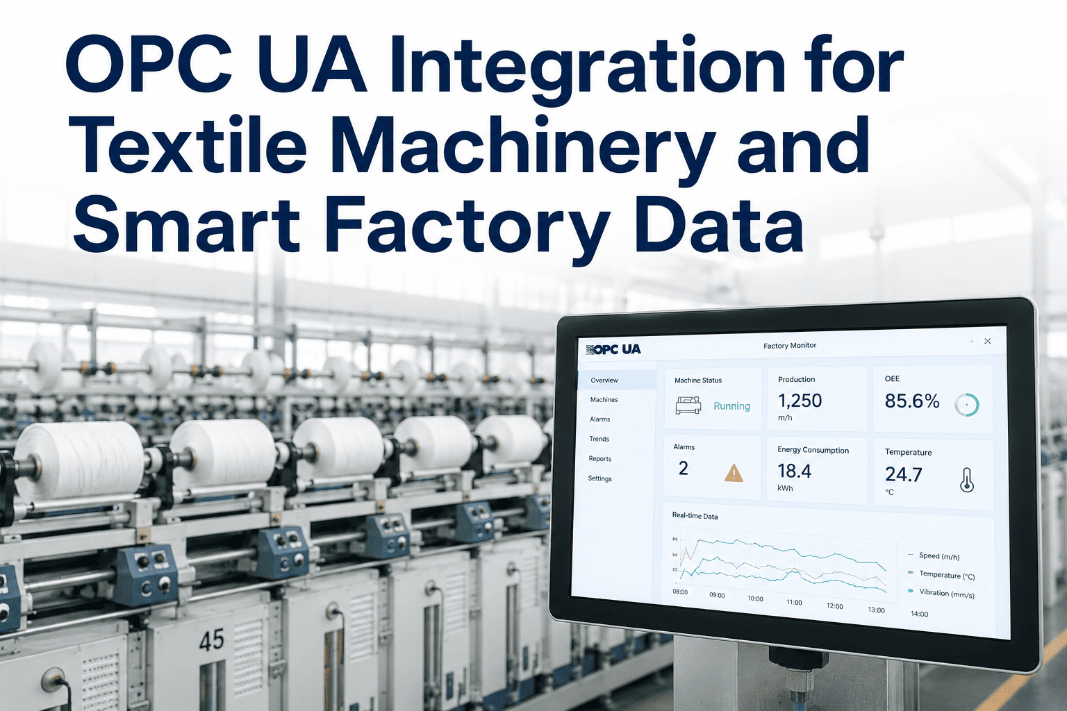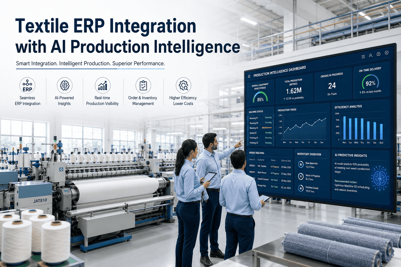
A KPI dashboard is only as trustworthy as the data feeding it, and in a textile mill that data typically arrives from three very different sources at once — PLCs on the loom or knitting machine reporting cycle counts automatically, IoT sensors tracking temperature, humidity, or vibration continuously, and operators manually logging things like defect counts or downtime reasons that no machine can capture on its own. Getting all three of these sources feeding the same dashboard accurately and on comparable timescales is the unglamorous groundwork that determines whether a KPI dashboard reflects reality or quietly drifts away from it. Mills building or auditing this data collection layer can start with a conversation with iFactory's support team about connecting PLC, sensor, and manual input streams into one consistent data pipeline.
Three Sources, One Dashboard — And Only One of Them Reports Automatically
PLC integration, IoT sensors, and structured manual input each capture a different slice of the truth, and a dashboard is only accurate when all three arrive consistently and on comparable timescales.
Why Mixed Data Sources Are Harder to Reconcile Than They Look
A PLC reports cycle counts continuously and precisely, an IoT sensor reports environmental conditions on its own polling interval, and a manual input from an operator arrives whenever that operator gets around to logging it, which might be end of shift rather than in real time. A dashboard trying to combine all three into a single, coherent picture of production performance has to account for these different timescales explicitly, or it risks showing a snapshot where automated data reflects this minute and manual data reflects three hours ago, creating a misleading picture of current state.
The Three Collection Methods and What Each One Is Actually Good For
Each method captures a different category of information, and understanding what each is suited for prevents a mill from trying to force one method to do a job better handled by another.
PLC Integration
Cycle counts, machine speed, and run status come directly from the machine's own controller, offering the highest accuracy and lowest latency of the three methods for anything the machine can measure about itself.
IoT Sensors
Environmental and condition data like temperature, humidity, and vibration that the machine's own controller does not track natively can be captured with purpose-built sensors added independently.
Structured Manual Input
Defect classification, downtime reason codes, and other judgment calls that require a human to observe and categorize still need a manual entry step, ideally structured into a fixed set of options rather than free text.
Feed Your Dashboard From All Three Sources Reliably
Book a 30-minute walkthrough of how iFactory unifies PLC, sensor, and manual input data into one consistent KPI pipeline.
Collection Method Comparison
Each method has a different accuracy, latency, and cost profile, and most mills end up combining all three rather than relying on a single approach.
| Method | Typical Latency | Main Risk if Used Alone |
|---|---|---|
| PLC Integration | Near real time | Cannot capture anything the machine controller doesn't measure |
| IoT Sensors | Seconds to minutes, per polling interval | Sensor drift or fouling can silently degrade accuracy |
| Manual Input | Minutes to hours, dependent on operator timing | Free-text entry produces inconsistent, hard-to-aggregate data |
Designing a Structured Manual Input Form Correctly
Not every manual input needs to be a free-text field, and most of the categorical information a mill collects can be captured through a well-designed structured form instead, dramatically improving how usable the resulting data is downstream.
Predefined Reason Codes
A fixed list of downtime or defect categories, agreed across the mill and used consistently by every operator, replaces free text and makes aggregation possible.
Timestamp Captured Automatically
The system, not the operator, records when an entry is logged, removing the ambiguity that caused the timescale mismatch in the scenario above.
Mobile-Friendly Entry Point
A form accessible from a handheld device on the floor, rather than requiring a walk back to a shared terminal, makes logging an event at the moment it happens practical rather than a chore deferred to later.
A Composite Scenario: The Dashboard That Looked Fine Until the Shift Report Came In
A textile mill's real-time KPI dashboard showed strong machine utilization throughout a shift, with PLC-reported cycle counts looking healthy across every loom on the floor. When the end-of-shift manual downtime log was entered, however, the reconciled efficiency figure for that shift came in noticeably lower than what the real-time dashboard had displayed for most of the day, confusing the production manager reviewing both numbers.
The gap traced back to a timescale mismatch: the PLC data reflected machine cycles in near real time, but downtime reason codes were only being logged by operators at the end of the shift rather than as downtime events actually occurred, meaning the real-time dashboard had no way to reflect stoppages until hours after they happened. Moving to a structured, timestamped manual entry logged at the moment of each stoppage, rather than a single end-of-shift summary, aligned the manual data with the same timescale as the PLC data and eliminated the discrepancy between the real-time view and the reconciled shift report.
Mistakes That Undermine Data Collection Accuracy
Treating Manual Input as Equivalent in Timeliness to Automated Data
Assuming manual entries arrive on the same timescale as PLC or sensor data, as happened initially in the scenario above, produces a dashboard that misrepresents current state until the mismatch is found.
Allowing Free-Text Entry for Categorical Data
Downtime reasons or defect types entered as free text are difficult to aggregate consistently, since the same underlying cause can be phrased many different ways by different operators.
Never Checking Sensor Calibration Against a Reference
IoT sensors can drift out of calibration gradually, feeding a dashboard with data that looks plausible but no longer accurately reflects actual conditions.
Building a Dashboard Before Confirming Data Source Reliability
Launching a dashboard before validating that all three data sources are actually feeding it consistently means any early adoption is built on a foundation not yet proven reliable.
Is Your Data Collection Layer Actually Feeding the Dashboard Consistently
Manual input is logged at the moment of the event, not batched at shift end
Real-time or near-real-time manual logging, as adopted in the scenario above, keeps manual data on a comparable timescale to automated sources.
Manual entries use structured categories, not free text
A fixed set of reason codes or defect categories keeps manual data consistent and aggregatable across operators and shifts.
Sensor calibration is checked on a defined schedule
Periodic calibration checks catch sensor drift before it silently degrades the accuracy of data feeding the dashboard.
Frequently Asked Questions
Why can real-time and reconciled KPI figures show different results for the same shift?
This happens when data sources feeding the dashboard update on different timescales, exactly the situation in the scenario above where PLC-reported cycle data updated continuously while downtime reasons were only logged manually at the end of the shift, meaning the real-time view had no way to reflect stoppages until the reconciled report came in hours later.
What makes structured manual input different from free-text entry?
Structured manual input uses a fixed set of predefined categories, such as a dropdown of standard downtime reason codes, rather than allowing an operator to type any description they choose, which keeps the resulting data consistent enough to aggregate and compare across shifts, machines, and operators rather than producing dozens of slightly different phrasings for the same underlying cause.
How often should IoT sensors feeding a KPI dashboard be recalibrated?
Calibration frequency depends on the specific sensor type and operating environment, but establishing a defined schedule and sticking to it is what prevents the kind of silent, gradual drift that can leave a dashboard reporting plausible-looking but inaccurate data for an extended period before anyone notices a discrepancy.
Can PLC data alone provide enough information for a complete KPI dashboard?
PLC data alone typically cannot capture everything a complete KPI picture needs, since a machine controller usually does not track ambient environmental conditions or make qualitative judgments like defect classification, which is why most mills need to combine PLC data with sensor and manual input rather than relying on any single source. Book a demo to see how iFactory combines all three sources into one unified pipeline.
What is the first step for a mill wanting to fix inconsistent dashboard data?
The first step is mapping exactly which data source feeds each KPI on the dashboard and what timescale each source actually reports on, since this mapping is what would have revealed the timescale mismatch in the scenario above before it caused confusion during a shift review. Mills wanting help with this kind of data source audit can reach iFactory support directly.
Feed Your KPI Dashboard From a Reliable, Consistent Data Foundation
iFactory unifies PLC integration, IoT sensor data, and structured manual input into one consistent pipeline, so your dashboard reflects reality on a comparable timescale. Book a walkthrough to see it running on a live textile production floor.