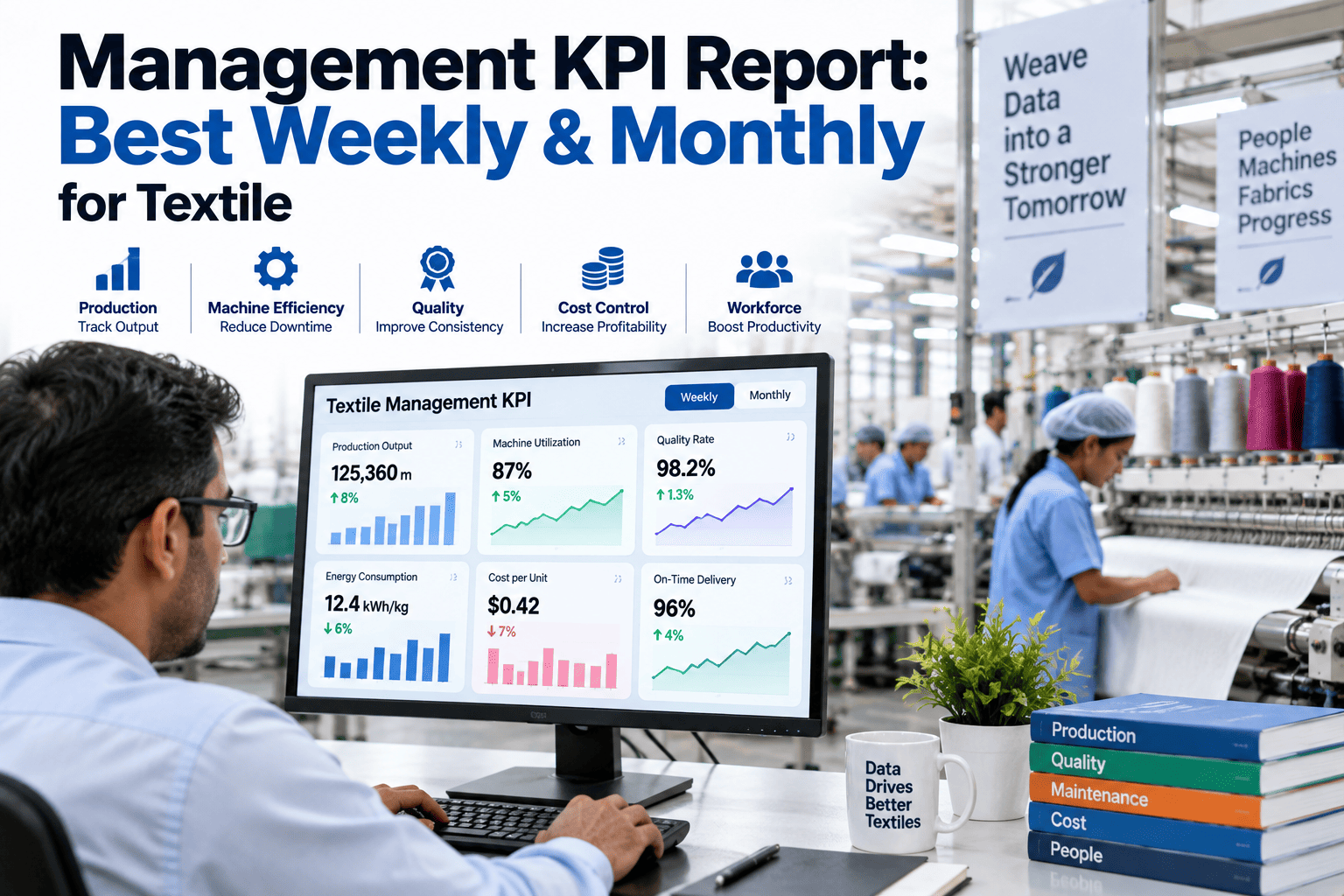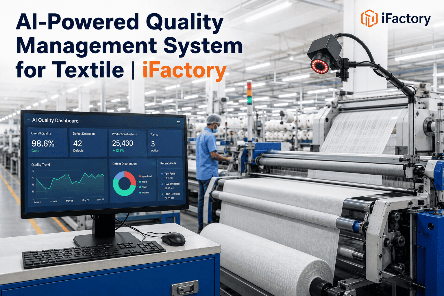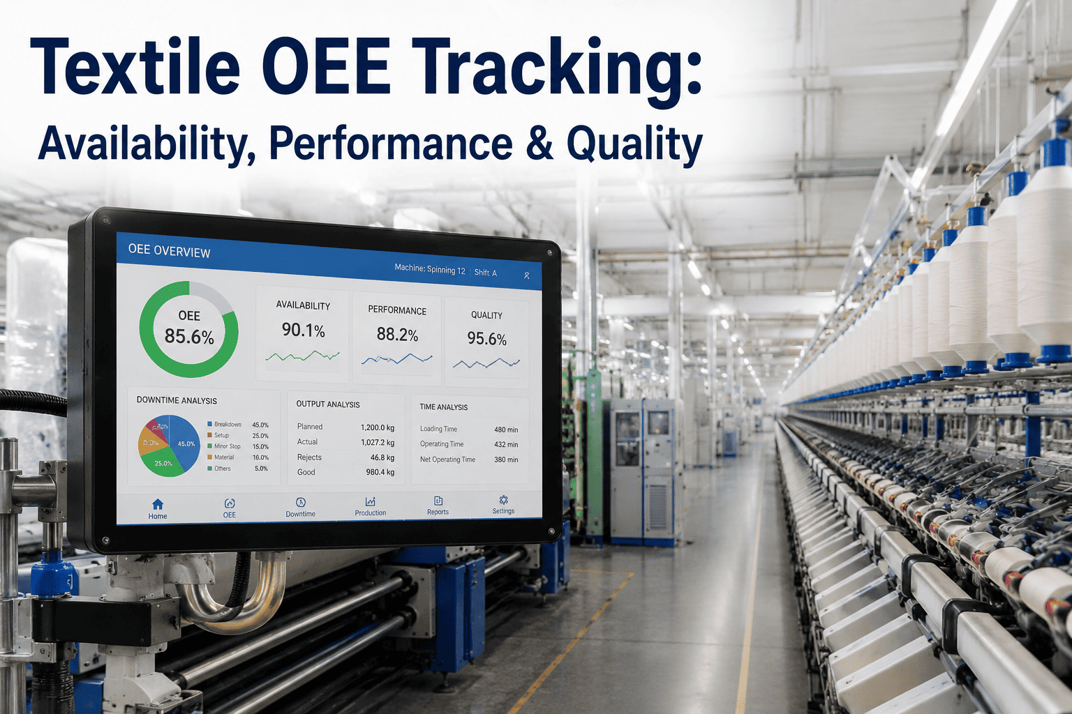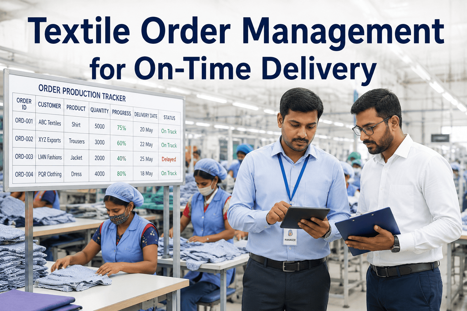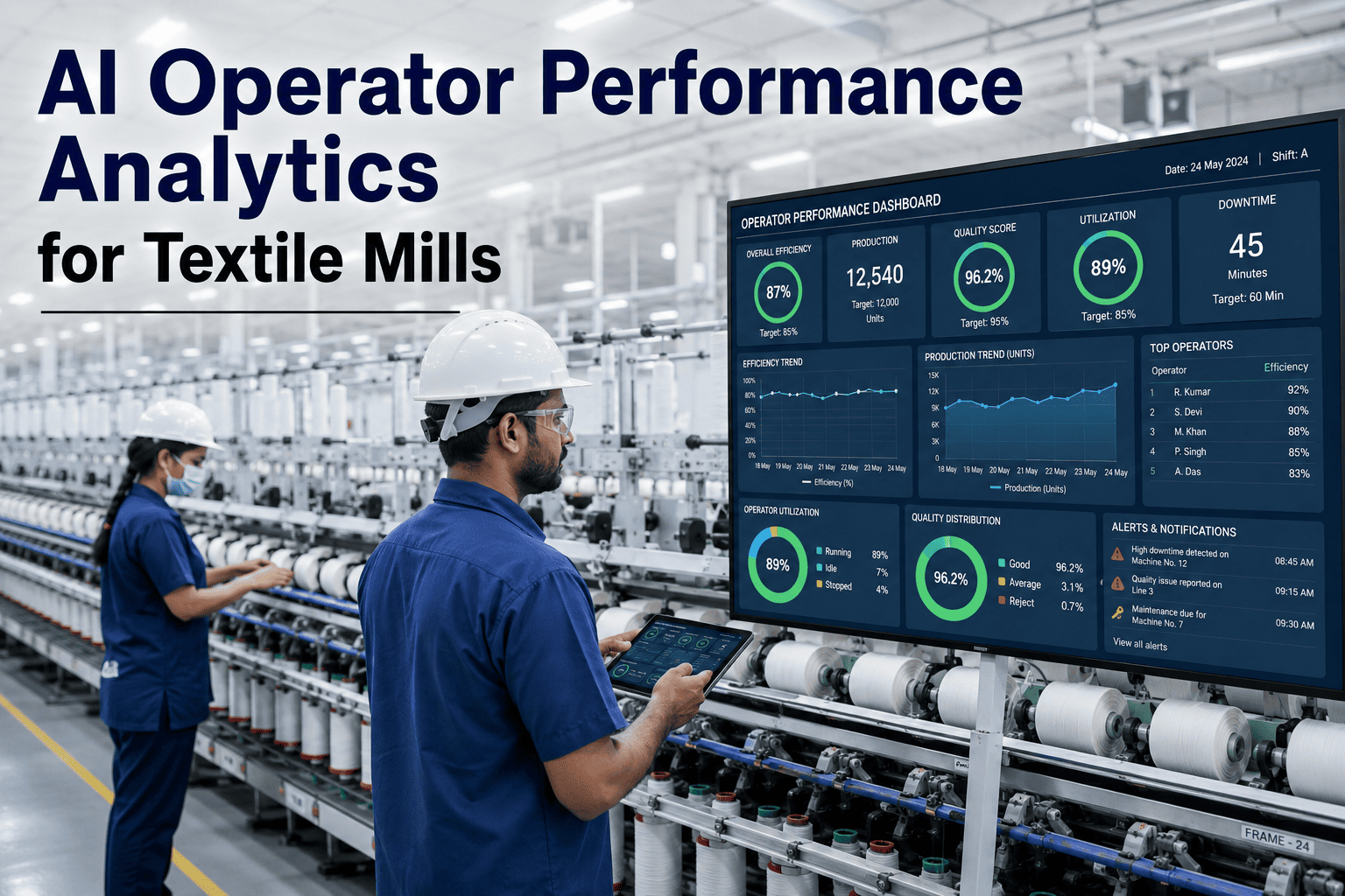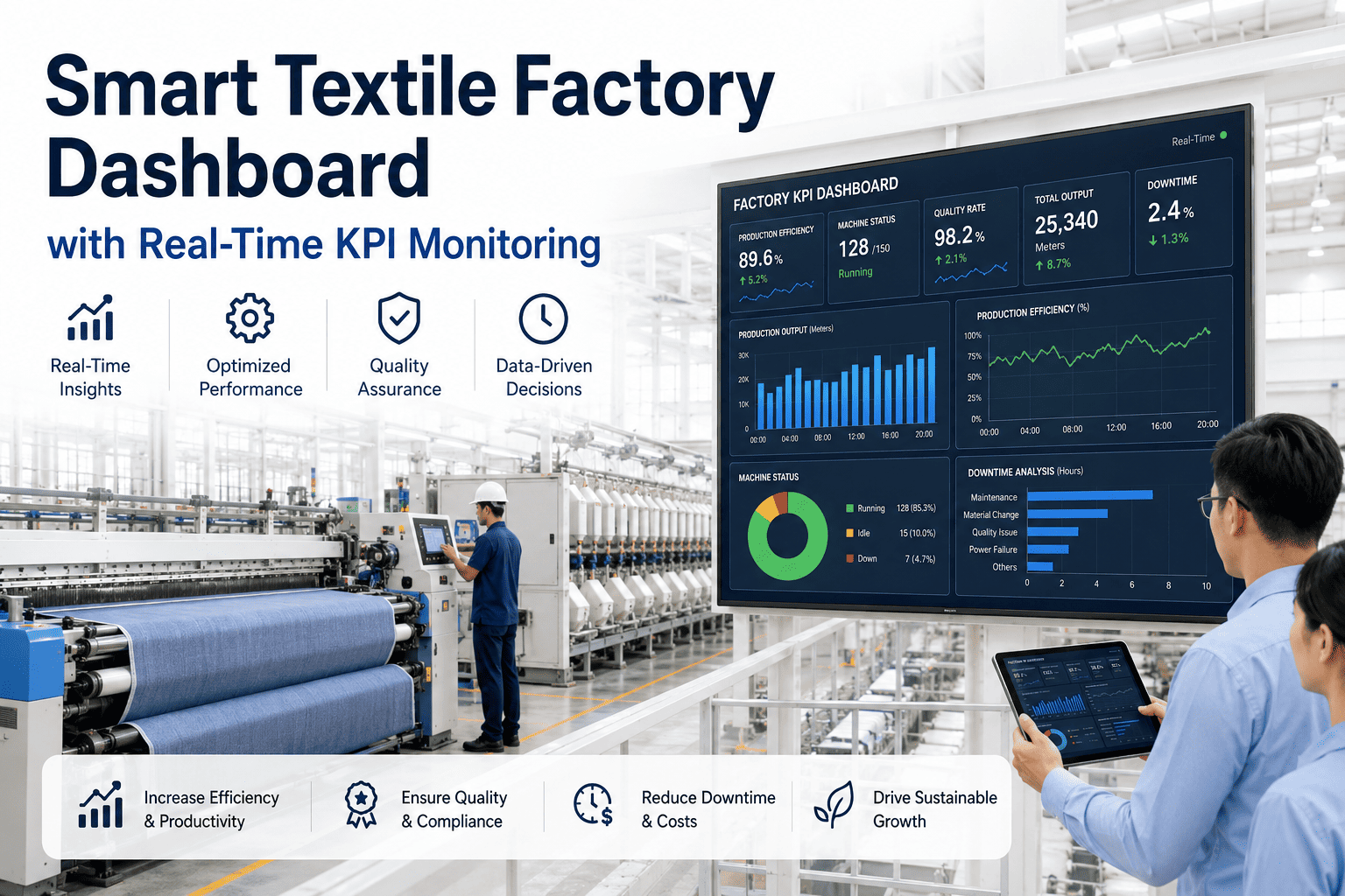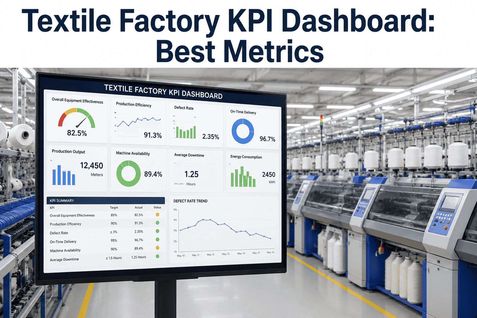
Most textile mills still run their weekly management review off a spreadsheet that someone pieced together the night before from three different machine logs, a quality inspector's notebook, and a guess about yesterday's downtime. By the time the plant manager sees the number, the shift that caused the problem is long gone and the root cause is buried under a dozen more changeovers. A KPI dashboard fixes the timing problem, not just the reporting problem, by pulling production, quality, delivery, cost, and sustainability data into one live view that updates as the mill runs rather than after it stops. iFactory builds these dashboards directly on top of a mill's existing spinning, weaving, and wet processing equipment, and you can book a demo to see a live dashboard built from your own machine data.
The Weekly Management Review Textile Mills Actually Need
iFactory connects spinning frames, looms, dyeing lines, and finishing equipment to a single live dashboard, replacing the Sunday-night spreadsheet with numbers that are accurate the moment a shift ends, so your management review can act on this week's mill instead of last week's.
Why a Weekly Spreadsheet Cannot Run a Modern Textile Mill
A management review built on hand-collected data is always describing a mill that no longer exists. Machine operators log counts on paper or in a shared spreadsheet, quality data lives in a separate inspection register, and delivery numbers come from a planning tool that nobody updates in real time. By the time all three are reconciled into one report, five to seven days have passed, and every decision made in that review is a reaction to history rather than a correction to the current shift. The people closest to the machines usually know something is wrong long before the report confirms it, but without a shared, trusted number to point to, that instinct rarely turns into a documented corrective action. Instead the same conversation repeats itself review after review, with each department defending its own version of the numbers instead of agreeing on what actually happened and what to do about it. The pain points below are the ones plant managers describe most often when asked why their current review process is not driving improvement.
None of these problems come from a lack of effort on the plant floor. They come from a reporting process that was designed around what a spreadsheet could hold, not around what a management team actually needs to run the mill week to week, and that gap only grows as production volume and SKU complexity increase.
Efficiency and quality figures are five to seven days old by the time management sees them, so corrective action lands on a shift that has already rotated twice and the operators involved may not even remember the specific changeover in question.
A planner spends four to six hours every week manually merging machine logs, quality registers, and dispatch records into one spreadsheet before the review can even start, time that could otherwise go toward scheduling and capacity planning.
Each department calculates efficiency, downtime, and waste using slightly different formulas, so the numbers in the review meeting get argued about instead of acted on, and trust in the report itself slowly erodes over successive quarters.
A weekly summary shows that efficiency dropped but not which machine, which shift, or which changeover caused it, so root cause analysis starts from zero every time instead of building on what was learned the previous week.
The Metric Categories Every Textile Management Dashboard Should Track
A dashboard that tries to show everything shows nothing useful. The mills that get the most value from a KPI system organize it around five categories that map directly to the questions a management review is supposed to answer: are we making enough, is it good enough, is it shipping on time, what is it costing us, and are we meeting our sustainability commitments. Each category below lists the metrics that actually change behavior on the floor, not just the ones that look good in a slide deck. A useful test for any candidate metric is whether a supervisor could look at it mid-shift and immediately know whether to intervene, escalate, or keep running as planned. Metrics that only make sense as a monthly average tend to belong in a strategic review rather than the operational dashboard that runs the daily and weekly cadence of the mill. The five categories are deliberately kept separate rather than blended into a single composite score, because a plant manager needs to know whether a bad week was driven by a machine problem, a quality problem, or a scheduling problem, and a blended score hides exactly that distinction.
Overall equipment effectiveness by machine and shift, spindle or loom utilization, changeover duration, and planned versus actual output against the daily production schedule, broken down so a supervisor can see exactly which machine is dragging the department average down.
First-pass yield, second quality and reject rate by defect type, in-process inspection results, and rework hours as a percentage of total production hours, tracked closely enough to catch a drifting process before an entire lot is affected.
On-time-in-full shipment rate, order lead time from booking to dispatch, work-in-process aging by stage, and late order count by customer and by root cause, giving planners the visibility to re-sequence orders before a delay becomes unavoidable.
Cost per kilogram of yarn or fabric produced, energy consumption per unit of output, waste and rework cost, and labor efficiency against the standard hour allowance, calculated the same way across every department so cost comparisons are actually meaningful.
Water consumption per kilogram of fabric processed, effluent treatment plant compliance readings, chemical usage against approved recipe limits, and energy sourced from renewable capacity, tracked in the same review cadence as production rather than as a separate annual exercise.
Where the Dashboard Numbers Actually Come From
A live dashboard is only as trustworthy as the systems feeding it, so iFactory connects directly to the equipment and business systems a mill already runs rather than asking operators to enter numbers a second time. Spinning frame and loom controllers report production counts and stop reasons automatically. Dyeing and finishing line PLCs report cycle data, temperature profiles, and chemical dosing directly from the recipe management system. Quality inspection stations, whether manual entry terminals or camera-based systems, feed defect data by lot and by shift the moment an inspection is completed. Dispatch and ERP systems supply order status, shipment confirmation, and customer delivery windows, so the delivery KPI is calculated against the same order data the sales team is using rather than a separate estimate. Because every source updates automatically, the dashboard reflects the plant as it actually runs at the moment someone opens it, not as it ran during last week's data collection cycle. Older equipment that predates any digital communication standard is not excluded from the dashboard either. A small edge sensor mounted near the machine's existing counter or motor can capture cycle events and stop conditions without touching the machine's internal control logic, and that data is time-stamped and fed into the same dashboard as the newer, natively connected equipment. This matters in textile mills more than in most industries, because it is common to find a spinning frame from one decade running alongside a loom from another, all expected to report into the same weekly review.
The Mistakes That Cause Dashboard Projects to Stall
Not every dashboard rollout succeeds on the first attempt. The mills that struggle usually make one of a small handful of avoidable mistakes rather than facing a fundamentally hard technical problem. The most common failure is skipping the step of agreeing on a shared calculation standard before connecting any data, which results in a dashboard that shows numbers nobody trusts because they do not match what each department was already calculating on its own. A close second is trying to launch every KPI category across the entire mill at once instead of validating one department first, which makes it difficult to isolate whether a discrepancy comes from a data source problem or a genuine process issue. A third common mistake is treating the dashboard as an IT deliverable handed to the plant rather than a management tool that supervisors and department heads help design, which leads to low adoption even after the technical work is complete. Building in the validation period, starting with one department, and involving the people who will use the dashboard daily avoids all three of these failure modes. It is also worth planning for the first month after go-live rather than treating the launch date as the finish line, since supervisors will surface edge cases in real production that were never anticipated during the design phase, and having a clear process for reviewing and resolving those questions quickly is what turns early skepticism into daily reliance on the dashboard.
Weekly Spreadsheet Report Versus a Live KPI Dashboard
Laid out side by side, the practical differences between the two approaches go well beyond how the numbers look on screen. They change who can act on a problem, how quickly they can act, and how much manual effort stands between a machine event happening and a decision being made about it.
| Review Element | Weekly Spreadsheet Report | iFactory Live Dashboard |
|---|---|---|
| Data Freshness | Five to seven days old by the time it reaches management | Updated continuously as each shift closes out production |
| Preparation Time | Four to six hours of manual reconciliation each week | Zero manual preparation, the dashboard is always current |
| Drill-Down Capability | Summary numbers only, no path back to the causing machine or shift | Click any metric to see the machine, shift, and order behind it |
| Definition Consistency | Each department calculates KPIs differently | One calculation standard applied plant-wide automatically |
| Access | Emailed once a week to a fixed distribution list | Available anytime to anyone with plant floor or office access |
| Historical Comparison | Requires opening and comparing multiple past files | Built-in trend views across shifts, weeks, and months |
How a Textile KPI Dashboard Gets Built, Stage by Stage
Building a dashboard is not a one-time IT project, it is a structured rollout that starts with agreeing on what the numbers mean and ends with a management team that trusts the screen more than the spreadsheet. The stages below reflect how iFactory typically brings a mill from its current manual reporting process to a fully live dashboard running across every department, with each stage designed to build confidence before the next one begins rather than rushing straight to a plant-wide launch.
Define the KPI Standard
Plant leadership agrees on one calculation method per metric so efficiency, waste, and delivery mean the same thing in every department review going forward, and that standard is documented so new hires and auditors can reference it later.
Connect the Data Sources
Machine controllers, quality stations, and ERP systems are connected through existing network infrastructure, with no changes required to the equipment itself, and any machine lacking a digital output is fitted with a small edge sensor during planned downtime.
Validate Against Manual Reports
The dashboard runs alongside the existing spreadsheet process for two to three weeks so the numbers can be checked and trusted before manual reporting is retired, giving the team a chance to catch any misconfigured data source early.
Roll Out to Management Review
The dashboard becomes the single source of truth for the weekly review, with role-based views for shift supervisors, department heads, and plant leadership, and the old spreadsheet process is formally retired once confidence is established.
What Changes After the First Ninety Days on a Live Dashboard
Mills that move from a weekly spreadsheet to a live dashboard consistently see the same pattern of improvement, because the underlying change is not the metrics themselves but how quickly people can act on them. The figures below are aggregated from textile mill deployments after the dashboard replaced the manual reporting cycle as the primary source for the management review, measured across the first two full quarters of live operation rather than the initial validation window when teams are still adjusting to the new process.
Planners and supervisors no longer spend a full workday each week reconciling machine logs into a spreadsheet before the review meeting, freeing that time for scheduling and floor walks instead.
Efficiency and quality drops are identified and corrected within the shift they occur rather than during the following week's review, when the operators and conditions involved have already changed.
Continuous visibility into defect trends by machine allows adjustment before a full lot is affected, rather than discovering the problem only after final inspection is complete.
Real-time work-in-process visibility lets planners re-sequence orders before a delay becomes a missed shipment date, reducing the expedited freight costs that come with last-minute recovery plans.