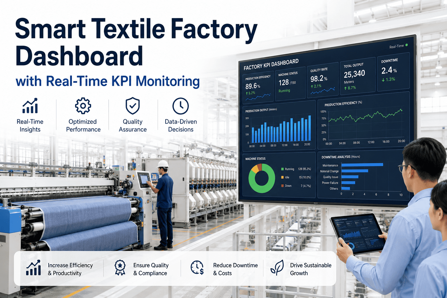
Ask ten mill managers how their plant performed last week and you will likely get ten different numbers pulled from ten different sources. A smart textile factory dashboard fixes that by pulling OEE, downtime, output, quality, energy, and maintenance data into one live, real-time KPI monitoring screen that every level of the plant looks at and trusts. Instead of chasing down reports before a Monday meeting, plant leaders open one screen and already know where the week stands. Mill leaders curious how their own KPIs would look on a live dashboard can book a demo today.
SMART FACTORY DASHBOARD · TEXTILE KPIs · 2026
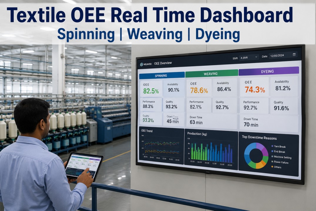
Every KPI That Matters, On One Live Screen
OEE, downtime, quality, energy, and maintenance data updating in real time, so your team stops debating whose number is right and starts fixing what the data actually shows.
OEE
Live availability, performance, and quality rolled into one number per line
DT
Downtime tracked by cause and machine as it happens on the floor
QC
Quality holds and rework rates surfaced before they reach dispatch
EN
Energy consumption per unit tracked alongside output for true cost visibility
Why Dashboards Fail Most Textile Plants
Plenty of mills already have a dashboard of some kind, yet most of those dashboards are built once, populated from static exports, and quietly ignored within a few months. The problem is rarely the visuals, it is the data underneath them. A dashboard pulling from yesterday's spreadsheet export is really just a slower version of the reports it was meant to replace, and teams learn fast which screens to trust and which to skip. Real-time monitoring only earns its place on the shop floor when the numbers refresh continuously and match what supervisors see happening in front of them.
A properly built smart factory dashboard treats KPI monitoring as infrastructure rather than a reporting project, connecting directly to machine, quality, and energy systems so every card updates the moment new data arrives, not the moment someone remembers to refresh a file.
REAL-TIME KPI MONITORING
See Your Own KPIs Live, Not Yesterday's
Get a walkthrough of a real-time dashboard built around your plant's actual OEE, downtime, and quality data.
What Goes Into a Mill-Ready Dashboard
Generic manufacturing dashboards rarely translate well to textile operations, since spinning, weaving, dyeing, and finishing each behave differently and need different KPI groupings to be genuinely useful.
| KPI Group | What It Tracks | Who Uses It Daily |
|---|---|---|
| Production Output | Shift-wise output against plan, by line and machine | Shift supervisors, plant managers |
| OEE Breakdown | Availability, performance, and quality per asset | Plant managers, maintenance leads |
| Downtime Analysis | Root cause, duration, and frequency by machine | Maintenance teams, engineering |
| Quality & Rework | Defect rates, hold status, rework volume | Quality teams, plant managers |
| Energy & Cost | Consumption per unit produced, by process stage | Plant managers, sustainability leads |
Getting Live in Four Steps
1
Map Your KPIs
Identify which numbers each role actually needs daily, rather than displaying everything a machine can technically output.
2
Connect the Sources
Machine sensors, quality logs, and energy meters feed the dashboard directly, replacing manual exports entirely.
3
Build Role-Based Views
Operators, supervisors, and leadership each see a screen scoped to their decisions, not one overloaded master view.
4
Refine With Usage
Dashboards are adjusted based on which cards teams actually act on, keeping the screen useful instead of cluttered.
What Plant Managers Are Saying
Our morning meeting used to start with someone running to print yesterday's numbers. Now the dashboard is already open on the wall screen before anyone walks in, and we spend the meeting deciding what to do about the numbers instead of arguing about what the numbers even are.
Plant Manager, Weaving and Finishing Unit
Frequently Asked Questions
How real-time is "real-time" on this dashboard?
Most KPI cards refresh within seconds of new data arriving from the connected machines, sensors, and quality checkpoints, so the dashboard reflects what is happening on the floor right now rather than a batch-processed summary. A small number of derived metrics that require aggregation across a full shift or day are recalculated continuously as new data streams in, so they stay current without requiring a manual refresh or export at any point.
Can different roles see different dashboards from the same data?
Yes, this is central to how the dashboard is designed rather than an afterthought. Operators typically see machine-level detail relevant to their station, supervisors see line and shift summaries across their area, and plant leadership sees a rolled-up view across the entire facility or group. All of these views pull from the same underlying live data, so there is never a mismatch between what one level of the organization sees and what another does.
What happens if a sensor or machine goes offline?
The dashboard clearly marks any asset with a data gap rather than silently showing a stale or flat number, so teams always know when a card reflects live conditions versus a temporary connectivity issue. Historical data for that asset remains intact and simply resumes updating once connectivity is restored, with no manual backfilling required from the team on the floor.
Do we need new sensors across the whole plant to get started?
Not for an initial rollout. Most plants already have enough machine and process data available through existing PLCs, energy meters, and quality checkpoints to build a genuinely useful first version of the dashboard. Gaps are typically identified during a short data audit early in the process, and any additional sensors needed can be added selectively rather than as a blanket requirement. Teams can review their specific setup through support before committing to any hardware spend.
How long does it take to get a live dashboard running?
A focused pilot on one or two critical lines is typically live within two to four weeks, giving the team a working example to validate before expanding further. Full plant-wide rollout across every KPI group usually completes within eight to ten weeks depending on how many data sources need to be connected. Plant leaders can book a demo to see a realistic timeline built around their own plant's current systems.
SMART FACTORY DASHBOARD · TEXTILE KPIs
Put Every KPI on One Trusted Screen
Join textile plants already running live OEE, downtime, quality, and energy monitoring in one dashboard.