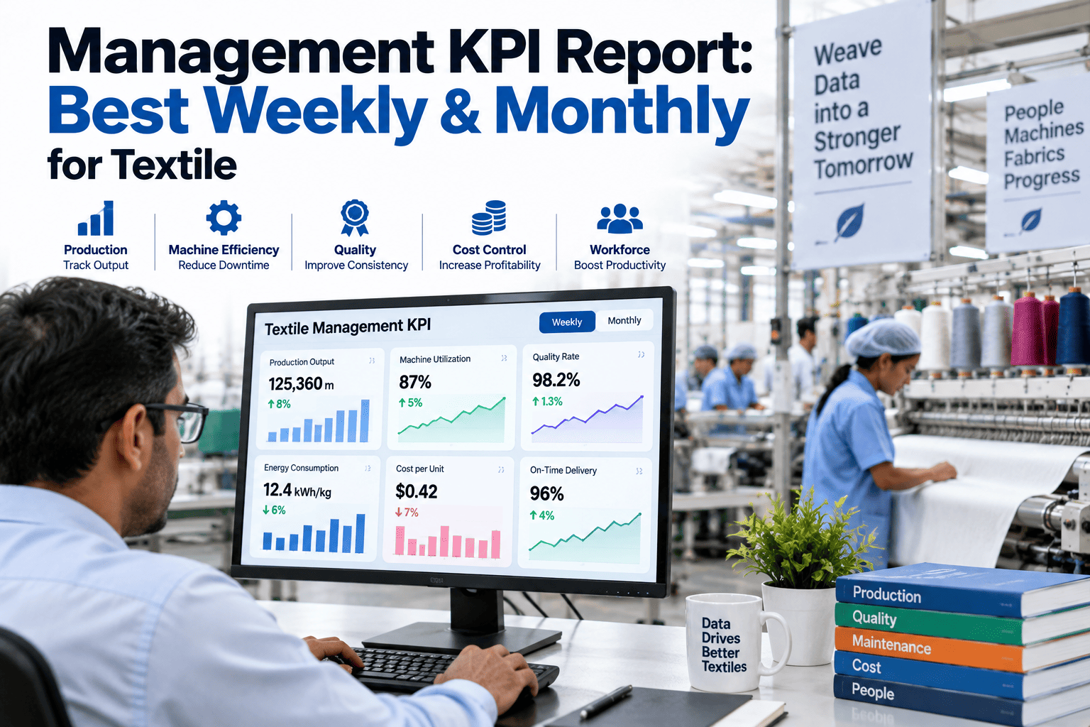
A weekly management review and a monthly one answer genuinely different questions, and a mill that runs both off the same report template usually ends up with a document that serves neither purpose well — too dense for a quick weekly check-in, too shallow for the trend analysis a monthly strategic review actually needs. Report structure, metric selection, and trend visualization all need to shift between the two cadences, since a weekly review is about catching an operational issue before it compounds while a monthly review is about spotting the slower trends that only become visible once enough weeks are stacked together. Mills building out this reporting discipline can start with a conversation with iFactory's support team about structuring weekly and monthly KPI reports as genuinely different documents rather than the same template run more or less often.
A Weekly Report and a Monthly Report Should Never Be the Same Document, Just Run Twice
Different cadences answer different questions, and a report structure that serves both weekly operational checks and monthly strategic review usually ends up serving neither well.
Catch it before it compounds
Spot the slower trend
Why the Same Template Fails at Both Cadences
A weekly review meeting has limited time and needs a report focused on what changed since last week and what needs immediate attention, while a monthly strategic review has more time allocated and needs a report that steps back to show trend lines across the month, comparisons against targets, and patterns that a single week's snapshot would never reveal. A report built to serve the monthly purpose, when run weekly, buries the urgent operational signal in too much trend detail, and a report built for weekly urgency, when run monthly, misses the broader pattern entirely.
What Belongs in Each Report Structure
Matching report content to its actual audience and purpose is what makes each cadence genuinely useful rather than a formality nobody reads closely.
Deviation From Target
A weekly report highlights which KPIs moved outside their expected range this week specifically, giving operational leaders a clear, immediate list of what needs attention.
Trend Line Over Time
A monthly report shows how each KPI has moved across every week of the month, revealing a slow drift that no single week's snapshot would make visible on its own.
A Small, Consistent Core Metric Set
A handful of core KPIs should appear in both reports so trend continuity is preserved, even as the surrounding detail and framing shift between weekly and monthly purposes.
Build Reports That Actually Fit Their Cadence
Book a 30-minute walkthrough of how iFactory structures distinct weekly and monthly KPI reports from the same underlying data.
Report Structures Compared
Understanding the practical differences between the two report types makes it easier to design each one deliberately rather than defaulting to one shared format.
| Element | Weekly Report | Monthly Report |
|---|---|---|
| Primary Question | What needs attention right now? | What pattern is emerging over time? |
| Metric Count | Narrow, focused on deviations | Broader, including trend context |
| Visualization Style | Simple current-vs-target comparison | Line charts showing multi-week trend |
| Typical Audience | Shift and production leaders | Plant and executive leadership |
Building the Monthly Report Around Rolling Trend Lines
A monthly report earns its place on the calendar by showing something a weekly snapshot cannot, and the most valuable addition is almost always a rolling trend view rather than a single end-of-month figure.
Week-by-Week Trend Line
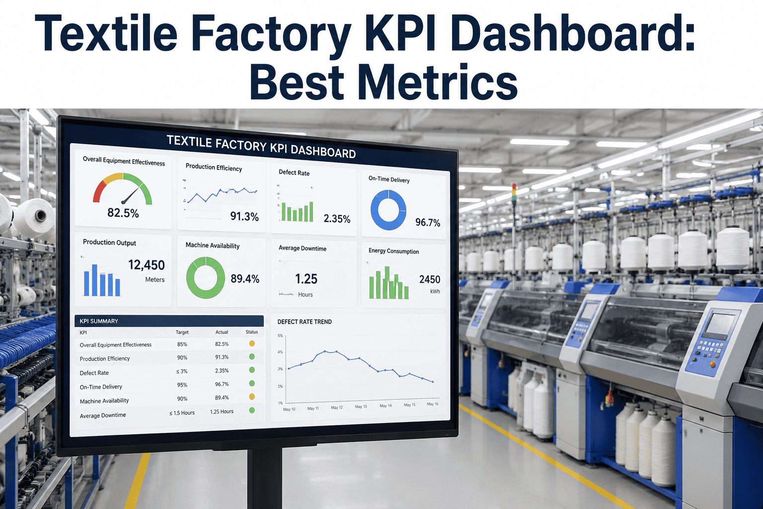
Plotting each week's figure across the month, rather than reporting only the final number, is exactly what would have revealed the defect rate creep earlier in the scenario above.
Comparison Against Prior Months
Overlaying the current month's trend against the same period in prior months highlights whether a pattern is seasonal or a genuinely new development.
Annotation of Known Events
Marking known events like maintenance windows or product changeovers on the trend line helps distinguish an expected fluctuation from a genuine unexplained drift.
A Composite Scenario: The Defect Rate Trend Nobody Saw Until the Quarter Review
A textile mill's weekly reports consistently showed defect rate within acceptable range week after week, since each week's figure individually sat close enough to target that it never triggered the deviation threshold the weekly report was built to flag. Production leadership had no reason for concern based on what the weekly reports were showing them.
When a quarterly strategic review compiled the full trend line across the preceding months, a slow, steady upward creep in defect rate became immediately visible, a pattern invisible in any single week's data but unmistakable once plotted across the full period. The root cause traced back to gradual wear on a specific loom component that had never crossed any single week's alert threshold but had nonetheless been quietly degrading quality month over month. The mill added a monthly trend report specifically to catch this kind of slow drift going forward, rather than relying on the quarterly review alone to surface it.
Mistakes That Undermine Management Reporting
Running Only Weekly Reports Without a Monthly Trend View
A slow drift that never crosses a weekly threshold, as in the scenario above, can persist for months without a monthly trend report to reveal the pattern.
Using the Same Report Template for Both Cadences
A shared template forces a compromise that under-serves the specific purpose of each cadence, whether that is immediate operational focus or trend visibility.
Selecting Metrics for Volume Rather Than Relevance
A report crowded with every available metric regardless of relevance to the specific cadence makes it harder to spot the signal that actually matters for that review.
Waiting for a Quarterly Review to Catch a Monthly-Scale Problem
Relying only on an infrequent quarterly review, as happened initially in the scenario above, gives a slow-developing issue far more time to progress before it is caught.
Is Your Reporting Cadence Actually Catching What It Should
Weekly and monthly reports are structured as genuinely different documents
Distinct formats matched to each cadence's actual purpose serve their respective audiences far better than one shared template.
A monthly trend view exists independently of any quarterly or annual review
A dedicated monthly trend report, as the mill in the scenario above eventually added, catches a slow drift long before an infrequent quarterly review would.
A small, consistent set of core metrics appears across both cadences
Keeping a stable core metric set preserves trend continuity even as surrounding report detail shifts between weekly and monthly framing.
Frequently Asked Questions
Why can a KPI look fine every week but still reveal a problem over a month?
A slow, gradual drift can produce week-to-week changes small enough to stay within a normal deviation threshold every single week, even though the cumulative change across several weeks is significant, exactly the pattern that let the defect rate creep in the scenario above go unnoticed in weekly reports until a quarterly review finally plotted the full trend line.
How many metrics should a weekly management report actually include?
A weekly report works best when it stays narrow, focused primarily on metrics that have deviated from target that specific week, since a report crowded with every available KPI regardless of current relevance makes it harder for the reader to quickly identify what actually needs attention in a time-limited weekly review meeting.
Should a monthly report replace the weekly report or run alongside it?
The two should run alongside each other rather than one replacing the other, since they serve different purposes, and the mill in the scenario above specifically added a monthly report as a supplement to its existing weekly cadence rather than replacing weekly reporting once the trend visibility gap became clear.
What is the best way to visualize a slow trend that weekly snapshots miss?
A line chart plotting the metric across every week within the month, rather than a single current-value figure, is what makes a gradual trend visible, exactly the visualization that revealed the defect rate creep in the scenario above once the full period was plotted together instead of viewed one week at a time. Book a demo to see how iFactory builds this kind of trend visualization automatically from weekly data.
What is the first step for a mill wanting to separate its weekly and monthly reporting properly?
The first step is defining the specific question each cadence is meant to answer, immediate operational attention for weekly and trend visibility for monthly, and then selecting metrics and visualizations that actually serve that question, rather than continuing to run the same report format at both frequencies. Mills wanting help structuring this can reach iFactory support directly.
Give Weekly and Monthly Reviews the Reports They Actually Need
iFactory structures distinct weekly and monthly KPI reports from the same underlying data, so operational urgency and trend visibility both get the attention they deserve. Book a walkthrough to see it running on live textile production data.