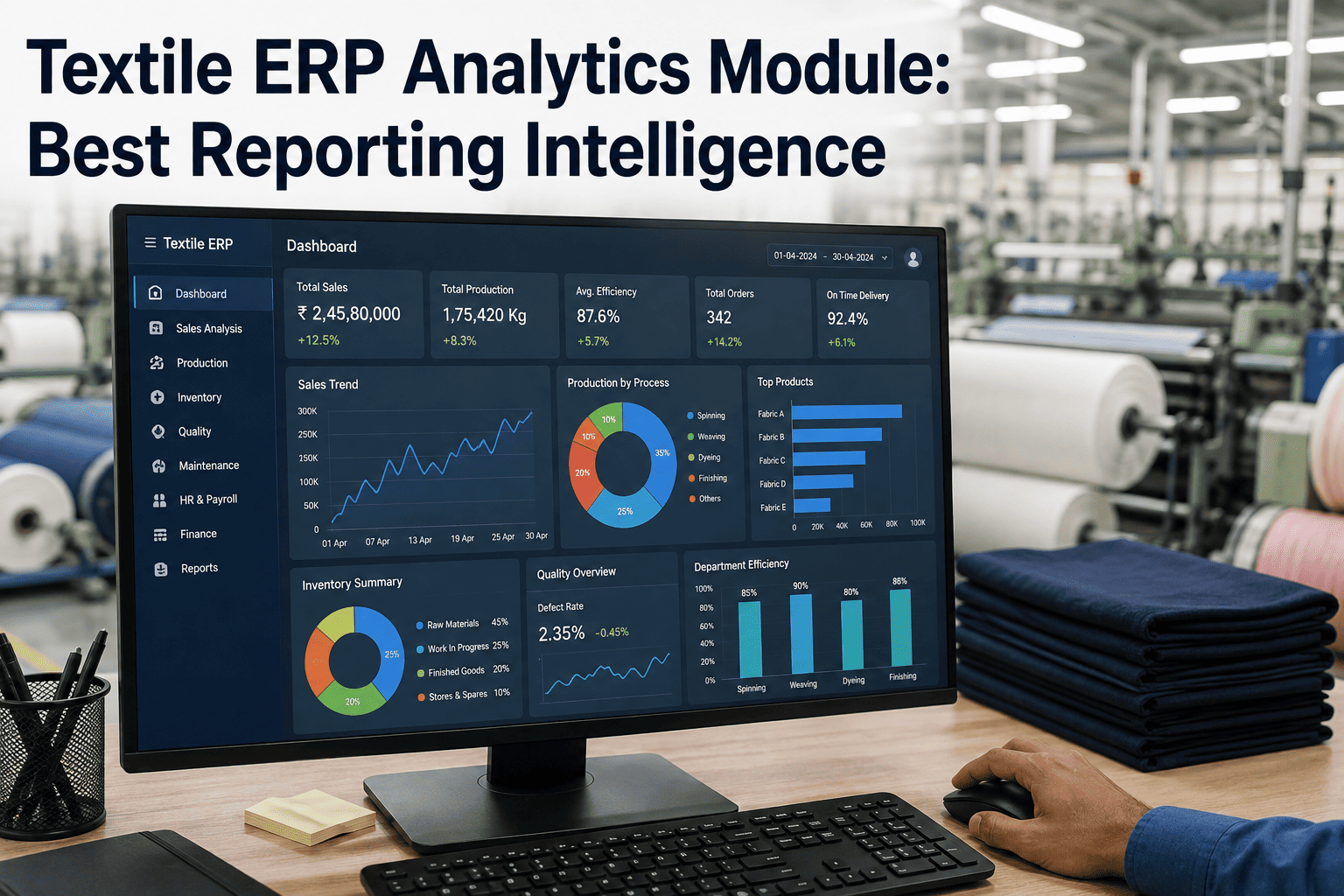
Most textile ERPs were built to record transactions — a purchase order raised, a batch closed, an invoice generated — and recording transactions is not the same job as helping a plant director understand why margin dropped two points this quarter. Analytics modules exist to close that specific gap: they sit on top of the transactional data an ERP already captures and turn it into the kind of reporting that answers a real question instead of just producing a export-ready table. The difference between a plant that has an ERP and a plant that has ERP analytics is the difference between having the data and actually being able to use it. Book a demo to see analytics running against your own ERP data.
Your ERP Already Has the Data. It Just Isn't Answering Any Questions.
Order history, batch records, machine downtime, and quality rejections are already sitting in your ERP tables, structured and mostly clean. An analytics module is what turns that raw transactional history into reporting someone can actually act on, without asking anyone to change how they enter data day to day.
Why "We Have an ERP" Doesn't Mean "We Have Reporting"
Ask a plant director for last quarter's rejection rate by fabric type and shift, and in most textile operations that question triggers a multi-day scramble — someone exports three separate reports, opens them in a spreadsheet, and manually reconciles fields that were never designed to be compared against each other. This is not a data problem, because the ERP captured every rejection event correctly. It is a reporting problem, because the system was built to record the transaction, not to answer the question a manager actually has three months later.
The scramble is also rarely a one-time cost. The same question tends to resurface every reporting cycle in a slightly different shape — this month it is rejection rate by fabric type, next month it is rejection rate by machine, the month after it is rejection rate against a specific buyer's tolerance — and each variation restarts the manual export-and-reconcile process from scratch because nothing about the previous month's work was reusable or saved for next time. Over a year, this adds up to a substantial and entirely avoidable time cost carried by exactly the people whose time is most valuable to the plant: production managers, quality heads, and plant directors who should be acting on reports, not assembling them by hand each cycle.
There is a second, quieter cost as well. When producing a report takes four to seven hours, the natural response is to produce it less often — monthly instead of weekly, quarterly instead of monthly — which means problems that would have been visible in week two are not caught until week eight, by which point the cost of the underlying issue has compounded well beyond what it would have been if the reporting cadence matched the pace of the problem instead of the pace of manual assembly.
Six Capabilities That Separate Analytics From Export Buttons
Many ERPs market an "analytics module" that is really just a nicer export screen with a few pre-built charts. Genuine analytics goes further, connecting data across modules, surfacing trends without being asked, and letting a non-technical manager build a new report without filing an IT ticket. The distinction matters when evaluating a purchase, because a module that only relabels the export screen will feel useful in a demo and disappoint within the first month of real use. Here is what that actually looks like in practice.
See These Six Capabilities Against Your Own ERP Data
Bring a real reporting question your team struggles to answer quickly today. We'll show you what that same question looks like once analytics is connected to your live data.
Two Different Tools Solving Two Different Problems
Built-in reporting and custom analytics are often marketed as interchangeable, but they solve genuinely different problems and most plants eventually need both. Built-in reports are fast, standardized, and require no setup — they are exactly right for recurring, well-defined questions like a weekly production summary that never really changes shape. Custom analytics exists for the questions nobody thought to pre-build a report for, which in practice is most of the interesting ones, because the questions that actually change how a plant is run rarely fit neatly into a pre-designed template.
The mistake most plants make is picking one and assuming it covers the other. A plant that only has built-in reporting eventually hits a wall the first time leadership asks a genuinely novel cross-functional question, and a plant that only has custom analytics without any standardized reporting ends up rebuilding the same weekly summary from scratch every cycle because nobody templated it, which defeats much of the time savings analytics was supposed to deliver. The two are complementary layers, not competing choices, and a well-designed analytics module offers both from the same underlying dataset.
| Dimension | Built-In Reporting | Custom Analytics |
|---|---|---|
| Setup time | None — ready out of the box | Initial configuration, one-time per report type |
| Best for | Recurring, standardized questions | Ad hoc, cross-functional, evolving questions |
| Who can use it | Anyone, no training needed | Power users with light training, or self-service builder |
| Flexibility | Fixed fields and layouts | Any combination of fields, filters, and comparisons |
| Typical output | PDF or scheduled export | Live dashboard, updated in real time |
Choosing which reports belong in each category is itself worth doing deliberately rather than defaulting everything into custom analytics because it feels more capable. A weekly production summary that never changes shape belongs as a built-in report precisely because its predictability is what makes it fast and reliable, while a comparison that shifts depending on what leadership is asking that particular week belongs in custom analytics where the flexibility earns its cost.
What a Working Analytics Dashboard Actually Shows
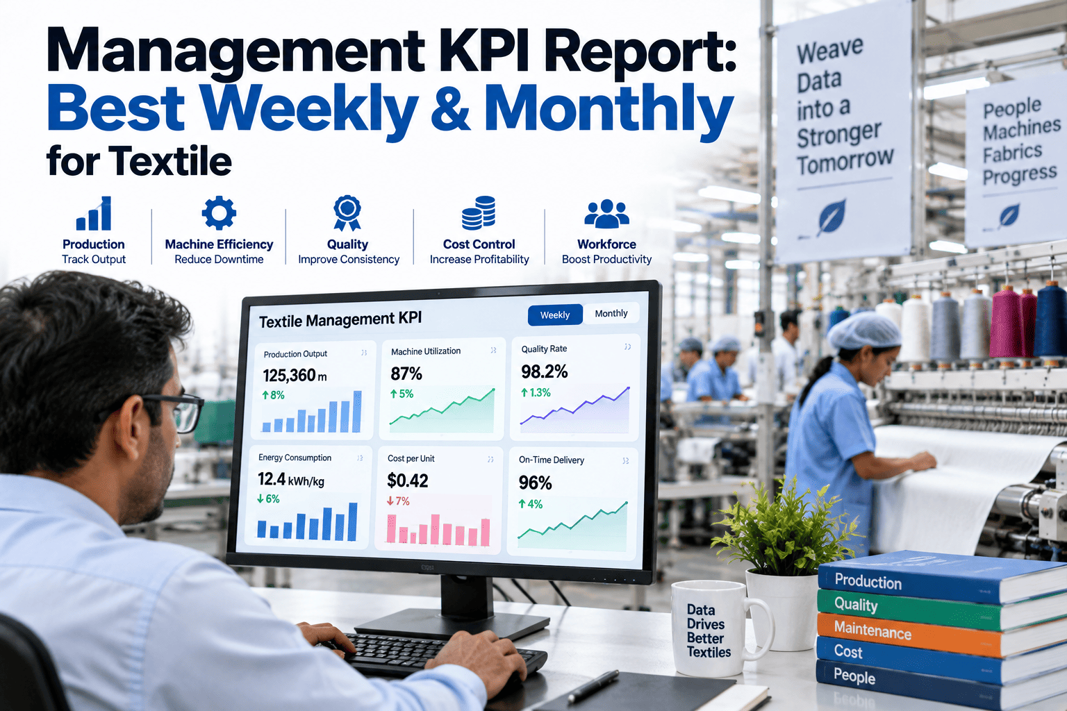
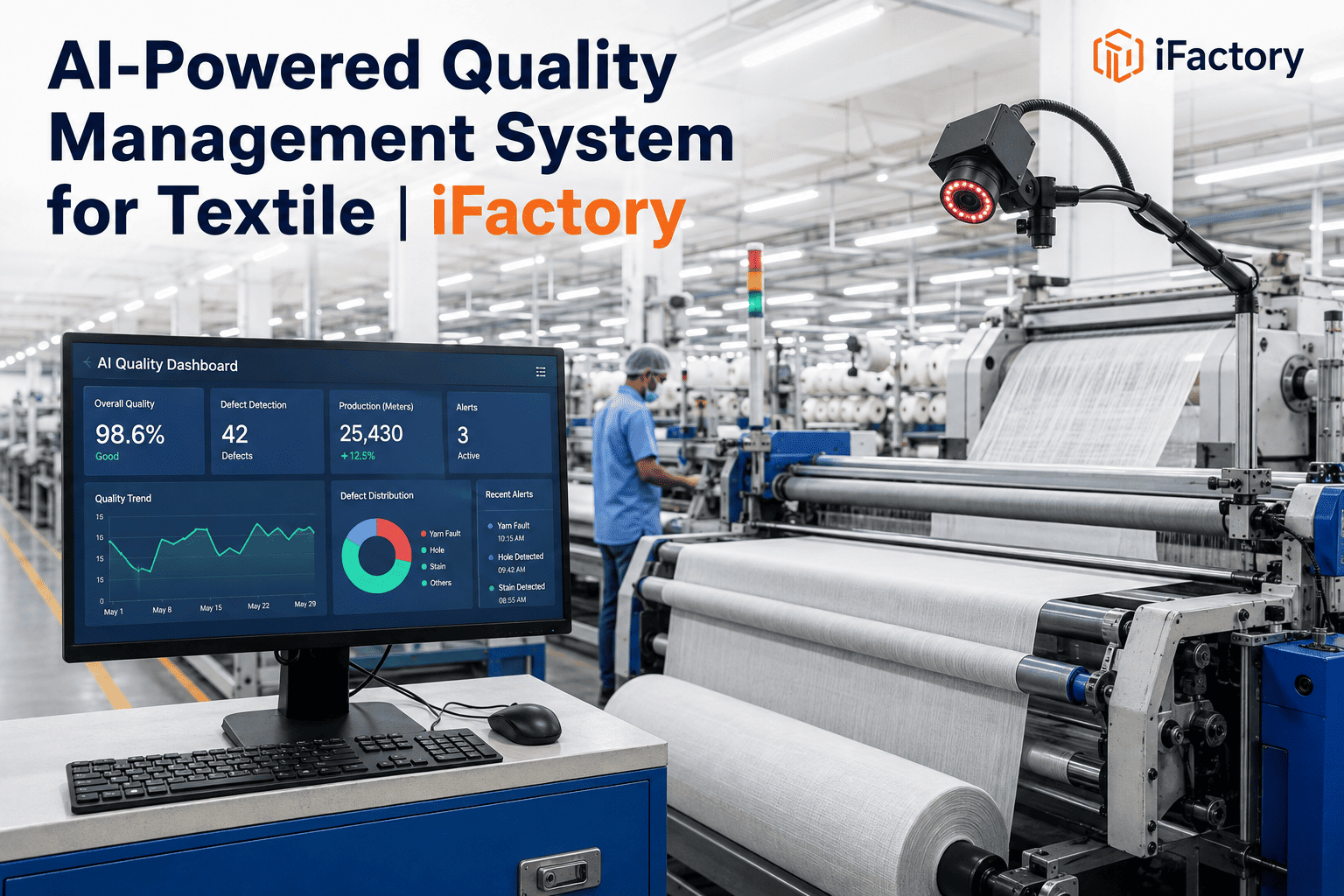
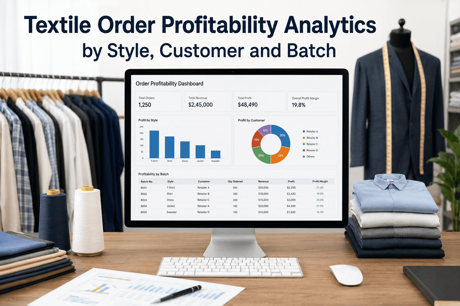
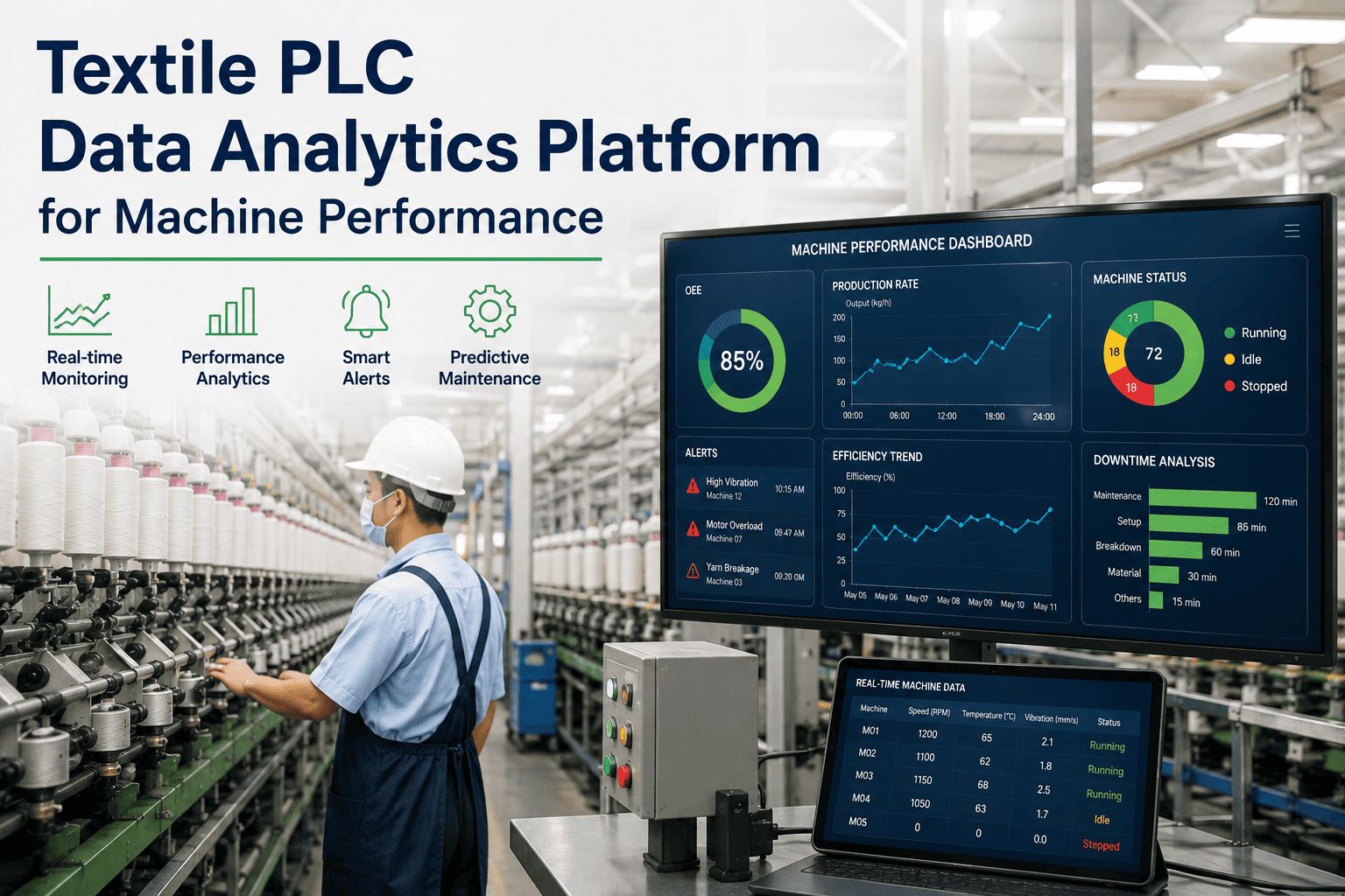
Abstract capability lists are less useful than seeing what a real dashboard panel looks like once it is built. These are representative of the panels a textile plant typically configures first, because they map directly to the decisions made most often on the floor and in the plant office. Each panel below is deliberately scoped to one clear decision rather than trying to show everything at once, which is also the design principle that makes a dashboard something people actually open every day instead of something they glance at once and abandon.
The Same Data, Answering a Different Question for Every Role
Analytics earns its budget line when different roles across the plant start pulling decisions from the same underlying dataset instead of maintaining separate, disconnected spreadsheets that inevitably drift out of sync with each other. This shared-dataset effect is often the most underrated benefit of an analytics rollout — beyond the time saved on any individual report, it eliminates the recurring arguments that happen when a production manager's spreadsheet and a quality head's spreadsheet show two different numbers for what should be the same underlying metric.
A Realistic Rollout Timeline
Analytics modules are typically layered onto an existing ERP rather than requiring a system replacement, which keeps the rollout timeline short and the risk to ongoing operations low. A layered rollout also means production continues uninterrupted throughout — nobody is asked to pause order entry or batch recording while the analytics layer is being connected, since it reads from existing tables rather than changing how they are populated. Most plants see the first working dashboards within the first month, with the full rollout including validation and alert tuning completing within a single quarter.
Four Avoidable Mistakes Plants Make When Adding Analytics
Analytics projects fail less often because of the technology and more often because of decisions made in the first few weeks of rollout — decisions about scope, ownership, and expectations that are easy to get wrong and expensive to unwind later once dashboards are already in front of users and trust has started to erode. These four patterns account for most of the disappointing deployments we see, and each one is avoidable with a small amount of upfront discipline.
The common thread across all four is scope discipline. A narrow, well-validated rollout that nails two or three high-value reports earns the trust needed to expand, while a broad rollout that tries to cover everything at once tends to produce dashboards nobody fully trusts and therefore nobody actually uses, regardless of how technically capable the underlying platform is. Trust, once lost early in a rollout, is far harder to rebuild than it would have been to earn carefully from a narrower starting point.
Common Questions on ERP Analytics for Textile Plants
Turn Your ERP's Existing Data Into Reporting You Can Act On
iFactory connects to the ERP you already run and builds role-based dashboards around the questions your team already asks every cycle. See it against your own data before committing to anything.