Manufacturing dashboards are deployed with the best intentions — give operators, supervisors, and managers real-time visibility into production performance. Yet the data tells a sobering story: the average plant-floor dashboard has a useful life of roughly ninety days before it becomes wallpaper. Peak adoption hits around week four, when the novelty is still fresh and the launch communication is still echoing. By week twelve, nearly two-thirds of stakeholders have stopped looking at it entirely, and only eighteen percent of the original audience opens the dashboard even once a month. This pattern repeats across industries, company sizes, and technology platforms because the root causes are not technical — they are behavioural, structural, and organisational. This page breaks down the five systemic failure modes that turn dashboards into digital wallpaper, provides a self-assessment to score your own dashboards against those failure modes, and offers a six-week action plan to rescue, redesign, or replace screens that nobody is using.
Is Your Dashboard Wallpaper? Find Out in 10 Minutes
A Quick Self-Assessment That Scores Your Dashboard Against the Five Failure Modes.
Take our ten-question dashboard health check to find out whether your screens are driving decisions or just decorating walls. Each question targets one of the five failure modes identified through research across more than forty manufacturing plants — content, design, process, people, and technology. Score each dimension on a simple Rarely / Sometimes / Always scale, total your results, and get an immediate picture of which failure modes threaten your dashboards most. You will walk away knowing exactly which of the five fixes to apply first, whether that is rationalising metrics, redesigning for a specific persona, adjusting refresh cadence, assigning ownership, or simplifying the visual layout. The assessment takes ten minutes and requires no special tools, no login, and no data entry — just honest answers about how your dashboards are built, who uses them, and what happens when something goes wrong on the line.
Dashboard Abandonment — The Numbers That Should Worry Every Plant Leader
The scoreboard below captures four statistics that every plant manager, operations director, and continuous improvement lead should know before investing in another dashboard project. These numbers come from research across discrete and process manufacturing plants of all sizes between 2022 and 2026. The picture they paint is consistent: dashboard abandonment is not a technology problem. It is a design, ownership, and audience-fit problem that no amount of better software will solve on its own.
The Five Failure Modes That Turn Dashboards into Wallpaper
Through structured interviews and dashboard audits across manufacturing plants, six recurring failure modes emerged as the root causes of dashboard abandonment. Each mode has a distinctive signature, prevalence rate, and recovery strategy. Understanding which of these six modes affects your dashboards is the first step toward rescuing them. The percentage shown on each card represents the share of audited dashboards that exhibited that failure mode as the primary cause of abandonment.
The Dashboard Adoption Lifecycle — Why Every Curve Looks the Same
The adoption curve below plots the typical usage trajectory of a manufacturing dashboard from launch through week twelve. The pattern is remarkably consistent across plants: a steep honeymoon ramp as the dashboard is introduced and championed, a brief peak around week four when the launch energy and initial training are still fresh, and then a steady decline as the dashboard is taken for granted, metrics grow stale, and users quietly revert to their old habits. The three coloured zones correspond to the emotional and behavioural phases that users pass through, and the dotted vertical line marks the peak adoption point after which every unowned dashboard begins its slide into wallpaper.
The Five Fixes — Pre-Built in iFactory
iFactory Ships Every Antidote to Dashboard Wallpaper as a Built-In Feature.
Every one of the five fixes described above is baked into the iFactory analytics platform as a standard capability, not a custom add-on. Persona-based dashboards with role-specific views for operators, supervisors, plant managers, and executives are available out of the box with pre-built metric sets for each persona. Sub-minute data refresh with automatic streaming from PLCs, sensors, and MES ensures that plant-floor screens always show current state, not yesterday’s report. Named dashboard ownership with quarterly review workflows built into the platform prevents the nobody-owns-it drift that kills most dashboards after ninety days. The simplified layout system enforces the one-screen-one-question design principle automatically. And the adoption analytics module tracks who opens which dashboard, how long they stay, and which metrics they view most, giving you the data you need to continuously improve rather than guess.
The Five Fixes — Proven Antidotes to Dashboard Wallpaper
Each of the five failure modes has a corresponding fix that has been validated in practice across manufacturing plants. These fixes are not theoretical best practices from a consultant’s playbook — they are interventions that have been applied in real plants and produced measurable improvements in dashboard adoption, user satisfaction, and decision quality. The fixes are ordered by impact: start with number one and work through the list sequentially for the fastest path from wallpaper to working tool.
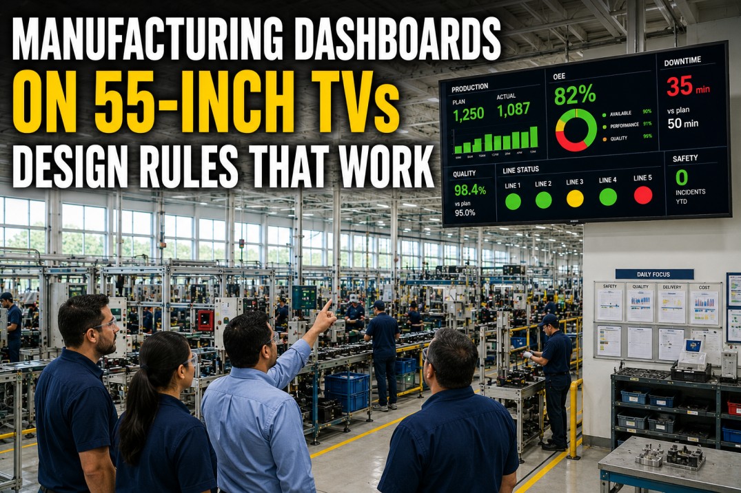
Before and After: Wallpaper vs Live Dashboard Comparison
The comparison table below contrasts the characteristics of a dashboard that has become wallpaper against the characteristics of a live, decision-driving dashboard across eight criteria. Each criterion maps to one of the five failure modes and shows the specific behavioural and design differences that separate a screen people use from a screen people walk past. Red dots indicate the wallpaper state; green dots indicate the live dashboard state.
| Criterion | Before (Wallpaper) | After (Live Dashboard) |
|---|---|---|
| Content Freshness | Updates daily or weekly | Updates every 30–60 seconds |
| Audience Fit | One-size-fits-all for entire plant | Persona-specific by role and level |
| Visual Density | Twenty-plus metrics per screen | Seven to nine decision-grade metrics |
| Actionability | Data is watched but rarely acted upon | Every metric drives a specific decision or alert |
| Ownership | Built by IT, owned by nobody | Named operations owner with quarterly review |
| Refresh Rate | Daily batch refresh | Sub-minute streaming or near-real-time |
| Mobile Access | Desktop-only — not available on the floor | Responsive web or native mobile app on the line |
| User Training | None — just put up the screen | Brief training on what each metric means and what to do |
Dashboard Health Check — 10 Questions to Score Your Screens
Use this ten-question self-assessment to evaluate any dashboard in your plant against the five failure modes. Each question is grouped into one of four categories — Content, Design, Process, People, and Technology — that correspond directly to the fixes. For each question, select Rarely, Sometimes, or Always based on the current state of the dashboard. A majority of ‘Rarely’ answers in any category indicates a failure mode that needs immediate attention. A dashboard that scores ‘Always’ on at least eight of ten questions is likely healthy and driving real decisions.
Six-Week Rollout Plan — From Wallpaper to Working Tool
Rescuing existing dashboards or launching new ones that avoid the wallpaper trap requires a structured, time-boxed approach. The six-week plan below takes you from audit through sustain, with each week focused on a specific activity that addresses one or more of the five failure modes. Follow the plan in sequence for a single dashboard or a dashboard portfolio. Each week includes a clear success metric so you know you are making progress.
- Inventory every dashboard in the plant
- Score each against the five failure modes
- Identify top-ten candidates for rationalisation.
- Eliminate duplicate dashboards
- Merge overlapping metrics
- Remove every metric that does not drive a decision
- Target 40–60% metric reduction.
- Apply persona-based layouts
- Build operator, supervisor, and manager views
- Set refresh cadence per persona
- Test readability at fifteen feet.
- Deploy to pilot line or area
- Run parallel with old dashboards for one week
- Collect user feedback
- Fix layout and data issues fast.
- Run thirty-minute walkthrough sessions per shift
- Explain each metric, what good looks like, and what action to take
- Distribute one-page reference card.
- Assign dashboard ownership
- Set quarterly review cadence
- Track adoption analytics
- Retire metrics that drop below 20% usage for two consecutive quarters.
Frequently Asked Questions
Why do most manufacturing dashboards stop being used after 90 days?
The 90-day abandonment pattern is driven by a combination of factors. Most dashboards are launched with enthusiasm but without a clear owner, so when the initial champion moves on or gets busy, the dashboard drifts. Metrics that were relevant at launch become outdated as production changes, but nobody updates them. The refresh cadence is typically daily or slower, so operators quickly learn that the data on screen is behind what they already know from the line. Information overload sets in as more metrics are added over time without removing any, making the screen harder to read. Finally, nobody trained the users on what to do with the information, so the dashboard becomes background noise. Breaking this cycle requires assigning ownership, matching refresh cadence to decision cadence, designing for the specific persona, and training every user on the action each metric drives.
What are the signs that a dashboard has become wallpaper?
There are six clear signs that a dashboard has become wallpaper. First, operators and supervisors walk past the screen without glancing at it — it has become part of the furniture. Second, when you ask operators what the dashboard says, they shrug or give an answer that is clearly not based on the current data. Third, the dashboard shows metrics that nobody in the room can explain the definition of. Fourth, the data is visibly stale — the date stamp says yesterday or last week. Fifth, the dashboard has more than twelve visible metrics on a single screen, which means nobody can process it at a glance. Sixth, and most tellingly, when a production issue occurs on the line, nobody walks to the dashboard to diagnose it — they use their own notes, call a supervisor, or walk to the line to see for themselves. If the dashboard is not the first place people go when something goes wrong, it is wallpaper.
How do I rescue a dashboard that nobody is using?
Rescuing a dead dashboard requires a structured intervention. Start with a candid audit: list every metric on the screen and ask the plant manager, supervisor, and operator separately whether they use it to make decisions. Delete every metric that gets a unanimous ‘no’. Then identify the three to five decisions that the dashboard’s target audience makes most frequently — for operators this is typically line speed adjustment, quality intervention, and downtime response — and design the dashboard around those decisions alone. Set the refresh cadence to sub-minute for plant-floor screens. Assign a named operations owner who will review the dashboard quarterly. Run a thirty-minute training session per shift showing users exactly what each number means and what to do when it changes. Finally, track adoption: if usage does not improve within two weeks, repeat the cycle. Most dashboards can be turned around in thirty days if leadership treats the rescue as a priority improvement initiative rather than an IT project.
What is the right refresh cadence for plant-floor dashboards?
Refresh cadence must match the decision cadence of the user. For plant-floor dashboards viewed by operators and line leads, the refresh interval should be thirty seconds to one minute. Operators make decisions about line speed, quality intervention, and downtime response in real time, and they need data that reflects the current state of the line, not the state it was in ten minutes ago. For shift-level dashboards used by supervisors to track shift performance against targets, a five- to fifteen-minute refresh is appropriate — the supervisor is looking at trends and cumulative numbers that do not change meaningfully every few seconds. For managerial and executive dashboards focused on daily, weekly, and monthly trends, a daily refresh is perfectly adequate because the decisions being made at that level operate on longer time horizons. A common mistake is applying a single refresh cadence across all dashboards regardless of audience and decision type, which either overwhelms executives with unnecessary volatility or starves operators of current data.
How do I measure dashboard adoption in my plant?
Dashboard adoption can be measured through both quantitative and qualitative signals. Quantitatively, track the percentage of target users who open the dashboard at least once per shift, the average session duration (a meaningful session is at least fifteen seconds), the most-viewed metrics, and the abandonment rate (users who opened the dashboard in the first week but have not opened it in the last thirty days). Most analytics platforms provide these metrics natively. Qualitatively, conduct monthly walkthroughs: stand at the dashboard screen during shift change and count how many people glance at it unprompted, ask operators what the current OEE number is, and observe whether the dashboard is referenced during shift handover meetings. A simple pulse survey asking ‘On a scale of one to five, how often do you use this dashboard to make a decision?’ provides a direct adoption score. The goal is not 100% adoption — some roles genuinely do not need the dashboard — but sustained usage above 60% of the target audience is a healthy benchmark for plant-floor dashboards.
Replace Wallpaper with a Dashboard Your Team Actually Uses
Stop Wasting Money on Dashboards Nobody Reads. iFactory Guarantees Adoption with Persona-Based Design, Sub-Minute Refresh, and Built-In Ownership Workflows.
iFactory’s manufacturing analytics platform is built from the ground up to prevent dashboard abandonment. Every dashboard starts with a persona template matched to the user’s role and decision frequency, so you never deploy a screen designed for the wrong audience. Data refreshes from the plant floor in under sixty seconds with native connections to PLCs, SCADA, MES, and ERP systems, so operators see current state, not yesterday’s snapshot. Every dashboard has a named owner with automated quarterly review reminders, so metrics stay relevant as production changes. The platform includes built-in adoption tracking that shows you exactly who is using which screen, how often, and which metrics they view most — giving you the data you need to continuously improve. Deployment takes weeks, not months, and the platform is configurable without coding. Book a demo to see how iFactory keeps dashboards alive past the ninety-day mark.