Most plants already have a downtime Pareto chart. It is usually ranked by number of stops and shows the same top bar every week. The team works on it for months and the losses barely move. The problem is not the chart but what it measures. Counting stops and counting minutes can both point you at the wrong failure. This guide shows how to build a downtime Pareto ranked by cost, drill it down to a fixable cause and prove the result, with a full worked example. Walk through your data in a downtime review.
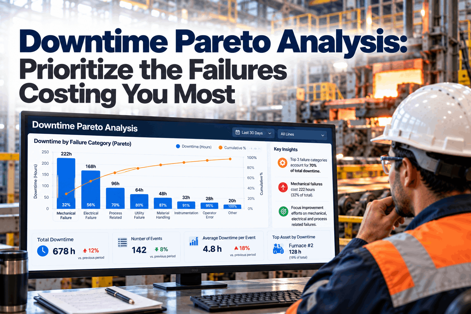
Downtime Pareto Analysis: Prioritize the Failures Costing You Most
Rank downtime by what it actually costs, not just how often it happens. Then drill the top bar down to one asset and one failure mode your team can fix this month.
- Why frequency and minutes can rank the wrong failure first
- A worked cost Pareto from raw downtime data
- Drill-down, reason codes and proving the gain
What a Downtime Pareto Should Tell You
The vital few, ranked by the loss you care about.
The Pareto idea, popularised in quality management by Joseph Juran as the "vital few and useful many", is simple: a small number of causes usually account for most of the loss. A downtime Pareto sorts stoppage causes from largest to smallest and adds a running total, so you can see where the line crosses roughly 70 to 80 percent. The causes to the left of that point are where improvement effort should go first. The hard part is choosing what to rank by. Our reliability analysts can help you decide for your lines.
Frequency
Number of stops. Good for spotting nuisance faults that wear down operators, but blind to long failures.
Minutes
Total time lost. Better, but treats a minute on a buffered machine the same as a minute on the bottleneck.
Cost
Lost output, repair, scrap and labour. The ranking that matches what the stoppage actually costs.
Why Frequency and Minutes Can Mislead
Not every minute of downtime costs the same.
A minute of downtime on the bottleneck machine loses a minute of output for the whole line. A minute on a machine with a buffer in front of it may cost nothing if the buffer covers it. A rare motor failure may stop the line only twice a month, yet bring repair cost, scrap and a long restart. Ranking by count or minutes alone hides all of this. That is why the same top bar can stay top for months while the real losses come from somewhere else. Test your current chart in a Pareto check.
Buffers absorb stops
Short stops on non-bottleneck machines often never reach the line output.
Rare but expensive
Big breakdowns add parts, contractors and scrap on top of lost time.
Restart losses
Some stops need a long ramp-up or produce off-spec product after restart.
Product mix
An hour lost on a high-margin product costs more than on a low-margin one.
How to Put a Cost on Each Downtime Cause
A simple formula is enough to change the ranking.
You do not need a perfect costing model. A consistent estimate, agreed with finance, is enough to rank causes fairly. Use the same formula for every cause and every month, so changes in the chart reflect changes on the floor, not changes in the maths. Agree the formula with our support team if you want a second view.
When output is lost, the plant loses the contribution margin on each unit, not the full selling price, because materials and other variable costs are not spent either. Using price inflates every number and makes small stops look bigger than they are. If the line is sold out and output can never be recovered, margin is the right figure. If lost output can be made up on overtime, use the overtime cost instead.
A Worked Example: Three Rankings, One Line
Same downtime data, three different top causes.
The grid below shows one month of downtime on a packaging line running 60 units per hour at the bottleneck, with a contribution margin of $40 per unit, so each lost line minute costs $40. The labeler has a buffer that absorbs about two thirds of its stoppage time. All figures are illustrative. Build the same view from your data in a working session.
Labeler looks like #2
160 stops put it second, yet most of its time is absorbed by the buffer.
Motor looks minor
Only 2 stops and fourth by minutes, so it rarely gets attention.
The real picture
Motor failure is #2 at $24,300. Labeler faults fall to last at $6,700.
Ranked by cost, filler jams, motor failure and changeover overrun reach 71.4 percent of the $100,300 total. Those three are the vital few for this line. A team that spent the month on labeler faults, the second bar on the frequency chart, would have attacked less than 7 percent of the cost.
See Your Downtime Ranked by Cost
Connect your machine states, reason codes and work orders, and see a cost-ranked Pareto for each line, refreshed every shift.
Drill Down Until the Cause Is Fixable
"Filler jams" is a category, not a cause.
A first-level Pareto tells you where to look, not what to fix. Take the top bar and run a second Pareto inside it, by station, failure mode or product. Then run a third if needed. Stop when the top bar names something a team can act on this month, such as one valve, one change part or one setting. Going one level too deep is rarely a problem. Stopping one level too early is the most common reason improvement projects drift. Practise the drill-down with our improvement team.
Line
Filler jams, $25,700.
Station
Valves 7 to 12 carry most of it.
Mode
Jams mostly on one bottle size.
Cause
Worn change parts on that size.
Action
Replace and set a wear check.
Use the same cost lens at every level, so a small station with expensive failures is not hidden behind a busy one with cheap ones. When you reach the failure mode, add a short root cause step, such as five whys, before choosing the fix.
Reason Codes Decide the Quality of the Chart
A Pareto is only as good as the codes behind it.
If a third of your downtime is coded "other" or "unknown", the biggest bar on the chart is a data problem. Fix the codes before trusting the ranking. Plan a clean-up in a reason code session.
Good reason codes
- Specific to machine and failure type
- Short list operators can use quickly
- Planned stops kept apart from failures
- Machine state captured automatically
Warning signs
- "Other" is one of the top bars
- Codes that differ between shifts
- Stops entered hours after they happen
- Micro-stops missing from the data
Prove the Gain with a Before and After Pareto
A fix is only done when the bar moves.
After each fix, compare the cost Pareto for the same line over the same length of time before and after. The fixed cause should shrink, and the next cause becomes the new top bar. That is how a Pareto program keeps moving rather than stalling on the same chart. Record each fix with its date, owner and expected saving, so the comparison is honest and the next review starts from facts rather than memory. Ask our analysts how to set up the comparison.
Downtime Pareto Mistakes to Avoid
Most stalled Pareto programs share the same habits.
These patterns come up again and again in plants that have a chart but no progress. A short program review can spot them.
What works
- Ranking by cost, checked against minutes
- Drilling down to a fixable cause
- One owner and date per top cause
- Before and after comparison every fix
What fails
- Ranking by stop count only
- Working on whole categories
- Mixing planned and unplanned stops
- Changing the time window every month
How iFactory Automates Downtime Pareto Analysis
Cost-ranked Pareto, live, on your own network.
iFactory captures machine states from PLCs and SCADA, links them to reason codes, work orders and production data, and builds cost-ranked Pareto charts for every line on an on-prem AI server inside your plant. The AI suggests drill-downs and tracks before and after results. Fit questions go to our solutions team.
Automatic capture
Stops and durations read from machines.
Three lenses
Frequency, minutes and cost side by side.
Reason code help
AI suggests codes and flags "other".
Drill-down
Line, station, failure mode and product.
Before and after
Every fix measured on the same basis.
Linked work orders
Top causes turned into planned jobs.
Results depend on your data quality, reason codes and how consistently fixes are followed through. We measure downtime cost by cause and the change after each fix on your own data during the pilot, rather than promising a general figure.
Turnkey AI: Delivered, Connected and Live in 6–12 Weeks
You do not build this. It arrives ready.
iFactory ships as a pre-configured NVIDIA AI server with the software pre-loaded, racked and ready. Rack it, plug in power and Ethernet, and the AI is live on your network. Our team handles cabling, network setup, PLC, SCADA, DCS and CMMS integration, PLC and production links, operator training and 24×7 remote monitoring. Data stays on your network. For a scope matched to your plant, request a turnkey quote.
Ship, network and data
Server installed. Machine states, reason codes, work orders and production data connected.
Model training and pilot
Cost model agreed with finance. Pareto charts run beside your current reports for one line.
Go-live and training
Cost-ranked Pareto live for all lines. Teams trained on drill-down. 24×7 monitoring begins.
Frequently Asked Questions
What is downtime Pareto analysis?
It ranks downtime causes from largest to smallest with a running total, so you can see the few causes that make up most of the loss and focus improvement there first.
Should we rank by frequency, minutes or cost?
Use cost as the main ranking, because it reflects what the business loses. Keep frequency and minutes as supporting views, since they help with nuisance stops and operator workload.
How do we estimate downtime cost?
Multiply lost line minutes by output per minute and contribution margin per unit, then add repair, parts and scrap. Agree the formula with finance and keep it the same each month.
What time window should we use?
Long enough to smooth out one-off events, often four to twelve weeks. Keep the window the same when comparing before and after a fix.
What if "other" is the biggest bar?
Treat it as a data problem first. Tighten reason codes and capture machine states automatically before acting on the ranking.
How deep should the drill-down go?
Until the top bar names something one team can fix soon, such as one component, one setting or one product size. That usually takes two or three levels.
How often should the Pareto be reviewed?
Look at it weekly in the production or reliability meeting, but judge fixes over a full window of four weeks or more. Daily swings are mostly noise and can send teams chasing the wrong cause.
Should planned stops be included?
Keep planned stops such as scheduled changeovers in a separate Pareto. Overruns beyond the planned time belong in the downtime Pareto.
How do we start?
Start with one line. A 6-week pilot connects your machine data, agrees the cost model and runs cost-ranked Pareto charts beside your current reports. To plan it, contact our team.
Work on the Failures That Cost You Most
In thirty minutes we take one line's downtime data and rank it three ways, so you can see whether your current top bar is the right one. You keep the analysis either way.
- 1A month of downtime data for one line
- 2Your current downtime Pareto
- 3Line rate and bottleneck machine
- 4A rough margin per unit from finance
- 5The top bar that never seems to move