Quality Dashboard Software for Real-Time KPI and Defect Analytics
By Josh Brook on April 25, 2026
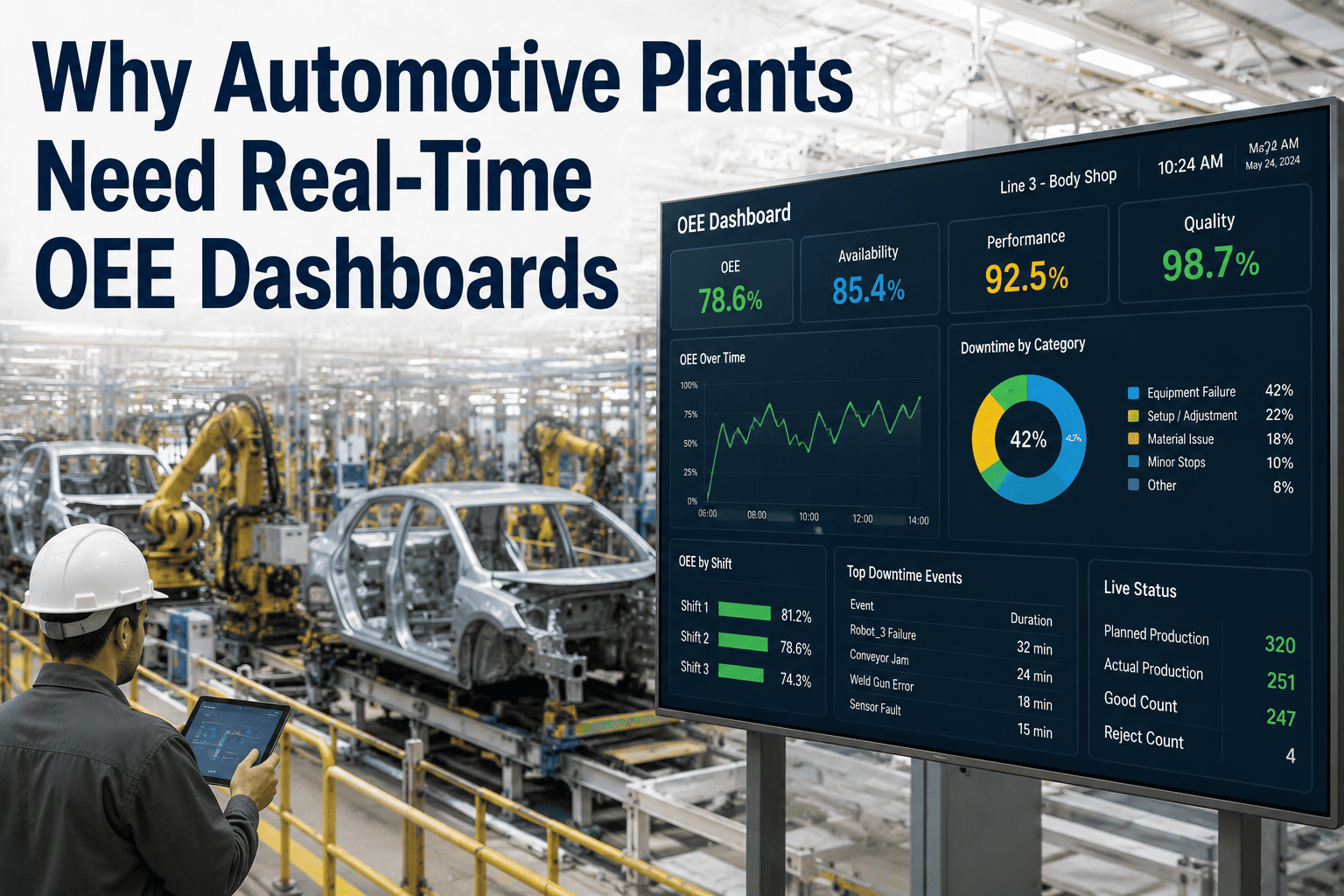
A medium-sized injection molding plant outside Chennai discovered something uncomfortable last summer: their monthly quality report and the actual condition of the floor had stopped agreeing. The report said First Pass Yield averaged 96.4% and rejection rate was holding steady at 2.1%. Meanwhile, the WIP holding area was overflowing, the rework cell was running a second shift it was never staffed for, and customer complaints had climbed 38% quarter over quarter. The numbers were real. They were just three weeks late, aggregated across mixed product families, and missing the rework loop entirely. By the time anyone read the report, the problems had already compounded for nearly a month. This is the gap a real-time quality dashboard closes — not by inventing new metrics, but by making the ones you already trust visible the moment they move. Eleven weeks after going live with a live KPI dashboard tied to MES and inspection data, that same plant cut customer complaints by 61%, recovered 14 hours of weekly rework capacity, and finally saw their FPY in the same week it actually happened. Quality cannot be managed in the rear-view mirror. It has to live on the screen in front of you.
iFactory Quality Intelligence
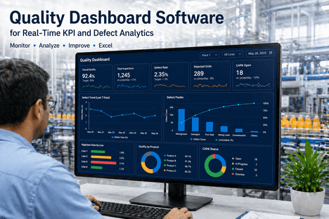
Quality Dashboard Software for Real-Time KPI and Defect Analytics
Live FPY, defect density, scrap rate, CAPA status, and supplier quality on one screen — refreshed every minute, drillable to the root cause, alert-driven the moment a metric drifts off target.
What a Real-Time Quality Dashboard Actually Looks Like
Most quality teams have never seen their own metrics presented this way. The dashboard below is a representative iFactory layout — eight KPI tiles, a defect Pareto, a CAPA funnel, and a top-five offending parts list — all driven by the same data flowing through your MES, inspection systems, and SPC engine. Every number updates as the line runs.
Plant Quality Dashboard — Line 3 — Shift A
LIVE · refreshed 24s ago
First Pass Yield
97.4%
+1.2% vs target
Defect Rate
2,840 ppm
at target ceiling
Scrap Rate
1.4%
−0.6% vs last shift
Rework Rate
3.8%
+1.1% above limit
Cpk (critical dim)
1.61
stable, capable
CAPA Closure Rate
82%
7 overdue
Supplier PPM
340
improving 90d
CoPQ % Revenue
1.8%
world-class band
Defect Pareto — Last 7 Days
Top defect modes by occurrence count
CAPA Funnel — Open Investigations
Status across the corrective action lifecycle
Issued48
Root Cause Identified41
Action Implemented32
Effectiveness Verified24
Closed16
Top 5 Offending Parts — This Week
1
Housing-A4501
142 defects · Flash · Cavity 3
32%
2
Cover-B2208
98 defects · Sink marks · Tool wear
22%
3
Bracket-C7712
71 defects · Short shot · Material lot
16%
4
Clip-D3044
52 defects · Color shift · Pigment
12%
5
Spacer-E1190
38 defects · Warp · Cooling cycle
9%
Want to see what your line looks like in this format? Book a 30-minute walkthrough — bring 7 days of defect data and we will build the exact view above on your numbers.
The Eight Quality KPIs That Belong on Every Dashboard
Dashboard design fails most often by trying to track everything. World-class plants converge on roughly the same eight KPIs — a balanced mix of leading indicators (catch problems early) and lagging indicators (validate that the system is working). These are the metrics that actually drive decisions on the floor every shift.
The CFO's quality KPI. Translates every dimension of poor quality into the only language the boardroom cares about — money.
Leading vs Lagging — The Architecture That Separates World-Class Plants
Most plants run almost entirely on lagging metrics — defect rate, scrap, customer complaints. By the time those numbers move, the damage is already done. World-class quality programs invert the ratio: leading indicators dominate the dashboard, lagging metrics validate that the leading system is working. This is the shift from quality archaeology to quality intelligence.
Leading Indicators
Predict tomorrow's defects
Cpk Drift
Capability collapsing on a critical dimension three days before the first defect occurs
Inspection Frequency
First-shift sample counts dropping below standard, hinting at coming process variation
Supplier Quality Rate
Receiving rejection rate climbing on a key vendor before the lots reach production
Audit Compliance
Layered process audit pass rate dropping, an early sign of process discipline erosion
Training Currency
Operator certifications expiring on critical-to-quality stations
Lagging Indicators
Confirm yesterday's failures
Defect Rate / DPPM
How many bad units left the line — measured after the fact, after the cost is sunk
Scrap Rate
Material discarded — the cost is already on the books by the time you see it
Customer Complaints
Quality failures the customer found before you did — the most expensive feedback loop
RMA Rate
Returns triggered by escaped defects — the brand-damage metric
Warranty Cost
Field failures monetized — the slowest, most painful learning loop in manufacturing
Four Dashboard Tiers — One System, Four Audiences
An operator on Line 3 needs different information than the plant manager, who needs different information than the corporate VP of Quality. A modern dashboard platform delivers all four views from the same data source — same numbers, different lens. This is what separates a real platform from a spreadsheet anybody can lose.
T1
Operator View
Audience: line operators & team leads
Refresh: every 30–60 seconds
Live FPY for current run, Cpk on critical dimensions, last 5 SPC alerts, current shift defect tally. 3–5 metrics, glanceable from across the bay.
T2
Supervisor View
Audience: line supervisors & quality engineers
Refresh: every 5–15 minutes
Zone-level FPY, top-3 defect Pareto, shift-to-shift comparison, open NCRs, supplier alerts. 5–8 metrics, drillable to the part and station.
What Connects to the Dashboard — And What That Buys You
A dashboard is only as useful as the data flowing into it. iFactory's quality dashboard pulls from every system that already produces quality-relevant data — so the numbers on screen actually match the floor, every minute, with no manual entry tax.
MES / SCADA
Live production counts, defect codes by station, downtime reasons, OEE quality factor.
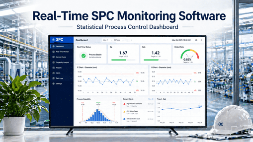
SPC Engine
Live Cpk per characteristic, Western Electric rule violations, control-chart status.
CMM & Vision
Inspection results from Q-DAS, DMIS, REST APIs. Pass/fail and dimensional data.
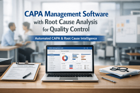
QMS / NCR
Open NCRs, CAPA status, audit findings, deviation reports, change-control items.
IQC System
Supplier scorecards, lot acceptance rates, SCAR status, switching-rule changes.
ERP / Cost
Standard cost per part, scrap value, rework labor hours, warranty claim totals for CoPQ.
What Plants See in the First 90 Days
The case for a quality dashboard is measurable. These are typical first-90-day outcomes from iFactory deployments at automotive, FMCG, electronics, and medical-device manufacturers in 2025–2026.
15%
Productivity lift
from earlier defect detection alone
61%
Fewer customer complaints
in plants moving from monthly to live
3 wks to 1 min
Reporting lag eliminated
from monthly aggregates to live tiles
2 hrs
Audit prep, not weeks
timestamped, searchable, ISO-ready
These outcomes are not slideware. Talk to our deployment engineers about how a 4–6 week pilot delivers measurable results in the first quarter.
Frequently Asked Questions
How is a quality dashboard different from our existing MES dashboards?
Most MES dashboards focus on production — units made, downtime, schedule attainment. Quality dashboards focus on conformance — Cpk, defect modes, CAPA status, supplier quality, CoPQ. The two are complementary. iFactory's quality dashboard typically runs alongside an MES, pulls production data from it, and adds the quality intelligence layer most MES platforms only handle superficially.
Do we need to replace our existing systems to deploy this?
No. The dashboard is designed to layer on top of what you already run. It connects to your MES, SPC system, IQC tool, QMS, ERP, CMM and vision systems via standard protocols (OPC-UA, REST, MQTT, Q-DAS, DMIS, ODBC). You keep your existing systems of record — the dashboard becomes the single pane of glass that unifies them.
How many KPIs should our dashboard actually display?
Fewer than your committee will want. Tier-1 operator views work best with 3–5 metrics. Tier-2 supervisor views handle 5–8. Tier-3 plant manager views top out around 12. Beyond that, screen real estate dilutes attention and the dashboard becomes a wall of vanity metrics nobody actually reads. Validated dashboards after 30 days are typically 40–60% smaller than the initial design — and the remaining metrics drive 2–3x more decisions.
What if our floor data quality is poor today?
Almost every plant we work with starts there. The dashboard rollout itself often surfaces data quality issues for the first time — duplicate defect codes, inconsistent part numbering, manual entry gaps. We treat the first 30 days as a data-cleanup window, with structured workshops to standardize codes and tighten capture. Most clients see a noticeable jump in data reliability inside the first month, simply because someone is finally looking at it.
How long does a typical deployment take?
A focused single-line pilot with 3–4 connected data sources typically goes live in 4–6 weeks: one week for system access and source mapping, two weeks for KPI configuration and tile design, then a parallel-run period before flipping to live. Multi-line plant rollouts run 8–12 weeks. Multi-plant enterprise deployments are typically structured as a wave program — 3–6 plants in the first quarter, with a standard playbook applied to subsequent waves.
Is the dashboard compliant with ISO and FDA requirements?
Yes. Every deployment ships audit-ready for ISO 9001, IATF 16949 (automotive), AS9100 (aerospace), ISO 13485 (medical device), and FDA 21 CFR Part 11 electronic records and signatures. Audit packs include time-stamped KPI history, signed CAPA records, drillable defect traceability, supplier scorecards, and full data lineage from source system to dashboard tile.
Stop Reading Yesterday's Quality Reports
See Your Real Plant on a Live Quality Dashboard — In 30 Minutes
Bring 7 days of defect data, your production counts, and a list of your top suppliers. We will load it during the call, build a working dashboard tier in front of you, and walk through every KPI tile on your actual numbers — not slides.