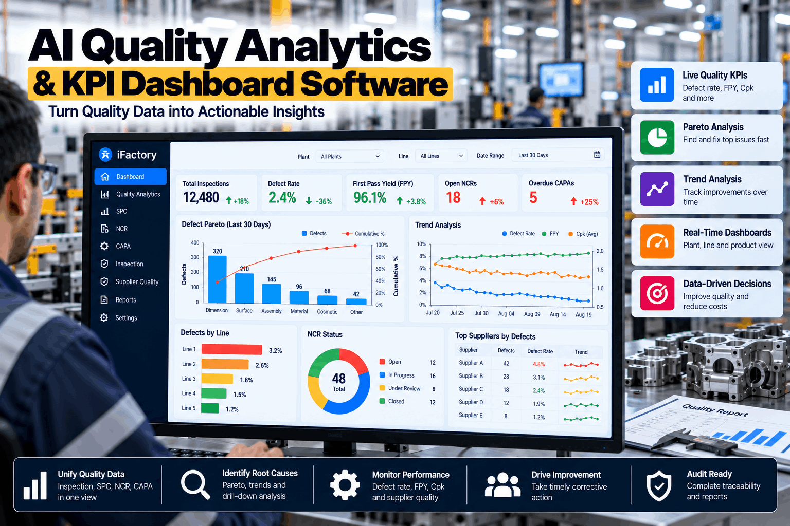
Most plants already collect more quality data than they can use. Inspection results sit in one system, nonconformance reports in another, SPC readings on a station PC and complaints in a mailbox — and the picture only comes together once a month, in a slide deck nobody has time to question. iFactory Quality Analytics brings those sources into live Pareto charts, trend lines and KPIs with one agreed definition each, so the people who can act see a problem while it is still small. The AI runs on a server in your own plant and answers questions in plain language. To see it working on your own data, book a dashboard walkthrough.
Every Inspection, NCR and SPC Reading in One Live Picture of Quality
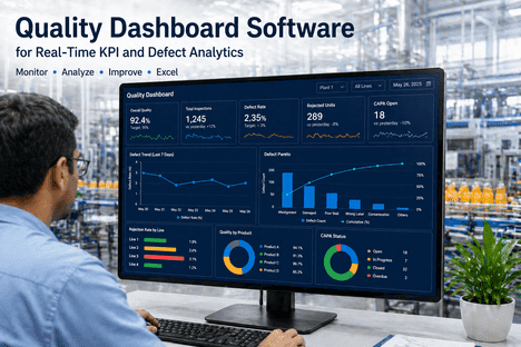
iFactory brings inspection, NCR, SPC, complaint and supplier data into one model and shows it as charts each role can act on — a Pareto for where the defects are, a trend for whether things are improving, a control chart for whether the process has shifted. Every number opens to the records behind it.
- Live Pareto, trend and control charts from one data model
- One agreed definition for every KPI
- Questions in plain language, answered on site
Why Quality Reports Arrive Too Late to Change Anything
The gap in those figures is the whole problem. Nearly every plant has KPIs; about one in four can see them as they happen, and about one in four trusts the data without reworking it. The rest is assembled by hand. In a 2026 survey of more than 600 US manufacturing leaders by L2L, 65% said frontline supervisors spend up to four hours per shift on manual data and reporting tasks. That is time spent describing last week instead of changing this one. If this sounds familiar, our quality team can look at how your reports are built today.
The month-end report
By the time the Pareto is in a slide, the lot has shipped, the shift has rotated and the cause has gone cold. The report explains; it cannot prevent.
Three versions of one KPI
Production counts reworked units as good. Quality does not. Finance uses a different period. Each number is right by its own rule, and the meeting is spent reconciling them.
Data in separate systems
Inspection results, NCRs, SPC readings, complaints and supplier rejects each live somewhere else, so nobody sees that the same lot appears in all five.
Charts with no next step
A chart that cannot be opened to the records behind it invites a debate about the chart. Nobody owns the bar, so nobody acts on it.
One Month on One Line: Four Numbers, Four Different Stories
Quality KPIs are easy to quote and easy to confuse. Take an illustrative month on one line: 31,000 units started, 1,178 of them rejected or reworked at least once, and 1,240 defects recorded in total, on a product with 8 defect opportunities per unit. First pass yield is 96.2%. Defects per unit is 0.040. Defects per million opportunities is 5,000 — between the 4-sigma level of 6,210 and the 5-sigma level of 233. Defective parts per million is 38,000. All four are correct, and each answers a different question. iFactory calculates them from the same records with the formula on view, so the argument about whose number is right stops. To review your KPI definitions with us, book a KPI session.
A note on scale: ASQ's long-standing estimate is that quality-related costs reach 15–20% of sales at many companies, far more than the scrap line in the accounts suggests. Showing cost beside count on the same dashboard is how that gap becomes visible.
Formula on view
Every KPI tile shows how it is calculated and which records are counted. Whether reworked units count as good is decided once, in the open.
One calendar
Shifts, weeks and reporting periods are defined once for the site, so production, quality and finance are looking at the same days.
History of each definition
When a formula or target changes, the date and the reason are kept with it, so a step in the trend can be told apart from a step in the rule.
Start With the Pareto: Where the Defects Actually Are
Joseph Juran's point — that a vital few causes account for most of the effect — is still the fastest way into quality data. In the same illustrative month, six defect types make up the 1,240 defects, and the first three account for 72% of them. That is where the first corrective action goes. The live version matters because a Pareto is only a starting point: the useful step is opening the tallest bar and splitting it by shift, machine, product, lot or supplier until the pattern shows. Our analytics engineers can set those splits for your process.
Split any bar
Open the dimensional bar and see it by machine, shift, tool, lot or operator. Each split is one tap away, and each opens to the inspection records.
Count and cost side by side
The most frequent defect is not always the most expensive. Switch the same chart between count, scrap cost and rework hours.
Compare periods
Put this month beside last month to see whether a bar is shrinking because of the action taken, or the problem has only moved somewhere else.
See One Line's Quality Data Live in Six Weeks
Choose one line or product family. We connect its inspection, NCR and SPC sources, agree the KPI definitions with your team, load the history, and put live dashboards in front of the people who run it.
Five Views, Each Built for One Question
A dashboard fails when it shows everything at once. Each chart type answers one kind of question, and iFactory uses each for that purpose only — the same data, shown the way the question needs. To see these views built from a sample of your data, book a working session.
Pareto
Where is the problem?Ranks defect types, causes or sources so effort goes to the few that matter most.
Trend line
Is it getting better?Shows a KPI over days, weeks or lots, with the target and the date of each corrective action marked.
Control chart
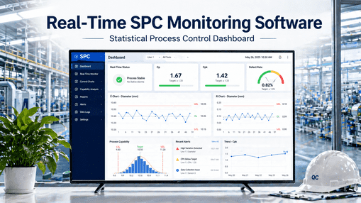
Has the process shifted?Separates ordinary variation from a real change using control limits and run rules, before parts go out of tolerance.
Heat map
Which line, shift or product?Lays defect rate across two dimensions at once, so a pattern such as one shift on one machine stands out.
Scorecard
How does each one compare?Ranks suppliers, lines or sites on the same KPIs, using the same definitions for all of them.
The Right View for Each Role
The operator, the quality engineer and the plant manager do not need the same screen. They need the same data at different levels and different speeds. iFactory builds each role's view from one model, so a number on the executive scorecard can be traced to the inspection record on the station. Our support team can configure views around your reporting structure.
What the AI Adds: From Charts to Answers
A chart shows what happened. Someone still has to notice it and work out why. In the Minitab survey, 30% of manufacturers already use predictive analytics and another 52% want to. iFactory's models run on a GPU server in your plant, read the same quality records as the dashboards, and do the noticing and the first pass of the why.
- Ask in plain language. "Which defect grew most this month on line 3?" returns the chart and the records, with no report to build.
- Catch the shift early. The AI watches every KPI for runs, trends and step changes and raises an alert while parts are still within tolerance.
- Find what moved together. When a defect rises, it lists what changed at the same time — lot, tool, fixture, shift, supplier — as leads to check, not conclusions.
- Write the summary. A weekly plain-language review of what changed, what is open and what needs a decision, ready for the management meeting.
Evidence for ISO 9001 Clause 9.1.3 — Without Building a Report
ISO 9001 requires an organisation to analyse and evaluate the data from monitoring and measurement, and clause 9.1.3 lists what that analysis must be used to evaluate. The 2026 edition, published in September 2026, keeps the same clause number. Most plants meet it with a quarterly slide deck assembled by hand. When the analysis is live, the evidence already exists on the day of the audit and feeds management review directly. The list here paraphrases the standard; check the wording against your own copy.
Spreadsheets, General BI Tools and Quality Analytics Compared
Manufacturing analytics is a fast-growing category — Market.us puts it at USD 12.1 billion in 2025, growing 17.8% a year, with on-premises deployments holding 58.2% of it. A general BI tool can draw any chart from any data, which is both its strength and its cost: someone has to build the quality model, the KPI rules and the SPC logic first. Quality analytics arrives with those already in place.
Delivered as a Turnkey AI System — Hardware and Software Together
iFactory ships as a complete bundle: a pre-configured NVIDIA AI server, racked and ready, with quality analytics, dashboards and the AI models pre-loaded. Rack it, plug in power and Ethernet, and the AI is live on your network — your quality data stays on site. Our team handles cabling, network setup, connections to PLCs, SCADA, gauges, CMMs and your ERP or QMS, operator training and 24×7 remote monitoring. For a scoped proposal, book a deployment call.
Ship, network and data
Server delivered and racked. Inspection, NCR, SPC, complaint and supplier sources connected. KPI definitions agreed and history loaded.
Model training and pilot
AI models trained on your history. One line or product family runs live dashboards, alerts and plain-language questions alongside existing reports.
Go-live and training
All lines and roles live. Manual reports retired one by one. Operators, engineers and managers trained on their own views.
Frequently Asked Questions
What is quality analytics software?
It brings quality data from inspection, nonconformance, SPC, complaint and supplier records into one model and presents it as KPIs and charts that refresh on their own. The aim is to shorten the time between a problem appearing in the data and someone acting on it.
Which quality KPIs should a dashboard show?
Start with a small set: first pass yield, defects by type, cost of poor quality, customer complaints or PPM, supplier PPM, and open NCRs with their age. Add process capability where you measure dimensions. A KPI belongs on the dashboard only if someone owns it and a decision depends on it.
How is this different from a general BI tool?
A BI tool is a blank canvas: it can chart anything once someone has modelled the data and written the rules. Quality analytics comes with the quality data model, standard KPI formulas, SPC logic and links to the underlying records already in place, so the work goes into agreeing definitions instead of building them.
Where does the data come from?
From station entry screens, gauges, CMMs and vision systems, PLC and SCADA signals, and NCR, CAPA, complaint and supplier records held in iFactory or in your existing QMS and ERP. Sources are connected during the first four weeks.
How current is the data?
Inspection and SPC readings appear as they are recorded. Records from other systems arrive at the interval those systems allow, typically minutes to hours. Each chart shows when its data was last refreshed.
Does our quality data leave the plant?
The analytics and AI models run on the NVIDIA server installed at your site, so quality records are processed and stored there. Remote monitoring by our team covers system health, and what is shared for support is agreed with you during setup.
How long does deployment take, and what do we need to provide?
A typical site is live in 6–12 weeks. You provide rack space, power, an Ethernet connection, access to your quality data sources, your current KPI definitions and a quality lead to agree them. iFactory supplies the pre-configured NVIDIA AI server, software, integration and training. To scope your site, contact our implementation team.
See the Problem While It Is Still Small
One turnkey system — NVIDIA AI server, quality analytics, integration and training — delivered and live inside 12 weeks. Start with the line where the monthly report raises the most questions.
- 1Which defect do we work on first?
- 2Which line or shift needs help today?
- 3Which supplier do we call?
- 4Did last month's corrective action work?
- 5What do we tell the customer?