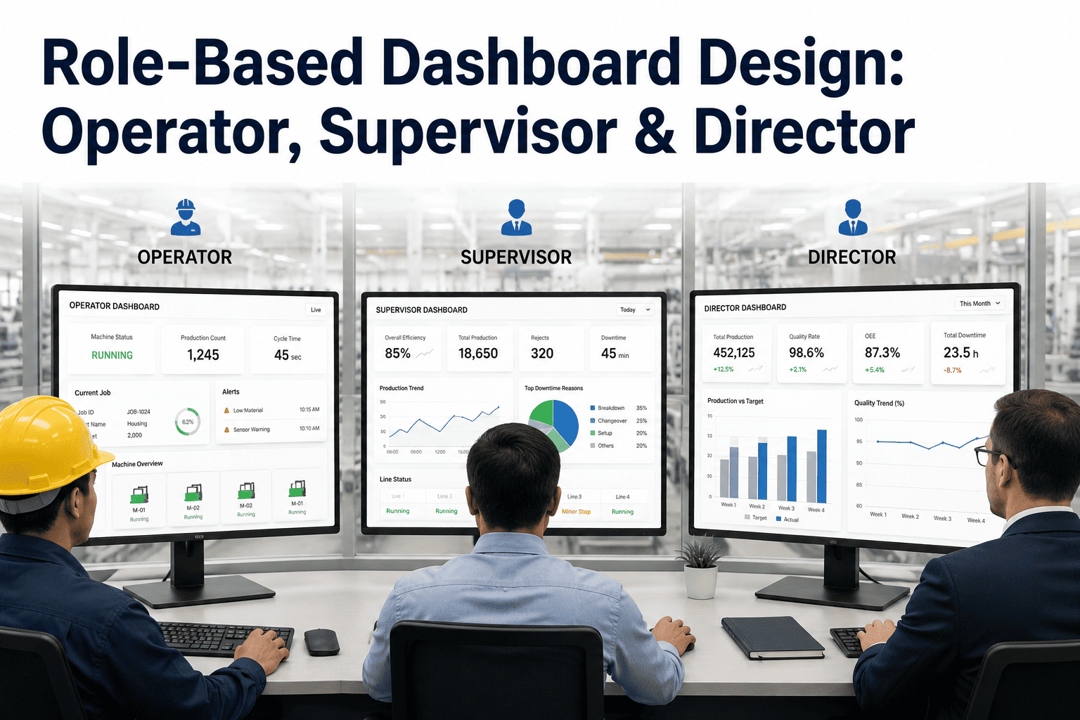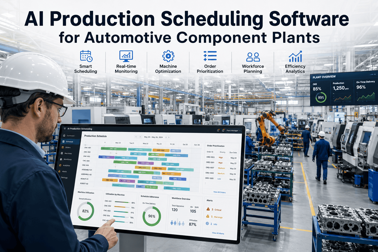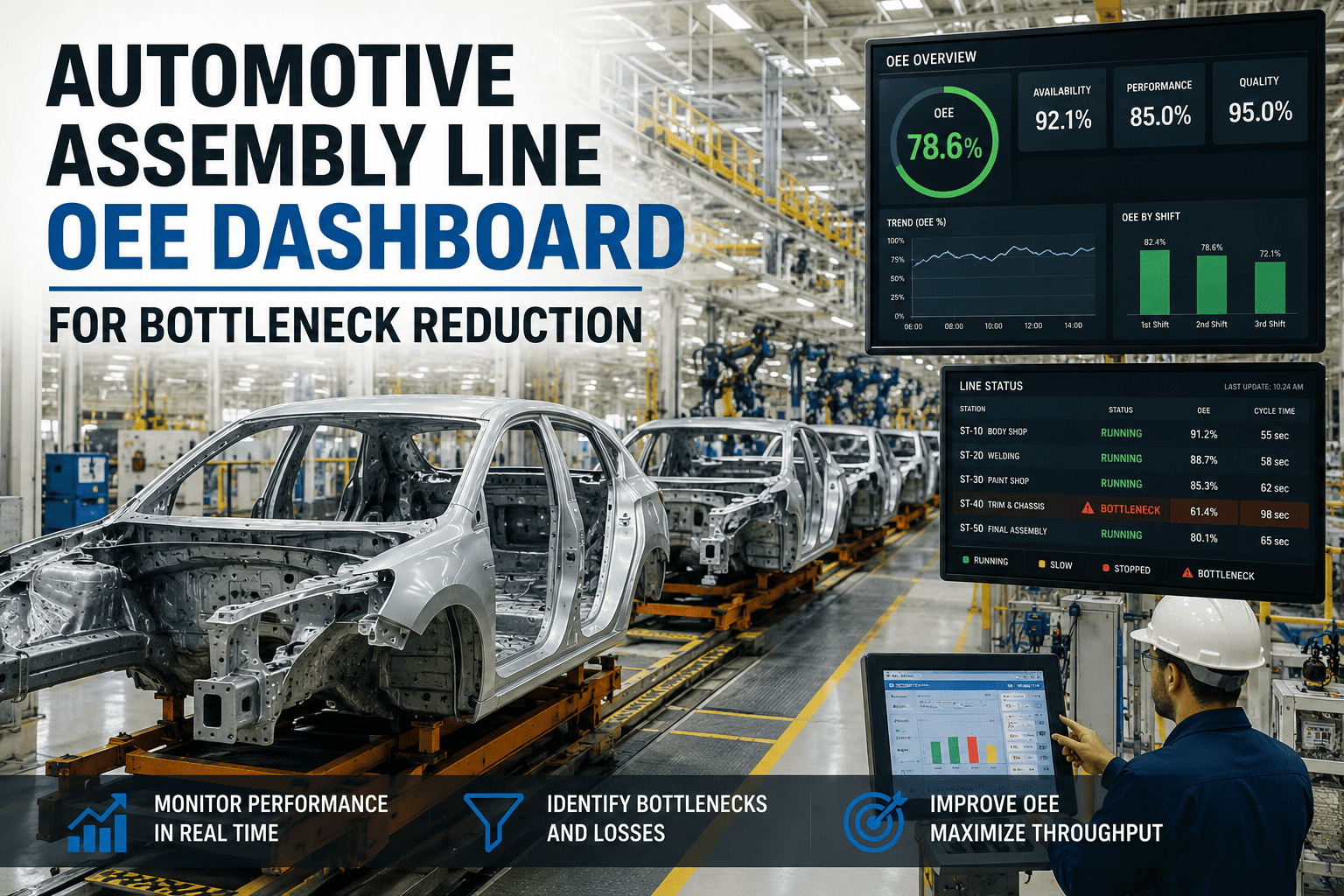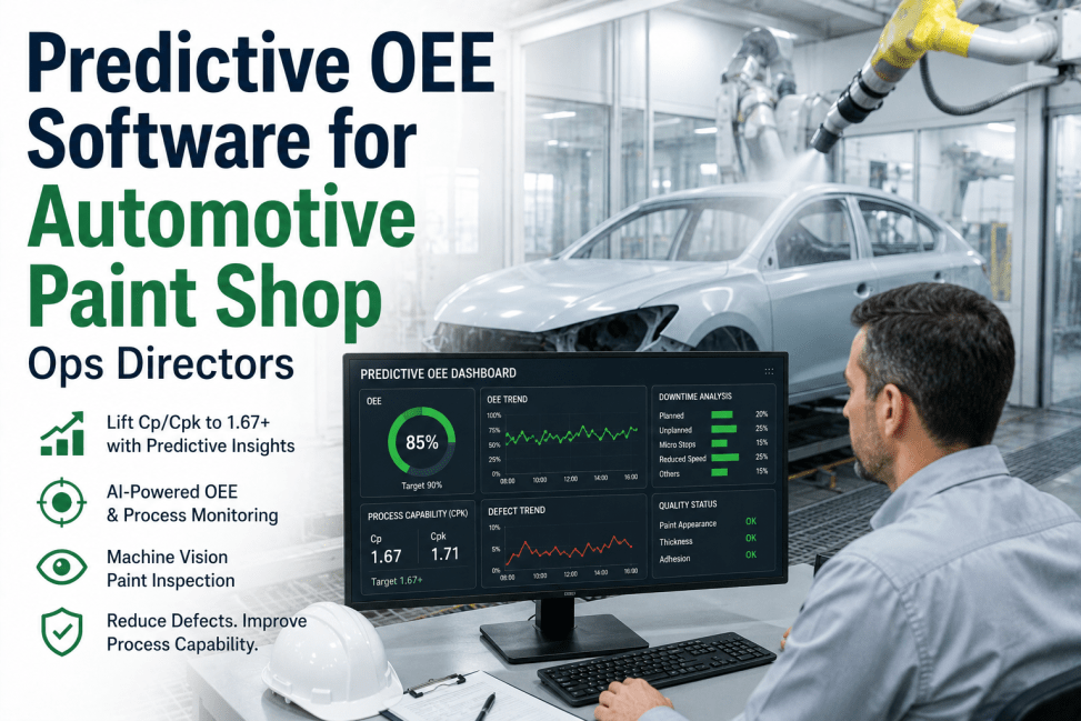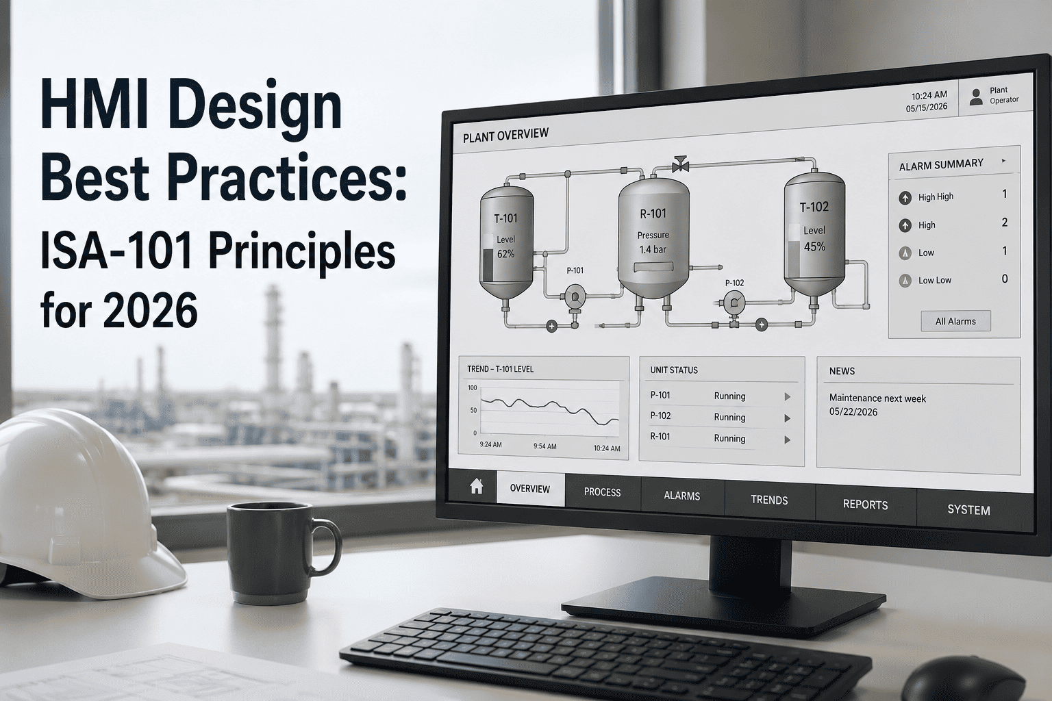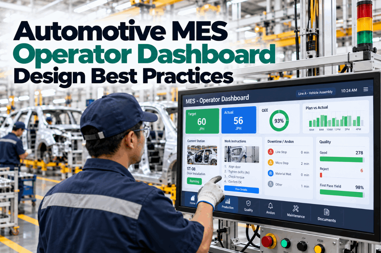
An automotive MES operator dashboard should tell a person on the line three things in a glance: am I on target, is anything wrong, and what should I do next. Most MES screens do not. They are designed by engineers, packed with tags and trends, and hard to read from two meters away in gloves. This guide covers practical design rules for operator screens, backed by HMI standards and research, with numbers you can apply this week. To see an operator dashboard built this way, book a short walkthrough.
Automotive MES Operator Dashboard Design Best Practices: Screens Operators Actually Use
Show the count, the problem and the next step. Keep everything else one tap away. Design rules that turn an MES screen into action on the floor.
On target or not, what is wrong and what to do next.
People track about four things at once; most MES screens show dozens.
A calm gray screen makes the one abnormal item stand out.
Five minutes at the station tells you more than a design review.
Why Most MES Screens Fail Operators
Most MES screens are built to show everything the system knows, not what the operator needs.
- Too much on one screen. Dozens of values compete for attention.
- Engineer language. Tag names and codes where plain words are needed.
- Small text and targets. Unreadable at arm’s length and hard to press with gloves.
- Color everywhere. When everything is bright, nothing stands out.
- No next step. The screen shows a fault but not what to do about it.
In a study with 21 professional operators, those using a well-designed interface spotted abnormal events before any alarm 48% of the time. On the traditional interface it was 10%.
That study was in a chemical plant, but the lesson travels. The same people did much better with a clearer screen.
A screen review at one station shows the gap quickly. We can do one with you on a call.
Operator View vs Engineer View
Operators and engineers ask different questions, so they need different screens.
- Every signal available
- Trends over hours and days
- Tag names and addresses
- Used at a desk
- Time to explore
- Goal: find root cause
- A handful of key values
- Now, this hour, this shift
- Plain words
- Used standing, in gloves, at a distance
- Seconds to read
- Goal: act now
MES sits at Level 3 of the ISA-95 model, between the controls on the floor and the business system above. It holds far more data than any one person needs, which is why role-based views matter.
Building the operator view first, then the others, keeps the focus right. See role-based views in a demo.
The Five Things an Operator Screen Must Show
If a screen shows these five things clearly, it is already better than most.
Jobs done versus plan for this hour and this shift, with the gap as a number.
Running, waiting, stopped or changeover, in one word.
The most important abnormal condition, in plain language.
What to check or do, taken from the work instruction.
One press to call quality, material or maintenance.
Illustrative. Give screen space in the same proportion.
Everything else belongs on a detail screen, one tap away. Our specialists can help decide what moves.
Use a Display Hierarchy
The ISA-101 standard for HMIs organizes displays into four levels, from overview to detail.
| Level | Purpose | Automotive example |
|---|---|---|
| Level 1 | Overview of the whole span of control | Line or zone status board: count, state, top issue |
| Level 2 | Operating display for an area | Station screen: target, current job, quality checks |
| Level 3 | Detail for troubleshooting | Robot or tool detail: faults, cycle steps, history |
| Level 4 | Support and diagnostics | Work instructions, wiring views, maintenance procedures |
Most operators live on Level 2 and glance at Level 1. Levels 3 and 4 are for when something is wrong.
A clear hierarchy also makes training easier. We map yours in every rollout.
Color, Contrast and Alarms
High-performance HMI design uses a calm background and saves strong color for abnormal conditions.
men have red-green color vision deficiency. A screen that relies on red against green fails for them.
Shape and text beside color solve this at no cost. Ask our team for a sample palette.
Sizes That Work on the Shop Floor
Operators read from a distance and press with gloves, so sizes matter.
- Make buttons larger than the minimum. Gloves and movement call for more than a phone-sized target.
- Size the main number for distance. A count read from 3 meters needs digits about 2.5 cm tall by the signage rule.
- Limit the main view. Four or five key items, not twenty.
- Leave space. Gaps between buttons prevent wrong presses.
- Check in real light. Glare and dust change what is readable.
A quick test is to stand where the operator stands and read the screen aloud. Our engineers do this on every station.
A Simple Layout That Works
A consistent layout means operators find things without thinking.
Jobs this hour and shift against plan, large digits.
Line state and the single most important issue.
The step to take now, in plain words.
Buttons for quality, material and maintenance.
Model, variant and any special checks.
Trends, history and diagnostics one tap away.
Keep the same layout at every station. An operator who moves from trim to chassis should not have to relearn the screen.
See the layout on a real station in a session.
Andon and Help Calls on the Screen
The dashboard should make it easy to call for help and easy to see that help is coming.
A visual management tool that shows the status of operations at a glance and signals whenever an abnormality occurs, in the words of the Lean Enterprise Institute.
Operator presses one button for the type of help.
Board, light and team leader’s device show the call.
The operator sees who is coming.
Cause recorded in a few taps.
Calls counted by station and reason.
The acknowledgement step is often missing. An operator who cannot tell whether the call was seen will call again or stop asking.
Call history by station is one of the most useful improvement tools a plant has. Discuss it with our advisors.
Role-Based Views From the Same Data
One MES, several views. Each role sees what it needs.
| Role | Main question | Screen focus |
|---|---|---|
| Operator | Am I on target and what do I do next? | Count, state, problem, action, help |
| Team leader | Which station needs me? | Open calls, stations behind, quality alerts |
| Supervisor | Will we make the shift number? | Line rate, losses by cause, staffing |
| Maintenance | What is failing and why? | Fault history, repeat faults, open work orders |
| Engineer | What is the root cause? | Trends, cycle steps, detailed signals |
The MES market is growing fast, from an estimated $15.95 billion in 2025 to $25.78 billion in 2030 according to MarketsandMarkets. Much of that spend will be judged by whether people on the floor actually use the screens.
Designing for roles from the start avoids rework later. We can sketch your role views in a working session.
Test the Screen With Operators
The fastest way to improve a dashboard is to watch someone use it.
Build a simple version of the screen.
Watch three or four operators use it for real.
What did you look for? What was missing?
Take off anything nobody used.
Test again after each change.
- Time to answer. How long to say whether the line is ahead or behind?
- Time to act. How long from a fault appearing to the first correct action?
- Wrong presses. How often is the wrong button hit?
- Unused items. Which parts of the screen are never looked at?
These four measures make design discussions short. A screen review gives you a baseline.
MES Operator Dashboard Checklist
Use this list to review any operator screen.
Most screens fail on content before they fail on style. We can run this check with you in a pilot.
How iFactory Builds Operator Dashboards
iFactory sits on top of your MES, PLC and quality data and gives each role a screen designed for its job.
Target, state, top issue and action.
Fault codes translated into words and steps.
One-press andon with acknowledgement.
Team leader, supervisor, maintenance and engineer.
Suggested next step from fault history.
An overlay, not a replacement.
It runs on premises on the iFactory server. Send a photo of one current screen and we will redesign it in a trial.
See One of Your Operator Screens Redesigned
Send a photo of a current station screen. We redesign it around count, problem and next step, and show both side by side.
The current screen shows 46 values. Operators use 5 of them every cycle. The other 41 belong on a detail view one tap away.
From 46 Values to 5
This is how a manufacturing engineer might work through a redesign.
iFactory ships as a pre-configured NVIDIA AI server, racked and ready with the operator dashboards and execution models loaded. Rack it, plug in power and Ethernet, and the AI is live. Scope covers data connections across press, body, paint, assembly and machining areas, PLC/SCADA, MES, CMMS and ERP integration, cabling and network setup, team training and 24×7 remote monitoring.
Server installed, PLC, MES and CMMS links live, history loaded.
Models tuned on your own lines, then piloted in one area with your team reviewing every output.
Rollout to the agreed lines, team training done, 24×7 remote monitoring in place.
Software, server and integration come as one package. For pricing, contact our sales team.
Frequently Asked Questions
Count against target, current line state, the single most important problem, the next action and a way to call for help. Everything else belongs on a detail view.
As few as possible. Research puts working memory at about four chunks, so four or five key items on the main view is a sensible limit.
A calm gray or muted background, with strong color reserved for abnormal conditions. Always pair color with shape and text, since about 1 in 12 men have red-green color vision deficiency.
At least about 1 cm, per Nielsen Norman Group, and larger for gloved hands on the shop floor.
The ANSI/ISA standard for human machine interfaces. It defines an HMI lifecycle and a four-level display hierarchy from overview to detailed diagnostics.
A first line is typically live within 6–12 weeks, working on top of your existing MES. Plan it with our specialists.
Give Operators a Screen That Helps
iFactory turns MES data into operator screens that show the count, the problem and the next step, with help one press away.
Illustrative. A good operator screen gives most of its space to the top two rows.