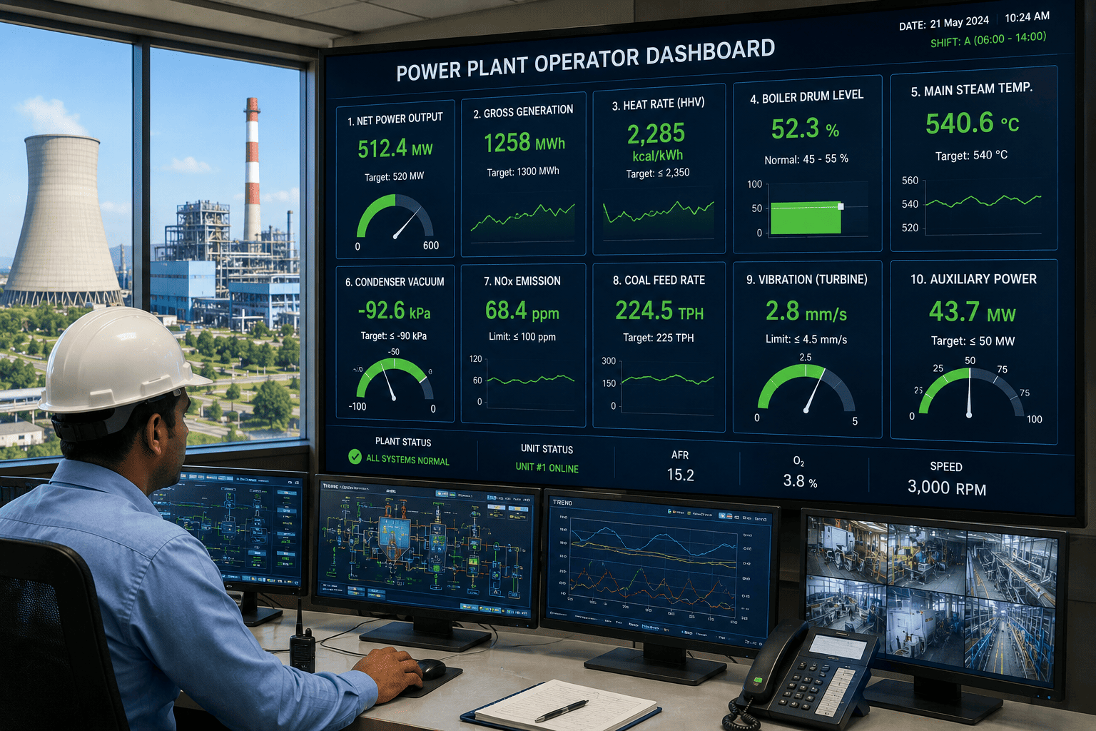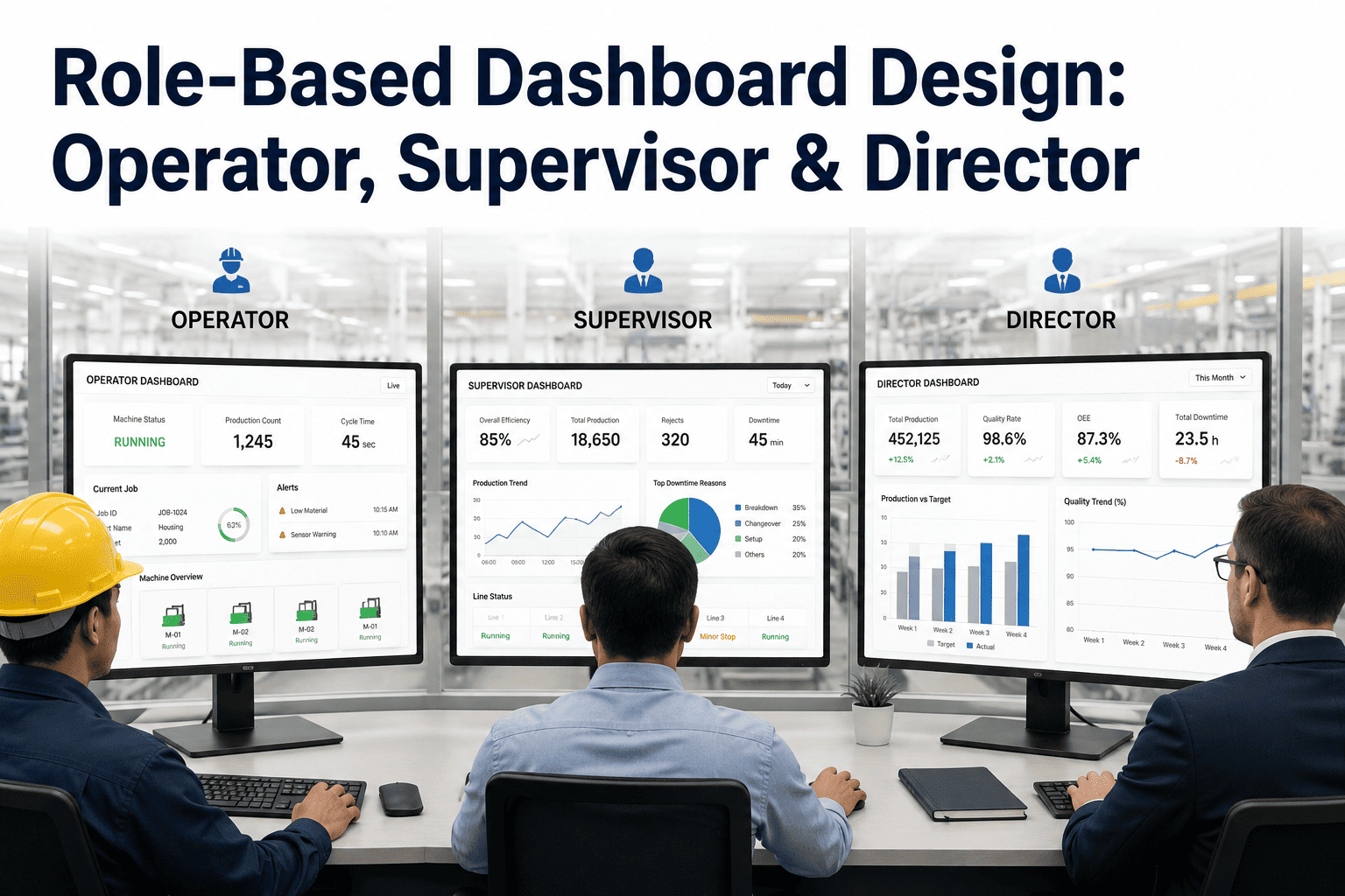
Give an operator a director's dashboard and they'll ignore it within a week — a quarterly cost trend means nothing when the decision in front of them is whether to stop the line in the next ten minutes. Give a director an operator's dashboard and they'll drown in cycle-time noise that tells them nothing about the resourcing decision they actually need to make. Most manufacturing dashboards fail not because the data is wrong but because one screen is trying to serve three completely different jobs at once. Building three connected views instead of one universal screen is a smaller change than it sounds like, and our team can walk through what that role-based structure looks like on your own plant floor data.
Designing Manufacturing Dashboards Around the Job Each Role Actually Does
Operators, supervisors, and directors ask fundamentally different questions of the same data. A dashboard that tries to answer all three at once usually answers none of them well. This is how to split one data foundation into three views that each earn their place on screen.
Three Roles, Three Questions
What Each Level of the Plant Actually Needs From a Screen
Operator
"Is something wrong right now, on my machine, that I need to act on?"
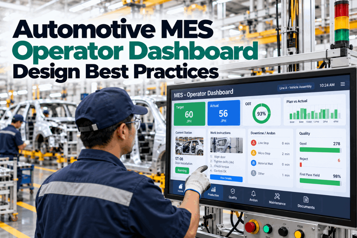
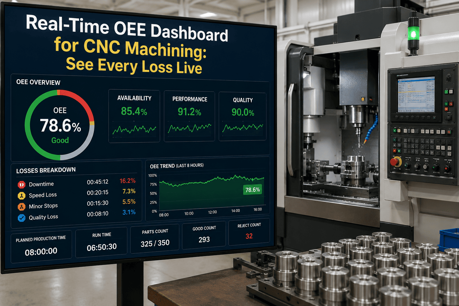
Needs real-time, machine-specific data refreshed continuously, with alerts tied to thresholds they can act on within minutes.
Supervisor
"How is my shift or line trending, and where do I need to intervene before it slips?"
Needs a rolled-up view across the whole line or shift, comparing against target, with drill-down into any machine flagged as off-track.
Director
"Are we improving over time, and where should the next investment go?"
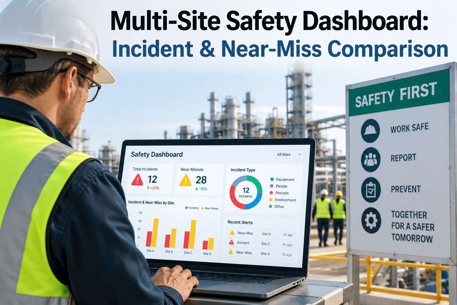
Needs trended, aggregated data across weeks and months, tied to cost and throughput, without shift-level noise.
Data Architecture
One Data Foundation, Three Levels of Aggregation
The mistake most plants make is building three separate reporting pipelines for three roles, which guarantees the numbers drift apart within a year as each pipeline gets patched independently. The better approach keeps a single source of truth at the machine level and aggregates it differently for each screen, so a director's monthly cost trend and an operator's real-time alert are always built from the exact same underlying data, just summarized at a different altitude.
Machine-Level Sensor & Event Data
Real-Time View
Operator
Operator
Shift Rollup
Supervisor
Supervisor
Monthly Trend
Director
Director
See Role-Based Views Built From Your Own Plant Data
A short demo shows the same machine-level data rolled up three different ways — one for the floor, one for the shift, one for the boardroom.
Design Specification
What Belongs on Each Screen — And What Doesn't
| Design Element | Operator View | Supervisor View | Director View |
|---|---|---|---|
| Refresh rate | Continuous / seconds | Every few minutes | Daily or weekly |
| Scope | Single machine or station | Full line or shift | Plant or multi-plant |
| Primary metric type | Leading, real-time | Blended leading & lagging | Lagging, trended |
| Typical decision made | Stop, adjust, or flag now | Reallocate labor or escalate | Invest, staff, or restructure |
| Screen density | Low — few numbers, large text | Medium — comparative charts | Higher — trend lines, summaries |
Where Dashboards Go Wrong
Four Signs a Dashboard Wasn't Actually Designed for Its Audience
1
Operators scrolling past charts to find the one number that matters
If a machine operator needs to interpret a trend line to know whether to act, the screen was built for someone with more time to analyze, not someone standing at a station.
2
Supervisors manually re-aggregating operator data in spreadsheets
If a shift lead is exporting machine data to build their own rollup, the supervisor layer of the dashboard doesn't actually exist yet — it's being recreated by hand every shift.
3
Directors requesting one-off reports outside the dashboard
A director who regularly asks an analyst for a custom pull is a sign the standard view isn't answering the resourcing and investment questions they actually face.
4
The same screen shown on the plant floor and in the boardroom
A single dashboard used everywhere is convenient to build but rarely well matched to the decision being made at either end of that spectrum.
Give Every Level of Your Plant the View They Actually Need
Real-time alerts for the floor, shift rollups for supervisors, and trended reporting for leadership — all from the same underlying data.
The plants that struggle with dashboard adoption almost always built one screen and tried to make it work for everyone, then wondered why operators stopped looking at it within a month. The moment you split the same data into a real-time view, a shift rollup, and a trended report, adoption jumps at every level because each person is finally looking at something built for the decision they're actually making.
Meera Fontaine-Rao
Plant Systems & Dashboard Design Lead · 9 years in manufacturing analytics
Frequently Asked
Role-Based Dashboards — Common Questions
Do we need three separate systems to build three separate views?
No — the recommended approach keeps one machine-level data foundation and applies different aggregation rules and refresh rates on top of it for each role, which avoids the data drift that comes from maintaining three independent pipelines. Book a demo to see this single-foundation approach in action.
How do we decide what counts as "too much detail" for a director's view?
A useful test is whether the detail changes the decision a director is actually making — if a shift-level fluctuation wouldn't change a staffing or capital decision, it belongs on the supervisor screen, not the director's monthly trend. Ask our team to help apply that test to your current reporting.
Can operators drill up into supervisor-level views if they want to?
Yes — role-based design controls what's shown by default, not what's accessible, so an operator curious about the broader shift trend can typically drill up while the default view stays focused on what they need to act on right now.
How long does it take to redesign an existing dashboard around roles?
Most of the effort goes into confirming the aggregation logic and thresholds for each role rather than rebuilding the underlying data connections, so plants with clean machine-level data already flowing in typically see role-based views live within a few weeks. Book a session to scope this against your current setup.
What happens when a supervisor is also acting as an operator on a small line?
Smaller lines often collapse the operator and supervisor views into one screen with both real-time detail and a shift-level summary visible together, since the same person is making both kinds of decisions in that setup. Contact support to discuss how this applies to leaner team structures.
Stop Building One Dashboard for Three Different Jobs
iFactory builds role-based views from a single data foundation — real-time for operators, shift rollups for supervisors, and trended reporting for directors — so every level of the plant sees exactly what they need to act on.