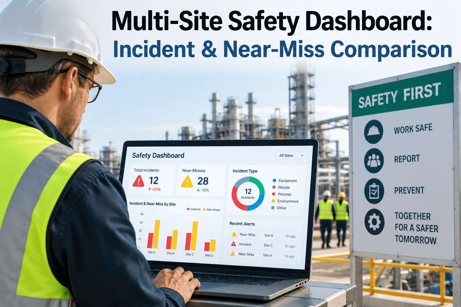
A plant safety report that only covers one facility tells you whether that site is improving, but it can't tell you whether "improving" is actually good enough, because there's no other site in the frame to compare against. A multi-site safety dashboard changes that by placing every plant's incident rate, near-miss reporting rate, and corrective action closure time side by side, using the same definitions and the same time window. Once that comparison exists, patterns emerge that a single-site report would never surface, like one plant systematically under-reporting near misses while another quietly runs the best safety culture in the company and nobody at headquarters has noticed. Manufacturing groups building this kind of cross-plant visibility can start the conversation with iFactory's support team.
Your Best Plant's Safety Culture Is Sitting in a Spreadsheet Nobody at HQ Ever Opens
iFactory pulls incident, near-miss, and corrective action data from every site into one live comparison, so safety leaders can see which plants are actually improving and which ones are quietly falling behind.
Why a Single-Site Safety Report Hides More Than It Shows
A plant manager reviewing their own site's safety trend has no external reference point for whether a given incident rate is actually acceptable, so improvement gets measured against last year rather than against what's genuinely achievable. Multi-site comparison replaces that isolated view with real context drawn from sister facilities running similar processes under similar conditions.
Near-Miss Reporting Varies Wildly by Culture
A plant with a genuinely strong safety culture often reports more near misses, not fewer, because workers trust the system, while a low near-miss count elsewhere can actually signal underreporting rather than genuine safety.
Best Practices Stay Trapped at One Site
A corrective action approach that dramatically reduced incidents at one plant rarely gets shared with sister facilities without a structured comparison surfacing the result in the first place.
Corporate Safety Reviews Miss the Real Outlier
A quarterly rollup that averages incident rates across all sites can mask one facility performing significantly worse than the rest, hidden inside a company-wide number that still looks acceptable.
Definitions Drift Between Facilities
Without a shared definition of a recordable incident or a near miss, cross-site comparison becomes unreliable even when every plant is genuinely trying to report honestly.
The Metrics a Cross-Plant Safety Comparison Actually Needs
A useful multi-site dashboard balances lagging indicators, which confirm what already happened, against leading indicators, which give a team time to intervene before an incident occurs.
| Metric | Type | What It Reveals | Review Cadence |
|---|---|---|---|
| Total Recordable Incident Rate | Lagging | Confirmed injuries against a standard exposure base | Monthly |
| Near-Miss Reporting Rate | Leading | How actively hazards get reported before injury | Weekly |
| Corrective Action Closure Time | Leading | How fast identified hazards actually get fixed | Weekly |
| Safety Training Completion | Leading | Whether required training keeps pace with staffing changes | Monthly |
Turning a Cross-Site Gap Into a Shared Best Practice
The real value of multi-site comparison isn't the ranking itself, it's the specific practice transfer that a clear gap makes possible.
Standardize Definitions Across Every Site
A shared, documented definition of incidents and near misses so the comparison is measuring the same thing everywhere.
Rank Sites on Both Leading and Lagging Metrics
A site with a low incident rate but weak near-miss reporting deserves a different response than one excelling at both.
Interview the Outperforming Site
A structured review of what the leading plant actually does differently, not just recognition of its result.
Pilot the Practice at the Lagging Site
A specific, tracked trial rather than a generic instruction to improve, with the same metrics used to confirm whether it worked.
Stop Letting Your Best Safety Practices Stay Trapped at One Plant
iFactory brings every site's incident, near-miss, and corrective action data into one live comparison, so proven safety practices can travel across your whole operation.
A Composite Scenario: The Near-Miss Program Nobody Had Copied
A multi-site manufacturer with four plants had watched one facility maintain a noticeably lower incident rate for over two years without ever formally studying why. Once a shared cross-site dashboard went live, the pattern became obvious immediately: that plant's near-miss reporting volume was roughly three times higher than the group average, meaning hazards were being caught and corrected long before they became injuries elsewhere.
A closer look revealed the leading plant had quietly implemented an anonymous mobile near-miss reporting tool over a year earlier, something none of the other three sites had adopted. Once the safety team documented and rolled the same tool out group-wide, near-miss reporting at the two lowest-performing plants increased significantly within the first quarter, and both sites saw their incident rate begin trending downward within two quarters afterward.
Common Mistakes in Multi-Site Safety Comparison
Ranking Sites on Incident Rate Alone
A low incident rate paired with low near-miss reporting can indicate underreporting rather than genuine safety performance, and ranking on the lagging metric alone misses that risk entirely.
Letting Each Site Define Terms Differently
Without shared definitions, a cross-site comparison quietly compares different things dressed up as the same metric.
Using Comparison Data to Punish, Not Improve
A leaderboard used to publicly criticize a lagging site tends to push reporting further underground rather than closing the actual gap.
Never Formally Studying the Top Performer
Recognizing a leading site without documenting what it actually does differently wastes the practice-transfer opportunity the comparison creates.
Is Your Group Ready for Cross-Site Safety Benchmarking
Every site already tracks incidents and near misses in some form
Even inconsistent formats are a workable starting point once a shared definition and data structure gets applied.
Leadership is willing to look at near-miss volume, not just injury rate
Treating a rising near-miss count as a sign of healthy reporting, not a problem, is essential for the comparison to work as intended.
There's a process for studying and transferring a best practice
A comparison without a defined next step for the lagging sites produces insight without improvement.
Site leaders trust the comparison won't be used punitively
A dashboard perceived as a scorecard for blame tends to distort the very reporting behavior it's meant to encourage.
Frequently Asked Questions
Why would a plant with more near misses actually be safer than one with fewer?
A rising near-miss count usually signals that workers trust the reporting system and are actively surfacing hazards before they cause injury, which is exactly the behavior a strong safety culture encourages. A plant with very few reported near misses alongside an average or above-average incident rate is more likely underreporting than genuinely safer, since hazards don't simply disappear, they just go unrecorded until something more serious happens. Teams building a cross-site model that accounts for this correctly can get guidance from iFactory support.
How do we get sites to agree on the same incident and near-miss definitions?
Standardizing definitions usually starts with a shared reference document reviewed jointly by every site's EHS lead, built around widely recognized frameworks like OSHA recordability criteria for injuries and a simple, consistent hazard-identification standard for near misses. The harder part is usually not writing the definition but retraining reporting habits at sites that have used a looser or stricter standard for years, which typically takes a full reporting cycle before the data becomes genuinely comparable.
Should smaller plants be compared against the same benchmarks as larger ones?
Incident rates and near-miss volume are typically normalized against hours worked specifically so smaller and larger sites can be compared fairly, but leadership should still account for statistical noise at smaller sites, where a single incident can swing a rate dramatically more than it would at a larger facility. Trending performance over several quarters rather than reacting to any single month's number helps avoid overreacting to normal variation at smaller plants.
How does a cross-site dashboard actually help transfer a best practice between plants?
Once the dashboard reliably identifies which site is genuinely outperforming on both leading and lagging metrics, safety leadership has a specific, evidence-backed reason to study that site's practices rather than guessing which of many possible factors explains the difference. Book a demo to see how a cross-site comparison connects directly to a practice-transfer workflow.
What's the fastest way to start comparing safety performance across sites we haven't unified before?
Begin with the two metrics every site almost certainly already tracks in some form, recordable incident rate and near-miss count, standardize how each is calculated, and layer in corrective action closure time once that baseline comparison is trustworthy. Trying to unify a dozen safety metrics across every site simultaneously usually stalls the effort before it produces any usable comparison at all.
See Every Plant's Safety Performance in One Honest Comparison
iFactory unifies incident, near-miss, and corrective action data across every site, so your best safety practices stop staying trapped at just one plant.