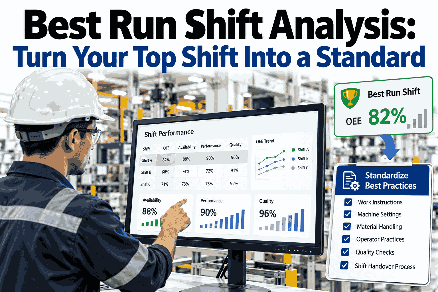
Every plant has a shift that quietly outperforms the others, the one where the line runs steadier, changeovers finish sooner and the scrap bin stays emptier, yet nobody can explain exactly why. Without a method, that run is remembered as luck, a strong crew or an easy product mix, and the lesson is gone by Monday. Best run shift analysis turns that memory into evidence, so the habits behind your top result become a written standard that every crew can follow. To see how this works on real shift data, explore a live shift comparison with our team.
Your Best Shift Already Proved What Is Possible, So Make It the Standard
iFactory AI compares every shift on the same line, isolates what the top run did differently and helps you turn those findings into standard work that every crew can follow.
Why Your Top Shift Is the Most Underused Asset on the Floor
Most improvement programmes look outward for answers, such as new equipment, new software or a consultant's benchmark, while the strongest proof of what your line can do is already sitting in last month's shift records. The best run happened on your machines, with your materials and your people, which removes the usual excuse that the target is unrealistic.
The difficulty is that a good shift rarely announces its recipe. Operators carry the knowledge in their hands, supervisors remember a few details, and the handover notes cover only the final hour. Best run shift analysis captures the recipe while the data is still fresh and compares it against the shifts that fell short, so the knowledge no longer depends on who happened to be on duty.
When the comparison is done well, the conversation changes from who performed worse to what conditions the weaker shifts were handed. That change in tone matters, because crews share their methods far more openly when the goal is to build a standard together rather than to rank people against each other.
Defining Best: A Scorecard That Goes Beyond One OEE Number
A single OEE figure can crown the wrong shift. A crew that ran an easy product at full speed may post a higher number than a crew that handled three difficult changeovers cleanly. A fair definition of best blends several signals, so the winner is the shift that was both productive and repeatable.
Also decide the comparison window early. Four to eight weeks of shifts on the same line usually shows a stable pattern, while a single outstanding night can be an outlier that is worth studying but not yet worth copying. The window below shows how confidence grows with the evidence you collect.
The Best Run Fingerprint: Six Factors Worth Capturing
A winning shift is the sum of many small conditions. Capturing only the output number tells you what happened but not why, so the analysis needs a fingerprint that records the conditions around every result. These six factors cover most of what separates a strong run from an average one.
Notice that two of the six factors describe behaviour rather than equipment. Parameters in practice and response to problems are where tacit skill hides, and they are usually the most valuable items to turn into a standard because no manual contains them.
Find the Habits Behind Your Strongest Shift
Bring three weeks of shift data from one line and see how a side by side comparison would surface what your best crew does differently.
Comparing Fairly: Normalise Before You Draw Conclusions
A comparison is only useful if the shifts faced similar conditions. A night crew that ran a difficult product with a late material delivery should not be judged against a day crew that ran a simple product all shift. Normalising removes the noise so the remaining difference points to behaviour and method.
| Factor | How it distorts the result | How to normalise |
|---|---|---|
| Product mix | Complex products run slower and change over more often | Compare shifts on the same product family or use a rated speed per product |
| Planned downtime | Scheduled maintenance or training lowers raw availability | Remove planned stops from the base time before scoring |
| Run length | Short runs carry a heavier startup and changeover share | Group runs by length band, such as under two hours and over six |
| Material quality | A weak lot creates stops that the crew did not cause | Tag stops with the lot and exclude supplier-driven events |
| Staffing level | A short crew cannot match a full crew on the same line | Record headcount and compare like for like |
| Upstream starvation | Waiting for feed or pallets looks like a line problem | Separate starved and blocked time from true line stops |
Once these adjustments are applied, the ranking often changes. A shift that looked mediocre on raw numbers may turn out to have handled the hardest conditions, and that is exactly the crew whose habits deserve a closer look.
Reading the Shift Hour by Hour to See Where the Run Was Won
Shift totals hide the moment a run is won or lost. A timeline view places the best shift beside an average one, hour by hour, so you can see whether the advantage came from a fast start, fewer mid-shift stops or a strong finish. The strip below is an illustrative example of that view.
Three windows deserve attention in almost every plant. Each one tends to reveal a different kind of habit, and each one can be improved with a different kind of standard.
Where the Gap Comes From: Breaking Thirteen Points Into Causes
Saying the best shift is thirteen points ahead is not actionable. Saying that five points came from faster changeovers and four from fewer micro-stops gives you two clear targets. Decomposing the gap into loss categories is the step that converts a score into a plan.
The shape of the cascade tells you where to start. When most of the gap sits in one or two categories, a focused standard such as a changeover sequence can close it quickly. When the gap is spread thinly across many categories, the cause is usually general discipline and handover quality.
This is also where automatic data capture pays off. Manual downtime logs tend to record long stops and miss the short ones, so a comparison built on handwritten reasons often understates the micro-stop share, which is frequently where the best crews quietly win.
From Insight to Standard Work in Five Moves
Finding the difference is only half of the job. A finding that stays in a presentation changes nothing, so the analysis must end with something an operator can pick up and use on the next shift. The path below keeps that conversion simple and visible.
A good standard explains the reason behind each step. Operators follow a rule more reliably when they understand what it protects, and they are also more likely to suggest improvements instead of quietly working around it. A short example of a standard work card shows the format.
Six Questions to Ask the Crew Behind the Best Run
Data shows where the difference sits, but only the people who ran the line can explain it. A short, respectful conversation with the best crew often uncovers adjustments that never reach a log, such as a small tweak made after a particular sound or a check done by habit. Keep it curious and informal, and ask open questions.
Write the answers beside the data, not in place of it. When an operator's explanation matches a visible pattern, such as fewer stops after a particular check, you have both the evidence and the reason, which is the combination that persuades other crews to adopt a change.
How the Same Method Looks in Different Production Environments
The method does not depend on a particular product. What changes is the loss that tends to dominate the gap, and therefore the first standard worth writing. The examples below show typical starting points in common manufacturing settings.
| Environment | Loss that often dominates the gap | First standard to write |
|---|---|---|
| Packaging and filling | Frequent short stops and format changeovers | Format change sequence and jam clearing routine |
| Machining and stamping | Tool changes and first piece approval time | Tool change steps and first piece sign-off |
| Textile and fibre lines | Yarn breaks, shade checks and restarts | Restart checklist and shade approval order |
| Food and beverage | Cleaning cycles and product switches | Clean down timing and restart verification |
| Assembly lines | Material shortages and station imbalance | Line feeding rule and station balancing guide |
Whatever the industry, the discipline is the same. Define best fairly, find the loss categories behind the gap, capture the method from the people who ran it and turn it into a one page standard that the whole plant can use.
Four Traps That Turn a Good Analysis Into a Poster on the Wall
Many plants run an analysis once, produce a clever chart and see no lasting change. The reasons are predictable. Avoiding the four traps below keeps the effort connected to daily work and protects the trust of the crews you need on your side.
The last trap deserves extra attention. The best run is a moving target, because a standard that works today will be beaten by a better method next quarter. Treat the benchmark as a living reference that rises as the crews improve.
A Thirty, Sixty and Ninety Day Path With a Readiness Checklist
Start with one line and one product family. A narrow scope gives clean data, quick feedback and a success story that makes it easier to extend the approach to other lines. The three phases below suit most plants.
Before the first comparison, a short readiness check keeps the effort focused and the results easy to trust. Most items take a few days, and several can be completed in a single planning meeting.
Turning Shift Data Into a Repeatable Standard With iFactory AI
Doing this analysis in spreadsheets is possible but slow, and it rarely survives past the first month. iFactory AI is built to keep the cycle running, so comparison, diagnosis and standard work stay connected instead of living in separate files.
The details of each connection depend on your equipment and existing systems, which is why a short working session on your own line is the best way to judge fit. You can review a shift comparison on your data before committing to a wider rollout.
| Measure to track | What it tells you | Healthy direction after the standard |
|---|---|---|
| Gap to best shift | How far the average crew sits from the proven result | Narrowing each month |
| Changeover duration | Whether the written sequence is being followed | Shorter and less variable |
| Micro-stop count per shift | Detection speed and quality of first fixes | Fewer events each week |
| Shift to shift variation | Consistency across crews on the same line | Tighter spread |
| Standard adoption rate | Share of changeovers or startups using the standard | Rising toward full use |
What Plant Teams Ask Before Starting Best Run Shift Analysis
See Best Run Shift Analysis Working on Your Own Line
Book a session with iFactory AI to compare your shifts, uncover what your top crew does differently and build the first standard work from real data.