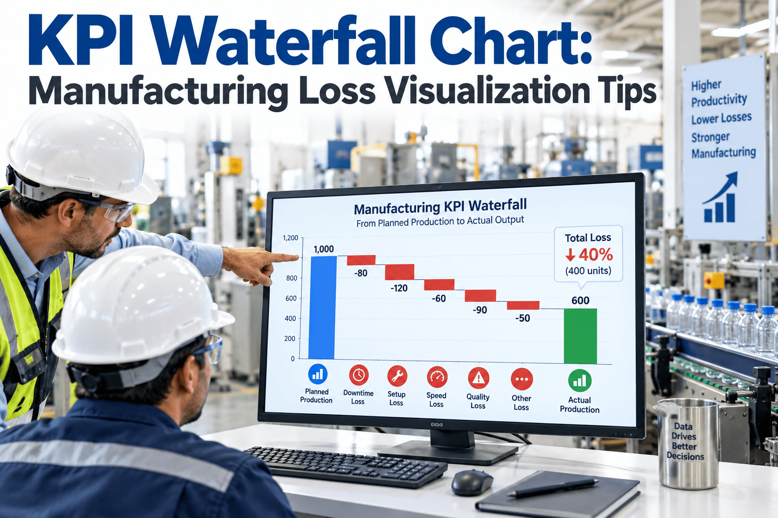
A single OEE percentage tells you how the shift went, but it hides exactly where the time actually went missing, and that's the part a production meeting actually needs to see. Ninety-two percent planned production time sounds fine until you realize twelve points disappeared to unplanned downtime, another eight to running slower than the ideal cycle time, and a further four to scrap and rework, each loss stacking on top of the last until what's left barely resembles the shift that was originally planned. A single number can't show that cascade. A waterfall chart can, turning three abstract percentages into a visual sequence anyone in the room can follow without needing the underlying math explained to them first. See what your own loss cascade looks like laid out visually.
One OEE Number Hides Where the Time Actually Went
Availability, performance, and quality losses stack on top of each other in sequence. A waterfall chart shows that cascade visually instead of burying it in a single percentage.
the cascade of availability, performance, and quality loss that combine to produce a single final OEE number
the time it takes someone in a production meeting to understand a waterfall visual, versus explaining the math behind a raw percentage
a well-built waterfall gives the whole loss story in a single glance, without needing three separate metrics explained
The Loss Cascade, Step by Step
Starting from planned production time, each loss category takes its share before the next one is even considered, which is exactly why the visual needs to cascade rather than sit side by side.
Planned Production Time
After Availability Loss (-12pt)
After Performance Loss (-8pt)
After Quality Loss (-4pt)
See Your Own Loss Cascade Laid Out Visually
iFactory turns your availability, performance, and quality data into a real-time waterfall view your whole team can read at a glance.
Three Losses, One Cascade
Each loss category in the waterfall represents a genuinely different kind of problem, which is exactly why separating them visually matters for deciding what to fix first.
Availability Loss
Time lost to unplanned downtime, changeovers, and setup — the first cut against planned production time and often the largest single loss category.
Performance Loss
Time lost to running below the ideal cycle rate during periods the equipment was technically running, often the hardest loss category to notice without continuous rate tracking.
Quality Loss
Time effectively lost to scrap and rework, since units that don't meet spec consumed production time without contributing to output that actually counts.
Visualization Method Compared
Different ways of presenting the same loss data carry very different levels of clarity for a team trying to act on it quickly.
Building a Waterfall That Actually Gets Used
A waterfall chart earns its place in a daily meeting only if it stays current and connects directly back to actionable detail.
Keep the three categories consistent
Availability, performance, and quality loss need the same definitions every shift and every line, or the cascade becomes impossible to compare over time.
Update it continuously, not at shift end
A waterfall built from real-time data lets a team catch a developing loss mid-shift, while one built only at day's end just documents what already happened.
Link each loss segment to its root cause detail
A waterfall shows where the loss happened; a linked Pareto or reason-code breakdown behind each segment shows why, which is what actually turns the visual into an action item.
What Changes When Loss Is Visualized This Way
Figures reflect typical outcomes within the first quarter after introducing a continuously updated waterfall view into daily production meetings.
A Continuous Improvement Lead's View on Waterfall Visuals
Every morning meeting used to start with someone explaining what the OEE percentage actually meant before we could even talk about what to do about it, and half the room's attention was already gone by the time we got to the actual problem. Switching to a waterfall view cut that explanation time to almost nothing, because everyone could see immediately which bar had the biggest bite taken out of it.
The Bottom Line on KPI Waterfall Visualization
A single OEE number is efficient to report but nearly useless for deciding what to fix, since it collapses three genuinely different loss categories into one figure that hides the cascade behind it. A waterfall visual restores that cascade, showing exactly how much time availability, performance, and quality loss each took in sequence, and doing it in a format a production meeting can absorb in seconds instead of a slide full of numbers that needs explaining every single day.
Frequently Asked Questions
What's the difference between a waterfall chart and a Pareto chart for loss analysis?
A waterfall chart shows the sequential cascade from planned time down to fully productive time across the three OEE loss categories, while a Pareto chart ranks individual loss reasons within one of those categories by frequency or duration. The two work well together — a waterfall shows which category to focus on, and a Pareto behind that category shows the specific root cause. Book a review to see both views built from your own data.
Can a waterfall chart be built in a spreadsheet, or does it need a dedicated tool?
A basic static waterfall can be built manually in most spreadsheet tools, but keeping it continuously updated with real-time loss data as a shift progresses generally requires a connected dashboard, since a manually maintained waterfall has the same update-lag problems as any other manually maintained metric.
Should the waterfall show percentage points or actual time lost?
Both have value depending on the audience — percentage points make cross-shift and cross-line comparison easier, while actual time or unit counts often resonate more directly with floor-level teams who think in terms of hours or pieces rather than abstract percentages. Many teams show both on the same visual.
How granular should the loss categories be within the waterfall?
The three standard OEE categories — availability, performance, and quality — are usually the right level for the primary waterfall view, with more granular reason-code detail available as a drill-down behind each segment rather than cluttering the main visual with too many categories at once.
Can this be displayed on a shop floor screen in real time, not just in meetings?
Yes — a continuously updating waterfall works well on a shop floor display, giving operators and supervisors the same visual throughout the shift rather than reserving it for a scheduled meeting, which tends to surface a developing loss while there's still time to respond to it. Talk to a specialist about setting this up for your specific floor displays.
Show Your Team Where the Time Actually Went
Book a 30-minute assessment. iFactory builds a live waterfall view from your availability, performance, and quality data.