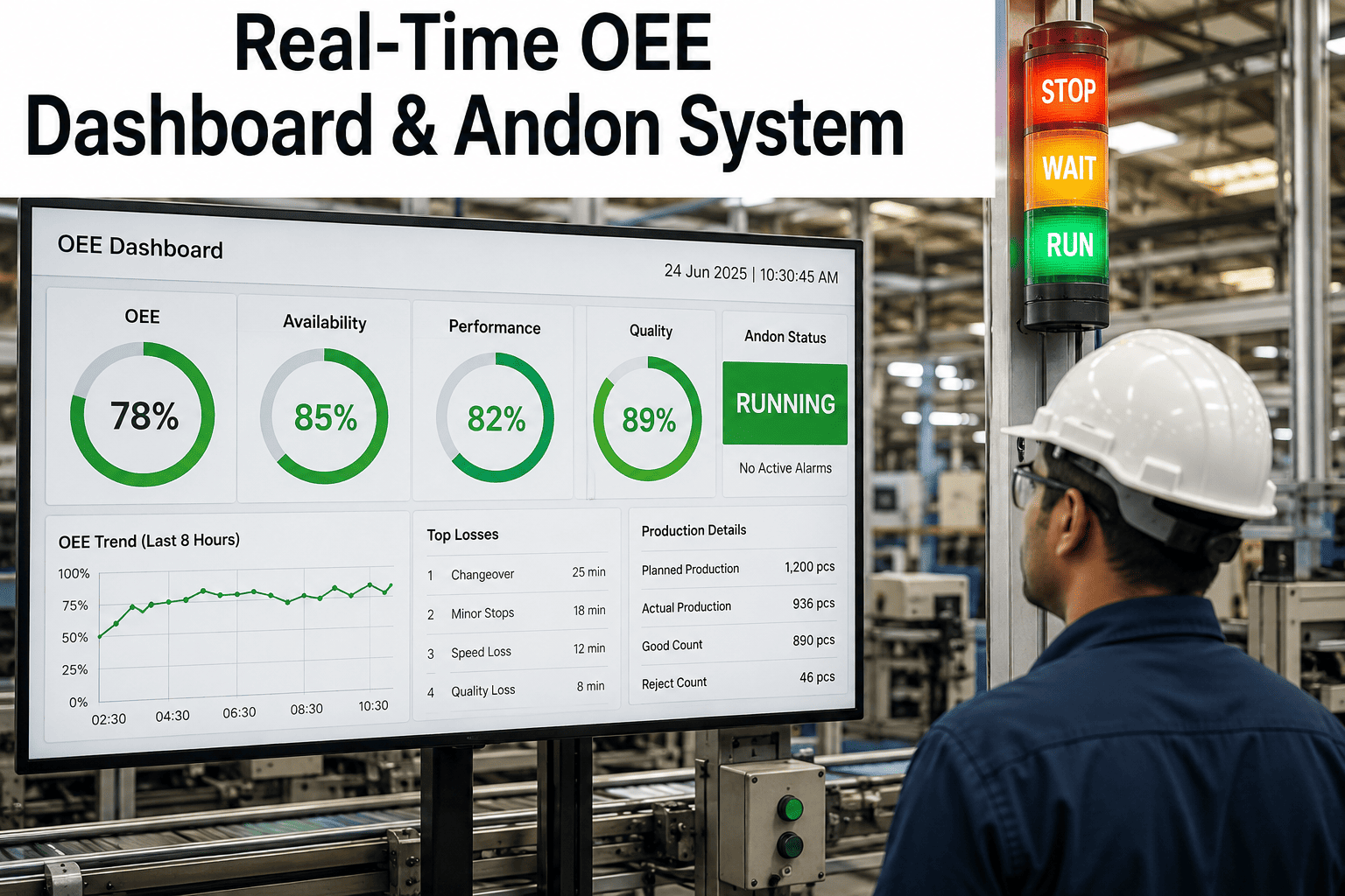
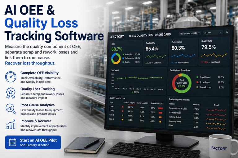
A Quality Rate of 94% sounds like a solved problem. It isn't a problem statement at all — it's a number with the actual problem hidden inside it. That 6% could be concentrated entirely in one shift's startup rejects after every changeover, or spread evenly across three lines as steady-state process defects, or quietly inflated by a rework category nobody is tracking as loss because the parts eventually pass inspection. Six Big Losses framework names two distinct quality categories — startup rejects and production rejects — for exactly this reason: they have different root causes, different fixes, and blending them into one blended Quality Rate percentage is why so many CI programs stall chasing a number instead of a pattern. Add a third dimension most shops don't track at all — which line, which shift, which product — and the single-number Quality Rate goes from unhelpful to actively misleading about where to focus improvement effort. See how iFactory breaks Quality Rate down by defect category, line, shift, and product so the pattern shows up before the investigation has to find it manually.
OEE Tracking & Production Optimization · Quality Loss Analysis
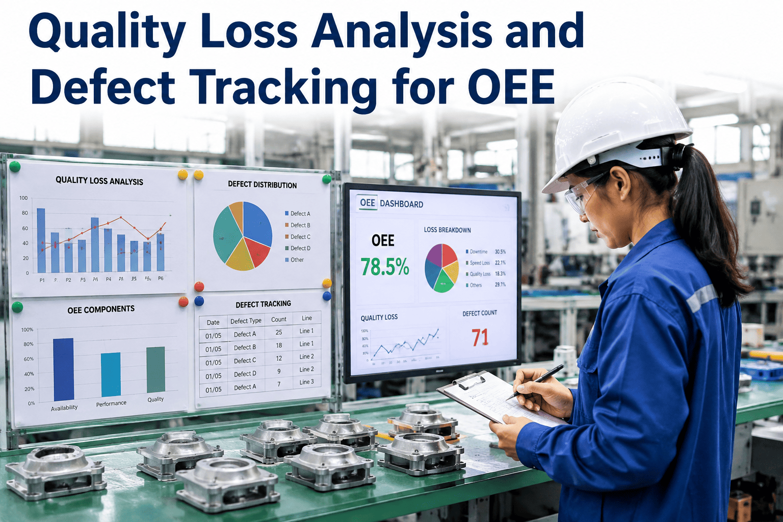
Quality Loss Analysis and Defect Tracking for OEE
Startup rejects, production rejects, and the rework losses most OEE dashboards don't count at all — broken down by line, shift, and product so a CI lead can find the pattern instead of staring at one blended percentage.
Six Big Losses categories are quality-related — and rarely tracked separately
First-passOEE Quality measures first-pass yield, not final-pass yield
Rework countsAs a defect, even if the part is eventually accepted
3 dimensionsLine, shift, and product — sliced together, not separately
8–14 ptsTypical OEE gain in 12 months with focused loss attribution
Why One Number Hides the Real Story
Quality Rate Is a Summary, Not a Diagnosis
OEE's Quality factor measures the proportion of total output that meets specification on the first pass — a single, useful summary number for tracking trend direction over time, and a nearly useless number for deciding what to fix next. Two plants can report an identical 91% Quality Rate with completely different root causes underneath it.
01
Startup and Steady-State Rejects Are Different Problems
Startup rejects cluster in the first cycles after a changeover or restart, driven by process variation during warm-up — temperature stabilization, calibration drift, residual material. Production rejects happen during stable running, driven by equipment settings, handling errors, or material issues. Fixing one doesn't touch the other.
02
A Blended Percentage Can't Point at a Shift or a Line
A single Quality Rate number for the week gives no signal about whether Tuesday's night shift on Line 2 is driving the majority of the loss, or whether it's evenly distributed — and those two scenarios call for completely different interventions.
03
Rework Frequently Isn't Counted as Loss at All
A part that fails inspection, gets reworked, and eventually passes looks identical to a first-pass good part in most simple part-count systems — but OEE's own definition treats reworked units as defects, since first-pass yield is what the metric is actually measuring, not final-pass yield.
04
SPC and OEE Usually Live in Separate Systems
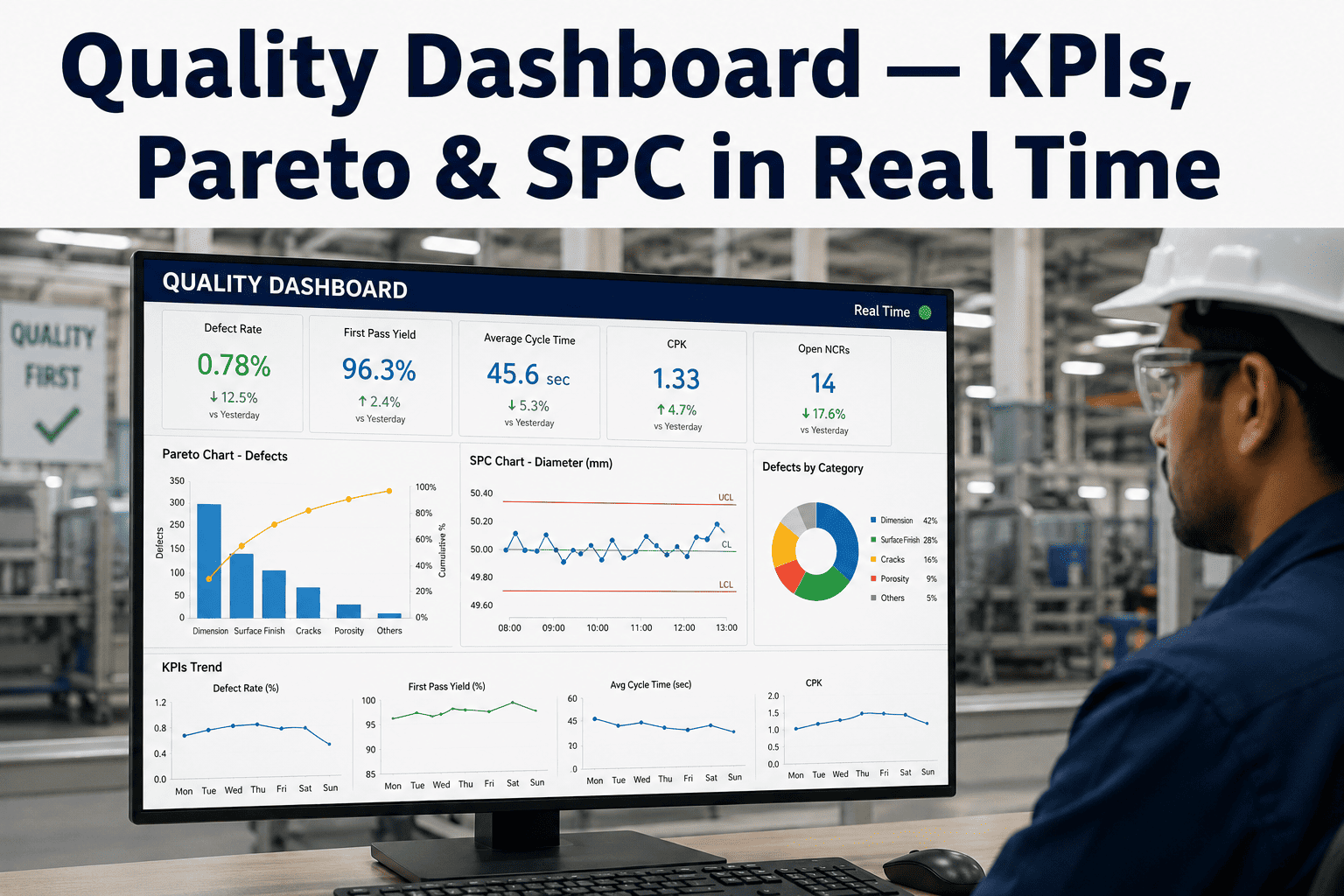
Statistical process control catches an out-of-control signal on a specific characteristic; OEE tracking reports a quality loss percentage on a separate dashboard. When the two systems aren't connected, a CI lead has to manually correlate an SPC flag with an OEE dip rather than seeing them as the same event from two angles.
These four gaps compound each other. A blended Quality Rate hides which line or shift is driving the loss; conflating startup and production rejects hides which fix actually applies once a problem area is identified; an untracked rework category understates the true first-pass yield loss even after the first two gaps are closed; and disconnected SPC data means even a correctly identified problem cell still requires manual detective work to trace back to its root cause. Closing all four is what separates a quality loss analysis program that actually drives improvement from one that produces a dashboard nobody acts on.
The Quality Loss Taxonomy
Three Categories, Three Different Fixes
The Six Big Losses framework, developed within Total Productive Maintenance, names two canonical quality categories. A third — rework — deserves separate tracking even though it doesn't always get its own line in a basic OEE report, because it consumes real labor and cycle time that the standard Quality Rate calculation doesn't fully capture on its own. Together, these three categories account for the large majority of quality-related OEE loss in most discrete manufacturing environments.
01
Startup Rejects
Defective units produced during the initial phase of operation — after a changeover, at the start of a shift, or following unplanned downtime. Driven by process variation before the line reaches stable operating conditions: temperature not yet stabilized, tooling not yet calibrated, or residual material from the prior run still working through the process.
Primary fix: standardized startup procedures with defined parameter hold points before production resumes
02
Production Rejects
Defective units produced during stable, steady-state running — not a startup or transition condition, but a genuine in-process quality escape. Common drivers include incorrect equipment settings drifting over a run, operator or equipment handling errors, or material lot issues surfacing mid-production.
Primary fix: SPC-driven process control and root-cause investigation tied to the specific drifting parameter
03
Rework (The Often-Missed Category)
Units that initially failed inspection, were corrected, and eventually passed. OEE's own definition counts these as defects for Quality-factor purposes, since the metric captures first-pass yield — but many shop-floor tracking systems only count final output, silently hiding the labor and cycle time rework actually consumed.
Primary fix: track rework as its own logged event, not just a delay before a "good" count
A heatmap like this one is only useful if the underlying data supports it — every reject needs to be logged with its line, shift, and product tag at the point of capture, not reconstructed afterward from shift-end paper logs or memory. Once that data discipline is in place, the pattern-finding work that would otherwise require a dedicated analyst pulling a manual cross-tab report becomes a view that updates automatically as new production data comes in, and a CI lead can scan for the darkest cell rather than requesting a special report every time a quality trend needs investigating.
Find the Cell, Not Just the Average
A Blended Quality Rate Can't Show You Which Line-Shift Combination Is Actually Driving the Loss
iFactory tracks quality loss by defect category, line, shift, and product simultaneously — so the pattern that would take a manual cross-tab exercise to find shows up as a single view.
The scenario below shows how a single weekly Quality Rate number decomposes once it's sliced by category, line, and shift — using the same kind of multi-dimensional breakdown the heatmap above illustrates.
Facility-wide blended Quality Rate91.2% — looks broadly acceptable at a glance
Quality Rate excluding Line 2 night shift96.8% — the rest of the facility is performing well
Line 2 night shift Quality Rate in isolation71.4% — this single cell is driving nearly all the facility-wide loss
Defect category breakdown for that cell82% startup rejects, concentrated in the first 40 minutes after shift-start changeover
Actionable findingNight shift startup procedure on Line 2 specifically — not a facility-wide quality issue
This is the difference between a Quality Rate that prompts a vague "let's tighten up quality" initiative and a Quality Rate that prompts a specific, scoped fix: standardize the night shift changeover procedure on Line 2, verify against day shift's already-successful startup sequence, and re-measure that one cell. A facility-wide quality initiative aimed at the blended 91.2% number would have spread effort across three lines and three shifts to fix a problem that lived in exactly one of those nine combinations.
Ranking What to Fix First
Not Every Quality Loss Category Deserves Equal Attention
Once quality loss is broken down by category, line, shift, and product, the next discipline is ranking those findings by actual impact rather than addressing whichever one is most visible or most recently discussed in a meeting. A Pareto approach — ranking loss categories and line-shift combinations by total lost units or lost time, then focusing improvement effort on the top one or two — consistently outperforms a scattered effort spread across every identified issue simultaneously.
1
Rank every line-shift-category combination by total lost units over a representative period, typically four weeks or more to smooth out day-to-day noise.
2
Focus improvement resources exclusively on the top one or two combinations until a measurable, sustained improvement is confirmed.
3
Only then move to the next combination on the ranked list — resisting the temptation to tackle multiple issues in parallel before the first is resolved.
Getting Started
Building a Quality Loss Analysis Program
These four steps move a CI program from tracking one blended percentage to tracking the specific patterns that number is hiding — each one addresses a distinct gap identified earlier, and the order matters since later steps depend on the data discipline established in earlier ones.
01
Separate Startup Rejects From Production Rejects at the Point of Data Capture
Tag every reject event with whether it occurred during a defined startup window (typically the first N cycles after a changeover or restart) or during stable running — this single tagging decision unlocks the entire startup-versus-steady-state analysis the rest of the program depends on.
02
Log Rework as Its Own Event, Not a Silent Delay
Capture rework as a distinct logged occurrence with its own count and time cost, rather than letting a reworked part disappear into the final good-part count once it eventually passes — this is the single most common gap between a shop's reported Quality Rate and its true first-pass yield.
03
Enable Simultaneous Slicing by Line, Shift, and Product
A dashboard that only supports one dimension at a time — line OR shift OR product — forces a manual cross-tab exercise to find a pattern like the Line 2 night shift example above. The analytical value comes specifically from slicing all three dimensions together.
04
Connect SPC Signals to the Corresponding OEE Quality Loss Event
Where SPC control charts exist for specific process characteristics, link an out-of-control signal directly to the OEE quality loss event it produced — closing the gap between two systems that otherwise require a CI lead to manually notice the correlation.
Field Perspective
“
The plants that make real progress on quality loss stop asking "how do we improve our Quality Rate" and start asking "which cell in the line-by-shift-by-product matrix is actually broken." Those are completely different questions, and the second one is almost always more answerable than it looks, because the loss is rarely spread evenly. I've sat in enough of these reviews to know that a facility-wide quality improvement initiative aimed at a blended number usually fails to move the needle, because most of the facility wasn't the problem in the first place — and the effort gets diluted across areas that didn't need fixing while the actual problem cell keeps producing the same defects it always did. Once a team sees the matrix laid out clearly, it's genuinely rare for anyone to argue the facility-wide approach was the right call.
Bianca Odutayo-Ferreira
Continuous Improvement Lead · 14 years running quality and OEE improvement programs across discrete manufacturing and packaging operations
Common Questions
Frequently Asked Questions
What's the difference between startup rejects and production rejects in OEE?
Startup rejects are defective units produced during the initial phase of operation — typically the first cycles after a changeover, shift start, or unplanned downtime — driven by process variation before the line reaches stable operating conditions such as temperature stabilization or tooling calibration. Production rejects, by contrast, occur during stable, steady-state running and stem from different root causes: equipment settings drifting over a run, operator or handling errors, or material issues surfacing mid-production. Because the two categories have different causes, they need different fixes — standardized startup procedures address the first, while SPC-driven process control addresses the second — which is why blending them into a single quality-loss number obscures which fix actually applies. Book a quality loss review to see how your current reject data breaks down between these two categories.
Does rework count as a quality loss in OEE, even if the part eventually passes inspection?
Yes — OEE's Quality factor measures first-pass yield specifically, not final-pass yield, which means a unit that initially failed inspection and was later corrected to pass still counts as a defect for OEE purposes, even though the final output looks identical to a part that passed the first time. Many basic shop-floor tracking systems only count final good output, which silently hides the labor and cycle time that rework actually consumed — a gap between reported Quality Rate and the OEE standard's own definition that becomes apparent only when rework is deliberately logged as its own event rather than absorbed into the final count.
Why does slicing quality data by line, shift, and product simultaneously matter more than looking at each dimension separately?
A facility-wide or even a per-line Quality Rate number can look moderately concerning while masking the fact that the loss is heavily concentrated in one specific combination — a particular shift on a particular line running a particular product — rather than spread evenly. Viewing line, shift, and product as separate one-dimensional reports each looks unremarkable individually, while the three-way combination reveals the actual pattern. This is analogous to a Pareto analysis but across three dimensions at once rather than one, and it's the difference between launching a broad facility-wide quality initiative and launching a scoped fix aimed at the specific combination actually driving the loss.
How does SPC relate to OEE quality loss tracking, and why are they often disconnected?
Statistical process control monitors specific process characteristics against control limits and flags when a process drifts out of statistical control, while OEE quality tracking reports the resulting defect rate as part of the overall equipment effectiveness calculation — two views of the same underlying quality event, but frequently housed in separate systems that don't share data automatically. This means a CI lead investigating an OEE quality dip often has to separately check whether a corresponding SPC signal fired around the same time, rather than seeing the two as connected in one view. Linking an SPC out-of-control signal directly to the OEE quality loss event it produced closes this gap and speeds up root-cause investigation considerably. Talk to solutions engineering about connecting existing SPC data to your OEE quality tracking.
What OEE improvement is realistic in the first year from focused quality loss elimination?
Plants starting from a lower OEE baseline with proper loss attribution and a focused improvement effort on one or two priority categories — rather than spreading effort across all loss types simultaneously — commonly see meaningful gains in the range of several percentage points to over ten points of OEE within twelve months, though the exact figure depends heavily on the starting baseline and how concentrated the loss pattern is. The consistent theme across improvement programs that succeed is ranking loss categories by actual impact and addressing the largest one first, rather than launching parallel initiatives against every category at once, which tends to dilute effort without producing a measurable result in any single area.
Stop Chasing a Blended Number
Break Quality Rate Down to the Line, Shift, and Category That's Actually Driving It
iFactory tracks startup rejects, production rejects, and rework as distinct categories — sliced simultaneously by line, shift, and product — so a CI lead can find the specific combination driving quality loss instead of launching a facility-wide initiative aimed at an average.