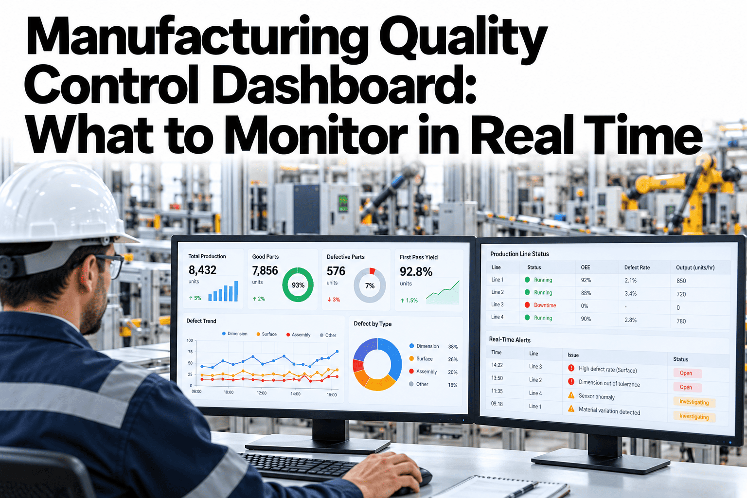
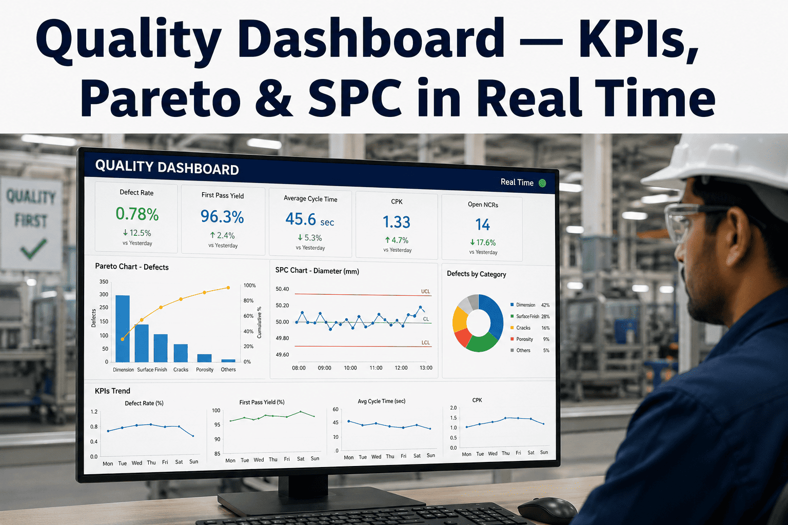
A quality dashboard is only useful if it shows the right things at the right moment. Many plants build screens full of charts that look impressive but do not tell anyone what to do, while real problems are found hours later in a report. A strong real-time quality control dashboard focuses on a short list of measures, shows them against clear limits and raises an alert when action is needed. This checklist covers what to monitor and why. To see how it could look on your own data, you can preview a quality dashboard with our team.
Real-time quality management
Monitor the Right Quality Signals in Real Time and Act Before Defects Spread
iFactory AI brings inspection, process and defect data into one live view, so quality teams spot drift early and respond while there is still time to fix it.
A live quality view starts with four numbers
First-pass yieldDefect rateProcess capabilityOpen alerts
Why real time mattersA Quality Problem Found Late Is a Bigger Problem
Every hour that a drifting process keeps running adds more suspect product. Real-time monitoring shortens that window.
Is quality stable?
Yield and defect rate right now
Where is it drifting?
Process trends before limits are crossed
What needs action?
Open alerts ranked by urgency
What did we learn?
Patterns by line, shift and product
A dashboard that answers these four questions in seconds will be used. One that does not will be ignored.
The monitor listEight Quality Measures Worth Watching Live
Start here. Not every plant needs all eight, but most need most of them.
1
First-pass yield
Share of units that pass without rework. The simplest overall health indicator.
2
Defect rate by type
Which defects are rising, grouped by cause so teams know where to look.
3
Scrap and rework
Cost and volume of lost product, tracked by line and shift.
4
Process capability and control
Whether key processes are stable and capable of meeting specification.
5
Inspection results at stations
Pass and fail counts from vision, gauges and manual checks.
6
Incoming material quality
Supplier lots accepted or held before they reach the line.
7
Open nonconformances
Issues waiting for containment, cause analysis or closure.
8
Alert response time
How quickly the team acknowledges and acts on quality alerts.
One dashboard, three viewsShow Each Role What It Needs and Nothing More
A single screen cannot serve everyone. Three layered views keep the same data consistent while changing the detail.
Operator view
Live pass and fail, current alerts and the next action.
Supervisor view
Line trends, top defects and open containment tasks.
Quality manager view
Cross-line performance, capability and closure of issues.
All three views should draw on the same numbers. When screens disagree, people stop trusting all of them.
See a Quality Dashboard Built From Your Own Data
Share your inspection results and defect categories and see how iFactory AI would turn them into a live, role-based quality view.
The key formulasDefine Every Metric in Writing Before It Goes on the Screen
Two teams using different definitions will always disagree. These common formulas show how a metric can be written down. The example numbers are illustrative.
First-pass yield = units passing first time / units started
40,000
Defective units per million
Defective units per million = defective units / total units x 1,000,000 = 400 / 10,000 x 1,000,000
Stable and capableUse Process Status to Decide Between Leave, Improve and Stop
Statistical process control adds two questions to every key process: is it stable, and is it capable of meeting the specification?
Process status
Stable
Unstable
Capable
Leave alone
Monitor and avoid unnecessary adjustment
Find the cause
Look for special causes such as tooling or material
Not capable
Improve the process
Reduce variation or review the specification
Stop and fix
Contain product and correct before running on
Capability indices such as Cp and Cpk summarise the capable question in one number. Customers often set their own minimum targets, so confirm yours.
Alert designAlerts Turn a Dashboard From a Display Into a Tool
A dashboard that waits to be looked at will miss events. Alerts bring the right information to the right person.
| Alert | Trigger example | Who is notified | Expected response |
|---|
| Defect rate spike | Rejects rise sharply within minutes | Line supervisor | Check the last change and contain product |
| Process drift | Measure trending toward a limit | Process engineer | Review settings before limits are crossed |
| Inspection fault | Camera or gauge stops reporting | Maintenance | Restore the check or add manual inspection |
| Supplier lot issue | Incoming defects above limit | Supplier quality | Hold the lot and contact the supplier |
| Overdue containment | Action open longer than agreed | Quality manager | Escalate and reassign |
Keep alerts few and meaningful. Too many alerts teach people to ignore them.
A day on the dashboardHow a Real-Time View Fits Into the Shift
1
Shift start
Review overnight alerts, open actions and any changeover checks.
2
Every hour
Glance at yield, defects and process trends against limits.
3
When an alert fires
Acknowledge, contain, find the cause and record the action.
4
Shift change
Hand over open issues with the dashboard as the shared record.
5
Weekly review
Study patterns by line, shift and product to guide improvement.
Data sourcesPull Inspection, Process and Business Data Into One View
Quality data usually lives in several systems. The dashboard connects them so teams do not switch screens.
Vision and gauge resultsProcess and SPC dataLab and test results
Quality dashboard layer
Operator screensSupervisor alertsManagement reports
Start with the sources your teams trust most and add more later. To plan the connections, ask our team about quality data sources.
Design choicesWhat Separates a Dashboard People Use From One They Ignore
Crowded dashboard
Dozens of charts on one screen
No limits or targets shown
Data updated once a day
Different numbers from each team
Focused dashboard
Four to eight measures per view
Limits and targets on every chart
Refresh rate matched to the process
One definition for every metric
Review the screen with real users. If they cannot say what to do after ten seconds, simplify it.
Detection speedWhat Faster Detection Looks Like
The goal is to shorten the time between a problem starting and the right person knowing. This view is illustrative.
Reports and spot checks
Product made before containment
Records for each decision
Real-time dashboard with alerts
Product made before containment
Records for each decision
These bars are illustrative. Measure your own detection time before and after the change so benefits are credible.
The full checklistQuality Dashboard Checklist: Ten Questions Before You Go Live
Use this list to review a new dashboard or to audit an existing one.
Every metric has a written definition
Each measure shows a target or limit
Views exist for operators, supervisors and managers
Refresh rates match how fast the process changes
Alerts have owners and response times
Data sources are reliable and time-stamped
A stale-data warning appears if feeds stop
Inspection and process data are linked to lots and batches
Users were involved in designing the screens
A monthly review of the dashboard is scheduled
RolloutThree Phases From First Screen to Daily Habit
Phase 1
Pick one line, agree four to six measures and write the definitions.
Phase 2
Build the first views, run them beside current reports and collect feedback.
Phase 3
Switch on alerts, train every shift and extend to other lines.
Expert reviewWhat a Quality Systems Manager Would Check First
Expert review
Dashboards fail because of definitions and ownership more than technology. Agree what each number means and who acts on it before choosing charts.
VerdictStrong when measures are few, defined and tied to named owners and actions.
Watch forBeautiful screens that nobody uses to make a decision.
Do nextPilot one line and ask operators which number they would act on first.
Frequently asked questionsWhat Quality Teams Ask About Real-Time Dashboards
How many metrics should a quality dashboard show?
Four to eight per view is a good range. More than that and the screen becomes hard to read, which hides the signals that matter. Put detailed analysis in drill-down pages or reports, and keep the live view focused on what needs attention now.
See a focused dashboard layout.
How often should the data refresh?
Match the refresh rate to how fast the process changes and how quickly someone can act. Fast lines may need updates every few seconds, while batch processes may need only minutes. Always show the time of the last update so people know the data is live.
Ask about refresh settings.
What data do we need to start?
A few reliable sources are enough: inspection results, key process measures and defect records, with time stamps and line or batch identifiers. Starting small makes the first dashboard useful sooner, and you can add sources once teams trust the numbers.
Review your available data.
Should the dashboard replace our reports?
Not at first. Run both side by side, compare numbers and fix definition differences, then retire reports that the dashboard fully covers. Some reports, such as customer or audit documents, may still be needed in a fixed format.
Ask about report planning.
How do we get operators to use it?
Involve them in designing the screens, keep the views simple and make sure alerts lead to quick, useful actions. When operators see that the dashboard saves them time and trouble, use follows. Gather feedback every month and act on it.
Plan operator involvement.
Spot drift before it becomes defects
Put Real-Time Quality in Front of Every Team
Book a session with iFactory AI to review your quality data, choose the measures that matter and design a live dashboard your teams will act on.