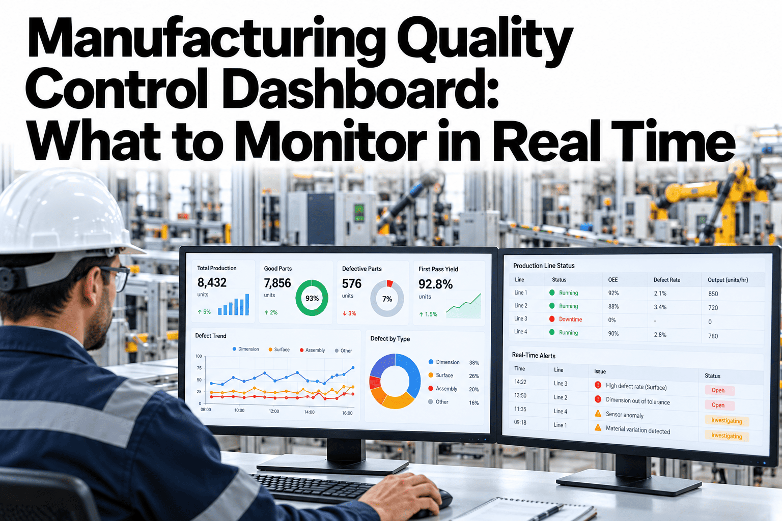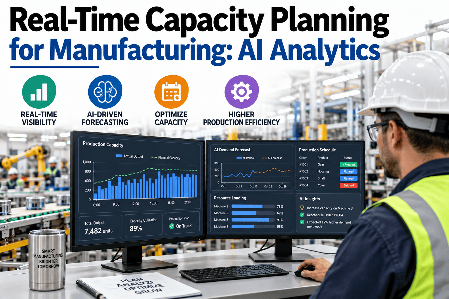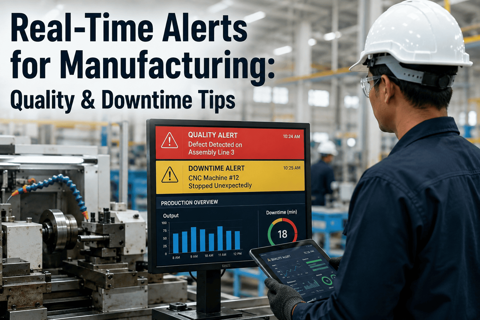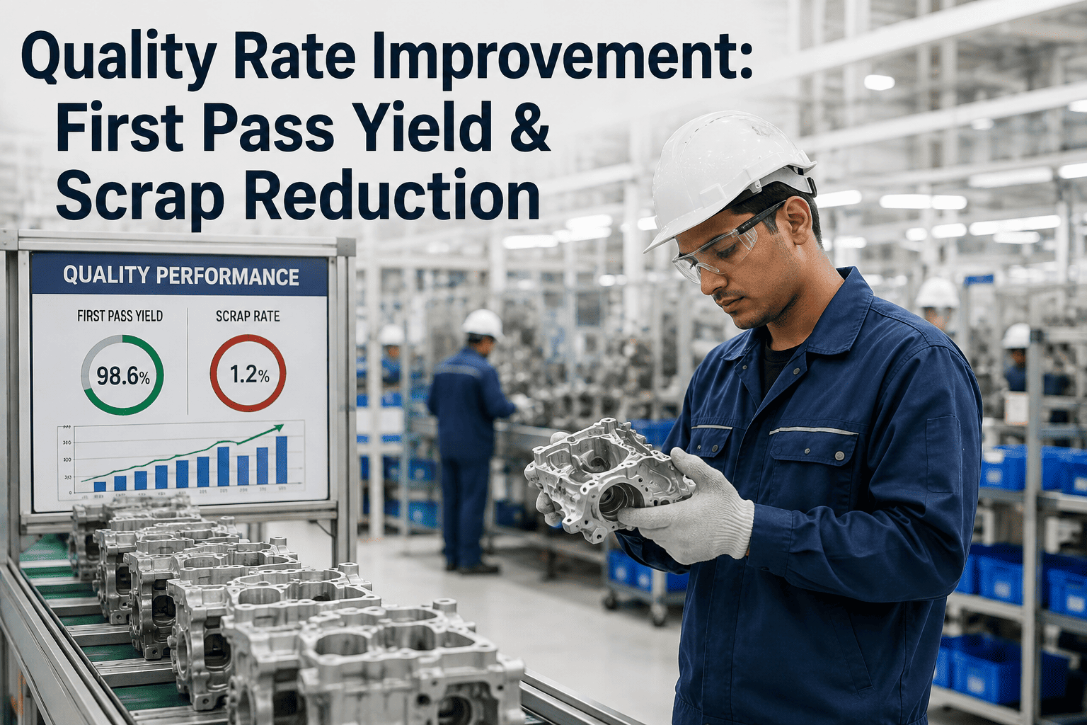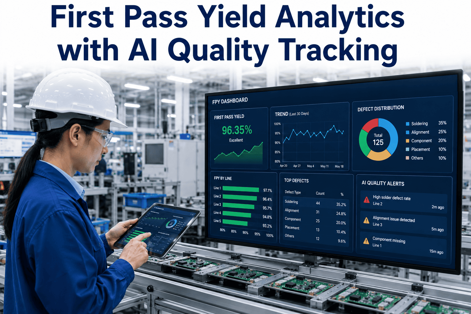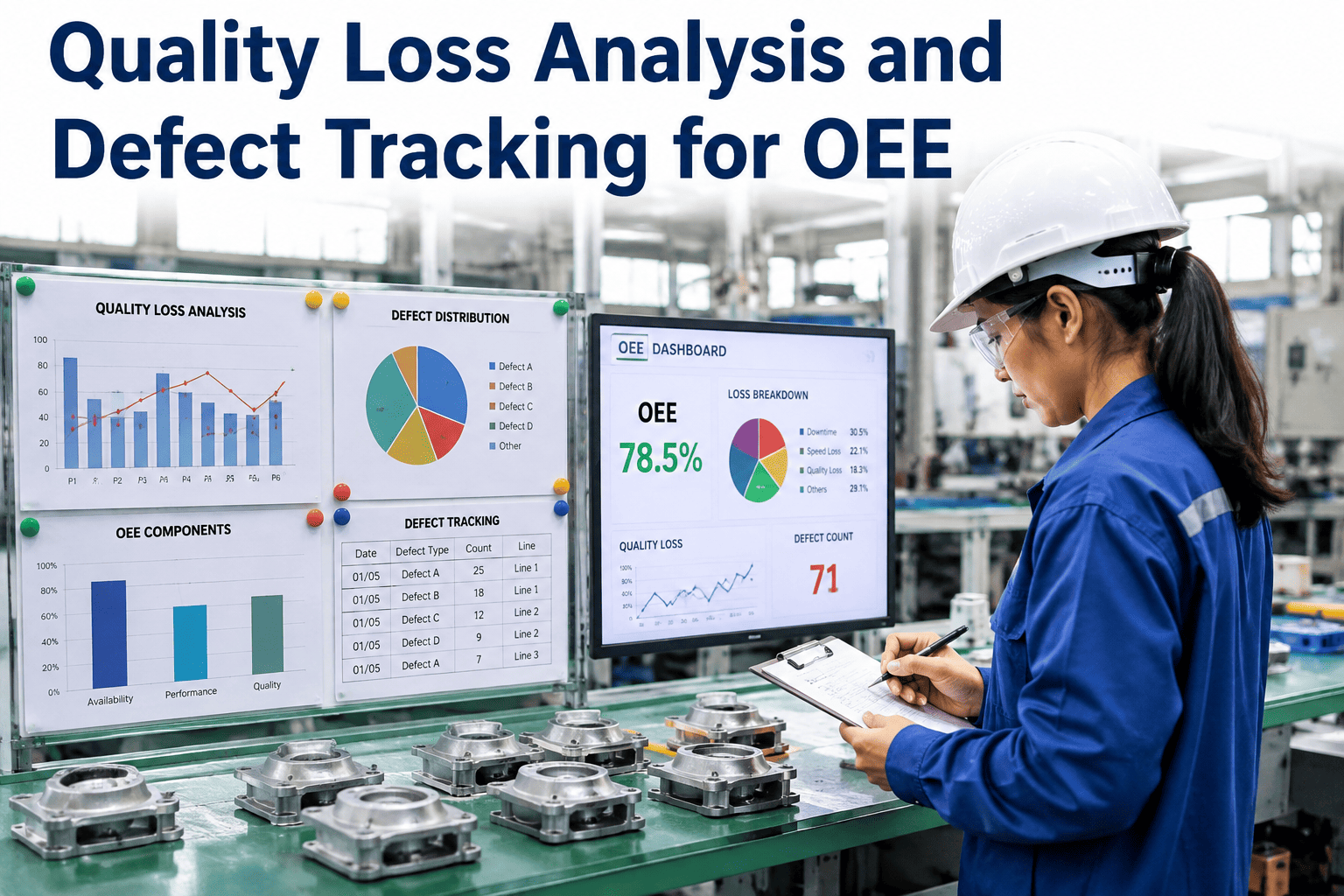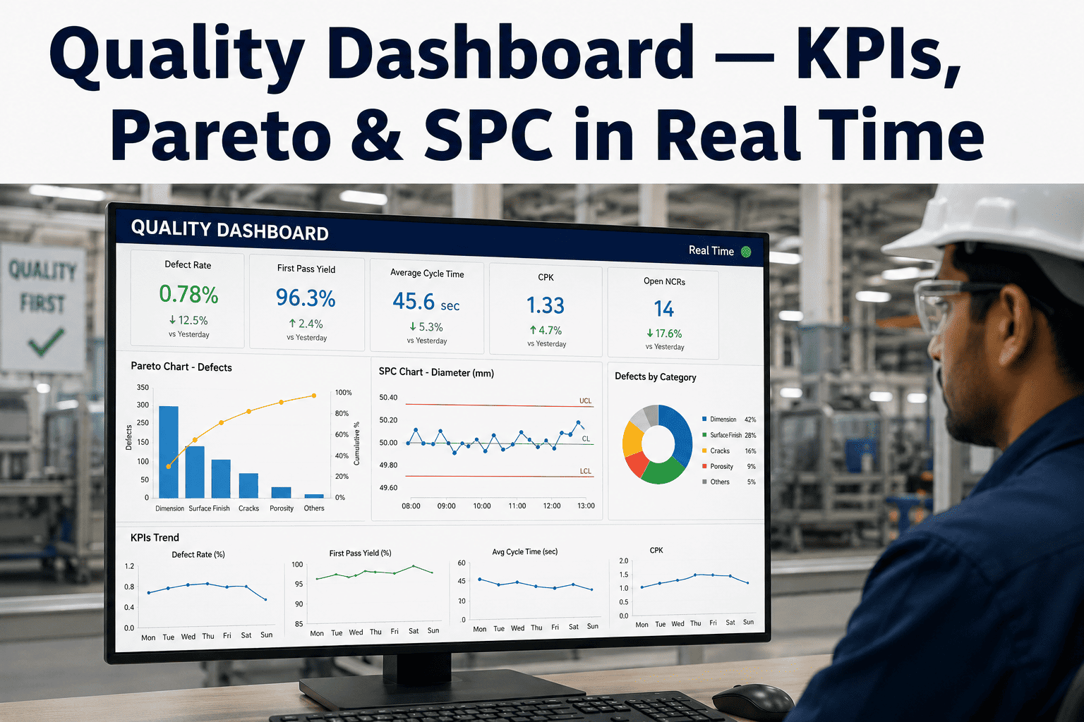
Most quality teams can tell you exactly what went wrong last month, because the monthly quality report is thorough, detailed, and completely useless for preventing the defects that are happening on the line right now. Cost of poor quality, scrap rate, and customer complaint data typically flow through spreadsheets and static reports that lag reality by days or weeks, which means the feedback loop between a defect occurring and someone acting on it is far longer than it needs to be given the data almost certainly already exists somewhere in the plant's systems. A real-time quality dashboard closes that loop, turning defect Pareto analysis, SPC trends, and Cpk tracking from a monthly retrospective into a live operating picture that quality managers and operators can act on the same shift a problem develops. iFactory AI consolidates defect data, SPC trends, and cost of poor quality into a single real-time dashboard with AI-driven anomaly detection that flags emerging problems before they show up in next month's report. Book a Demo to see your own quality data live.
Real-Time Quality Dashboards — From Monthly Reports to Same-Shift Action
iFactory AI consolidates defect Pareto, SPC trends, Cpk tracking, and cost of poor quality into one live dashboard, with anomaly detection that flags emerging quality problems the same shift they start.
Why Monthly Quality Reports Are Too Slow to Prevent Defects
A monthly quality report is, by definition, a historical document — it tells a story about what already happened, compiled from data that was often collected weeks earlier and assembled by someone manually pulling numbers from multiple disconnected systems. By the time a rising scrap rate or a new defect Pareto leader shows up in that report, the underlying process condition causing it has usually been active for the entire reporting period, quietly generating cost of poor quality the whole time. Closing that gap does not require collecting new data — it requires connecting the data that already exists into a system that surfaces it continuously instead of once a month.
The Core KPIs a Real-Time Quality Dashboard Should Track
Not every quality metric deserves equal real estate on a live dashboard. The KPIs below represent the small set that actually drive same-shift decision making, as opposed to metrics better suited to a periodic management review.
Defect Pareto Analysis
A live-updating Pareto chart ranks defect types by frequency and cost impact, keeping quality teams focused on the few defect categories driving the majority of total scrap and rework cost.
SPC Trend Monitoring
Control chart trends for critical characteristics are visualized continuously, with out-of-control signals surfaced on the dashboard the moment they occur rather than during a scheduled chart review.
Cpk and Ppk Tracking
Process capability indices are recalculated continuously as new data accumulates, giving quality engineers a live view of whether a process remains capable of meeting specification, not just a static quarterly snapshot.
Cost of Poor Quality
Scrap, rework, and warranty cost data are aggregated in real time, connecting quality performance directly to the financial impact that resonates most clearly with plant and business leadership.
First Pass Yield
First pass yield by line, shift, and product is tracked continuously, surfacing yield erosion early enough for teams to intervene before it accumulates into a significant production loss.
Customer Complaint Trending
Incoming customer complaints are correlated against internal defect and process data, helping quality teams connect field issues back to the specific production conditions that likely caused them.
How Quality Data Flows From the Line to a Same-Shift Decision
Building a real-time dashboard is not just a visualization exercise — it requires a data pipeline that moves quality information from the point of collection to a decision-maker's screen fast enough to matter operationally.
Inline Data Collection
Inspection results, SPC measurements, and defect classifications are captured directly at the point of inspection, eliminating the delay of manual data entry into a separate system after the fact.
Real-Time Aggregation and Calculation
Pareto rankings, control chart limits, and capability indices are recalculated continuously as new data arrives, rather than through a batch process that runs once a day or once a week.
AI Anomaly Detection
Machine learning models trained on historical quality patterns flag emerging anomalies that may not yet trigger a formal out-of-control rule but represent an early warning worth investigating.
Alerting and Same-Shift Response
Alerts route directly to the quality engineer or supervisor responsible for the affected line, enabling investigation and corrective action within the same shift the anomaly was detected.
Static Monthly Reports vs. Real-Time Quality Dashboards
- Compiled manually from multiple disconnected data sources
- Defect trends surface weeks after the underlying cause began
- Cpk and capability data reviewed on a periodic, often quarterly, cycle
- No proactive anomaly flagging between reporting periods
- Data aggregated automatically from connected quality and process systems
- Defect Pareto and SPC trends visible continuously, same shift as they emerge
- Cpk and Ppk recalculated in real time as new data accumulates
- AI anomaly detection flags emerging issues before they become trends
Measured Outcomes from Real-Time Quality Dashboard Deployment
| KPI | Baseline (Monthly Reporting) | With Real-Time Dashboard | Primary Value Driver |
|---|---|---|---|
| Defect Escape Rate | Baseline varies by process maturity | 60%+ reduction | Same-shift detection and response |
| Time to Detect Trend | 1-4 weeks | Same shift | Continuous Pareto and SPC recalculation |
| Cost of Poor Quality Visibility | Monthly aggregate only | Real-time, by line and shift | Automated scrap and rework cost aggregation |
| Root Cause Investigation Time | Days, starting from scratch | Hours, AI-narrowed starting point | Correlated anomaly detection |
Stop Finding Out About Quality Problems a Month After They Started
iFactory AI unifies defect Pareto, SPC, Cpk, and cost of poor quality into one live dashboard with AI anomaly detection built in.
Real-Time Quality Dashboards — Frequently Asked Questions
What KPIs should a real-time quality dashboard actually track?
The most operationally useful real-time quality dashboards focus on defect Pareto analysis, SPC trend monitoring, Cpk and Ppk capability tracking, cost of poor quality, first pass yield, and customer complaint trending. These six metrics collectively give quality and production teams enough of a live picture to detect and act on emerging problems, while more detailed or strategic metrics remain better suited to periodic management review rather than a live operational dashboard.
How is this different from the quality reports we already generate monthly?
Monthly reports are compiled after the fact from data that has already accumulated for weeks, meaning any trend they reveal has typically been active the entire reporting period before anyone sees it. A real-time dashboard aggregates the same underlying data continuously, surfacing defect trends, SPC violations, and capability shifts the same shift they occur, which is the difference between reacting to a problem and preventing it from compounding further.
Do we need new sensors or inspection equipment to build a real-time dashboard?
In most cases, no. The data needed for defect Pareto, SPC, and cost of poor quality tracking typically already exists across inspection stations, quality management systems, and production data historians — the gap is usually integration and aggregation, not data collection. Contact Support to confirm compatibility with your existing quality and process systems.
How does AI anomaly detection differ from standard SPC out-of-control rules?
Standard SPC rules such as Western Electric and Nelson rules detect specific statistical patterns that are well defined and proven, while AI anomaly detection can identify more subtle, multivariate patterns across correlated process variables that may not trigger a formal SPC rule violation but still represent a meaningful early warning. The two approaches work together, with AI anomaly detection catching issues that traditional single-variable control charts are not designed to see.
How quickly can a plant get a real-time quality dashboard running?
Most plants move from initial data connection to a working live dashboard within a few weeks, since the platform integrates with existing inspection, SPC, and quality management data sources rather than requiring new infrastructure. Book a Demo to see a working dashboard configuration built from a sample of your own quality data.