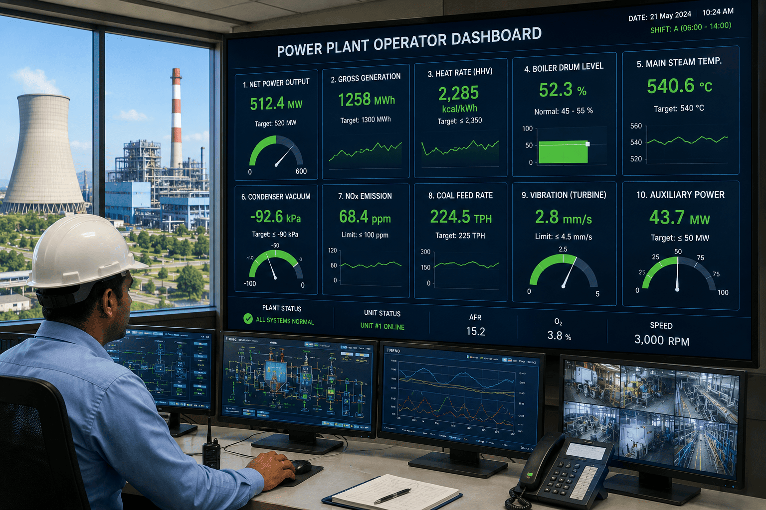
The control rooms that catch trouble before the alarm rings aren't staffed with smarter operators — they're watching a different screen. Plants that run blind to live data find problems through trips, NOx exceedances, and torn-up turbine blades; the ones that watch the right KPIs every shift see the drift hours before a trip and weeks before a forced outage. The list of metrics that separates the two groups is shorter than you'd think — and an iFactory live dashboard puts every one of them in front of the operator the moment they sit down.
iFactory Production Execution
10 KPIs Every Power Plant Operator Should Be Watching Live
Heat rate, MW output, drum level, NOx, vibration — the metrics that warn an operator hours before a trip and weeks before a forced outage. Here is what to watch, where the healthy band sits, and what each KPI is really telling you.
91%
nuclear capacity factor, 2025
9 ppm
new EPA NOx floor, large CT
2.3
mm/s Zone A vibration ceiling
Live
every shift, not hourly
Why "Once a Shift" Isn't Enough Anymore
The hourly PI report tells the operator what was happening an hour ago. The grid dispatches on minutes. The EPA's January 2026 rule pushed NOx limits on efficient new combustion turbines down to 9 ppm — from a ceiling of 15 ppm that hadn't moved since 2006. A heat-rate drift of 200 BTU/kWh costs real fuel from the moment it shows up. Live KPI tracking is no longer a nice-to-have — it is how operators stop trouble before it becomes a trip, an exceedance, or a forced outage that hits the availability number for the whole quarter.
The 10 KPIs That Belong on Every Live Dashboard
These are the ten readings an operator should glance at and immediately know whether the plant is healthy, drifting, or in trouble. The healthy band on each one is the difference between catching a problem early and explaining it to the plant manager in the morning. Bands shown are general industry ranges — OEM specs and permit limits override them.
1
Net Heat Rate
BTU per kWh
< 7,0007,000-7,500> 7,500
The sharpest single measure of fuel-to-power efficiency. Break it down by GT, ST, and HRSG so a 200 BTU drift points the operator at the actual cause.
2
Load vs Dispatch Setpoint
MW or % deviation
±1%1-3%> 3%
How tightly the unit is following dispatch. Misses become grid imbalance penalties and accelerated turbine wear from ramp overshoot and undershoot.
3
Capacity Factor, 24-hr Rolling
% of nameplate
> 55%45-55%< 45%
Are you actually running when you are supposed to be running? A rolling window catches partial outages and curtailments a daily figure averages away.
4
Boiler Drum Level
mm deviation from setpoint
±25 mm25-75 mm> 75 mm
Too high and water carries into the steam header; too low and tubes risk dry-out and rupture. Live trending catches shrink and swell before a trip.
5
Main Steam Temp & Pressure
°F drift / psi drift
±5 °F5-15 °F> 15 °F
Both a duty-cycle indicator for the HRSG and a leading flag of upsets. Wider drift points to combustion, attemperator, or feedwater trouble.
6
NOx Emissions
ppm at 15% O2
< 9 ppm9-15 ppm> 15 ppm
The KPI that protects the operating license. EPA's January 2026 rule pushed the floor for efficient large turbines to 9 ppm — creep matters as much as the level.
7
Bearing Vibration, RMS
mm/s velocity
< 2.3 (A)2.3-4.5 (B)> 4.5 (C)
The clearest leading indicator on any rotating machine. ISO 20816-3 sets the zone boundaries; the trend matters as much as today's reading.
8
Fuel Flow Stability
σ of flow over interval
TightDriftingUnstable
A leading indicator of combustion problems. Rising standard deviation precedes CO spikes, thermal shock, and flame instability — well before a trip.
9
Auxiliary Power Consumption
% of gross generation
5-8%8-10%> 10%
How much of what you generate the plant keeps for itself. Climbing aux power is often the first sign that fans, pumps, or mills are straining downstream.
10
Forced Outage Rate, Rolling
% of period hours
< 2%2-4%> 4%
The honest score on reliability. A rolling forced-outage figure trumps any availability claim made on a slide deck — and tells you which units are eating it.
Want these ten KPIs mapped against your plant's tags and OEM bands? Talk to our process team and we'll show you what's already in your historian — and what's missing.
Lagging vs Leading — Catch Trouble Before It Trips You
Half the value of a KPI is in which way it points in time. Lagging indicators tell the operator what just happened; leading indicators tell them what is about to happen. A live dashboard mixes both, so the operator sees the score and the early warning on the same screen.
Lagging KPIs
What Already Happened
Heat rate, gross MWh, fuel consumed for the shift
Forced outage rate over a rolling window
Capacity factor, availability, equivalent availability
Daily emissions totals against permit caps
Leading KPIs
What's About to Happen
Bearing vibration trend before it crosses Zone B
Fuel-flow standard deviation before flame instability
Drum-level drift and swell before a low-level trip
NOx creep toward the permit limit before exceedance
Build Your Dashboard in Four Tiers
Ten KPIs is the right number to watch, but they don't all belong in the same panel. Group them by what each one protects — the fuel bill, the asset, the grid relationship, or the operating license — and the dashboard stops being a wall of numbers and starts being a decision aid.
T1
Efficiency
Heat rate, fuel-flow stability, auxiliary power consumption — the KPIs that protect the fuel bill, hour by hour.
T2
Output
Net MW, load deviation against dispatch setpoint, 24-hour capacity factor — what the grid is paying you for, in real time.
T3
Safety
Drum level, main steam temperature and pressure, bearing vibration — the KPIs that stand between the plant and a forced outage.
T4
Compliance
NOx and CO ppm, ammonia slip, opacity — the KPIs that protect the operating license under the new EPA combustion turbine rules.
Curious how your current panel maps to these four tiers? Book a demo and we'll redraw it against your unit and your permit.
Industry Benchmarks at a Glance
Where the bands should sit for a healthy modern unit. These are general industry ranges — OEM specifications and permit limits override anything below, but they are a reasonable place to start a conversation about what "good" looks like on each KPI.
| KPI |
Healthy |
Watch |
Act Now |
| Heat rate, gas CCGT | < 7,000 BTU/kWh | 7,000-7,500 | > 7,500 |
| NOx, new large gas turbine | < 9 ppm | 9-15 ppm | > 15 ppm |
| Bearing vibration, Group 1 rigid | < 2.3 mm/s RMS | 2.3-4.5 | > 4.5 |
| Capacity factor, gas CCGT | > 55% | 45-55% | < 45% |
| Drum level deviation | ±25 mm | 25-75 mm | > 75 mm |
| Load deviation vs setpoint | ±1% | 1-3% | > 3% |
| Aux power consumption | 5-8% | 8-10% | > 10% |
| Forced outage rate, rolling | < 2% | 2-4% | > 4% |
Spreadsheet KPIs vs Live KPIs
The same ten KPIs land very differently depending on how the operator sees them. A spreadsheet refreshed at end of shift is a postmortem. A live dashboard is a decision aid. The metrics on each list are identical — what changes is whether the operator can do anything about them in time.
Hourly PI + Excel
The Postmortem
Hourly exports, manual reconciliation in spreadsheets
NOx exceedance discovered in next morning's review
Heat-rate drift averaged into a single daily figure
Vibration alarm sat in a chart no one was watching
Live iFactory dashboard
The Decision Aid
Every KPI live, with healthy and alarm bands visible
NOx creep flagged minutes after it starts trending up
Heat-rate drift split by GT, ST, and HRSG in real time
Vibration trend pushed to the operator's screen and phone
Want to see your spreadsheet panel rebuilt as a live KPI dashboard? Talk to a specialist and we'll mock it up against your plant's tags.
Frequently Asked Questions
How many KPIs should we actually display live in the control room?
Around ten, grouped into tiers. Past that, the operator stops reading the screen and starts ignoring it. The ten on this list cover efficiency, output, safety, and compliance — which is the full job. Drill-downs and per-equipment screens belong one click away, not on the main panel.
Aren't most of these already in our DCS?
The raw tags usually are. The KPIs almost never are — heat rate split by GT/ST/HRSG, rolling capacity factor, fuel-flow standard deviation, drift against permit bands. The work is in the calculation layer and the alarm logic, not the sensors. That is exactly what an iFactory dashboard adds on top of your existing historian.
What's the most overlooked KPI on this list?
Fuel-flow standard deviation. Most plants show fuel flow itself, but the trend in its variability is the earliest leading indicator of combustion trouble — well before CO spikes, NOx creep, or a flame-instability trip. It is the cheapest early warning available.
How does this connect to predictive maintenance?
Directly. The leading KPIs on this list — vibration trend, fuel-flow variability, drum-level drift, climbing aux power — are exactly the signals predictive maintenance turns into work orders. Live KPI tracking is the operator's view of the same data that drives the maintenance team's view.
Do we need new sensors, or can iFactory use what we already have?
Almost always existing tags. The historian, DCS, and CEMS already carry the raw data; what is missing is the KPI calculation, the band logic, and the live presentation. Most deployments stand up the dashboard on the data you already own, then add sensors only where a real gap shows up — usually nowhere for the first cut.
Stop reading yesterday's numbers.
See Your Plant's KPIs Live
Bring the unit you most want to tighten. We'll stand up a live dashboard of these ten KPIs on your existing historian tags, set the healthy bands against your OEM specs and permit limits, and show your operators exactly what they would be seeing — hours before the next trip, weeks before the next forced outage.
10
KPIs, live, every shift
Existing
historian tags, no new sensors
Live
not hourly, not next morning