Statistical Process Control in Power Plants: A Practical Guide
By Josh Brook on June 16, 2026
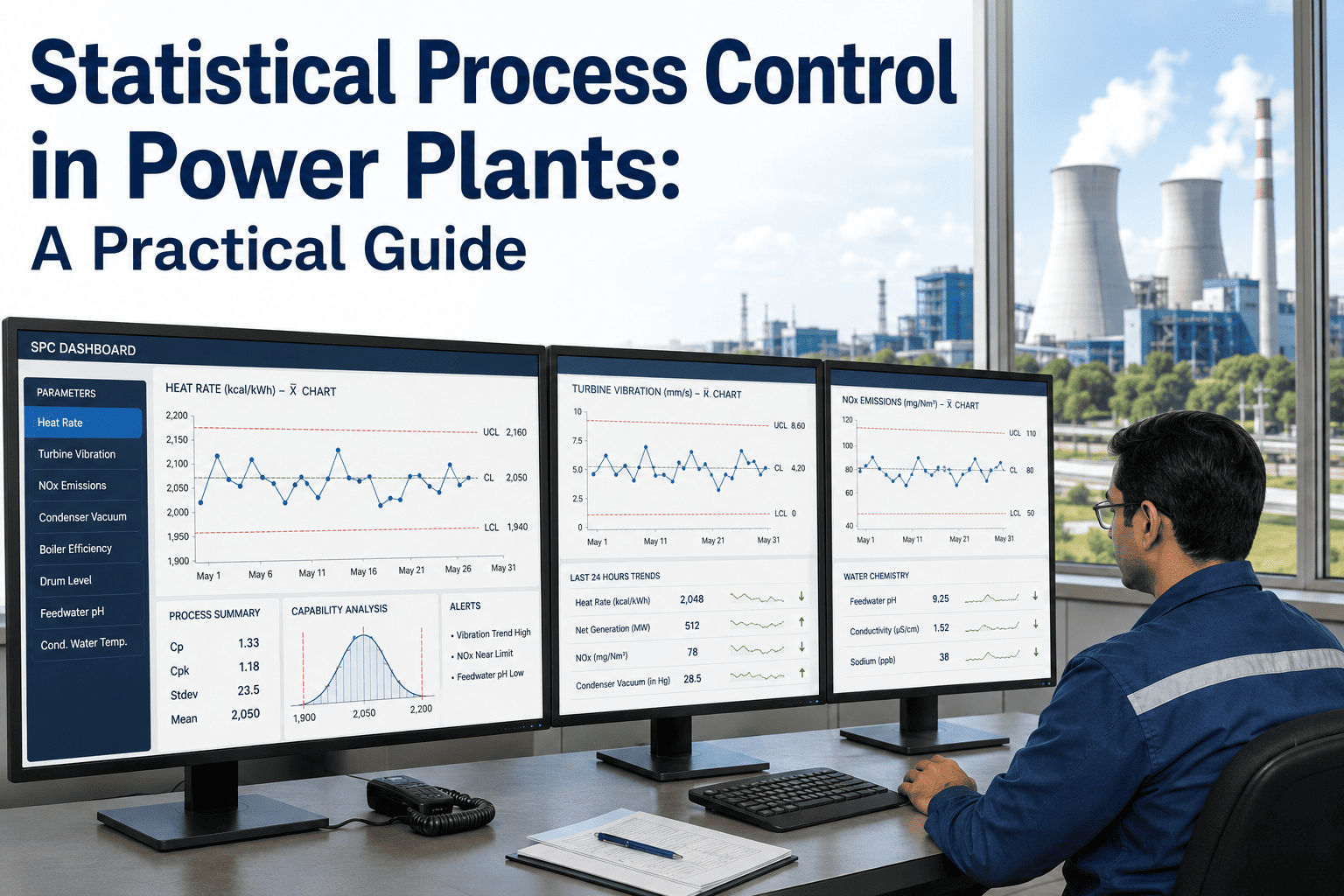
There is a moment in every power plant where someone notices that heat rate has been creeping up for a week, vibration is a hair higher than last shift, or feedwater conductivity edged sideways three days ago — and no alarm fired, because nothing crossed a threshold. That moment is exactly the one statistical process control was built to catch. SPC does not wait for a permit exceedance or a trip; it watches the shape of the data and tells the operator when something has changed before the threshold is ever breached. An iFactory dashboard runs SPC continuously on every signal you already have, so an SPC-aware control room finds problems weeks earlier than one that waits for alarms.
iFactory Analytics for Power Generation
Statistical Process Control in Power Plants — A Practical Guide
SPC catches drift in heat rate, vibration, emissions, and water chemistry weeks before alarms fire. Here is how the charts work, where they belong inside the plant, and what an SPC-aware control room actually puts on the screen.
An alarm is a binary verdict — over the threshold or under it. SPC is a verdict on the pattern of the data over time. A signal can sit comfortably inside its alarm band for weeks while drifting steadily toward trouble, and a hard threshold will never see it. SPC sees it, because the drift itself violates the statistical pattern of a stable process. The cost of waiting for the alarm is often the trip, the exceedance, or the boiler tube failure that already cost the industry roughly $1.9 billion a year in corrosion damage alone — much of it traceable to water chemistry that drifted long before any limit was crossed.
SPC also draws a sharp line between two kinds of variation. Common-cause variation is the natural noise of a stable process — fuel quality wiggles, weather, sensor jitter. Special-cause variation is the signal that something has actually changed — a fouled probe, a worn bearing, a control valve drifting. The whole job of an SPC chart is to separate the two and only ring the bell when something has truly changed.
The Anatomy of a Control Chart
A control chart plots a single process variable over time against a centerline and two limits that describe how that signal naturally behaves when nothing is wrong. The math is straightforward: take a stable baseline of the process, compute its mean and standard deviation, and draw the upper and lower control limits at three standard deviations from the mean. Roughly 99.7% of a stable process's data falls inside those limits — anything outside has only a 0.3% chance of being noise.
Centerline
The process mean from a stable baseline period. The signal a healthy process oscillates around.
Warning zones (±2σ)
Where roughly 95% of healthy data sits. Clusters here are early signals of drift even with no UCL breach.
Control limits (±3σ)
99.7% of stable-process data is inside this band. A single point outside has only a 0.3% chance of being noise.
Process value
The signal being monitored — heat rate, vibration RMS, NOx ppm, conductivity, anything continuous.
Four Chart Types, Four Jobs
Not every signal in a power plant behaves the same way, so SPC offers different charts for different jobs. Four cover the vast majority of what an operator needs.
Shewhart X-bar / R
Catching Large Shifts Fast
The classic chart. Plots subgroup means against ±3σ limits and is excellent at flagging large, sudden shifts in a process — a tripped trim valve, a sensor failure, a sudden fuel quality change.
Best for: subgrouped data, large step changes
Individuals (I-MR)
For Continuous Single Reads
When subgroups don't make sense — a single heat rate value per hour, a single conductivity reading per minute — the Individuals and Moving Range chart pair handles single-point series with the same statistical rigor.
Best for: one reading at a time, slow signals
EWMA
Catching Small, Slow Drift
The exponentially weighted moving average detects small sustained shifts a Shewhart chart would take hundreds of points to see. EWMA can flag a real shift in roughly 15 observations versus 370 for Shewhart — built for the slow creep of bearing wear or fouling.
Best for: slow drift, fouling, gradual wear
CUSUM
Earliest Possible Detection
The cumulative-sum chart adds up deviations from target and flags a shift the moment the cumulative drift becomes statistically improbable. Often the earliest of the four to detect a real change, at the cost of being trickier to interpret.
Best for: critical signals where minutes matter
Not sure which chart fits which signal in your plant? Talk to our analytics team and we will map chart types to your historian tags.
Where SPC Lands in a Power Plant
SPC is most useful on signals that move continuously, drift slowly, and matter financially or operationally. Four areas inside a power plant tick all three boxes — and in our experience, almost every plant we work with has at least one of them running blind.
A
Heat Rate Drift
SPC on net heat rate, broken down by GT, ST, and HRSG. Catches fouling, condenser vacuum loss, and gradual GT degradation as drift well before the daily report shows a number worth investigating.
B
Vibration Trend
EWMA on bearing vibration RMS catches the slow climb toward ISO Zone B long before the alarm trips on Zone C. The trend itself is the warning — the absolute value is the late signal.
C
Emissions Creep
NOx, CO, and ammonia slip drift slowly as SCR catalyst degrades, burners foul, or controls drift. SPC flags creep toward the permit limit weeks before an exceedance, while there's still time to act on it.
D
Water Chemistry
Silica, sodium, chloride, conductivity, dissolved oxygen. Roughly 60% of power-plant equipment damage traces back to water chemistry deviation — and almost all of that is drift, not sudden change. SPC is purpose-built for it.
The Patterns That Catch Drift
A single point outside ±3σ is the most famous rule, but it's far from the only one. Western Electric and Nelson rules describe a handful of patterns — clusters, runs, trends — that are statistically improbable in a stable process. Four of them do most of the real work in a power plant.
One point beyond ±3σ
The classic rule. Less than 0.3% chance of being noise — almost always a real change.
Nine points on one side
A sustained shift the alarm bands miss entirely. Common with sensor drift, controller bias, or fouling.
Six in a row trending
A monotonic climb or descent. The signature pattern of bearing wear, catalyst aging, and heat-exchanger fouling.
Two of three beyond ±2σ
A cluster of "near misses" on the same side. Often the earliest visible sign of a developing shift.
Want these rules running on your tags right now? Book a demo and we'll show your signals on a live SPC chart against a stable baseline.
Control Limits vs Permit Limits — Don't Confuse Them
This is the single most common SPC mistake in a power plant. Control limits and permit (or specification) limits answer two very different questions, and using one as the other is how SPC programs lose credibility in the first six months.
Voice of the process
Control Limits
Calculated from the process itself, ±3σ from its own mean
Describe what the process actually does when stable
A violation means something has changed
Used to detect drift and special-cause variation
Voice of the customer or regulator
Permit / Spec Limits
Set externally — EPA permit, OEM spec, contract terms
Describe what the process must do to be compliant
A violation means a fine, a warranty issue, or a trip
Used as a hard threshold, not a drift detector
Both belong on the same chart, but they do different work. The control limits catch the drift; the permit limits remind the operator how close it is to becoming a real problem. The ratio between the two — process capability, or Cpk — tells you whether the process even has room to drift before something bad happens. If your control limits sit close to your permit limits, you have no margin and SPC alone won't save you.
A Four-Step SPC Roadmap for Power Plants
Standing up SPC on a power plant is less about software than about discipline. The same four steps work for heat rate, vibration, emissions, and water chemistry — the only thing that changes is which signal and which chart.
1
Pick the signal and the chart
Choose the variable that matters financially or operationally and the chart type that fits it. Continuous single reads get Individuals or EWMA; subgrouped data gets X-bar/R; critical drift detection gets CUSUM.
2
Establish a stable baseline
Pull a period when the unit was running normally — no startups, no upsets, no known special causes — and compute the mean and standard deviation from it. This is the reference the chart will defend.
3
Set limits and pattern rules
Draw control limits at ±3σ, warning at ±2σ, and turn on the four Nelson rules that matter — single point, nine on a side, six trending, two of three beyond ±2σ. Overlay the permit or spec limit as a separate line.
4
Route signals to a human
A rule violation that no one sees is the same as no rule at all. Send the signal to the operator's screen, push it to a mobile alert, log it for the engineer in the morning — and review the false-alarm rate monthly so the chart stays trusted.
Want this stood up against your plant's tags? Talk to a specialist and we'll walk through the baseline period, the chart selection, and the rule set on your data.
Frequently Asked Questions
Do we need expensive software to run SPC, or can it live on our existing historian?
SPC sits on top of whatever historian you already have. The math is a baseline mean, a standard deviation, and four pattern rules — the value is in the live presentation, the chart selection, and the alarm logic, not the data acquisition. Most iFactory SPC deployments use the tags you already record, with no new sensors.
How often does an SPC rule trigger a false alarm?
With the standard ±3σ rule alone, roughly once every 370 points on a perfectly stable process — that is the 0.27% noise probability built into the math. Adding pattern rules raises the false-alarm rate, which is why a well-tuned SPC system uses three or four rules, not all eight. The monthly review of false alarms is what keeps the chart trusted.
How is SPC different from predictive maintenance?
SPC tells you that a signal has changed. Predictive maintenance tells you what is failing and roughly when. SPC is usually the upstream signal — a Nelson rule on bearing vibration trend is exactly the kind of input a predictive model uses. In practice the two live on the same dashboard, with SPC as the operator's view and predictive maintenance as the planner's view.
Will SPC work on signals that aren't normally distributed?
Some chart types are sensitive to that assumption and some are not. EWMA is more robust to non-normal data than a classic Shewhart chart, which is part of why it is the workhorse for power-plant signals like vibration and emissions creep. If your data is heavily autocorrelated or non-normal, the right answer is often EWMA on residuals from a model, not a vanilla Shewhart chart.
Where should we start if we've never run SPC before?
Pick one signal that matters financially and is reasonably stable when nothing is wrong — net heat rate, NOx ppm, condensate conductivity, or a single bearing vibration RMS. Stand up one EWMA chart against a clean baseline period, run it live for a month, and see what it catches. The first chart almost always pays for the rest of the program.
Catch the drift before the alarm.
See SPC Running Against Your Plant's Signals
Bring one signal that has cost you a trip, an exceedance, or a forced outage in the last twelve months. We'll pull a clean baseline from your historian, stand up the right chart on it — Shewhart, EWMA, or CUSUM — and show you exactly what an SPC-aware control room would have seen, and how many weeks earlier it would have seen it.