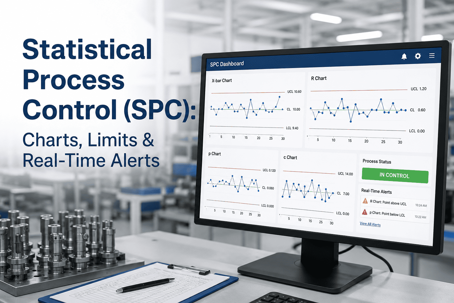
An X-bar and R chart looks deceptively simple once it's running on a production line: two plots, a centerline, and a pair of control limits that either contain the process or don't. What's easy to get wrong is everything before that chart goes live — picking a subgroup size that's too small to detect real shifts, calculating control limits from a period that wasn't actually stable, or applying out-of-control rules inconsistently between operators on different shifts. Get the setup wrong and the chart either misses real problems or drowns operators in false alarms until they stop trusting it entirely. This guide walks through subgroup sizing, control limit calculation, and the out-of-control rules that make an X-bar R chart worth the wall space, and how a demo can show live control charts running against your own process data.
Statistical Process Control
Setting Up X-Bar and R Charts That Operators Actually Trust
Subgroup sizing, control limit calculation, and Western Electric zone tests, explained the way you'd actually apply them on the floor.
Why X-Bar and R Charts Are Still the Workhorse of Process Control
An X-bar chart tracks the average of small subgroups of measurements over time, showing whether the process center is drifting. The companion R chart tracks the range within each subgroup, showing whether process variation itself is growing or shrinking. Used together, they separate two very different problems: a shift in the X-bar chart means the process is producing parts centered somewhere it shouldn't be, while a shift in the R chart means the process has become less consistent, even if the average still looks fine.
That distinction matters because the corrective action is different in each case. A drifting average often points to tool wear, a machine setting, or a material lot change. Growing range often points to a worn fixture, inconsistent operator technique, or a mixed material source. Charting both variables side by side is what makes root cause investigation faster than staring at a single combined metric.
Choosing Subgroup Size: The Decision That Shapes Everything Else
| Subgroup Size (n) | A2 Constant | D3 Constant | D4 Constant |
| 2 | 1.880 | 0 | 3.267 |
| 3 | 1.023 | 0 | 2.574 |
| 4 | 0.729 | 0 | 2.282 |
| 5 | 0.577 | 0 | 2.114 |
| 6 | 0.483 | 0 | 2.004 |
Subgroups of four or five are the most common choice on manufacturing lines because they balance sensitivity against sampling burden well. Smaller subgroups, like two or three, are faster to pull but make the R chart less reliable at detecting a real shift in variation. Larger subgroups improve statistical power but increase the sampling workload per hour, which matters on lines already running tight cycle times. The constants above come from standard SPC tables and are used directly in the control limit formulas below, so the subgroup size decision has to be made before any limit is calculated, not adjusted afterward.
Calculating Control Limits Step by Step
1
Collect 20-25 subgroups from a period known to represent normal, stable operation, not a startup or changeover window.
2
Calculate the average range (R-bar) and the grand average (X-double-bar) across all subgroups collected.
3
Apply the X-bar control limits: X-double-bar plus or minus A2 multiplied by R-bar, using the constant for your subgroup size.
4
Apply the R chart limits: upper limit equals D4 multiplied by R-bar, lower limit equals D3 multiplied by R-bar.
5
Verify the baseline period was actually in control before locking limits in; recalculate if any baseline points are out of control.
See It Running Live
Watch Control Limits Calculate Automatically From Your Process Data
A short demo shows subgroup collection, limit calculation, and rule flagging without a spreadsheet in sight.
Western Electric Zone Rules: Catching Problems Before a Point Goes Out of Limits
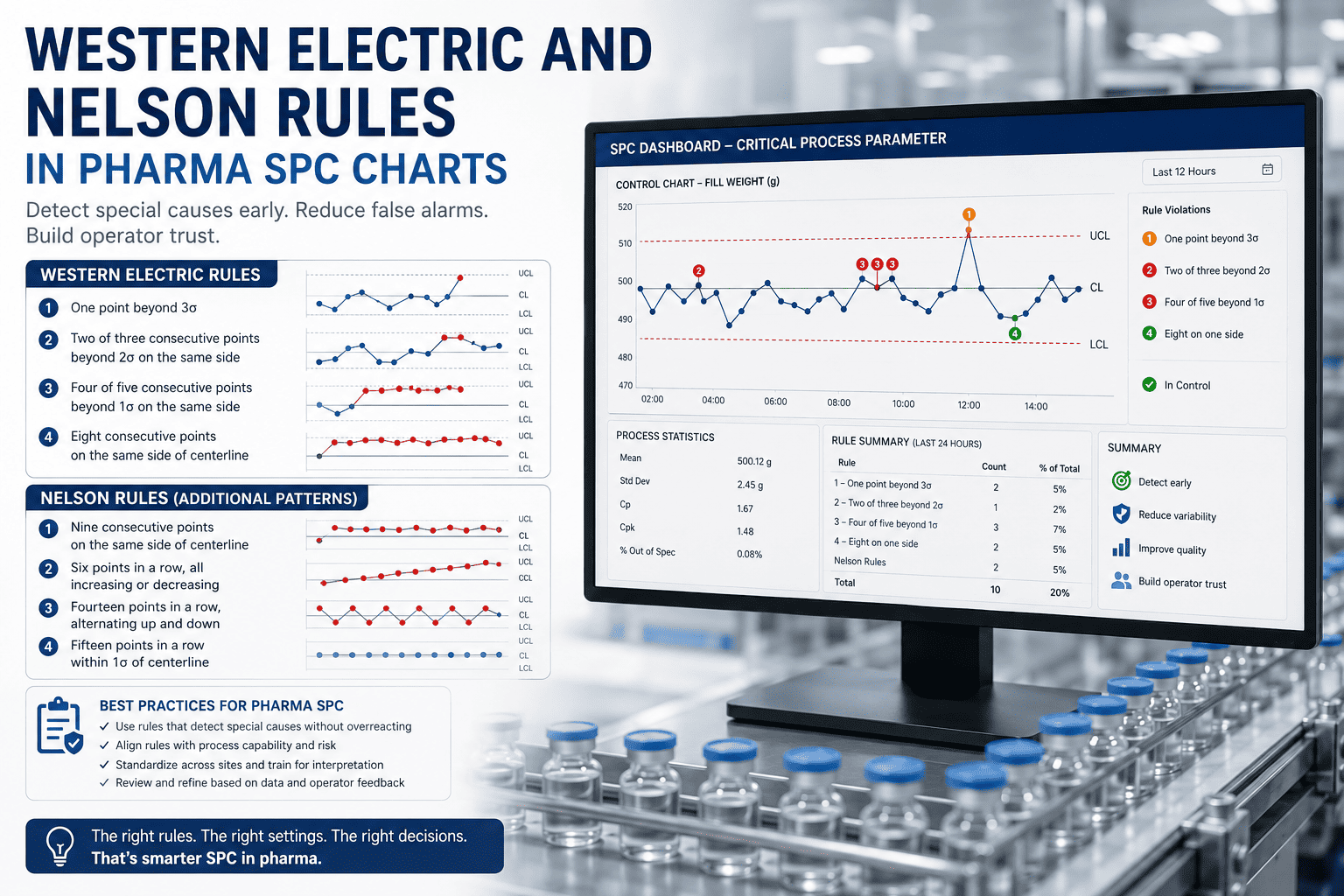
A single point outside the control limits is the easiest signal to catch, but it's often not the earliest one. The Western Electric rules divide the space between the centerline and the control limits into three zones and flag specific patterns within those zones that indicate a process is drifting before any single point crosses the outer limit.
Rule 1: One Point Beyond 3-Sigma
A single point falls outside the upper or lower control limit — the clearest and most urgent signal.
Rule 2: Two of Three in Zone A
Two out of three consecutive points fall in the outer third of the control limit range, same side of centerline.
Rule 3: Four of Five in Zone B
Four out of five consecutive points fall beyond one standard deviation from centerline, same side.
Rule 4: Eight Points, One Side
Eight consecutive points fall on the same side of the centerline, indicating a sustained shift.
Common Setup Mistakes That Undermine an SPC Program
Most SPC programs that lose operator trust don't fail because of the math; they fail because of decisions made before the chart went live. Calculating limits from a baseline period that included a known process upset bakes that instability into the limits permanently, making the chart either too tight or too loose for the process it's supposed to monitor. Changing subgroup size after limits are set without recalculating is another common error, since every constant in the formula is tied to that specific subgroup size.
Inconsistent sampling timing causes a subtler problem: if subgroups are pulled whenever an operator has a spare minute rather than on a fixed interval, the chart can miss shifts that happen between samples or falsely attribute normal variation to a process change. A fixed sampling schedule, even a simple one, produces a far more trustworthy chart than an ad hoc one.
20-25
subgroups typically needed to establish a statistically reliable baseline
4-5
is the most common subgroup size balancing sensitivity and sampling effort
2 Charts
center and spread need separate tracking to diagnose the right root cause
Frequently Asked Questions
When should we switch from an X-bar R chart to an X-bar S chart?
Once subgroup size grows beyond about ten, the range statistic becomes a less efficient estimator of process variation than the standard deviation, which is when most SPC practitioners switch to an X-bar S chart. For the subgroup sizes of two to six commonly used on manufacturing lines, the R chart remains the standard choice because it's simpler to calculate by hand and easier for operators to interpret at a glance.
What should we do when a point falls outside the control limits?
Treat it as a signal to investigate immediately, not a data point to note and move past. Check for an assignable cause — a tool change, material lot switch, or operator changeover — before continuing production, and document the finding whether or not a clear cause is identified.
Support can help set up automatic alerts so an out-of-control point reaches the right person immediately rather than waiting for the next chart review.
How often should control limits be recalculated?
Control limits should stay fixed as long as the process remains stable and unchanged, not recalculated every time new data comes in. Recalculation is appropriate after a deliberate process improvement, an equipment overhaul, or a material change significant enough to shift the underlying process capability, not as a routine periodic exercise.
Can SPC charts replace final inspection entirely?
No. SPC charts monitor process stability and catch drift early, which reduces the volume of defects reaching final inspection, but they don't verify every individual unit against every specification. Most mature quality systems run SPC on key process characteristics alongside a reduced, risk-based final inspection rather than eliminating inspection altogether.
What's the fastest way to get SPC charts running without manual data entry?
Connecting your measurement devices or quality stations directly to a system that calculates limits and flags rule violations automatically removes the largest source of delay and transcription error in a manual SPC program.
A demo can show automated subgroup capture running against a live process so charts update without anyone re-typing numbers into a spreadsheet.
Charts Operators Actually Trust
Move From Manual SPC Spreadsheets to Automated Control Charts
See subgroup capture, limit calculation, and rule-based alerts running on your own production line.