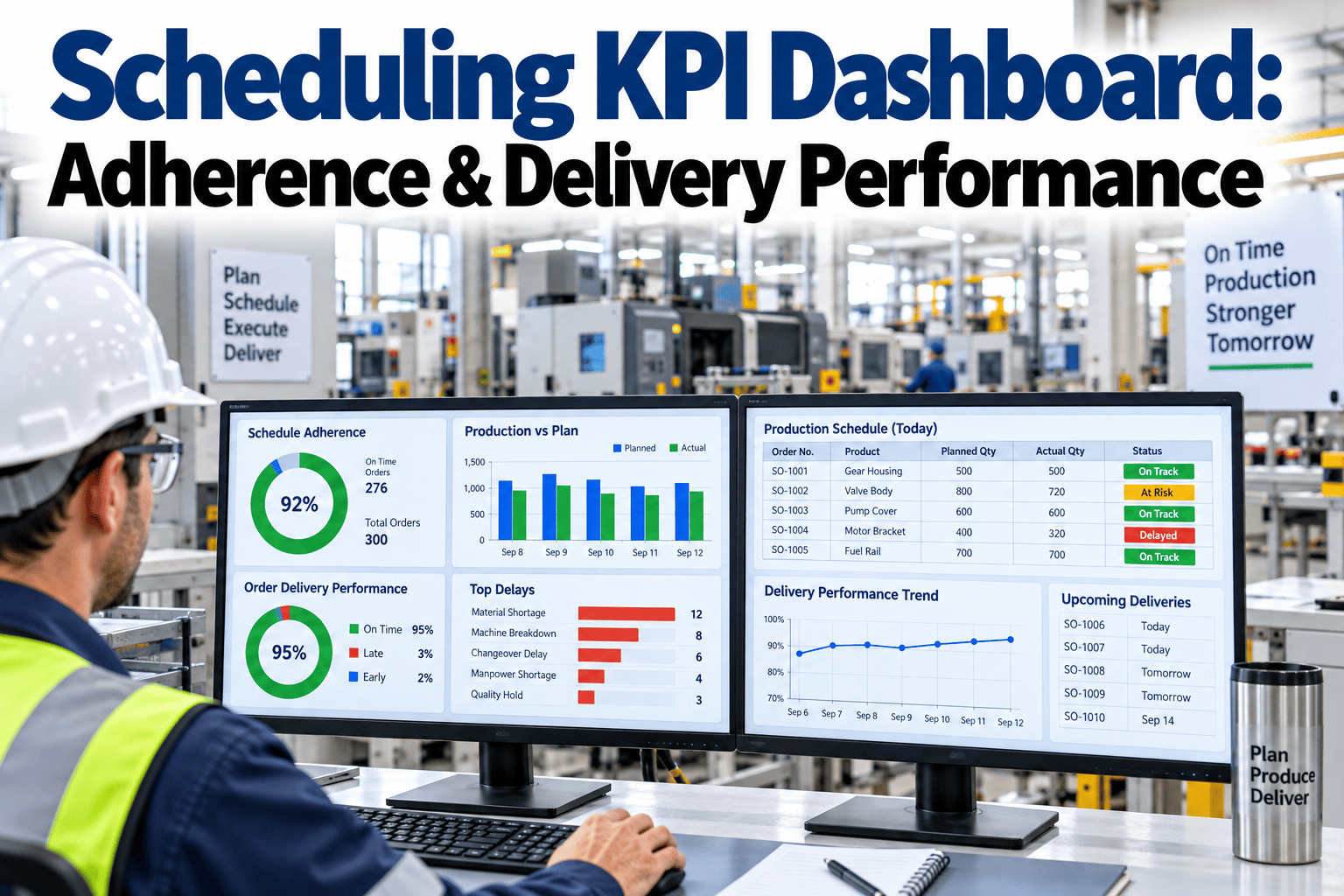
A production schedule can look perfectly reasonable on the whiteboard and still fall apart within the first two hours of a shift once a machine change takes longer than planned or a rush order gets slotted in ahead of everything else. Most plants feel the result of that breakdown long before they can point to a specific number causing it, showing up as missed ship dates, expedited freight, and a scheduler who spends more time firefighting than planning. A KPI dashboard built specifically around scheduling performance turns that vague sense that things are off track into measurable trends that show exactly where a schedule is losing time. This guide covers the core metrics worth tracking, how to structure them into a dashboard people actually use, and where scheduling KPI programs commonly stall out. You can book a demo to see how iFactory turns scheduling data into a live adherence and delivery dashboard.
See Exactly Where Your Schedule Loses Time, Not Just That It Did
A scheduling KPI dashboard tracks adherence, delivery performance, and changeover efficiency together, so scheduling conflicts show up as a trend instead of a monthly surprise.
Scheduling Conflicts Hide Behind Metrics That Measure Something Else
Most plants already track output, uptime, and quality closely, and those numbers can all look healthy on a day when the schedule itself was a mess of last-minute reshuffling. A line can hit its production target while still missing several original due dates, simply because the sequence got rearranged mid-shift to work around a changeover problem or a material shortage.
That gap between "we made the numbers" and "we made the schedule" is exactly what a dedicated scheduling KPI dashboard is meant to close. Without it, the true cost of scheduling conflicts, expedite fees, overtime, missed ship dates, stays scattered across other departments' reports instead of showing up in one place where a scheduler can actually act on it.
Five Core KPIs Worth Putting on the Dashboard
Not every scheduling number deserves a permanent spot on the dashboard, and adding too many at once tends to dilute attention rather than sharpen it. These five give a scheduling team a reasonably complete picture without becoming overwhelming.
| KPI | What It Measures | Typical Target Range | Common Data Source |
|---|---|---|---|
| Schedule Adherence | Share of jobs that start and finish within their planned window | 85 to 95 percent on a stable line | MES or production tracking system timestamps |
| On-Time Delivery | Share of customer orders shipped by the promised date | 95 percent or higher for most manufacturers | Order management or ERP shipping records |
| Changeover Efficiency | Actual changeover duration against the planned standard | Within 10 to 15 percent of standard time | Line timers or manual changeover logs |
| Schedule Stability | How often a published schedule changes after release | Fewer than 10 percent of jobs resequenced | Scheduling system change history |
| Takt Time Adherence | How closely actual cycle time tracks the planned takt time | Within a few percent of target takt | Line cycle counters or MES cycle data |
Four Categories Keep a Dashboard From Turning Into a Wall of Numbers
How closely actual production follows the plan, including on-time starts, on-time finishes, and how often the sequence gets reshuffled after release.
Whether the schedule ultimately served its real purpose, measured through on-time shipment rate and how far late orders typically slip past their promise date.
How much planned production time is lost to changeovers, and whether actual changeover duration is tracking toward or away from the standard.
Whether scheduled capacity is actually being used as planned, distinguishing planned downtime from the unplanned gaps that scheduling conflicts create.
Most Scheduling Dashboards Grow Through Four Stages
Few plants build a fully predictive scheduling dashboard on the first attempt, and trying to jump straight there usually stalls the project. Understanding which stage your team is actually in helps set realistic next steps.
Schedule performance is discussed only after a customer complains about a late shipment, with no regular reporting in place.
Adherence and delivery numbers are pulled manually into a weekly or monthly report, but the data is backward-looking and often stale by the time it's reviewed.
A dashboard updates automatically from production and order data, giving schedulers a current view they can act on during the shift rather than after it.
Trend data is used to flag jobs at risk of slipping before they actually miss, giving the scheduler time to adjust the plan rather than just record what happened.
Common Mistakes That Undercut a Scheduling KPI Program
A dashboard built only around units produced can look fine even while the original schedule sequence collapses entirely, hiding the actual conflicts happening underneath it.
A monthly adherence report tells a scheduler what already went wrong, but does nothing to help them catch a slipping job while there's still time to recover it.
Focusing only on final delivery outcomes while ignoring how often the schedule gets reshuffled mid-stream misses one of the earliest warning signs of a scheduling process under strain.
A KPI dashboard without a clear owner responsible for reviewing it regularly tends to quietly go stale, even when the underlying data connections still work fine.
Finding the Real Source of Late Shipments
A contract manufacturer had been missing roughly one in ten promised ship dates for several months, with the scheduling team assuming the cause was simply too much order volume for available capacity. Output reports looked reasonably healthy, which made the delivery misses harder to explain.
Once a schedule adherence and changeover efficiency metric were added alongside the existing delivery tracking, the pattern became clear: a specific product family was consistently running changeovers well past standard time, pushing every job behind it later in the sequence. Retraining the changeover crew and adjusting the standard time brought both changeover efficiency and on-time delivery back in line within two months.
Building the Dashboard Without Overbuilding It
Start with schedule adherence and on-time delivery, since together they show both whether the plan was followed and whether it actually served the customer.
Add changeover efficiency once the first two metrics are stable, since changeovers are one of the most common root causes behind adherence misses.
Assign clear ownership for reviewing the dashboard on a set cadence, so trends get acted on instead of just observed.
Connect the dashboard to live production and order data as soon as practical, moving the team from a monthly report toward a current, actionable view.