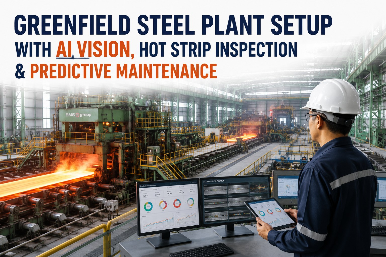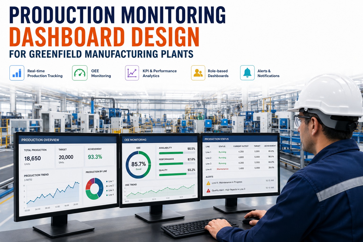
A production dashboard is only useful if someone makes a faster, better decision because of it. Most don't — they cram fifty metrics onto one screen, refresh once an hour, and serve everyone and no one. A greenfield plant can do far better, because you get to design the monitoring layer before anyone forms a bad habit: agree on how every KPI is calculated, instrument the data at the source, and build separate views for the operator at the line, the engineer chasing root cause, and the manager watching the whole plant. This guide covers how to design production dashboards that actually get used.
Designing the monitoring layer for a new plant? Book a 30-minute dashboard strategy consultation to define your KPIs, roles, and views before go-live.
What a Good Dashboard Looks Like
Start With the Metrics That Matter
Before a single chart is drawn, decide what the dashboard is for. The anchor metric in nearly every production environment is Overall Equipment Effectiveness, because it folds the three ways a line loses value into one number. World-class OEE is around 85%, and your effective capacity is your OEE — a line running at 68% has 68% of its theoretical output to sell, not 85%. And everyone has to calculate it the same way, or the numbers start an argument instead of a fix. If you want your KPI definitions and views set up cleanly, you can walk through them with a specialist.
Around OEE, a production dashboard needs the operational vitals that explain it and drive action. Keep the set tight:
Design for the Audience: Role-Based Dashboards
A single dashboard cannot serve every role. The operator at the line, the engineer chasing a loss, and the plant manager watching the whole floor make different decisions on different clocks — so they need different views. Plants that build role-based views with sub-minute refresh report markedly higher OEE improvement and far higher daily engagement than those handing one screen to everyone.
Operator
SecondsAt the line, deciding what to do right now.
- Live OEE and run status
- Output vs shift target
- Current downtime event
- Color-coded machine state
Engineer
Live + trendChasing the root cause of a loss.
- Downtime Pareto by reason
- OEE-loss breakdown
- Drill-down to machine & shift
- Correlation with maintenance data
Plant Manager
Trend + alertsWatching the whole plant and the week.
- OEE trend across all lines
- Schedule attainment
- Exception alerts only
- Shift & line comparisons
Want role-based views mapped to your team? Book a dashboard design workshop and we will lay out operator, engineer, and manager screens for your plant.
Dashboard Design Principles for the Plant Floor
The difference between a dashboard that gets used and one that gets ignored comes down to a handful of rules. Each one is about supporting a decision, not displaying data.
The Greenfield Dashboard Setup Roadmap
On a new plant, build the monitoring layer in parallel with the line, so dashboards are live and trusted on day one.
-
1
Define governed KPIs and a data model
Agree exactly how OEE and every metric are calculated, plant-wide, so no two roles see different numbers for the same line.
-
2
Instrument data at the source
Capture machine status, counts, and downtime reasons automatically from commissioning — not through manual entry or weekly exports.
-
3
Design role-based layouts
Build distinct operator, engineer, and manager views, each carrying only the elements that role needs to act.
-
4
Set thresholds, color rules, and alerts
Define good, watch, and act bands for each metric and route exceptions to the right person automatically.
-
5
Deploy to floor displays and mobile, then iterate
Put screens on the line and in pockets, watch how they are used, and refine layouts against real decisions.
Ready to sequence this against your build? Book an implementation session and leave with a phased dashboard plan for your project team.
Dashboards Your Team Will Actually Use
iFactory captures production data at the source and delivers governed, role-based dashboards — real-time OEE, output, downtime, and quality for operators, engineers, and managers — with drill-down from the headline number to the machine behind it.
Expert Perspective
The dashboards that fail almost always fail for the same reason: they were built to show data, not to support a decision. Someone pulls every available metric onto one screen, hands it to the whole plant, and refreshes it once a shift. Six weeks later nobody looks at it. The ones that stick do the opposite — they ask what decision each person makes, strip the screen down to the few numbers that drive it, and update fast enough to matter. On a greenfield site you can build that discipline in from the start, before a single bad dashboard sets the expectation that dashboards are wallpaper.
— Manufacturing Analytics Practice, iFactory Engineering Team
world-class OEE benchmark
max elements per screen — three to five for operators
higher OEE improvement with role-based, sub-minute dashboards
The Bottom Line
A production dashboard earns its place when it changes what someone does next. Anchor it on OEE with governed definitions everyone trusts, keep each screen to the few elements that drive a decision, and build distinct views for the operator, the engineer, and the manager. A greenfield plant is the ideal moment to get this right — instrument the data at the source, design the role-based layouts before go-live, and refresh fast enough that problems are caught while they are still cheap to fix. Do that, and the dashboard becomes the first thing your team checks, not the last thing they ignore.
Design Your Monitoring Layer From Day One
From governed KPI definitions to role-based, real-time dashboards with drill-down, iFactory helps greenfield teams stand up production monitoring that goes live with the plant — and turns floor data into faster decisions.
Frequently Asked Questions
What KPIs should a production monitoring dashboard show?
Anchor on Overall Equipment Effectiveness and its three components — availability, performance, and quality — then add the operational vitals that explain it: output versus target, throughput, downtime with reasons, scrap rate, cycle time, and schedule attainment. The goal is a tight set that drives action, not an exhaustive list. Keeping each screen focused matters more than showing everything.
What is a good OEE to target?
World-class OEE is around 85 percent, reached through high availability, near-rated speed, and very low defect rates. Most plants run well below that. A useful way to think about it is that effective capacity equals OEE — a line at 68 percent OEE can realistically deliver only 68 percent of its theoretical output, which is why honest measurement protects delivery commitments.
Why use role-based dashboards instead of one view?
Because an operator deciding what to do this minute and a manager reviewing the week need different data at different speeds. One screen built for everyone forces each person to filter and reinterpret it, which slows decisions and kills adoption. Role-specific views with fast refresh consistently achieve much higher engagement and bigger performance gains.
How many metrics should one dashboard screen show?
No more than seven discrete data elements on any single screen, which is the practical limit of working memory for time-pressured decisions, and ideally three to five for operator views. Screens that exceed this produce longer decision times and lower accuracy. If you need more detail, put it behind a drill-down rather than on the main view.
How does iFactory help design production dashboards for a greenfield plant?
iFactory helps define governed KPI definitions, captures production data at the source, and builds role-based dashboards for operators, engineers, and managers with drill-down from the headline number to the machine behind it. Designed in during construction, the dashboards go live with the plant. You can book a dashboard strategy consultation to plan it for your facility.