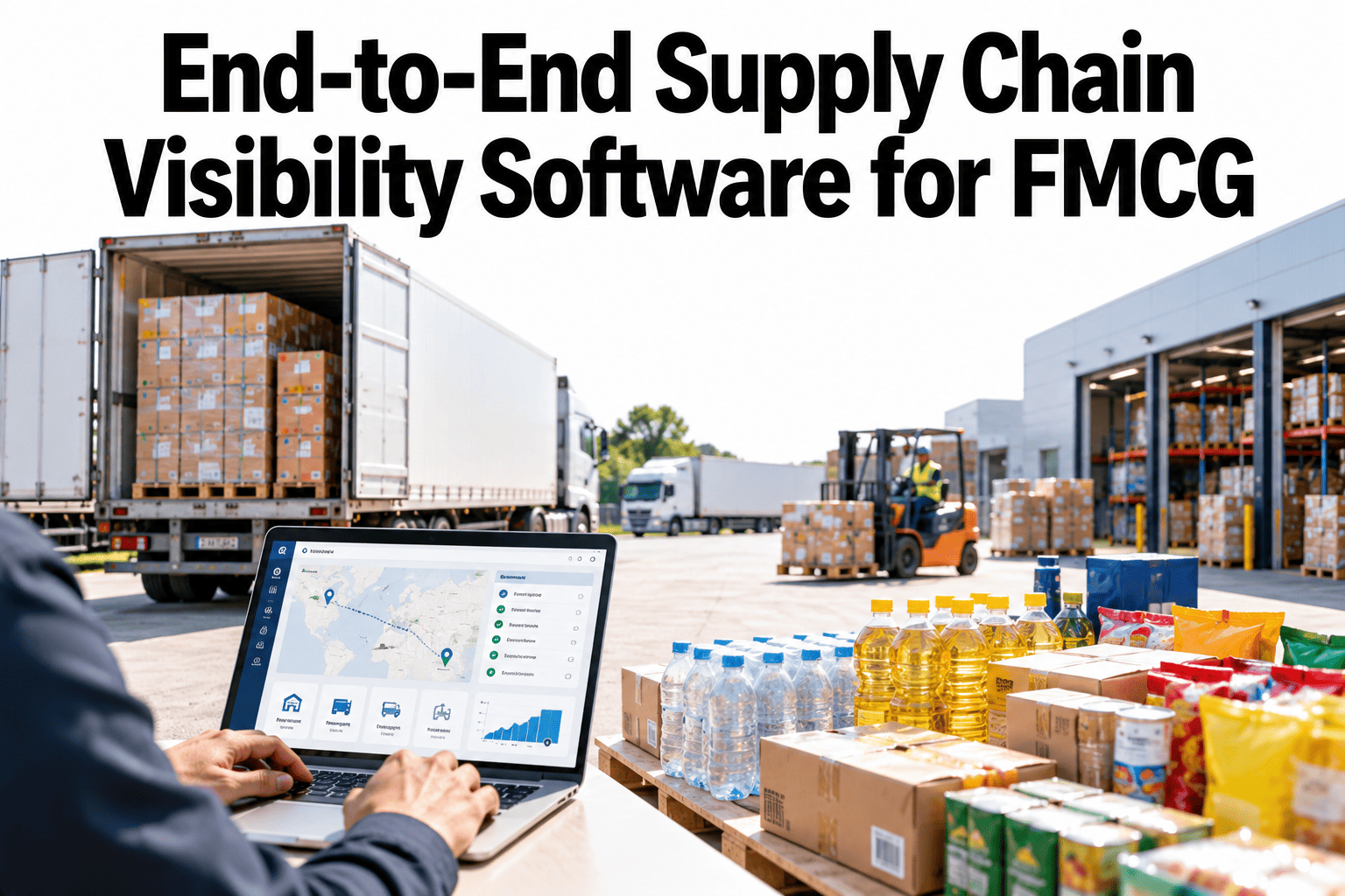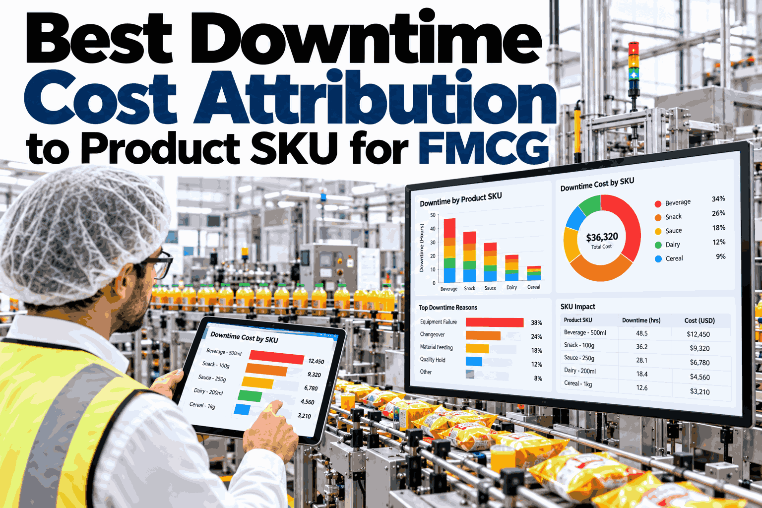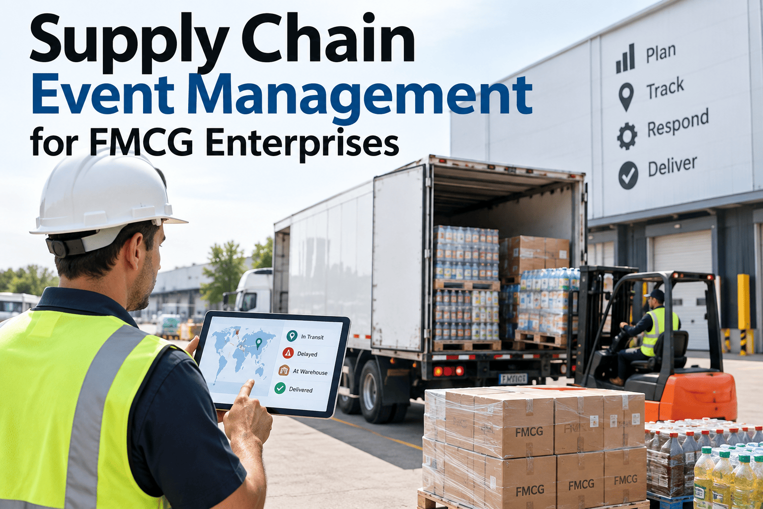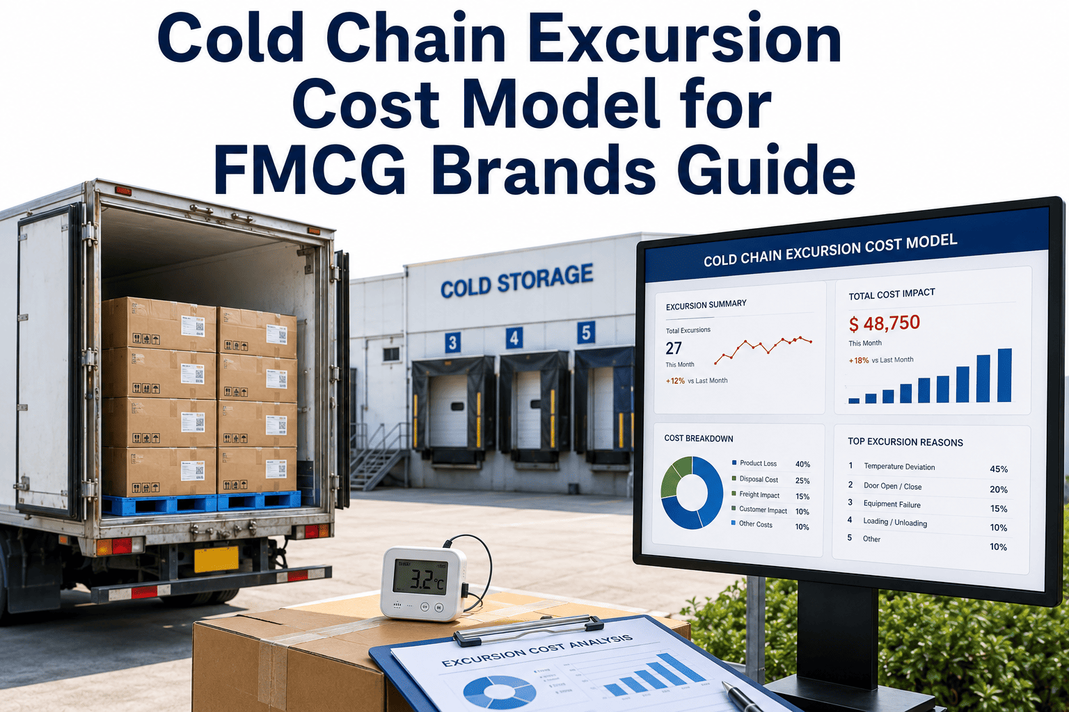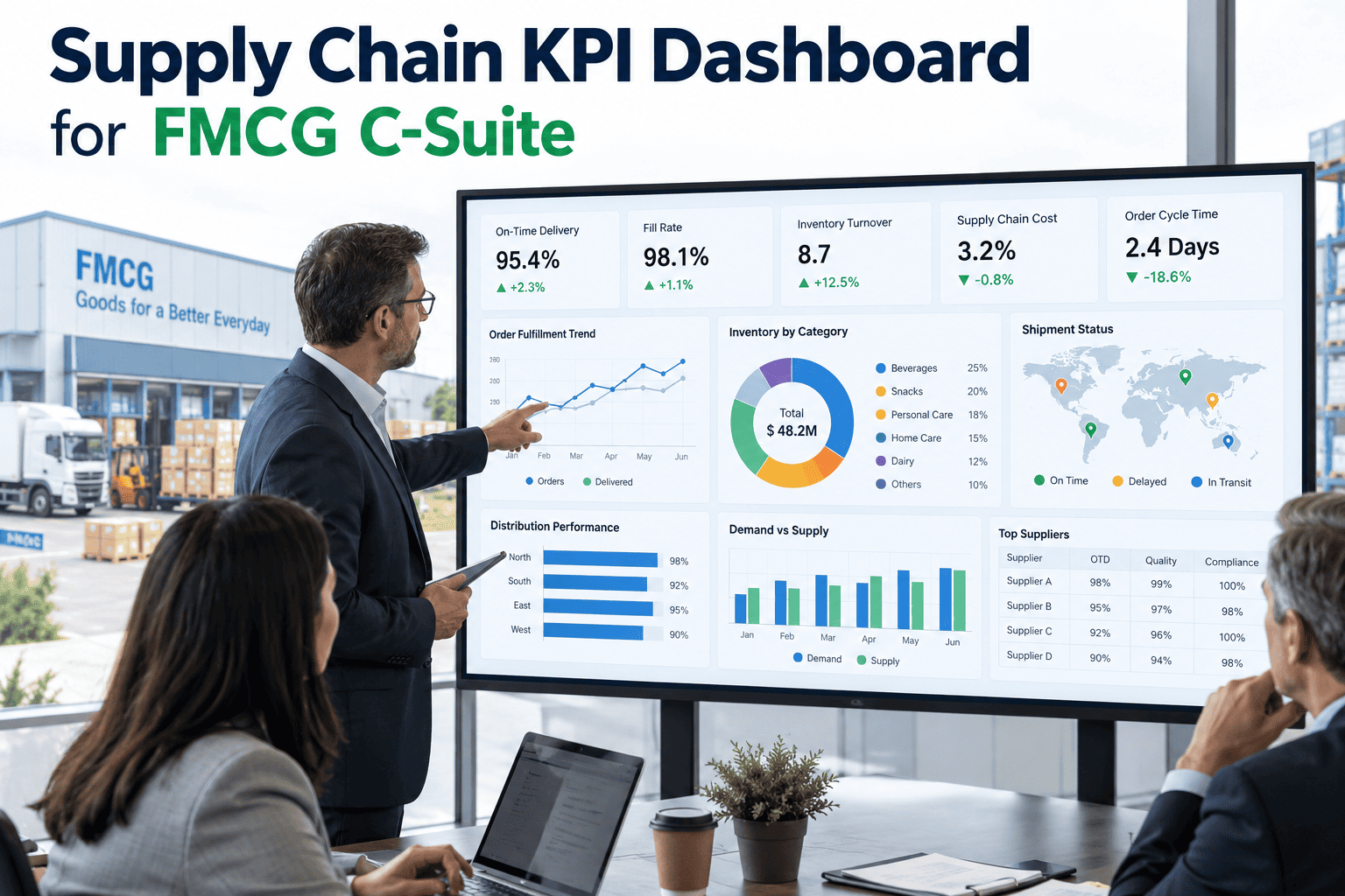
A supply chain generates hundreds of numbers a day, but a C-suite audience needs exactly four or five of them summarized in a way that answers one question immediately: is the supply chain healthy, and where does it need attention this week. Perfect order rate, cost-to-serve, cash-to-cash cycle time, and forecast accuracy are the metrics that consistently earn a place on that short list, not because they are the only numbers that matter, but because each one rolls up dozens of operational details into a figure a leader can act on without needing to understand the underlying system architecture. Building a dashboard that actually gets opened every week, rather than generated once and forgotten, depends on getting the drill-down structure right, and teams designing this can start with a conversation with iFactory's support team about connecting end-to-end supply chain data into a single control tower view.
Four Numbers, One Page, No Guessing About Where the Supply Chain Actually Stands
Perfect order, cost-to-serve, cash-to-cash, and forecast accuracy roll up hundreds of operational details into the handful of figures a C-suite audience can act on immediately.
Why Most Executive Dashboards Fail to Get Used
The most common failure mode is not choosing the wrong metrics — it is choosing too many of them, or presenting the right ones without a path to the operational detail behind a concerning number. A dashboard that shows perfect order rate declining but gives no way to see which region, customer, or product line is driving the decline forces the executive to schedule a meeting just to understand what the number means, and a dashboard that requires a meeting to interpret gets opened less and less often until it stops being checked at all.
The Four Metrics, and What Each One Actually Rolls Up
Each of the four core metrics compresses a different part of the supply chain into a single number, and understanding what sits underneath each one is what makes the drill-down structure meaningful rather than arbitrary.
Perfect Order Rate
Combines on-time delivery, order completeness, damage-free condition, and accurate documentation into one figure, and a decline can be traced back to any one of these four components independently.
Cost-to-Serve
Aggregates transportation, warehousing, and order processing cost per order, varying significantly by customer channel and order profile in ways a single average figure can obscure.
Cash-to-Cash Cycle Time
Reflects how many days working capital is tied up between paying suppliers and collecting from customers, driven by inventory days, receivables, and payables together.
Forecast Accuracy
Measures how closely the demand plan matched actual sell-through, and poor accuracy at the top level often hides very different accuracy performance across product categories.
See Your Supply Chain on One Page, With Real Drill-Down
Book a 30-minute walkthrough of how iFactory's control tower rolls up end-to-end supply chain data into a dashboard executives actually use.
Dashboard Design Approaches Compared
How a dashboard is structured determines whether it survives past its first month of use, and the differences between approaches are more about structure than about which metrics are chosen.
| Approach | Typical Structure | Common Failure Point |
|---|---|---|
| Comprehensive Report | Dozens of metrics across multiple pages | Too much detail, no clear priority signal |
| Static Scorecard | A handful of metrics, updated periodically | No drill-down, requires a meeting to interpret |
| Live Control Tower View | Core metrics on one page with drill-down live underneath | Requires connected, real-time underlying data |
Building the Drill-Down Hierarchy Correctly
The value of a drill-down structure depends entirely on whether the layers underneath each top-level metric actually match how the organization investigates a problem in practice, not an arbitrary data hierarchy that happens to be easy to build.
Region or Business Unit
The first drill-down layer typically splits a top-level figure by region or business unit, immediately narrowing where a concerning trend is actually concentrated.
Distribution Center or Product Category
A second layer, tied to the physical or product structure of the business, is what let the packaging issue in the scenario above get isolated to a specific combination rather than a whole region.
Root-Cause Detail
The deepest layer surfaces the specific operational record, such as a damage code or a late shipment reason, that finally answers what actually happened.
A Composite Scenario: The Perfect Order Decline That Took Three Weeks to Explain
An FMCG company's leadership team noticed perfect order rate had declined over two consecutive reporting periods on their monthly scorecard, and the initial response was to schedule a cross-functional review meeting to understand the cause, since the scorecard itself offered no path to the underlying detail. The review meeting required pulling data manually from three separate systems covering transportation, warehouse operations, and order management before a root cause could even be discussed.
The eventual finding, a packaging change that had increased damage rates specifically for one product line shipped through one regional distribution center, took nearly three weeks to surface from the point the decline was first noticed on the scorecard, almost entirely due to the manual data-gathering step rather than the actual investigation once the right data was in hand. The company rebuilt its dashboard with live drill-down from the top-level perfect order figure down to product line and distribution center detail, cutting the time to identify a similar root cause to under a day on the next occurrence.
Mistakes That Undermine Executive Dashboard Adoption
Showing Every Available Metric Instead of the Vital Few
A dashboard crowded with dozens of metrics forces the viewer to do the prioritization work themselves, defeating the purpose of a summary view built for quick executive consumption.
Providing Summary Figures With No Path to Detail
A static top-level number with no drill-down forces a manual investigation the moment something looks wrong, exactly the gap that cost three weeks in the scenario above.
Updating the Dashboard on a Slower Cadence Than Decisions Are Made
A monthly refresh cycle on a dashboard meant to support weekly operational decisions leaves leadership acting on data that is already outdated by the time it is reviewed.
Defining Metrics Differently Across Regions or Business Units
Inconsistent metric definitions between parts of the organization make a consolidated dashboard misleading, since the same-looking figure may not mean the same thing in every row.
Is Your Dashboard Actually Built for Executive Use
The top-level view fits on one page without scrolling through dozens of metrics
A tightly curated set of top-level metrics is what makes a dashboard scannable in the time an executive actually has to review it.
Every top-level metric has a live drill-down path underneath it
Drill-down is what turns a concerning number into an actionable one without requiring a separate manual investigation, as the scenario above demonstrates.
Metric definitions are standardized and documented across the organization
A shared definition for each metric, applied consistently across regions and business units, is what makes a consolidated view trustworthy rather than misleading.
Frequently Asked Questions
Why do perfect order rate, cost-to-serve, cash-to-cash, and forecast accuracy dominate C-suite dashboards?
Each of these four metrics summarizes a different dimension of supply chain health — service quality, operating cost, capital efficiency, and planning accuracy — and together they give a reasonably complete picture without requiring an executive to review dozens of operational metrics individually. Most other supply chain metrics ultimately feed into one of these four at some level, which is part of why they serve well as top-level indicators with drill-down beneath them.
How much drill-down detail should sit beneath a top-level executive metric?
The right depth is whatever it takes to get from a top-level number to an actionable root cause without leaving the dashboard, which in most FMCG organizations means at least two additional levels, such as region and then distribution center for perfect order rate, or product category and then specific SKU for forecast accuracy. The scenario above shows what happens when that drill-down does not exist: a straightforward root cause takes weeks instead of hours to surface.
How often should an executive supply chain dashboard refresh?
The right refresh cadence depends on how quickly the underlying metrics can meaningfully change and how quickly leadership needs to act on them, but for most FMCG supply chains a weekly refresh at minimum, with some metrics like fill rate or perfect order updating closer to daily, keeps the dashboard aligned with the pace at which operational decisions are actually being made. A monthly-only refresh, as described in the scenario above, is often too slow to catch an emerging issue before it compounds.
Can a single dashboard serve both C-suite and operational audiences?
A well-designed dashboard can serve both audiences through its layered structure — the top-level view serves the C-suite audience directly, while the same underlying drill-down data, viewed at a deeper level, serves operational teams investigating a specific issue, which is exactly the structure that turned a three-week investigation into a same-day one in the scenario above. Building one connected data structure rather than two separate parallel reporting systems is what makes this dual-audience approach sustainable. Book a demo to see how iFactory structures this kind of layered dashboard.
What data foundation does a live control tower dashboard actually require?
A live control tower view requires the underlying transportation, warehouse, order management, and planning systems to be connected into a common data layer, rather than each system holding its own siloed data that has to be manually reconciled, which is exactly the gap that made the original investigation in the scenario above take three weeks. Plants and organizations without this connectivity in place today typically need to prioritize that integration work before a live dashboard becomes achievable. Teams assessing their current data connectivity can reach iFactory support for guidance.
Give Leadership One Page That Actually Answers the Question
iFactory's control tower rolls up perfect order, cost-to-serve, cash-to-cash, and forecast accuracy into one live view with real drill-down underneath. Book a walkthrough to see it running on connected supply chain data.