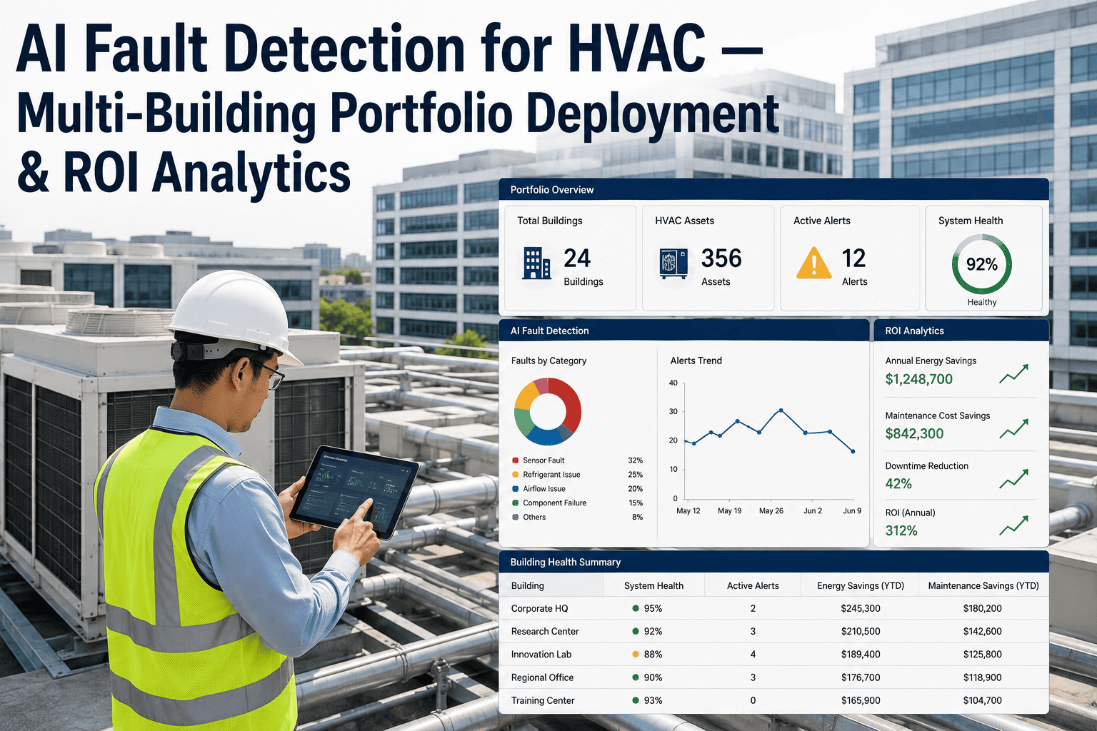
Two buildings the same size, in the same city, can carry utility bills that differ by 40% or more, and the raw kilowatt-hour number tells you nothing about why. One might be an office running efficiently, the other a hospital with a genuinely heavier HVAC load — or they might be identical office towers where one has a chiller quietly running 30% over its healthy kW/ton range. Comparing raw consumption across a portfolio conflates all of these causes into a single misleading number, which is exactly why so many facilities teams end up chasing the wrong buildings when they try to find savings. iFactory's HVAC energy analytics platform benchmarks every site on EUI, kW/ton, and EER, normalized for climate, occupancy, and building type, so a genuine outlier stands out instead of hiding behind a building that was simply always going to use more energy — see your own portfolio ranked on a fair comparison.
Raw Energy Bills Don't Tell You Which Building Is Actually Underperforming
EUI, kW/ton, and EER each measure something different, and none of them mean anything across a portfolio until they're normalized for climate zone, occupancy, and building type. iFactory ranks your sites on a fair comparison, so the real outliers stand out.
Why Ranking Buildings by Raw Consumption Gets It Wrong
The instinct when reviewing a portfolio's energy bills is to sort by total spend and start with the highest number. That instinct is almost always misleading, because raw consumption bundles together everything that drives energy use — building type, climate, occupancy, size — with the one thing you're actually trying to isolate: whether the HVAC system itself is performing well.
None of this is a criticism of the teams doing the reviewing. Sorting by total spend is the natural first instinct because it's the number that shows up first on every utility invoice, and building a properly normalized comparison by hand across dozens of sites is genuinely difficult without dedicated tooling built for exactly that purpose.
The hospital in this comparison isn't underperforming, it's operating exactly as a 24-hour, high-ventilation facility should. The office, meanwhile, sits at the very top of its peer range with nothing to flag it — until the comparison is normalized against buildings of its own type, at which point the picture reverses entirely.
This is the exact scenario that sends facilities teams chasing the wrong building for months. A portfolio review that ranks by raw spend will always put the hospital at the top of the list and the underperforming office somewhere in the safe middle, and every hour spent investigating the hospital's "excessive" consumption is an hour not spent on the office that's actually leaking money to a failing chiller.
EUI, kW/Ton, and EER Measure Different Things
No single number tells the whole story. Each of these three metrics answers a different question about HVAC performance, and a complete portfolio benchmark needs all three working together rather than picking one and ignoring the rest.
That EER caveat matters more than it might first appear. Two RTUs with identical nameplate EER ratings can behave very differently in the field depending on economizer function, fan control, and how much of their runtime is spent at part load rather than the full-load condition the rating was measured under — which is exactly why EER is best used to compare units against their own historical baseline, not as the sole cross-portfolio yardstick.
The three metrics also operate at different resolutions, which is part of why a complete benchmark needs all of them. EUI gives you the whole-building signal that tells you where to look first. kW/ton and EER then zoom into the specific system once EUI has flagged a site worth investigating, turning a portfolio-level anomaly into an actionable, equipment-specific finding rather than leaving the team to guess which system inside an underperforming building is actually responsible.
See where your portfolio actually ranks
iFactory can benchmark your sites on EUI, kW/ton, and EER against the right peer group, before you commit to anything.
Benchmark Against Buildings Like Yours, Not a National Average
Even a correctly calculated EUI is meaningless without the right comparison group. National medians vary enormously by building type, and comparing a hospital against an office average produces a number that looks alarming for reasons that have nothing to do with actual performance.
| Building Type | Typical EUI Range | Why It Differs |
|---|---|---|
| Warehouse / Storage | 10–30 kBtu/sq ft | Minimal conditioning, low occupancy density |
| K-12 Schools | 48–68 kBtu/sq ft | Seasonal occupancy pattern, moderate ventilation needs |
| Office Buildings | 52–65 kBtu/sq ft | Standard occupied-hours conditioning, moderate density |
| Retail / Mall | 75–90 kBtu/sq ft | Extended hours, high lighting and refrigeration load |
| Healthcare / Hospital | 100–250 kBtu/sq ft | 24/7 operation, high ventilation and humidity control |
A portfolio that mixes building types has to segment the comparison accordingly — an office should be benchmarked against other offices, a warehouse against other warehouses. Flattening everything into one ranked list is what causes a legitimately well-run hospital to look like the portfolio's worst offender.
It's worth noting these ranges are national medians, not hard boundaries — a well-run building can sit comfortably outside them for defensible reasons, just as a struggling one can sit inside them and still be a genuine underperformer relative to its specific local climate and occupancy pattern. The ranges are a starting orientation, not a verdict on their own.
Climate and Occupancy Have to Be Corrected For Too
Building type is only the first variable. Two identical office buildings can still show meaningfully different EUI simply because one sits in a hot, humid climate zone and the other doesn't — and occupancy pattern shifts the comparison again.
None of these adjustments are exotic statistics — they're the difference between a benchmark that actually identifies underperformance and one that just re-sorts the portfolio by which buildings happen to run the hardest for entirely legitimate reasons.
The value of getting all four adjustments right compounds as a portfolio grows. A five-building portfolio where someone knows every site's quirks by heart can sometimes get away with informal, intuition-based comparisons. A fifty-building portfolio spanning multiple climate zones and building types simply can't be held in one person's head accurately enough to catch the real outliers without a normalized, systematic approach doing the work.
How iFactory Builds a Fair Portfolio Ranking
Rather than comparing raw numbers, the platform builds a normalized view of every site so the ranking reflects actual HVAC performance rather than the accident of building type or climate zone.
Because the normalization happens automatically and continuously, the ranking stays current as buildings are added to the portfolio or as a site's occupancy pattern shifts, rather than requiring a manual re-analysis every time something in the portfolio changes.
That continuity matters because a portfolio is never static. A building's occupancy pattern can shift meaningfully after a tenant change, a renovation can alter its envelope performance, and a new acquisition brings an entirely unfamiliar building type into the mix — a benchmark that has to be manually rebuilt every time one of these events happens will always be at least slightly out of date, and out-of-date normalization produces exactly the misleading rankings this whole approach exists to avoid.
Delivered as a Live Ranking, Not a One-Time Report
iFactory doesn't hand back a static benchmarking spreadsheet that goes stale the day it's delivered. The normalized ranking stays live and updates as new data comes in across the portfolio.
Scope covers the cabling, network configuration, utility and BMS integration, and operator training, so what your team gets is a live ranking they can return to every month, not a one-time snapshot that's outdated by the next billing cycle. Trusted by 1000+ clients with 99.9% uptime, the deployment is built to fit around a live, multi-site portfolio.
A live ranking also changes how a monthly portfolio review actually works. Instead of starting from a stack of utility bills and reconstructing the comparison from scratch each cycle, the review starts from a dashboard that already reflects the current normalized standing of every site, freeing the time that used to go into assembling the comparison for actually acting on what it shows.
What Portfolio Teams Ask Before Benchmarking Across Sites
Find Your Real Outliers, Not Just Your Biggest Buildings
iFactory benchmarks every site on EUI, kW/ton, and EER, normalized for climate, occupancy, and building type — so the portfolio ranking points to genuine underperformance instead of buildings that were always going to run hot.