Infrastructure Condition Index — AI Multi-Asset Scoring & Portfolio Health Dashboard
By Grace on June 27, 2026
A bridge inspector writes "NBI rating 4." A pavement engineer records "PCI 62." A facilities manager notes "FCI 18%." A water system analyst flags "critical risk on the WIF scale." All four are describing the same concept — the physical condition of public infrastructure — yet none of these scores can be compared, aggregated, or rolled up into a single portfolio view. For an asset manager overseeing multiple infrastructure classes across a city, county, or agency, this scoring fragmentation is not a technical inconvenience — it is a decision-making failure that directly produces misallocated capital, deferred maintenance backlogs, and budget requests that cannot survive city council scrutiny. The Infrastructure Condition Index (ICI) solves this by translating every asset class's native condition language into a unified 0-100 health score — so a bridge in Pennsylvania, a road in Texas, a water pump in Michigan, and a municipal building in Oregon all report condition on the same scale, in the same portfolio dashboard, with the same defensible methodology.
Unified Condition Index · Multi-Asset Scoring · Portfolio Health Dashboard · Cross-Class Comparison · Capital Prioritisation
Bridges, Roads, Water, Facilities — Four Asset Classes, Four Different Condition Scores. The Infrastructure Condition Index Translates All of Them into One View.
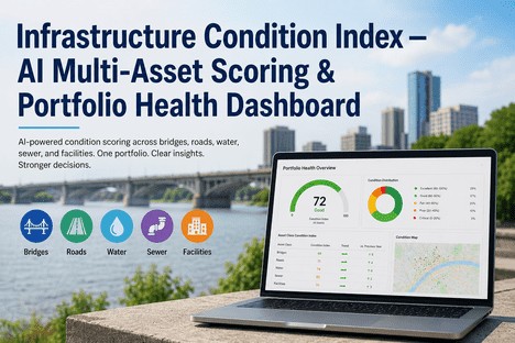
iFactory's AI-powered Infrastructure Condition Index normalises condition data from every asset class into a unified 0-100 health score — giving asset managers the first true portfolio-level view of infrastructure health across their entire network.
America's 2025 infrastructure GPA — the highest since 1998, but still below investment-grade condition
Funding Gap
$3.6T
Ten-year infrastructure investment gap across 18 categories — the cost of not having a prioritised portfolio view
Roads in Poor Condition
39%
Of 4.1 million miles of US public roadways rated poor or mediocre — the largest single-asset-class condition challenge
Deferred Backlog
$1T+
Deferred maintenance backlog across US government and commercial facilities — invisible without standardised portfolio scoring
Four Asset Classes, Four Condition Languages — and Why the Translation Problem Costs Billions
The most expensive infrastructure decision an asset manager makes is not which single bridge or road to repair — it is how to compare deferred maintenance needs across fundamentally different asset classes when each class reports condition in a different unit. Bridges use the National Bridge Inventory 0-9 rating. Pavements use the PCI 0-100 index. Facilities use the FCI percentage. Water and sewer systems use asset-specific risk matrices. These scores were never designed to be compared, and the consequence is that capital plans are shaped by the loudest department head rather than the highest-risk asset.
The Condition Scoring Fragmentation Problem — Each Asset Class Uses a Different Scale
Bridges — NBI Rating
National Bridge Inventory 0-9 scale — but 5 means "fair" and also "functionally obsolete" depending on context.
The NBI rating is the most established infrastructure condition metric in the US, covering 623,000+ bridges. Each bridge receives a 0-9 rating for deck, superstructure, substructure, and culvert condition. A rating of 4 is "poor." But an NBI 4 cannot be compared to a PCI 60 or an FCI 15% — there is no translation table between the scales. The FHWA reports 6.8% of bridges as structurally deficient, yet this binary classification masks the graduation of risk across the portfolio. A bridge at NBI 3 and a bridge at NBI 5 may both be classified "not deficient," but their remaining useful life differs by a decade. Without a unified index, this granularity is lost in portfolio-level reporting.
NBI 0-9 scale6.8% rated poor
Roads — Pavement Condition Index
PCI 0-100 scale per ASTM D6433 — but the same PCI score means different things in different climate zones.
The Pavement Condition Index is the industry standard for road condition assessment, rating pavement surfaces from 0 (failed) to 100 (excellent) based on distress type, severity, and density. PCI scores drive maintenance and rehabilitation decisions across 4.1 million miles of US roadways. However, PCI surveys are conducted on multi-year cycles, and the interval between inspections means a road segment that scores 72 one year may be at 55 by the time the data reaches the capital plan. The ASCE 2025 report gave US roads a D+ — the second-lowest grade across all 18 categories — with 39% of major roads in poor or mediocre condition. Without a unified index that updates between inspection cycles, road condition data in portfolio dashboards is always one to three years out of date.
PCI 0-100 (ASTM D6433)ASCE grade: D+
Facilities — Facility Condition Index
FCI percentage — deferred maintenance cost divided by replacement value — but the benchmark thresholds vary by organisation.
FCI is calculated as total deferred maintenance cost divided by current replacement value, expressed as a percentage. The APPA and NACUBO benchmarks define under 5% as "good," 5-10% as "fair," and above 10% as "poor." But FCI is typically calculated from facility condition assessments conducted every 3 to 5 years, meaning a facility can cross the "poor" threshold and stay there on paper for years before reassessment reveals it. The US government and commercial facility deferred maintenance backlog exceeds $1 trillion, and static FCI calculations are a primary reason this backlog grows faster than capital plans can address it — because the condition data driving the plan is too coarse and too stale to defend emergency funding requests.
FCI = Deferred / CRV$1T+ backlog
Water-Sewer — Risk Matrices
Water Infrastructure Condition Index (WIF) and asset-specific risk matrices — the least standardised of all asset classes.
Water and wastewater infrastructure condition assessment is the least standardised among major asset classes. Some utilities use the Water Infrastructure Condition Index (WIF), others use custom risk matrices combining pipe age, break history, soil corrosivity, and criticality. The EPA estimates that drinking water and wastewater infrastructure require $744 billion and $271 billion respectively over 20 years — yet most utilities cannot produce a portfolio-level condition score that integrates with the broader municipal infrastructure dashboard. Water assets are typically managed in dedicated systems with no condition mapping to roads, bridges, or facilities in the same jurisdiction — a data isolation that produces capital plans where a failing water main and a collapsing road segment compete for the same budget dollars with no common condition language to compare them.
Four Different Condition Scores for the Same Infrastructure Portfolio Is Not Data-Rich Decision-Making. It Is Four Separate Guessing Games.
iFactory's Infrastructure Condition Index normalises NBI, PCI, FCI, and risk-matrix scores into a single 0-100 health score per asset — updated continuously from inspection data, sensor feeds, and work order history — so asset managers compare condition across classes with confidence.
How the Infrastructure Condition Index Creates a Single Health Score Across Every Asset Type
The Infrastructure Condition Index (ICI) is not a replacement for industry-standard condition scoring methodologies like PCI, FCI, or the NBI rating. It is a normalisation layer that maps each method's output onto a consistent 0-100 health scale — preserving the native scoring detail while making cross-asset comparison possible. The intelligence is in the mapping logic, the update frequency, and the weighting: iFactory's AI continuously ingests inspection results, sensor data, work order history, and maintenance cost data to compute a rolling health score that updates as new information arrives, rather than waiting for the next biennial assessment cycle.
Step 01
Ingest Native Condition Scores from Every Asset Class — Without Requiring Data Format Changes
Multi-Source Ingestion
iFactory ingests condition data in the native format of each asset class. For bridges, that is the NBI 0-9 ratings, deck condition codes, and sufficiency ratings from biennial inspections. For roads, it is PCI scores from ASTM-compliant distress surveys, pavement surface ratings, and ride quality indices. For facilities, it is FCI percentages, component-level condition assessments, and system-level ratings from facility condition assessments. For water and sewer, it is WIF scores, pipe condition ratings, break frequency histories, and consequence-of-failure classifications. No asset class is required to change how it currently measures condition. iFactory reads the existing scores and maps them onto the unified ICI scale using validated translation logic.
Native format preservation
Validated translation logic per asset class
No data format changes required
Step 02
Continuous Score Updating — Condition Data That Improves Between Inspection Cycles
Live Condition Tracking
The most important difference between a static condition index and iFactory's ICI is update frequency. Traditional PCI, FCI, and NBI scores are point-in-time snapshots taken on fixed cycles — every two years for bridges, every one to three years for pavements, every three to five years for facilities. Between inspections, condition degrades invisibly. iFactory's ICI updates continuously by integrating multiple data streams: completed work orders that replace or repair components, sensor readings that detect vibration or leakage, reactive maintenance frequency that signals deteriorating reliability, and age-based deterioration curves that model expected condition decay since the last inspection. The result is a health score that changes as the asset's actual condition changes — not as the inspection calendar dictates.
Work order-driven score updates
Sensor and IoT data integration
Age-based deterioration modelling
Step 03
Portfolio Health Dashboard — One View of Every Asset's Condition Across Every Class
Unified Dashboard
The portfolio health dashboard is where the unified condition index becomes actionable. Every asset — whether a bridge, a road segment, a water pump station, a municipal building, or a sewer main — appears on the same dashboard with the same 0-100 ICI score, the same colour-coded condition banding, and the same click-through drill-down to the underlying native condition data. Asset managers filter by asset class, geographic region, condition band, or remaining useful life. The dashboard automatically ranks assets by ICI score, so the worst-condition assets across the entire portfolio appear at the top regardless of asset type. For the first time, a capital planner can see that a bridge at ICI 32, a road at ICI 28, and a facility at ICI 34 are all competing for the same budget — and the dashboard provides the consistent methodology to defend which one gets funded first.
Cross-asset-class ranking
Colour-coded condition bands
Drill-down to native scoring data
Step 04
Stakeholder Condition Communication — Translating Technical Scores into Budget Language
Executive Reporting
One of the most valuable functions of a unified condition index is not technical — it is communicative. Elected officials, city councils, county commissioners, and the public do not understand NBI 4, PCI 62, or FCI 18%. They understand a colour: green for good, yellow for watch, red for critical. iFactory's ICI dashboard generates condition reports in four formats: the technical view with native scores for engineers; the portfolio summary with ICI bands for asset managers; the executive summary with condition distribution pie charts and trend lines for the chief administrative officer; and the public-facing summary with plain-language condition descriptions and project timelines for community engagement. The unified score lets every stakeholder see the same underlying data through a lens appropriate to their role — eliminating the translation errors that happen when technical staff present raw condition scores to non-technical decision-makers.
Four-format condition reporting
Plain-language condition communication
Council-ready budget justification
How Different Stakeholders Use the Same Infrastructure Condition Index Dashboard
The Asset Manager
Sees every asset across every class ranked by ICI score. Filters by condition band, geographic zone, or asset type.
The asset manager uses the dashboard to identify the worst-condition assets across the entire portfolio regardless of asset class, then drills into each asset's native condition data and maintenance history to validate the ICI score before building the capital plan. The ranking eliminates the "loudest voice wins" dynamic from capital allocation — the data decides, not the department head with the most political influence.
Cross-class ranking + drill-down validation
The Capital Planner
Uses ICI trend lines and deterioration curves to model three capital scenarios — and defend the chosen one in budget hearings.
The capital planner runs the portfolio through iFactory's scenario engine: maintain current spend, increase capital by 15%, or decrease by 10%. For each scenario, the engine projects ICI scores across the entire portfolio for 1, 3, 5, and 10 years — showing exactly how each funding level changes the condition distribution. The output is a single-page executive summary that translates technical condition data into budget language: "At current funding, 34% of assets will enter critical condition within five years. A 15% capital increase reduces that to 18%." This is the format that city councils approve.
Scenario modelling + council-ready reporting
The Elected Official
Receives the public-facing summary: colour-coded condition distribution, top-five critical assets, and the funding gap in plain language.
For the elected official, the ICI dashboard generates a one-page infrastructure health report that answers three questions: What is the overall condition of our infrastructure? Which assets are at risk of failure? How much funding is needed to maintain acceptable condition levels? The report uses no technical acronyms, no scoring methodology explanations, no engineering jargon. It shows the percentage of assets in each condition band, the top five critical assets with their location and projected consequence, and the dollar gap between current funding and the funding required to maintain a "good" portfolio condition rating.
Plain-language condition + funding gap summary
The Public
Accesses the community-facing portal showing planned projects, completed work, and the condition trajectory of neighbourhood infrastructure.
One of the underappreciated benefits of a unified condition index is public transparency. iFactory's ICI dashboard powers a public-facing infrastructure status page that shows residents the condition of roads, bridges, water systems, and public facilities in their area — using the same colour-coded bands the asset manager sees internally, but with project timelines, budget allocations, and expected completion dates attached. This transparency reduces the volume of "why is this road not fixed?" inquiries, builds public trust in capital planning decisions, and creates a documented record of infrastructure condition that supports bond referendums and funding ballot measures.
Public transparency + bond referendum support
"
Before iFactory, every budget cycle started with the same argument: the roads department would present PCI data, the facilities team would show FCI percentages, the water utility would walk through risk matrices, and the bridge engineer would reference NBI ratings. Each department used a different number to say the same thing — "my assets need funding." There was no way to compare them. The asset that got funded was the one with the most persuasive presenter, not the worst condition. The ICI dashboard changed that completely. Now every asset speaks the same language. We rank the entire portfolio by condition, and the capital plan writes itself.
— Director of Infrastructure Asset Management, County Public Works Department — 22 Years Managing Multi-Class Infrastructure Portfolios
Conclusion
The $3.6 trillion infrastructure investment gap facing the United States over the next decade cannot be closed by funding alone — because even when funding is available, the absence of a unified condition language across bridges, roads, facilities, and water systems means capital is frequently allocated to the wrong assets. The asset manager responsible for a multi-class infrastructure portfolio cannot make defensible prioritisation decisions when each class reports condition on a different scale, updates on a different cycle, and communicates in a different technical vocabulary.
The Infrastructure Condition Index solves this by giving every asset in the portfolio the same 0-100 health score, the same colour-coded condition band, and the same update cycle — without requiring any asset class to abandon its existing condition assessment methodology. Bridges keep their NBI ratings. Roads keep their PCI scores. Facilities keep their FCI percentages. But the asset manager sees them all on one dashboard, ranked by condition, comparable across classes, and supported by a scenario engine that translates condition data into the budget language that city councils approve and the public understands.
iFactory's Infrastructure Condition Index module ingests condition data from every major asset class, normalises it onto a unified 0-100 scale, updates continuously between inspection cycles, and presents the results in a portfolio health dashboard that serves asset managers, capital planners, elected officials, and the public with role-appropriate views of the same underlying data. Book a Demo to see your portfolio's condition scores normalised into a single health dashboard, or talk to an expert about how the ICI mapping logic handles your specific asset classes and current inspection methodologies.
Frequently Asked Questions
No. The ICI is a normalisation layer, not a replacement methodology. Your bridge inspection team continues to use NBI 0-9 ratings per FHWA requirements. Your pavement team continues to use PCI surveys per ASTM D6433. Your facilities team continues to calculate FCI from condition assessments. iFactory ingests those native scores, maps them onto the unified 0-100 ICI scale using asset-class-specific translation logic, and updates the portfolio dashboard automatically as new inspection data arrives. Your existing inspection processes, regulatory reporting, and historical condition data remain unchanged — the ICI adds a portfolio-level view on top of them without requiring any modifications to how you currently assess condition at the asset level. Talk to an expert about the ICI mapping methodology for your specific asset mix.
The ICI uses age-based deterioration curves to model condition decay since the last inspection, so an asset that was scored two years ago with no intervening inspection data does not show a static score — it shows a projected score reflecting estimated deterioration over the elapsed period. The model applies asset-class-specific deterioration rates: a road pavement might degrade 3-5 PCI points per year depending on traffic loading and climate zone, while a bridge superstructure might degrade 0.2-0.5 NBI points per year. The dashboard clearly marks each asset's score as "inspected" (base data), "projected" (modelled from last inspection using deterioration curves), or "adjusted" (updated from work order or sensor data between inspection cycles). This transparency prevents uninspected assets from being incorrectly represented as well-maintained simply because nobody has looked at them recently. Book a Demo to see the deterioration modelling configured for your asset classes and climate conditions.
Yes. The ICI dashboard generates condition reports aligned with both GASB 34 (modified approach and depreciation method) and GASB 87 (lease asset condition reporting) requirements. The modified approach report uses the ICI condition bands to demonstrate that assets are being preserved at or above the established condition level, with supporting inspection cycle documentation and condition trend data. The depreciation method report uses the ICI's remaining useful life estimates, combined with asset age and replacement cost data, to calculate annual depreciation and accumulated depreciation for financial statement presentation. Both report formats include the audit trail documentation — inspection dates, methodology references, condition score certifications — that external auditors require for infrastructure asset valuation opinions. Talk to an expert about configuring the ICI reporting module for your specific GASB reporting requirements and audit framework.
For a typical municipal or county portfolio covering 1,000-5,000 assets across 4-8 asset classes, the ICI implementation timeline covers: weeks one to two for asset registry reconciliation and data source identification; weeks three to four for ICI mapping logic configuration per asset class — including the translation rules, deterioration curves, and condition band thresholds; weeks five to six for historical inspection data ingestion and score baseline establishment; weeks seven to eight for portfolio health dashboard configuration, user role creation, and stakeholder view setup; and weeks nine to ten for training and go-live. The first portfolio health dashboard view — showing every asset in a unified 0-100 condition index — is typically available within the first thirty days, populated initially with available inspection data and projected scores where inspection data is older than twelve months. Book a Demo to walk through the implementation plan specific to your portfolio size, asset classes, and current inspection cycle frequency.
One Condition Language Across Every Asset Class. One Portfolio Dashboard That Decision-Makers Actually Trust.
iFactory's Infrastructure Condition Index — unified 0-100 health scoring across bridges, roads, facilities, and water systems. Continuous score updating between inspection cycles. Portfolio dashboards for asset managers, capital planners, elected officials, and the public.